A more complete picture of what’s coming up
This was a classic case of “How hard could it be?” that started as a series of customer requests and bug reports. People wanted to see their events AND their dated to-dos on their Basecamp 3 Schedule cards. Totally reasonable, right? Like anything involving dates, timezones, and computers, it took more than a little wrangling… But now you can!
Let There Be To-dos
Here’s a great example from our Ops Team. Before, we only showed upcoming schedule events. That triggered a misleading message that said “Nothing’s coming up!”

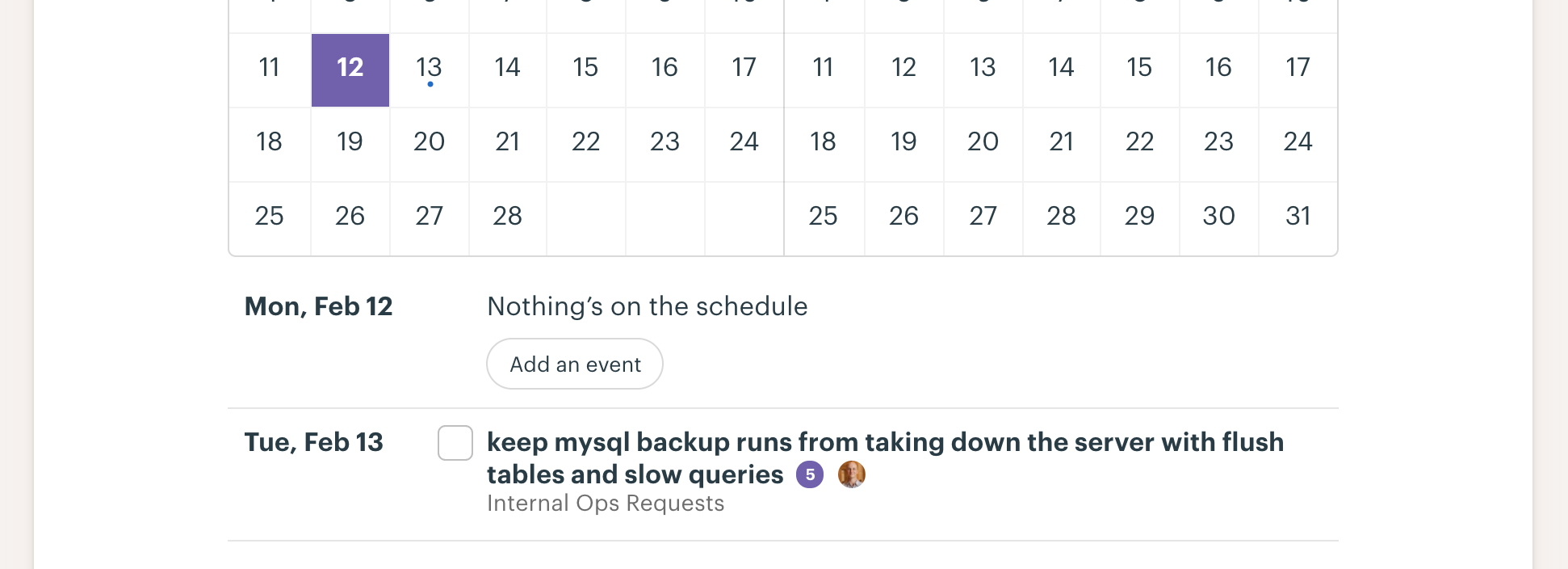
Why is this misleading? If you click through to the Schedule itself, you’ll see there’s actually a to-do due tomorrow:

You wouldn’t have known that glancing at the Schedule card. With the changes we just added, you’ll now see something like this when you’ve got upcoming to-dos:

Who and When?
Another thing was missing from the previous design: It wasn’t clear exactly who was involved in an event and precisely when it was happening. That’s because we just showed the name of the event and the date on which it occurred:

Now, we show avatars for each participant and to-do assignee as well as times for events that happen at a specific time:

Templates
Project Templates were also missing to-dos. That led to situations like this where the Schedule looked blank:

In fact, there may have been several to-dos:

We hope this makes Schedule cards more useful for you. Stay tuned for more updates to Basecamp 3!
Got feedback or ideas to share? We’d love to hear what you think about the new features. You can contact us on Twitter or share your thoughts via our Support form.

