For years we’ve used Basecamp To-Dos to track all of our design and programming work here at Basecamp. They help us make sure that nothing slips through the cracks.
However, for some projects, tracking to-dos isn’t enough. When you have dozens or hundreds of tasks, you need a way to see the bigger picture. Is the project going to be done on time? Are we making progress on the right tasks? Which things need to be solved now and what can be deferred until later?
To solve this problem, we built an entirely new idea into Basecamp To-Dos. It’s a 10,000-foot view of our projects that answers the hard questions about where things really stand.
Introducing the Hill Chart.
Progress is not a number
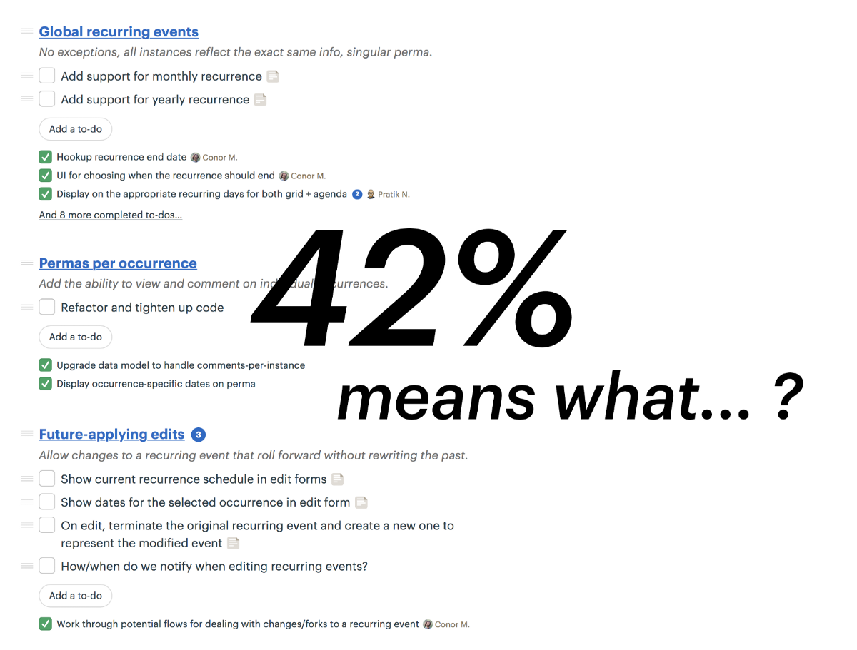
“42% of the tasks are complete.” What does that tell you? Very little.
For creative work and software projects, you can’t describe progress with a number. Why not? Because tasks on a project aren’t all the same. If the team gets stuck or starts to run out of time, it matters which tasks are in that 42%. The strategy for getting unstuck depends on where you’re stuck.
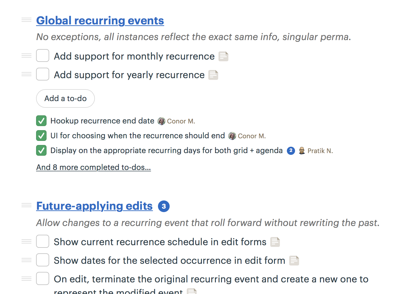
More than that, we don’t actually know every task in advance. As we roll up our sleeves on a project, we discover more detailed tasks to track than we had in the beginning. A raw percentage count would show our progress going backward instead of forwards when that happens!
What we really want to know is where the work stands. Has the team figured out how to do it? Are there unknowns that will block us ahead? What’s solved and what’s still full of uncertainty?
Work is like a hill
We found a metaphor for talking about this at Basecamp. Every piece of work has two phases. First there’s an uphill phase where you figure out your approach. You have a basic idea about the task, but you haven’t figured out what the solution is going to look like or how to solve all the unknowns.
Then after you’ve explored what works and what doesn’t, you reach a point where there aren’t any unsolved problems anymore. That’s like standing at the top of the hill. You can see clearly all the way down the other side. Then the downhill phase is just about execution.
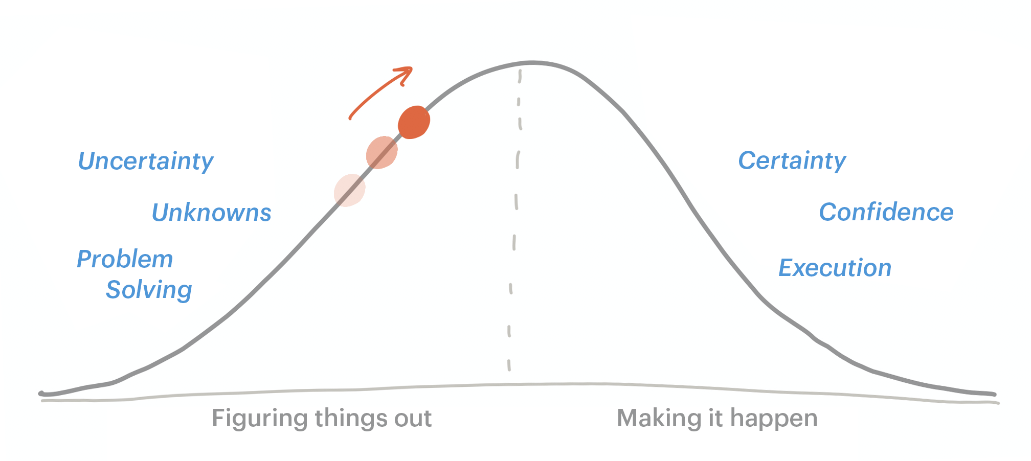
Work on the two sides of the hill is very different.
Uphill work is hard to estimate. You might go in circles searching for the right approach. And as long as unknowns remain, there’s risk. The programmer thinks it’ll be a quick change but the API is different than expected. Or the interaction design seemed like a quick fix but there’s no room for the button on the mobile version.
On the downhill side, the world is certain. You’ve solved the problems, figured out your approach, eliminated the unknowns. All that remains are steps of execution to finish the project.
A human data point
No calculation will tell you how many unknowns are on a to-do list. Or how hard the remaining problems are. That’s why we built a way for teams to communicate, in a human way, exactly how they feel about where the work stands from unknown to known using the metaphor of the hill.
Here’s a demo to show you how it works.
A Hill Chart from a real project
Each of our development projects in Basecamp is made of a set of To-Do Lists. We create a To-Do List for each piece of work that we can make progress on independently.
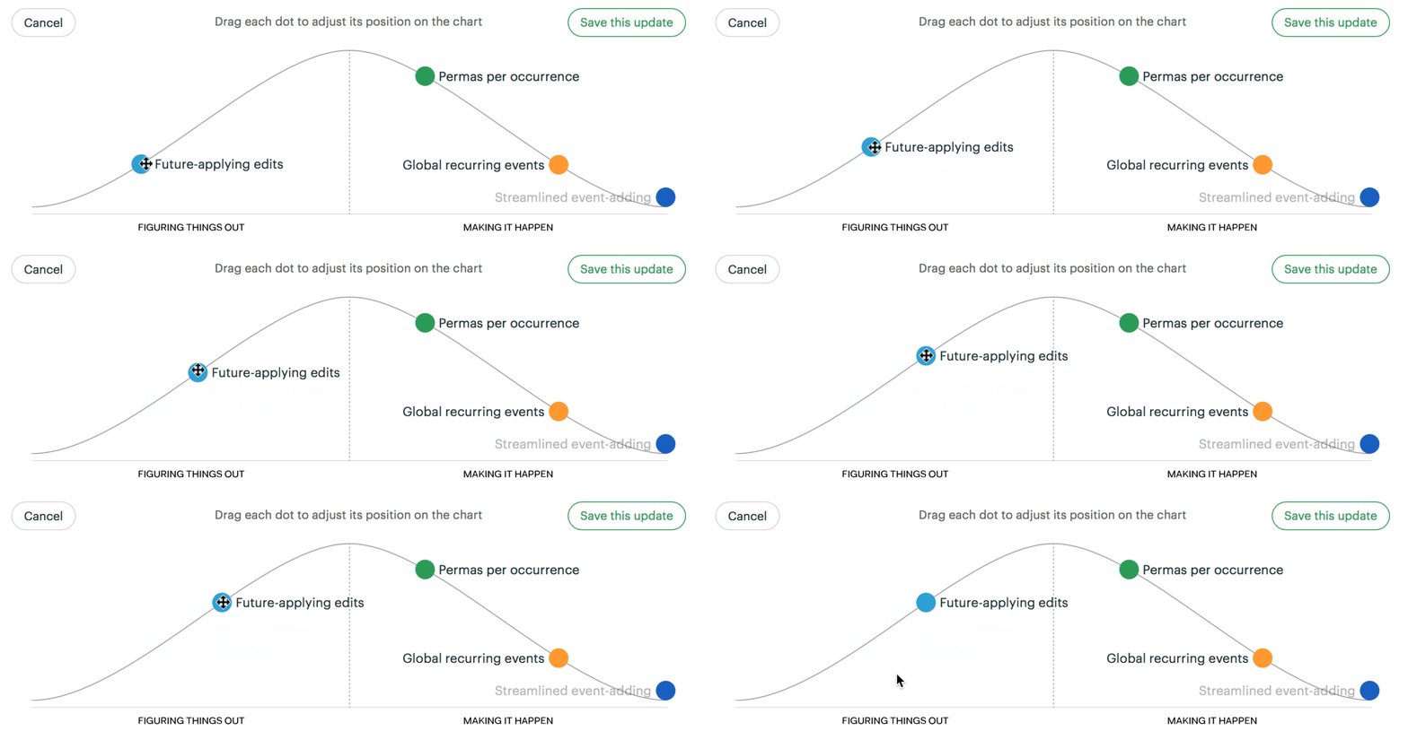
Now to track progress, we turn on Hill Chart tracking for each list. This will reveal a Hill Chart on the top of the To-Dos screen with a dot for the list we’re tracking.
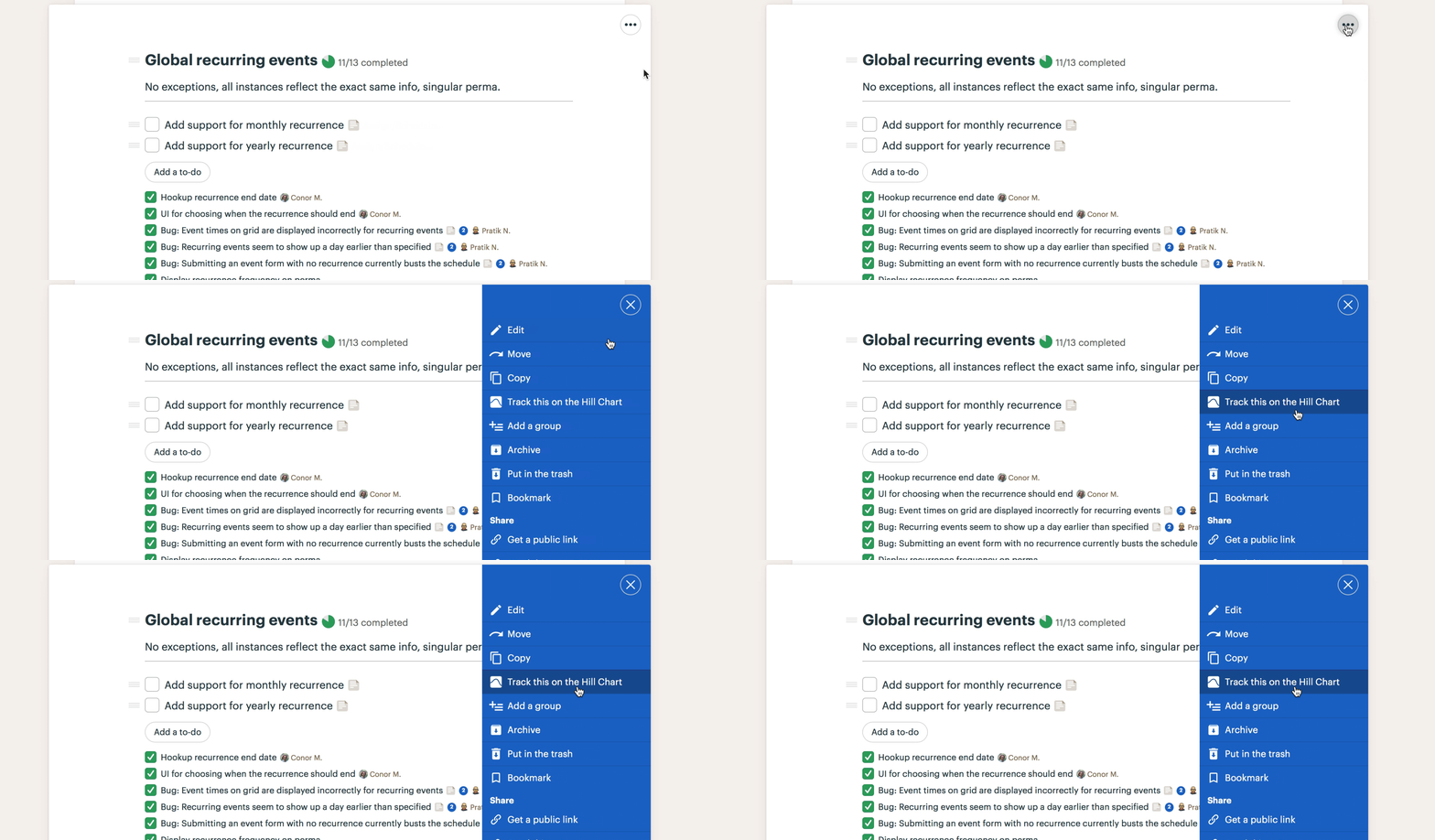
We did this for three lists. Next we click Update on the Hill Chart and drag the dots for those lists into position.
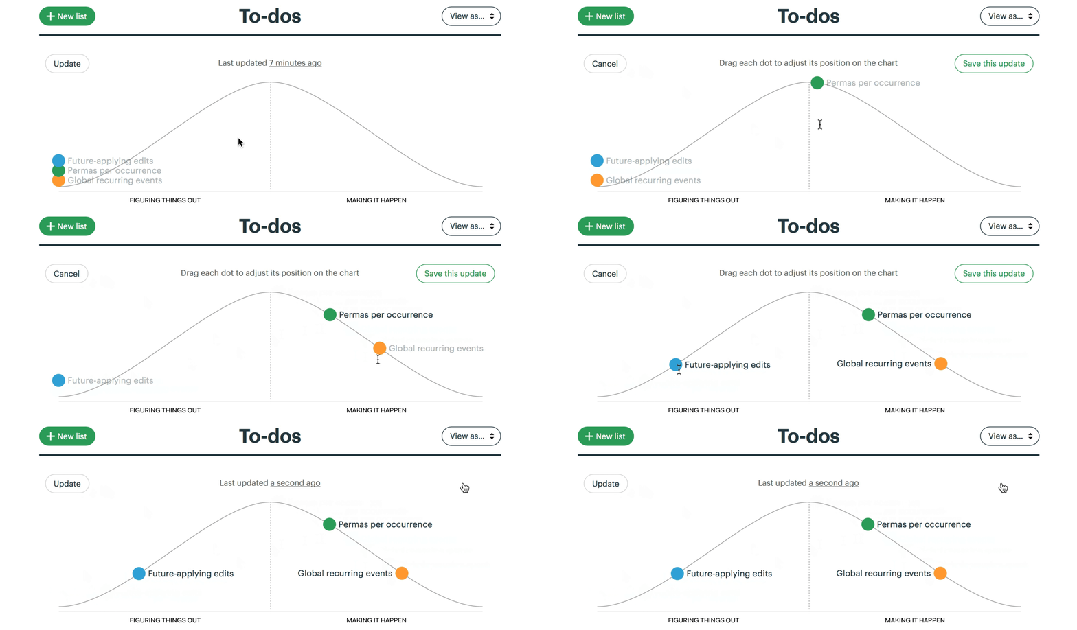
Now anybody who checks on the project can see the status of these three lists. Two of them are over the hill — full of certainty, with just execution left. One is still on the uphill slope, which means there are unsolved problems or open questions.
Note how that the status is human generated, not computer generated. This reflects a real person’s feeling of the work at this moment. And because the status is attached to lists, not individual to-do items, we gain a higher-order perspective on all the work at once.
Hills make history
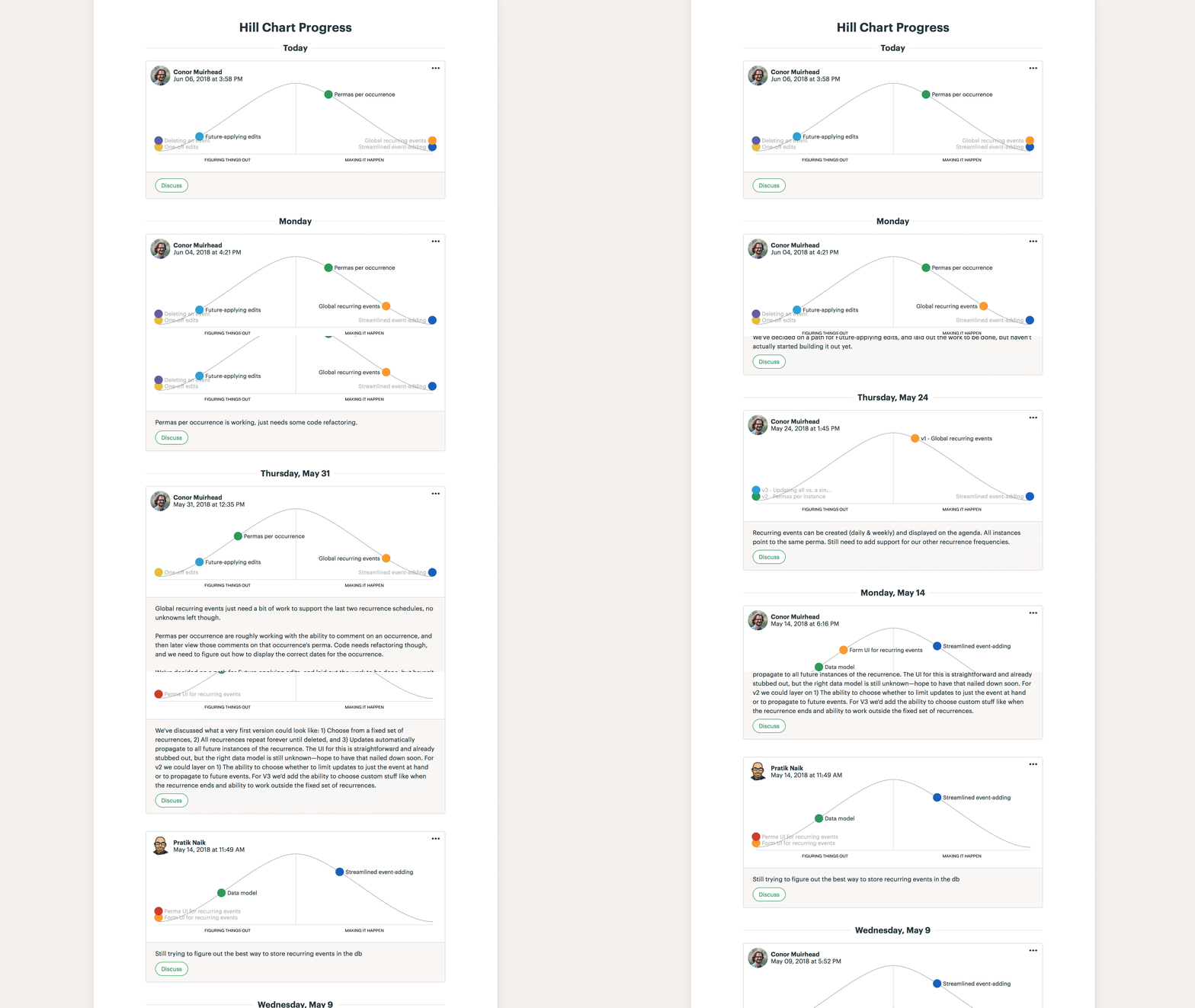
Every time someone updates the positions on the hill, a new snapshot is saved to the project’s history. This enables managers to immediately acquire a ton of context about what is moving on the project and what isn’t without peppering the team with questions. People on the team can optionally annotate each of their updates with commentary. You can even comment on or Boost someone else’s Hill Chart update. This enables a new level of fast, asynchronous communication about high-level progress on projects.
More well-defined work
Sometimes trying to position a list on the Hill Chart helps you to better structure the work. On a recent project we were building a feature to notify people when an Event in Basecamp was rescheduled.

That dot sat there for a few days without moving. Something was wrong. Why weren’t we making progress? After a short talk with the team, we realized that it was unclear where to place the dot because part of the work was fully figured out and part wasn’t. The back-end code to deliver the notification was fully solved. But there was some more design work relating to the emails and Hey! menu that we hadn’t figured out. So where should the dot go?
In a case like this, the hill is telling us to break up the list. We renamed the original list to “Notification: Delivery” and moved it over the hill to show where it really stood. Then we created two separate lists to track the front-end work that was still uphill.

Redefining the To-Do Lists like this made it easier to see what was actually going on in the project and what needed to be done next.
Flexible, per-list setting
For each project, you can choose which To-Do Lists appear as dots on the Hill Chart. It’s a per-list setting, so you can still have regular To-Do Lists mixed in with your tracked lists. We usually keep a list called “Chowder” at the end a project for loose ends that don’t fit anywhere else, and we don’t plot that one on the hill.
From unknown to known, and known to done
Instead of counting tasks, the Hill Chart shows where the work really stands. From unknown on the far left, to known at the top, to done on the far right.
Since we adopted the Hill Chart internally at Basecamp, our teams have been communicating about progress at a level never before possible. Our intuitions are the same, but now we have a visual way to immediately show each other where the work stands. And because of the Hill Chart history, we don’t need to call meetings to catch up on a project’s status. It’s no longer a challenge to see what’s in motion and what’s stuck. We can have quick, substantial conversations asynchronously about where to focus next or how to break up a problem.
That’s the kind of thing Basecamp is supposed to do: make you more organized, give you more time, and put everybody on the same page.
We hope you can experience the same benefits we have by trying the Hill Chart on your next Basecamp 3 project. You can use the Hill Chart on any project today by navigating to a particular To-Do List and choosing “Track this on the Hill Chart” from the Options menu (•••) in the top-right corner.
New to Basecamp? Learn what it’s all about and start a 30-day free trial over at Basecamp.com.

I love this. I’ve enjoyed using the hill chart so much over the last few months. Can I steal the hill chart idea and incorporate it into a product I’m working on? Is that bad form or are you happy for people to use the idea and eventually build on it?