We’re close to finishing up a refresh of the Basecamp 3 interface on web and desktop. We’re planning on launching it in the next few weeks, so we wanted to give you a thorough preview before it shows up in a browser near you.
First, why?
A combination of reasons, really. One, we have some new ideas that we didn’t have when we launched Basecamp 3 a few years ago. Now feels like a good time to modernize. Two, we have some cleaning up to do. We’ve updated the product hundreds of times over the last few years, and we’ve introduced some inconsistencies and rough edges. Time to pause, clean it up, and set the stage for the next few years. And three, we think this new design makes Basecamp more enjoyable to use, and far more approachable for new customers. It was a heck of a lot of fun to do, too!
Further, we’ve always believed in following the same pattern car manufactures follow. Major model updates every few years, and mid-cycle refreshes about half way into a model cycle. Basecamp Classic (February 2004), Basecamp 2 (March 2012), and Basecamp 3 (November 2015) are our major model updates (entirely new code under the hood, entirely new designs, etc), and the Basecamp 3 refresh like the one we’re about to launch in early 2018 is equivalent to a mid-cycle refresh in the car world.
Lastly, we approached this as a refresh, not a redesign. We wanted to update navigation, page layout, typography, buttons, placement, and proportions, while still retaining a familiar Basecamp 3 feel. A freshening up, not a flushing out. We know our customers are in the middle of important work, and they rely on Basecamp to help them manage the load, so we wanted to tread confidently, but change carefully.
Let’s take a look at some screens
Messages
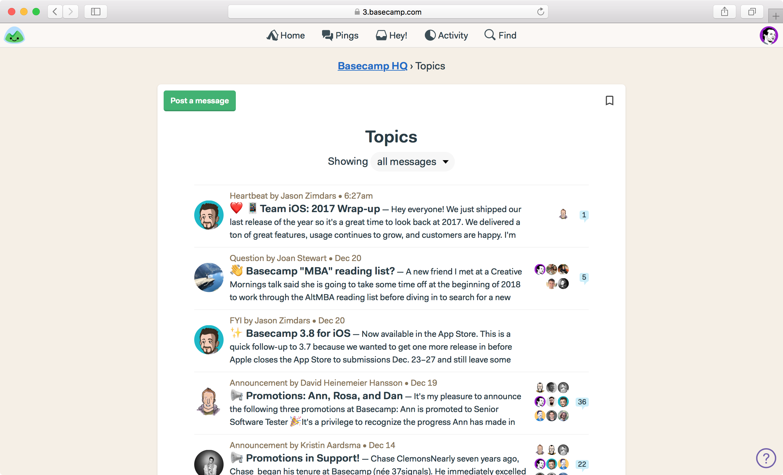
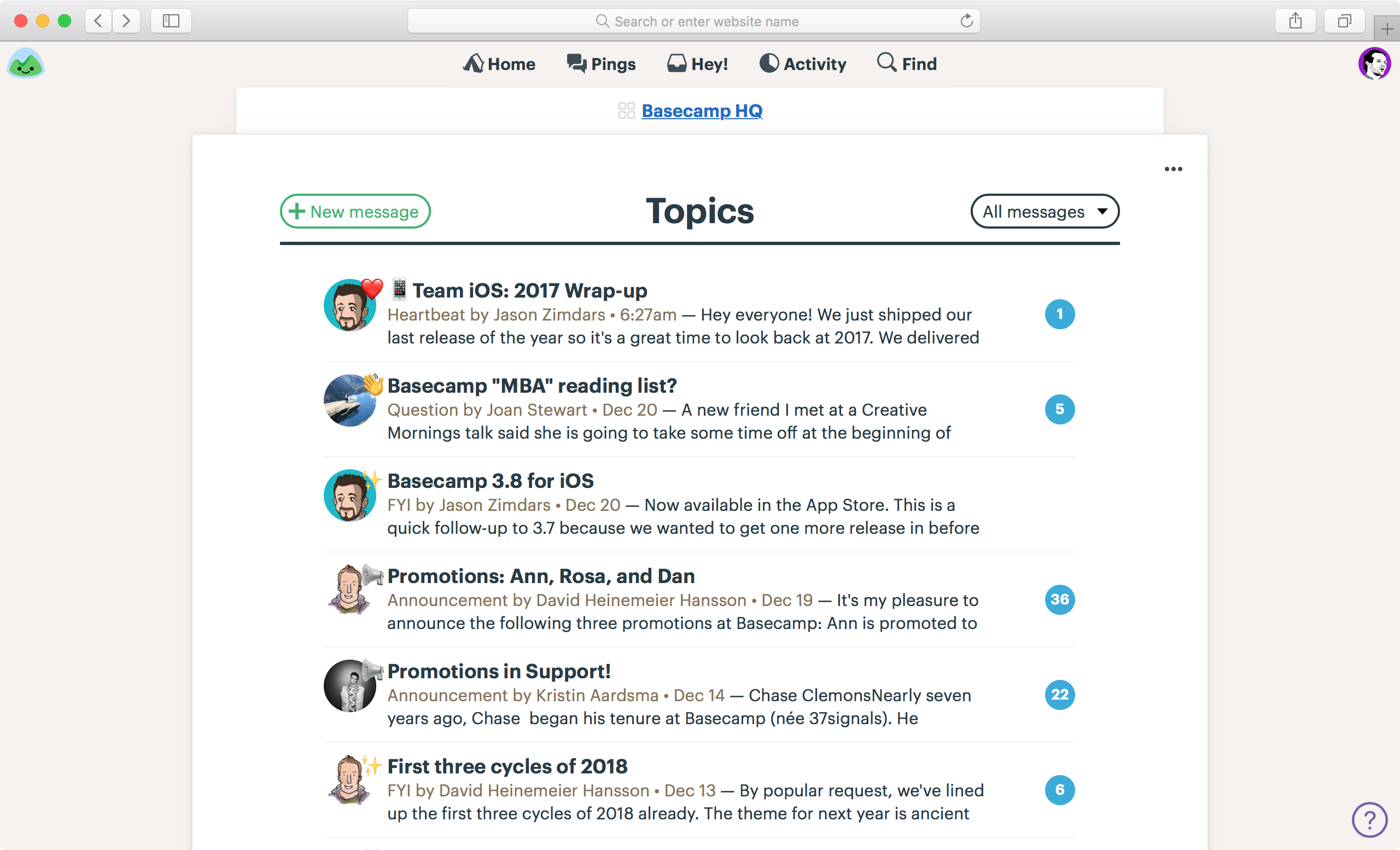
First let’s look at the screen that shows all the posts on the message board inside a specific project or team. The new design is wider, bolder, and more confident. Fewer floating objects, stronger left margin so text all starts from the same place, stronger callout of comment count in big blue circles, less dead space at the top of the screen, more messages visible without scrolling, etc. Before on the left, after on the right.
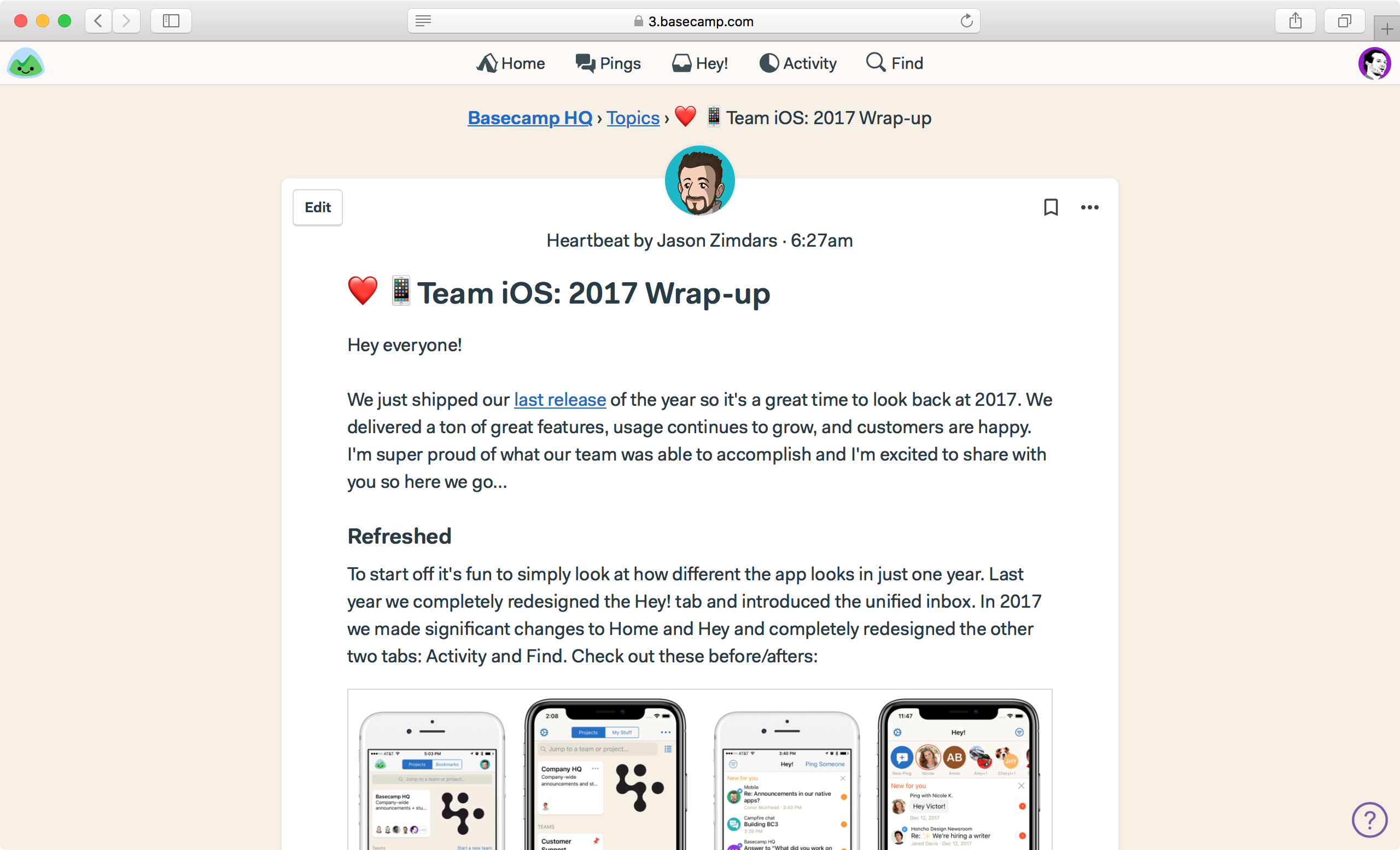
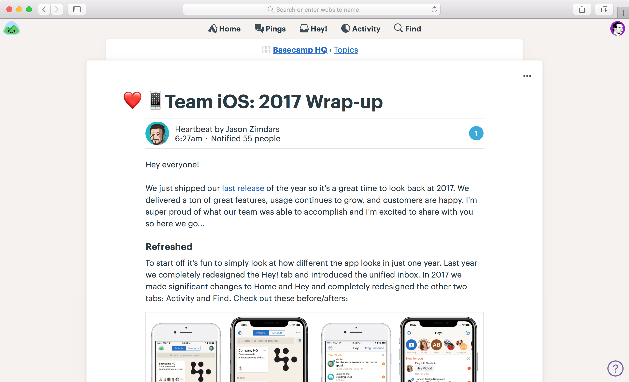
And now let’s compare what an actual message board post looks like. Here you’ll see a tighter layout, fewer intersecting and overlapping shapes, stronger masthead, better type, reorganized metadata, and overall better use of space. It just feels a whole lot more confidence inspiring, which is important when making company-wide announcements using the message board.
Automatic Check-ins
Automatic Check-ins are of the most popular features in Basecamp 3, and they’re getting a well-deserved overhaul.
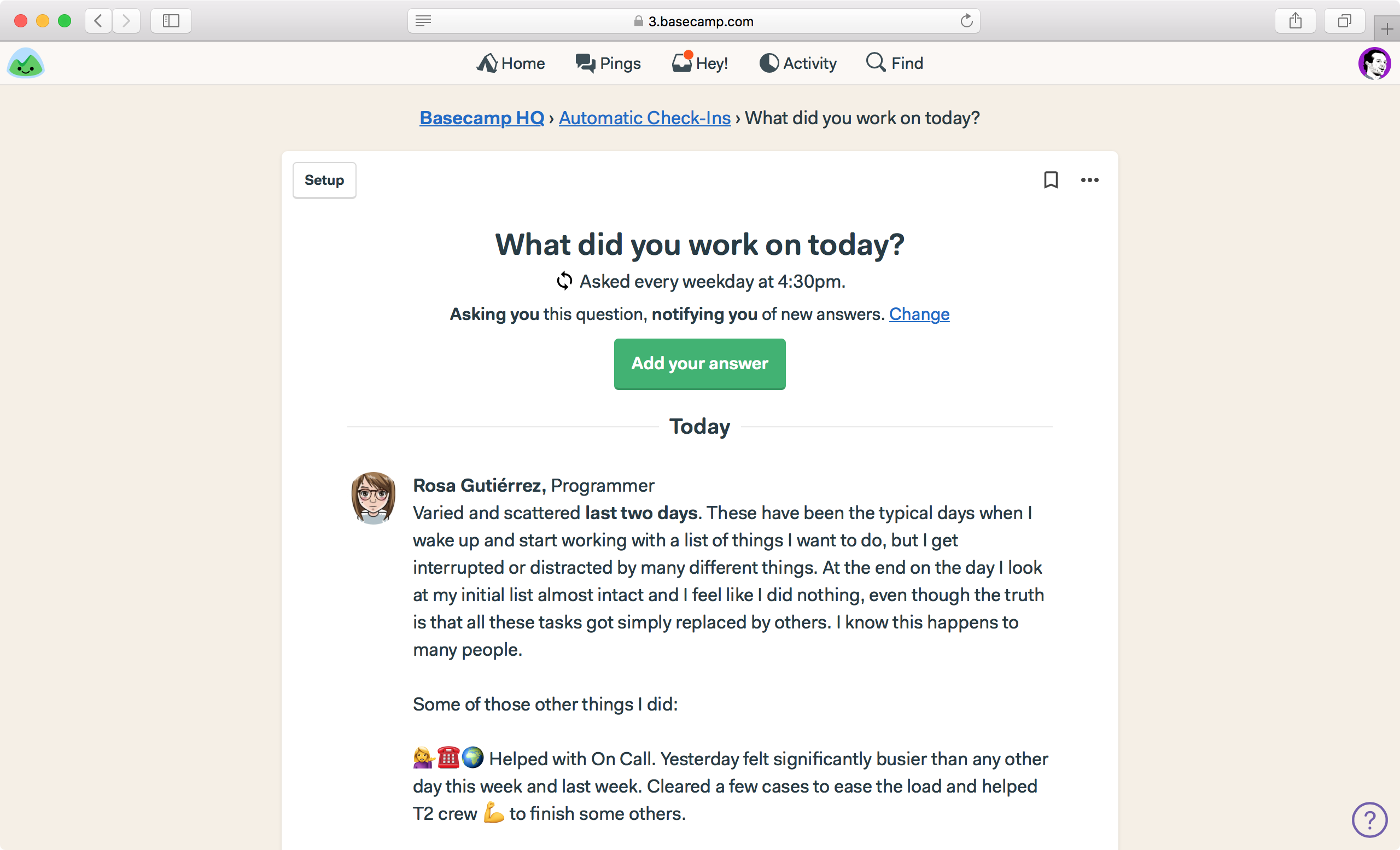
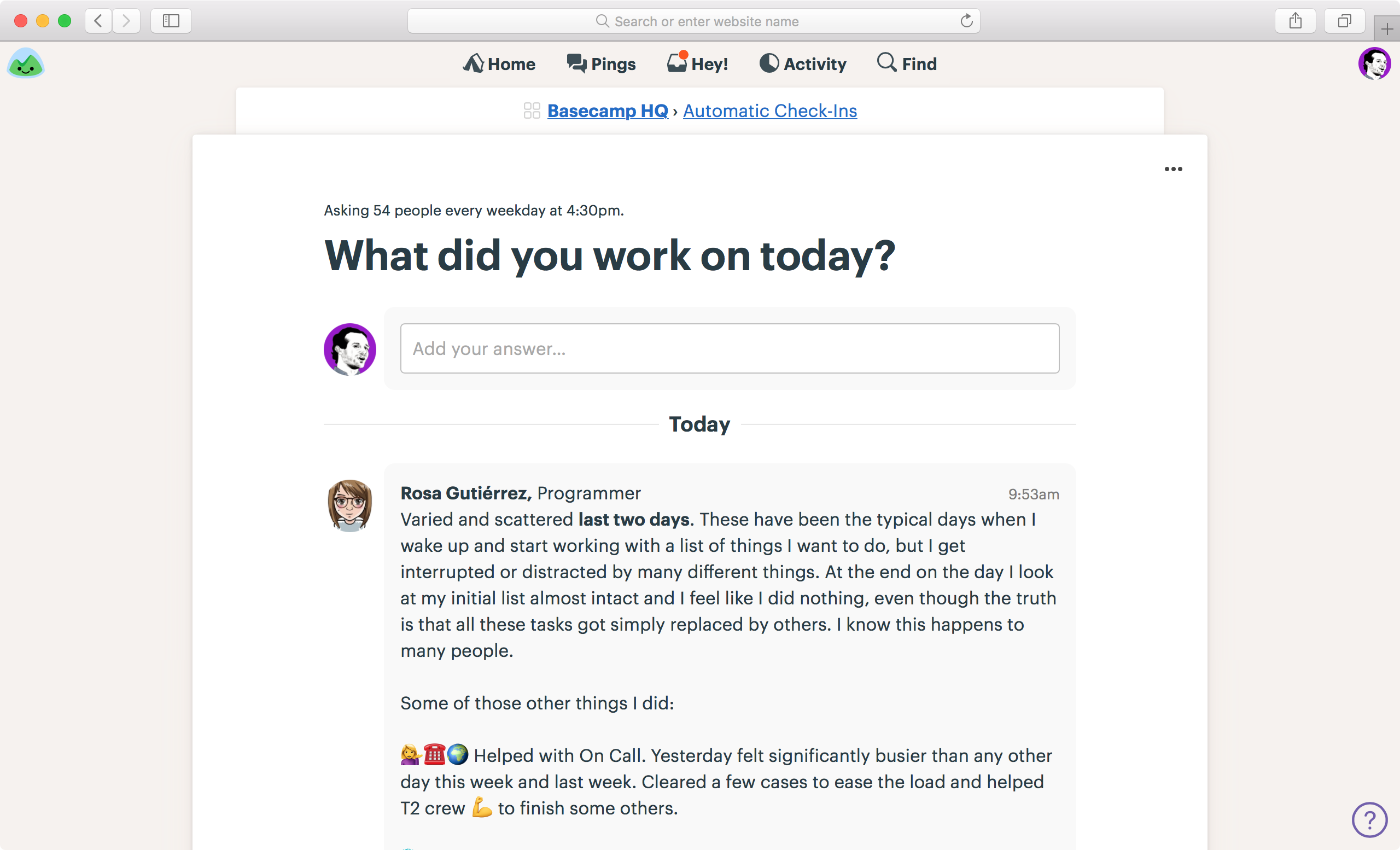
Let’s look at the check-in page itself. Here’s an example from “What did you work on yesterday?”. The previous design is on the left, the new design is on the right. We’ve cleaned up the top quite a bit, and replaced an “Add your answer” button with a field you can just type directly into. We’ve tucked some infrequently used subscription options into the ••• menu, vs. having them messily exposed. And you’ll also see a hint of the new answers/comment design — individual comments are now encased in a light grey shape to hold them together and separate them from everything else on the screen.
Schedules
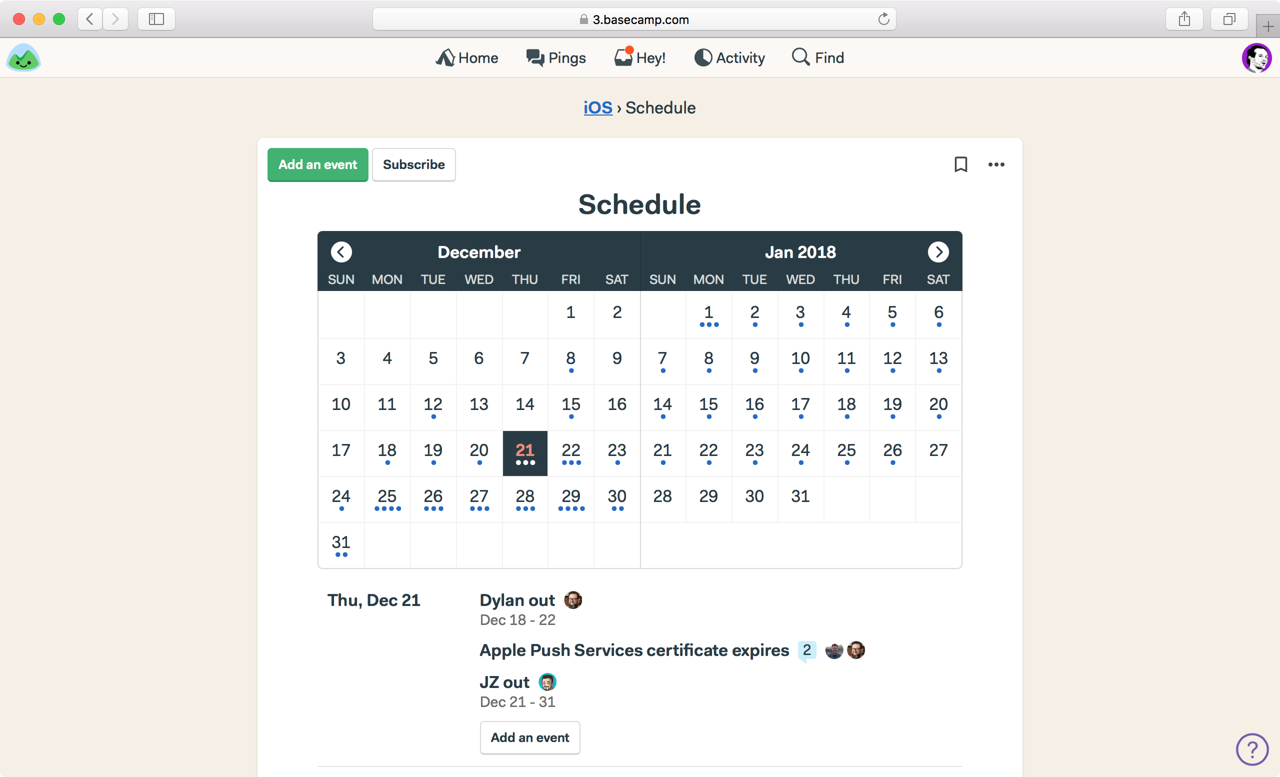
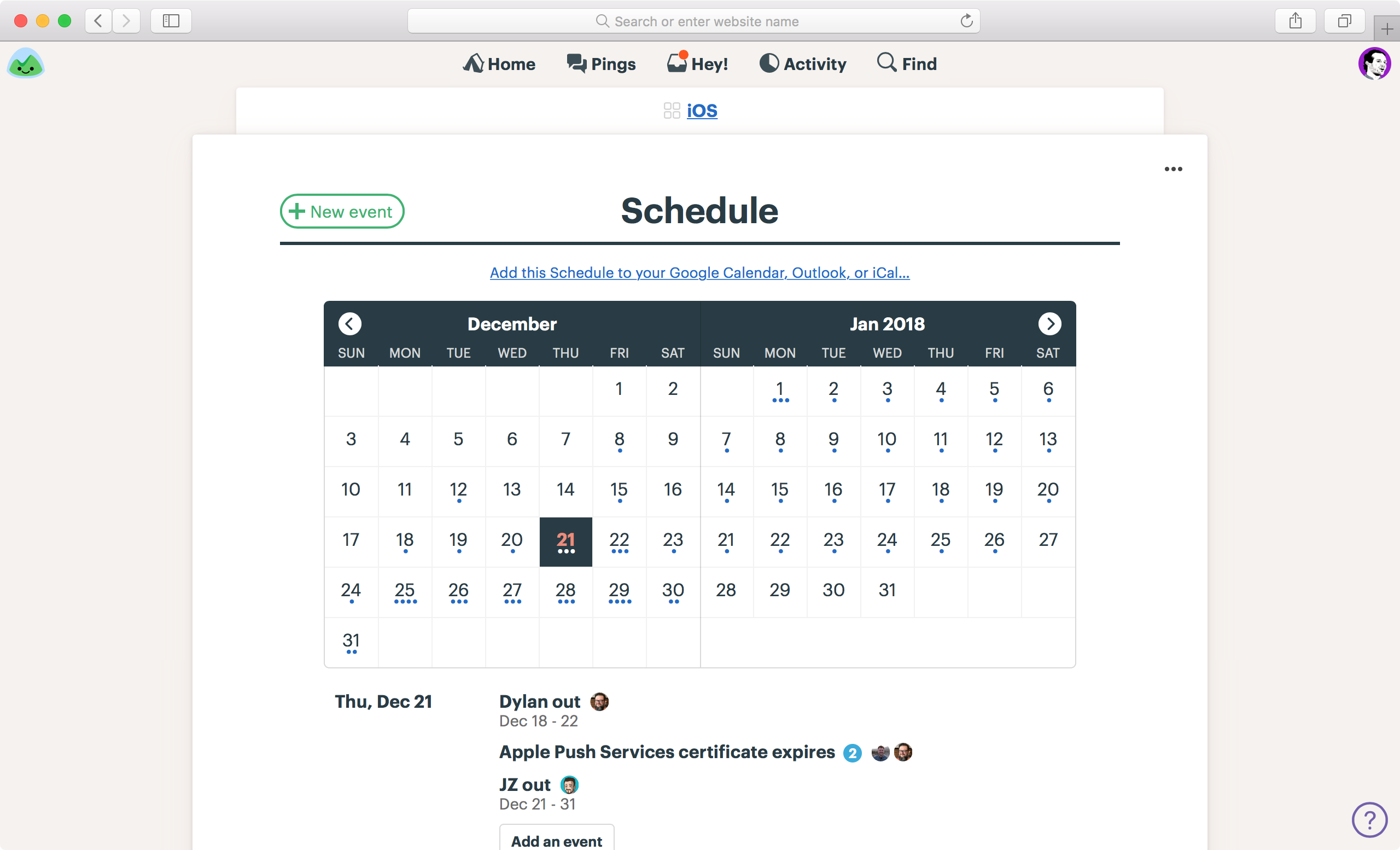
We’ve tweaked the schedules design as well. While it inherits the new header design you’ve seen elsewhere, we’ve replaced an ambiguous “Subscribe” button with a clearer, front-and-center “Add this schedule to your Google Calendar, Outlook, or iCal…” link. Further, we’ve tightened up the header, and given things a bit more room to breathe, so the screen just feels more solid, less floaty. Before’s on the left, after’s on the right.
Project/Team home screens
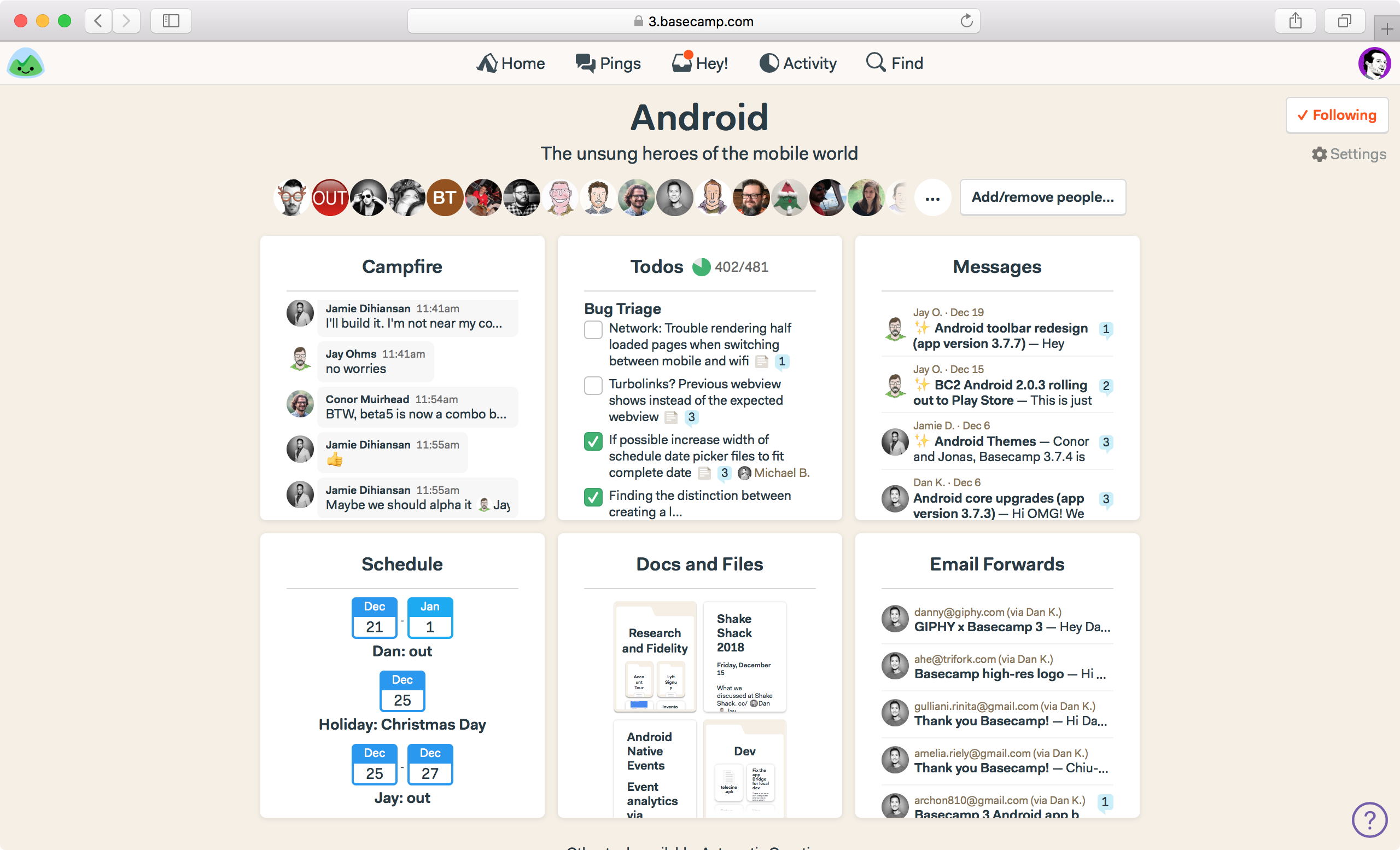
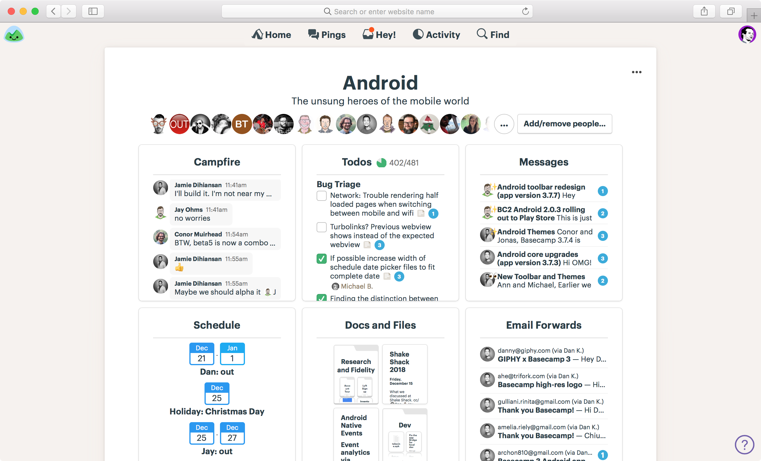
We’ve put everything on a white sheet, vs directly on the background. It helps eliminate awkward negative gaps, shapes, and alignment, and it just tidies things up considerably. The page feels more sure of itself, and better organized overall.
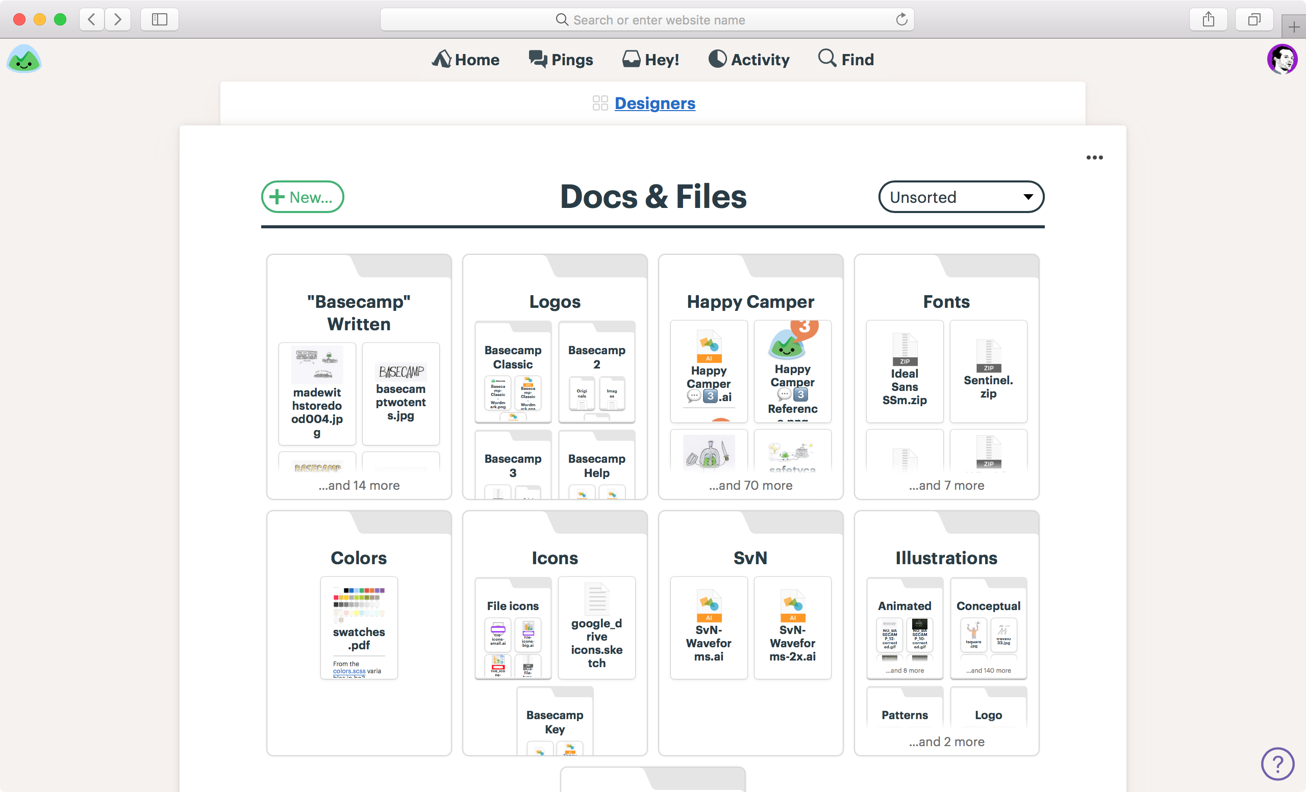
Docs & Files
Docs & Files also get a white sheet, a new masthead, a general clean up, and the new look:
Navigation and background
You’ll see in the screenshots above, that we’ve lightened up the background. Less beige, less yellow. It’s paler, but still a trademark warm tone. We want Basecamp to feel comfortable and cozy, not cold and clinical like so much software out there.
We’ve also placed the navigation straight on the background, vs. in a strip. This cleans things up and emphases the content below rather than the navigation above. Further, we’ve added a “backsheet” behind the breadcrumb which further emphasizes hierarchy and adds some structure.
Before:

After:

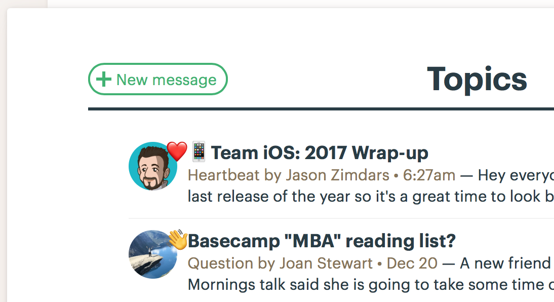
“New” buttons are also all in the same place now. The current design has them centered and big in some places, while small and top left in other places. Now they’re always top left on the same line as the headline like this:
Overarching themes
While this remains a work in progress, and the final product may look a bit different from the previews you see here, the gist will be the same. We aimed to make the interface and user experience more consistent and predictable, the text more readable, and the hierarchy clearer and more intuitive. Further we tweaked the typeface, sizing, spacing, and proportions to make everything feel more comfortable, and removed a bunch of fussiness from the design. Overall, we feel great about where we’re headed here, and we’re eager to share the final version with everyone soon.
Thanks for following along, and thanks for all the feedback along the way. We’ve built plenty of it into the redesign.
All the best,
— The team at Basecamp
