Declaring your love of simplicity has long been a prerequisite pledge for anyone working on products. It’s the perfect placeholder word for everyone to load up with their own personal aspirations, all the while nodding in agreement with someone holding diametrically opposed ideas. Even the most obtusely designed products will have a parent ready to explain “it’s actually quite simple if you just…”
Beyond the trouble of pinning down exactly what simple means is certifying its value. “Simple” is just one of the many qualities we can use to evaluate products, and it is by no means the most important. To use a trite phrase to describe another: Simple is overrated!
Here are but a few qualities I’d take over simple:
- Useful
- Clear
- Fun
- Satisfying
- Inspiring
- Endearing
I wouldn’t just rank “simple” low on my list of priorities for a finished product, but also for the tools we use to take us there. My favorite tool is the programming language Ruby. It is anything but simple. Thousands of methods across the standard library, so many keywords I can’t even tell you the number. Full of subtlety that directly relates to its wonder and delight.
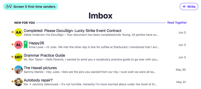
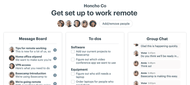
Basecamp is in the same boat. It’s clear, it’s just enough, but it is not “simple”. We literally have hundreds of individual screens spread across 6 major features that could each be individual products (and are!).
The value is derived from solving many of the problems most people face when trying to make progress together. It tries to do so in a clear and playful manner. “Simple” is not high on the list of priorities, and the product is much better for it.
It’s time to knock “simple” down a peg. It’s just not that important.

