Some scraps and learnings from the workroom floor
Recently I’ve been working on an update to Basecamp 3 that’ll give people a couple more options for how they sign up and log in to Basecamp. People will be able to choose from using a password, their Google account, their Facebook account—or all three.
Huh, why write about that, there’s nothing special there? I know, right!? I’m not sharing this because there’s anything groundbreaking in the feature, but because I found myself re-learning the importance of looking at my work critically, and honing things in by asking and answering a few simple questions along the way.
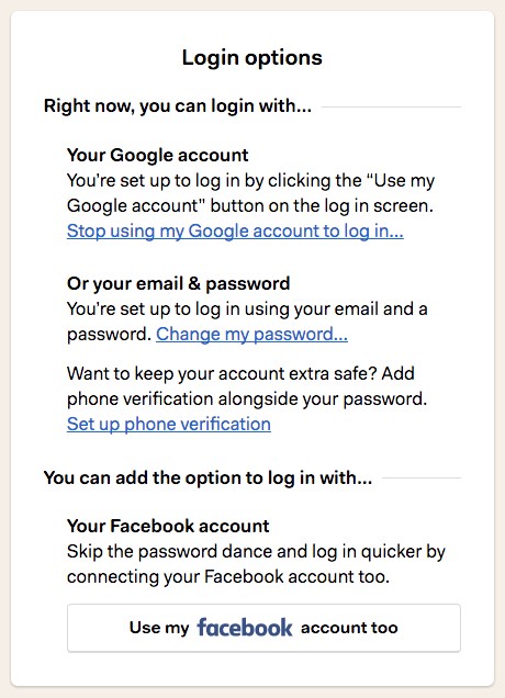
So, as we start offering multiple methods to log in to Basecamp, we need to also provide a place for people turn each method on or off. Let’s dive in and take a look at my first iteration on this screen.
Getting the mechanics in place
I started by carving out a screen to hold all the login options that are available to a person. I was thinking about this screen as an unfortunate (but necessary) evil for letting people toggle these login options.

Take one look at this first iteration and it’s clear that my attitude was showing through 😳. Sure, you can turn Google off. Yes, you can start using Facebook. Yeah, you can figure out which options are on or off…you just have to read every single word on the page!
The mechanics were there, but there was no soul, and no clarity.
What is this really about?
I’m still not clear what I’m looking at here or what the options actually are… Ok, I finally figured out I’m using Google…
…right now there’s a lot of parsing to do. You could have Facebook on, but you’d have to scroll through two other options first that are calling you to do something. It’s unclear if this screen is informational, or transactional, or both.
After getting the above feedback, I realized I hadn’t really stopped to think on what this screen was really about. Sadly, this is a mistake I’ve made many a time! It can be all to easy for me to start with the mechanics and then just leave it there.
So I asked myself, what is this really about? After a bit of thought, it was clear that I was hoping to do two things:
- Give current state of the world
- Offer any additional options
Explaining the current state of the world was something I was already trying to do in each individual login method’s copy, but totally failing to express holistically. If these two things were really the purpose of this entire screen, why not structure everything around them?
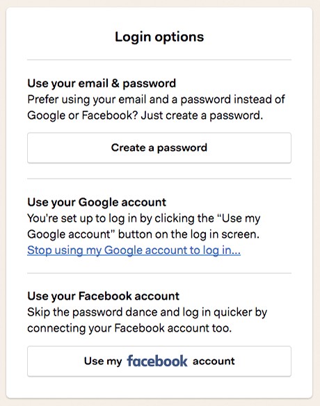
A big step forward. Now the screen tells me what’s set up right now, and what my other options are. But…it still lacks clarity and precision! I have to read the entire thing to actually understand it.
The first time around I missed the forest for the trees—state was expressed in the individual blocks, but not holistically. This time around I missed the trees for the forest—the screen has the right structure, but the blocks are confused and seemingly unaware of their context.
I mean, who wants to read three paragraphs just to get a sense of what there current options are?
How can I make this clearer?
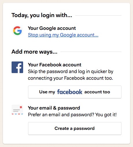
Now that the screen’s structure reflected its purpose, it was time to tighten things up and double down on making it as clear and precise as I could.
Could I say this more efficiently?
The first step towards clarity was to remove a lot of words.
“Right now you can log in with…” becomes “Today, you log in with…”
“You can add the option to log in with…” becomes “Add more ways…” because folks already know what we’re talking about.
The paragraphs describing how “you’re set up to login…” for each active login method are just repeating what the heading tells us. Drop those.
Sometimes words are too wordy, and an image can speak more efficiently. Adding icons for each login method made it easier to see what’s on/off without even having to read beyond the headings.
Oh, and speaking of headings, we don’t need that “Login options” title up top anymore — gonzo!

The final (for now) product is a lot better. The whole and the parts are working together. It’s clear what the state of the world is, and I can easily see my other options. The words are precise and clear.
The questions I asked along the way
Like I said, no groundbreaking designs here, but I was surprised at what asking a few questions did to transform this screen.
Here are the questions I used along the way:
- What’s this screen really about?
- Is the overall screen oriented around that purpose?
- How about the individual building blocks?
- Could I say this more efficiently?
- Is there anything I could remove (or add) to make this clearer?

If you haven’t already, head over to Basecamp and start a free account. You can get going with either a password or your Google account—we haven’t gotten to Facebook yet.
