Basecamp 3 saw a flurry of updates over the last 6 weeks. Here’s what a few small teams working together were able to ship.

A few months ago I wrote up a post sharing the details of how we structure our teams and work in six week cycles at Basecamp. It turned out to be very popular article.
Now let’s take it one step further and show the actual work itself.
Six weeks , 8 people, 40-hour work weeks
Here’s what our core product team of 4 programers and 4 designers were able to start, complete, and ship to Basecamp 3 customers over the last six weeks. Note: This is for the web/desktop app only. The iOS (4 people) and Android (3 people) teams shipped entirely different work over the last cycle.
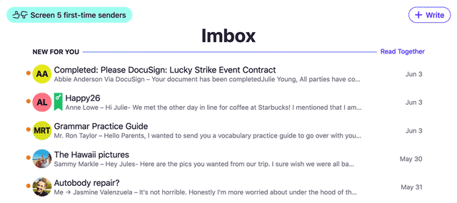
- Many Basecamp 3 customers still prefer receiving notifications via email, but they can experience email overload quick on busy Basecamp accounts. So now we’ve fixed that for them. Now we batch together pings (Basecamp 3’s version of instant messages), to-do assignments, t0-do reminders, and file upload notifications that come in within a few minutes of each other. This means instead of receiving separate emails for each individual thing, now you just get a single aggregated digest here and there. Peace and calm!
- Automatic check-ins, one of Basecamp 3’s killer features, just got better. Now customers have more control over when the automatic check-ins are sent. Daily, every other day, once a month, at exact times, etc. This update introduces major flexibility, which was a top customer request.
- It’s now more obvious how to share files in Pings and Campfire chats on the desktop. It was always clear on iOS and Android, but on the desktop we only let you drag files into the window. Now there’s an explicit paperclip button you can click to select files (you can still drag too).
- Admins can now delete comments from comment threads (on messages, to-dos, documents, automatic check-ins, files, schedule items, or wherever else comments are possible). This wasn’t a top request, but it was very important for those who really needed it. Done and done!
- Now you can resend an invitation or send a direct link to anyone on Basecamp. Sometimes someone didn’t get the original invite, or they haven’t used Basecamp for a while so they forgot how to log in. Now you can help them do it rather than just tell them how to do it. Subtle difference, but a major level up for those who like to be full service.
- Major simplification across the top of messages, to-dos, documents, files, etc. We combined a couple of menus into one, and exposed the bookmark icon outside the menu. These aren’t the kind of changes that people immediately notice, but they appreciate them when they run into them. It’s a better design.
- We tidied up a row of buttons for saving a draft or publishing a message or document. This one had been bothering us for a while. Since the buttons are in a more logical order, and designed slightly differently, it’s now a lot harder to make a mistake by pressing the wrong button.
- Now you can page through all attachments in a single thread by just using the arrow keys on your keyboard or clicking the arrows on your screen. This is a much faster way to browse designs, comps, photos, etc. We had this in previous versions of Basecamp, but embarrassingly we hadn’t added it to Basecamp 3. Now it’s there!
- We eliminated a few steps to post the first message or to-dos when there were no messages or to-dos in a project. We were repeating ourselves before with a couple of screens in between you and the initial action. Now it’s single-click direct.
- A variety of typographic updates to improve spacing of titles, paragraph breaks, and space above and below bulleted/numbered lists. Airier, more comfortable, and reads better.
- Major update for managing people on the admin side (in Adminland). We condensed a variety of separate options into a single screen, made it much easier to see every single user across the entire account on a single page, and provided single-click actions to change someone’s access permissions, send a link to log in, etc. Major win for centralization here.
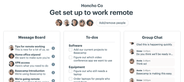
- Now you can quickly jump to the HQ, any team, any project, your assignments, what you’ve done recently, your bookmarks, and your drafts from a single Jump screen. From anywhere you can now just hit command-j on the Mac (or alt-j on Windows), and you’ll get a pop-up that lets you jump anywhere from anywhere.
Nearly there…
There are a few things that were basically completed during last cycle, but either haven’t shipped yet or need a tiny push over the finish line. These should be shipped shortly:
- Custom emoji picker for Pings and Campfire chats.
- Lazy-loading images only once they’re on the screen. This speeds up load times, renders pages faster in the browser, and reduces bandwidth.
- Tweaking the way Automatic Check-in notifications are represented in the Hey! menu. Subtle change, but should reduce unnecessary noise for very active accounts.
- Consistent display of dates that outside the current year.
Correction: Six(ish) weeks
We say six weeks, but in some senses it was 7 or 8, but in other ways it was more like 4 or 5. This cycle we had one programmer 90% out on paternity leave (he came back the last week of the cycle), and we had one designer partially out for a few weeks (also on paternity leave). So we were understaffed the full six weeks. We used an extra week or so after the cycle had ended to wrap a few things up. That’s how we get to 7 or 8 weeks, even though we were only at full power for about two of those total 8 weeks.
Did those 8 people work on every project together?
No. Teams are usually made of of two or three people. Sometimes just one if a programmer or designer can handle the whole thing themselves. Multiple small teams are working on parallel on different things, no one team dependent on the other to move forward.
Who ran the projects?
At Basecamp, each team runs their own projects. We don’t have dedicated project managers. Generally the designer takes the lead (since nearly all work here at Basecamp starts with visual design), but sometime a programmer leads, or there’s truly equal leadership throughout.
Who decided who worked on what?
The core product team of 4 programmers and 4 designers figured it our themselves. David, Ryan, and I put together the big picture plan for this cycle (with input from a variety of people), and then the teams themselves divvied up the work and made all the calls and adjustments required to get it done on time.
Did everything ship at once?
No — we ship when things are ready. We don’t hold work to ship in big single releases. We work in six week cycles, but the work goes out when it’s done, one thing at a time.
Was that everything that shipped?
No — lots of other customer-facing stuff shipped as well. If we include just two more people in the mix, we also shipped a bunch of marketing site improvements and a/b tests as well as in-app a/b tests aiming to improve conversion, onboarding success rates, self-service discounts for students/teachers and non-profits, and some testing around a new tier we’re considering offering.
Any other questions?
Any curiosities? Stuff I didn’t cover that you’re curious about? Any other questions about how we work? Post ’em below in the comments and if we have answers we’ll be sure to respond. Thanks!

