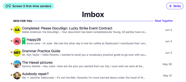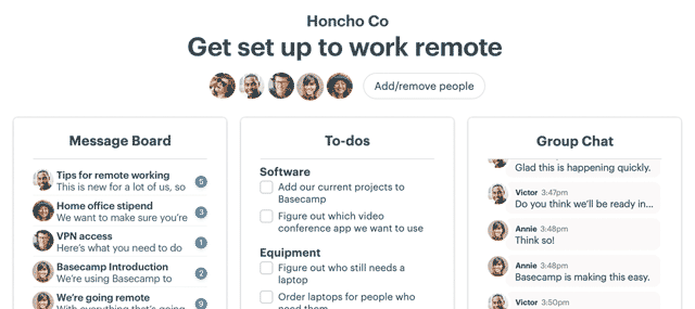
The inbox is the center of everything. Whether it’s email, assignments, messaging, chatting, IM, whatever, if someone wants you to see something, it shows up in an inbox of some kind.
The design of the inbox has more impact on our daily decision making than any other part of any piece of software we use. It’s fucking important.
If you use a group chat tool like Slack, HipChat, Microsoft Teams, or something similar, your inbox — and, therefore, your day — is filled with mysteries, secrets, and “Whats?”. You’re probably so numb to it that you don’t realize how much of your time and attention is being wasted.
“To see what is in front of one’s nose needs a constant struggle.” -George Orwell
You’re stumbling around in the dark all day long because of a simple design pattern. The pattern is core to group chat, no matter the tool. It’s a fundamental flaw of the medium hidden in plain sight.
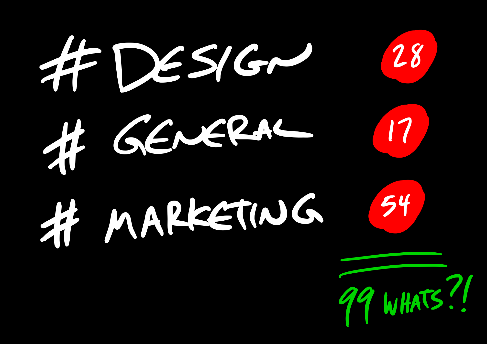
The inbox in the sidebar of Slack, Hipchat, and Microsoft Teams is stacked with rows like this:

There’s a category, room, or channel name on the left and an unread indicator on the right. But wait, what’s that 28 mean?

28 what? 28 things I have to see? 28 things I could see? How many of those things matter to me? Are any of them relevant? The category attached to the number is so broad, that anything, everything, or nothing important could be hiding behind the number.
If you use a group chat tool, there’s only one way to find out if the unread number is relevant: You have to click through and read everything just to figure out if there was anything worth reading. That’s the very definition of wasting time. Doing work to see if there’s work to do.
This design lacks context. General categories are too roomy to provide specific context, and specific context is what we use to determine if something’s worth digging into or not. Without it, we’re unable to use our time wisely. An absence of detail wastes our attention.
4 of those lines could have been jokes. 9 of them mildly interesting anecdotes. 3 of them relevant to you. 8 of them random observations. And 4 questions and followups that didn’t pertain to you. Or some other combination. Maybe all 28 were completely unrelated to anything you’re working on, even if 34 things earlier were. Who’s to know when all you have to go on is a number?
Surely not every single thing said in #design or #general or #marketing or #engineering or #projectname is relevant to you. And if it is — if you have to follow along with hundreds or thousands of individual lines a day — communication problems across your company run deep.
And that’s just one room/channel. Add in a few more, and you start to run into big numbers of unknowns, lot of whats?
Making matters worse, if you’re like most people, your sidebar lists a whole lot more than just 3 rooms/channels. Many people keep a dozen or more up there. Multiply that by dozens or hundreds of people at a company, and you can only imagine how much time, money, and attention is being wasted every day. You’re paying for software that makes people do extra work just to see if there’s any real work worth doing.
We took a different approach with Basecamp 3
When we set out to design Basecamp 3, we put people’s time and attention at the center. Everything that matters must be surrounded with context and detail that gives you the information you need to make good decisions about how you spend individual moments throughout your day.
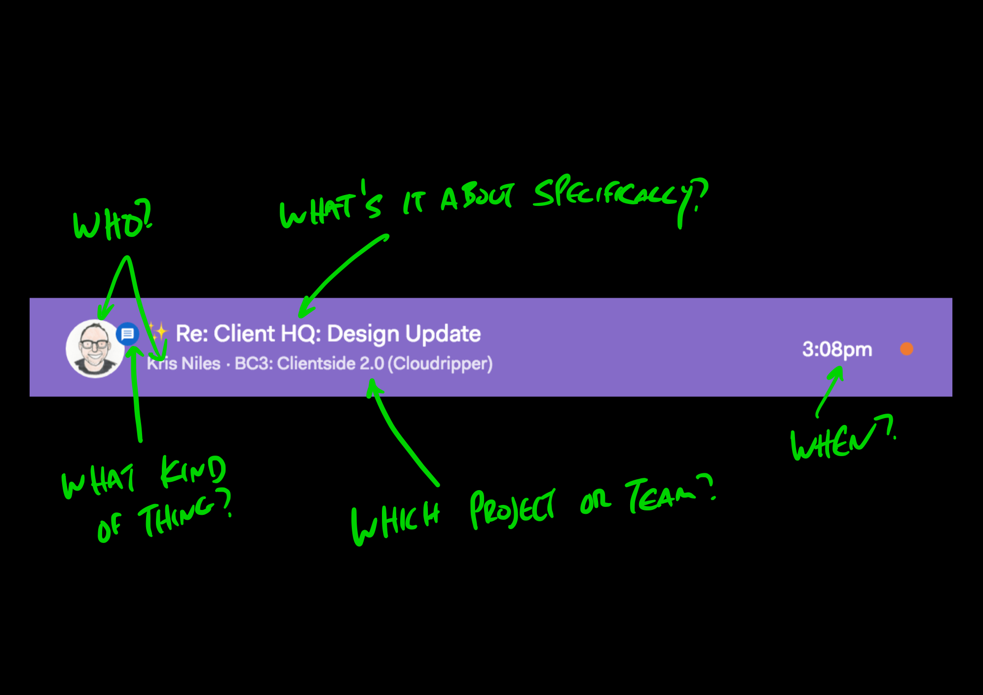
In Basecamp 3, there’s no sidebar that’s constantly pulling your attention away and to the left. Instead, there’s a menu at the top called Hey! When you choose to pull that menu down, revealing what’s inside, you’ll see rows that look like this:

This design is full of context. Each row gives you the who, the kind of thing (an @mention, a to-do you’ve been assigned, a to-do that’s been completed, a comment, a new document, a new message, etc), the specific subject/topic that’s relevant to the discussion, which project or team it relates to, and when it happened.
Here’s my actual Hey! menu right now:
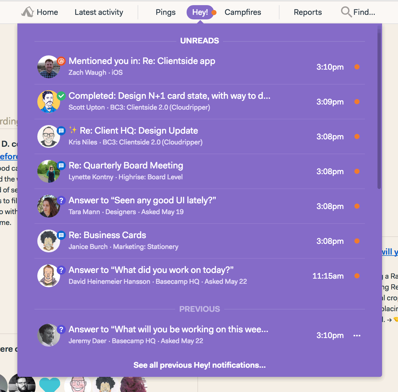
At a quick glance, I can see who’s said/done the most recent thing in each thread. I can judge relevance and timeliness. For example, I’m not working on the Business Cards stuff day-to-day, so I can ignore that one at the moment, but there’s a Highrise Board Meeting coming up shortly, and because Lynette, the Highrise COO posted something, then it’s important that I check that out. I can also see that Scott completed a to-do that I assigned to him. And that Zach @mentioned me in a conversation on a to-do about the Clientside feature we’re working on.
The Basecamp 3 Hey! menu is full of context. It lets me scan without committing. I’m informed simply by looking at it. I can jump in selectively and make my own decisions how to spend my attention because all the information is in front of me. I can pull it down, glance, and step right back out. When things are out of the way in a menu I can decide to get to them later.
Contrast that with the group chat style sidebar where I only have a scant, general idea what I’m jumping into. At a glance I can’t really tell if there’s anything behind the curtain that’s worth my time right now. So I have to go look at everything. What a distraction. The fact that you can’t know what’s behind the number actually entices you to waste time finding out. It’s a dark pattern.
This adds up
We tend to judge how things affect us personally. But when you’re using a group tool with others, the effects are wide ranging. If you’re wasting 15 minutes every hour peering through irrelevant chat logs and getting inadvertently pulled into unnecessary conversations, imagine all the other people at your company doing the same thing. Every hour. Every day. 1500 minutes wasted every hour? More? Quantify the waste. Bad design adds up.
So stop. Take note. Pay attention to how often you have to jump in to determine if jumping in was worth it. How often you have to read everything to see if there was anything worth reading. How many times you’re pulled away by secrets and mysteries in your inbox. If you start counting, you’ll be surprised how high the number goes.

Your time is too valuable to put up with this.
Tired of wasting your time and energy on the chat treadmill? Graduate from group chat to Basecamp 3. It’s the calmer, saner way to work. Stop spinning your wheels or running in place — Basecamp 3 helps you get traction with new projects. Since switching to Basecamp 3, 89% of our customers have a better handle on their business, 84% report more self-sufficient teams, and more than half save over 10 hours of busywork a month. Give it a try, for free.
