Whenever I dive into something new, I try to find at least one “why the hell not?” moment. And when I can, I try to leave evidence of that moment in whatever it is that I’m building.
When we launched our company (37signals) back in 1999, we launched a black and white, text-only site without a single piece of portfolio work to be found. All the other agencies we were competing with had very flashy pages, loaded with pictures of their work. So why black and white and text only? Because why the hell not lead with ideas rather than compete on pictures? We thought it could be better that way. It worked out well for us.
One of my favorite why the hell not moments was when we were writing REWORK. One of the things that always bugs me about paper books is that you have to leaf through a dozen or so pages before you arrived at page one of the actual text. You’ve got the testimonials, the table of contents, the dedication/acknowledgement page, the copyright page, usually a blank page, a title page, etc… THEN you get to the book. This is also one of the reasons I really like cracking into a new book on the Kindle — you start right at the text.
So when we were talking to our publisher about how we wanted REWORK to be organized and designed, I asked them if we could put the copyright page at the end, rather than the beginning. It would be one fewer page to leaf through up front, and if any page was ignored more than the others, it had to be the copyright page. So why the hell not just put it at the back?
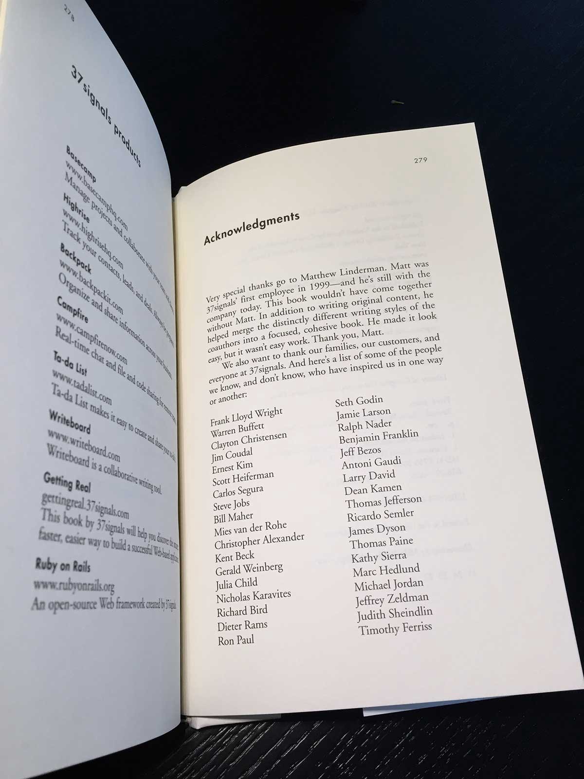
Initially our publisher didn’t know how to respond. No one had ever asked that before and they’d never seen an example of a copyright page in the back. But ultimately they said yes, so today if you pick up a copy of REWORK, and go to the last page, you’ll find the copyright page right there in the back of the book on page 280:

You’ll also find the acknowledgement page on page 279, rather than right up front:

Whenever I’m struggling with a decision that seems “unusual”, I’ll look back at these two pages in REWORK and remind myself that just because everyone else does something one way doesn’t mean you have to do it that way. Sometimes it’s just worth saying why the hell not and going for it.
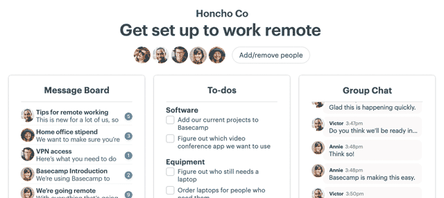
There’s a whole bunch of “why the hell not” in Basecamp 3. There’s nothing else out there like it. If you’re struggling to stay on top of your growing business, and you’re trying to run things on email, text, chat, and meetings, you’re doing it the hard way. Stop doing that! Try the Basecamp 3 way instead.

