You’re reading Signal v. Noise, a publication about the web by Basecamp since 1999. Happy !

Jason Z.

About Jason Z.

Jason Zimdars joined Basecamp in 2009 as a UI designer. Most recently he worked on Basecamp for iPhone and iPad. He thinks about Basecamp constantly.

Designed by Apple in California

Jason Z.
Jason Z. wrote this on 55 comments

Designed by Apple in California
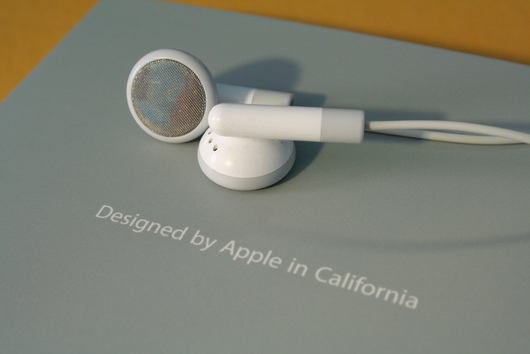
Photo: Marcus Jeffrey

“I think that ‘Designed by Apple in California’ is the most brilliant thing to ever appear on a package,” I wrote on the application-site that was mentioned in yesterday’s post on sites that landed jobs at 37signals. SvN reader Michael P. Mills asked:

I agree, that line is brilliant and I remember the first day I ever saw it.

I am very curious to hear why you believe that “it is the most brilliant thing to ever appear on a package”.

This simple tag has appeared on nearly every Apple product or package in at least the last decade. (I couldn’t find any definitive answer as to how long it’s been in use, but I remember it distinctly on the iPod packaging in early 2000’s.)

What’s great about this phrase is that it’s powerful on more than one level.

Presentation

Designed by Apple in California is usually presented dramatically and in isolation. Often you see it after opening a flap or unfolding a panel. It stands alone as a single line of type on a solid field. There is never anything that distracts from it. The early cube-shaped iPod packages were the best at this. You’d remove the sleeve, unfold two panels, and there it was. The next fold revealed the device. That I still remember this sequence says a lot about how powerful the experience was.

Emotion

The copy itself, evokes feelings of artistry. Like this object was meticulously crafted, carefully wrapped, and bought safely to your door. It feels human, as if you received it directly from the person who so lovingly made it. Craftsmen sign their work. Master Bladesmith Bob Kramer puts his name on all his knives. Vermont Furniture Designs puts its name inside each dresser it makes. Edward Tufte advises designers to always put their name on what they make — it shows that you care about the finished product and take responsibility for it. That’s the feeling I get from this line.

Also, it wasn’t “Made by Apple in California,” it was Designed. I can’t think of another company that holds design in higher esteem or even one that touts every product as designed, not made. This might be the best expression of the company’s mission available.

California

The design comes from Cupertino, from people who obsess over it. Items may be manufactured in China, but they’re designed by Apple headquarters. And that matters to people. Plus, California evokes magic for many people — especially the California of the mid-1970’s that gave birth to Apple Computer and really, the entire personal computer revolution. Warm weather, surfing, celebrity and a free-wheeling easy lifestyle in the age of American Graffiti are not such bad things to associate your company with.

Marketing that doesn’t shout

There is an adage in graphic design that goes something like this:

If you want to make something stand out in your design, make it big. If it needs to stand out even more, make it bold. Still not enough? Make it red.

Big and bold and red epitomize the lazy designer because it always works but shows no imagination. Marketing is usually full of big and bold and red.

Yet here, Apple goes subtle. The careful design makes the statement even more powerful. Apple conveys the importance of this phrase by isolating it, so it never can be missed. It never has to compete with other elements. It’s small and elegant, just like the devices themselves. It is revealed dramatically and unexpectedly. All of these devices make this statement loud and clear without Apple ever having to raise its voice. By doing that, it sets the tone for the actual product and experience contained within.

Usage is like oxygen for ideas. You can never fully anticipate how an audience is going to react to something you’ve created until it’s out there. That means every moment you’re working on something without it being in the public it’s actually dying, deprived of the oxygen of the real world.


Matt Mullenweg, founding developer of WordPress, in 1.0 Is The Loneliest Number
Jason Z. on Nov 12 2010 7 comments

Blob Motility is an attempt of actuated shape display using fluid programmable matter. We have developed an environment where we can program the shape of gel geometrically and topologically using our unique magnetic fluid called pBlob. This enables us to experience organic shape changes in real space, like a metaball in the CG world. The control hardware is composed of electromagnets arranged in the honeycomb structure and their control circuits. We describe the method of blob creation, details of the mechanism and the language for transformation control, and propose some applications we are developing at present.
via Make:

Jason Z. on Oct 15 2010 3 comments

Customizing web forms with CSS3 and WebKit

Jason Z.
Jason Z. wrote this on 32 comments

Last week, we shared a few things we’d learned about UI in mobile WebKit browsers. In that post we touched briefly on the idea of using CSS3 to make form inputs that look and feel the same in all WebKit browsers across platforms. Today I’d like to share some specific examples of how we did that.

Getting started

Customizing form elements in WebKit browsers all starts with applying the -webkit-appearance property to all inputs:

input, textarea, select {
   -webkit-appearance: none;
 }
Un-styled inputs
Form inputs in Safari before and after applying -webkit-appearance:none.

This removes all of the browser’s default styling from the inputs. You can then apply your own CSS styles.

Base styles

I started by adding some basic styles that would be common to all inputs:

input, textarea, select {
   border: 1px solid #555;
   padding: 0.5em;
   font-size: 15px;
   line-height: 1.2em;
   width: 80%;
   background: #fff;
   background: -webkit-gradient(linear, left top, left bottom, from(#fff), to(#ccc));
   -webkit-appearance: none;
   -webkit-box-shadow: 1px 1px 1px #fff;
   -webkit-border-radius: 0.5em;
 }
Basic styling example
Base styles

That gives us some consistent treatment (and the checkboxes and radios now are visible again), but we’ll need to address some of these specifically.

Getting specific

Using the [type=] attribute selector in our CSS, we can specify styles for each input by kind. For example here are some addtional styles that will be applied to checkboxes and radios:

input[type=checkbox],
 input[type=radio] {
   display: inline-block;
   font-size: 15px;
   line-height: 1em;
   margin: 0 0.25em 0 0;
   padding: 0;
   width: 1.25em;
   height: 1.25em;
   -webkit-border-radius: 0.25em;
   vertical-align: text-top;
 }

 input[type=radio] {
    -webkit-border-radius: 2em; /* Make radios round */
  }

Our checkboxes and radios are now properly sized. Next, we’ll want to specify how the checkboxes will look when checked. The :checked pseudo-class makes it as easy as applying a background image:

input[type=checkbox]:checked {
   background: url("data:image/png,%89PNG[...]") no-repeat center center;
   -webkit-background-size: 28px 28px; /* shrink high resolution background */
 }
styled checkboxes and radios
Checkboxes and radios in both states

The browser applies and removes the checked attribute as the user clicks the widget, allowing us to style our custom checkboxes without any Javascript.

Custom style

After making some additional styles for textareas, submit buttons, and focused fields, our form now looks something like this:

Final form
Our final customized form viewed with Mobile Safari

The appearance of our form is clear and the inputs are now consistent across a variety of WebKit browsers including Apple Safari, Google Chrome, and mobile browsers on iOS and Android devices. See the example in your browser.

With some simple modifications, we can completly change the look:

Alternate look
An alternate look based on the same code

Working example of this alternate look.

Final thoughts

Certainly, changing the appearance of the default form widgets is not something to be taken lightly. Our approach here was a fairly conservative exploration in standardizing on an input style similar to Mobile Safari as a proof of concept. Radically changing UI that people have become accustomed to in their browser should be avoided unless there are substantial benefits to the user. We considered the case that someday 37signals would want to offer mobile versions of all of our apps. Having a standard set of inputs that feel like us, like the desktop apps that so many people are already used to is definitely a benefit. Regardless of your particular stance, it’s exciting that CSS3 finally gives us these powerful options for customization at all.

Here’s what we’ve learned about doing UI for mobile web apps with WebKit

Jason Z.
Jason Z. wrote this on 32 comments

Lately, we’ve been exploring ways to offer web apps that perform like native apps on mobile devices. For this short sprint we targeted mobile WebKit browsers—especially the default browsers on iOS and Android—because of their widespread use and excellent support for HTML5 and CSS3.

Here are a few things we’ve learned along the way:

Browser differences

Targeting WebKit browsers specifically lets us make liberal use of -webkit extensions to CSS3 (as seen in the spinner animation we shared recently). Incompatibilities between the current browsers on iOS and Android devices has not been an issue so far.

Fonts

The biggest difference is the default installed fonts. We prefer Lucida Grande for our apps in desktop browsers, but the font isn’t available on any of the mobile devices we tried. iOS offers Verdana, Helvetica or Arial; Android devices have Droid Sans. Just like on the desktop, Verdana is large relative to other fonts. For that reason, we choose Helvetica on iPhone. Compared to Helvetica, Droid Sans appears a bit smaller and more condensed.

Form widgets

Form widgets are another distinct difference between the platforms, but because of the flexibility of WebKit are less of an issue. The native browser widgets on Android are ugly in some cases and unuseable in others.

For example the checkbox widget has a checkmark in both the checked and un-checked states—the checkmark turns green when “checked”. Using CSS we were able to create new widgets that look nearly identical on both platforms. Because of the differences in font rendering, however, it can be difficult to do things like align text inside a button. Web designers should not be surprised by this since it’s a common hassle between even desktop browsers and platforms.


Default form inputs on iOS (left) and Android. Notice how the label on the submit button is positioned differently on each. Or imagine a long list of Android checkboxes where none is “checked”. Are they all checked or un-checked?

Testing

For the purposes of testing your app, both platforms offer desktop simulators. Testing on the iPhone SDK simulator is fast, convenient, and fairly representative of using the actual device—it actually looks like an iPhone.

The iPhone simulator supports the iPad, iPhone and iPhone 4 devices, but only on the latest OS version. Because of this, supporting older versions of Mobile Safari could be a challenge. While it’s possible to run multiple versions of the iPhone SDK, testing on older versions is best done on a physical device.

The Android SDK’s simulator, however, is a sluggish java app launched from the command line that gives no sense of the feel of the OS within the context of the hardware. It does account for the wide array of Android hardware and software versions/features in the wild, but in an obtuse way. You can’t, for example, launch an HTC Droid X profile but instead have to spin up a new virtual device and enter the hardware profile yourself.


The iPhone and Android simulators running side-by-side. Click the image to see it larger

In fact, all testing is best done on real hardware. The simulators give a poor sense of the app on the actual devices. This is especially true in terms of scale. The much smaller pixel size on desktop computers means the simulated devices appear much larger than you’d expect on your computer screen. Much larger than the actual device. Type that looks great on the device can look horsey on the desktop.

For this reason we’ve also been testing on real phones. Using Dnsmasq we can serve requests for the app on our development machines to devices via a wifi network. Touching the UI is an important distinction from the desktop simulator. Real devices are also particularly useful for previewing on the iPhone 4’s retina display. And a real Nexus One is much faster than the simulated Adroid device.

Screen resolution

The iPhone’s retina display also revealed some additional challenges. Web pages in Mobile Safari on iPhone 4 are scaled at twice the resolution of the earlier iPhone models. This means that images created at 72dpi look fuzzy on iPhone 4 where they are zoomed to twice their size.

Fortunately, -webkit browser extensions to CSS handle this scenario well. Images in CSS targeted at Mobile Safari should be designed at exactly twice the intended display size. So a 16px x 16px icon rendered as a CSS background image should be built in Photoshop at 32px x 32px. Then, we can tell the browser the intended display size using the -webkit-background-size property like this:

background: url(images/icon_retina.png) no-repeat;
-webkit-background-size: 16px 16px;

That displays a high resolution image for iPhone 4 when it doubles the dimensions, and a shrunken version for the lower resolution devices. This appears to work similarly on Android though we haven’t tested a wide range of resolutions. We’ve used the convention of naming images that require this special handling with “_retina” in the file name.

Web app settings

We also explored the apple-mobile-web-app-capable settings which lets apps that are bookmarked to the home screen on iOS act more like native apps. These settings let you specify a loading screen image, allow for local caching of data (even the entire app), and hide the browser chrome. Unfortunately nothing like this yet exists on the Android platform, but it’s a great step for browser-based apps so hopefully the idea will catch on.

Final thoughts

Despite opinions to the contrary, mobile web apps still feel like an excellent opportunity to offer native-like performance without having to specialize in a particular platform, or be subject to the whims of an overlord.

Browser-based mobile apps clearly have the potential to offer user experience that is on-par with native apps. Of course designing that kind of experience is going to require more than emerging mark-up and style techniques—it’s not going to be enough to just serve a mobile stylesheet for your app. Offering a native-worthy mobile experience requires you to rethink the UI of your app and deliver it within an environment where touch is the rule. A big part of this exploration not covered here considered fast page rendering, touch interaction, and local asset storage. We hope to share some of the tech side in another post.

Loading spinner animation using CSS and WebKit

Jason Z.
Jason Z. wrote this on 33 comments

It’s hard to stifle a smile any time I get a glimpse of the future thanks to WebKit-based browsers like Safari and Chrome (and their mobile counterparts on iOS and Android devices). That happened today when I discovered a way to make an iPhone-style spinner without any images, just CSS.

First attempt

I have been working on a project that targets mobile WebKit browsers so it was natural to explore using -webkit-animation to handle the image rotation. My initial idea was to use a single PNG image as a mask over a colored background which makes it possible to change the color of the spinner in code. Here’s how that looked in CSS:

p#spinner {
  height: 62px;
  width: 62px;
  overflow: hidden;
  background: #000;
  -webkit-mask-image: url("data:image/png[...]");
  -webkit-mask-size: 62px 62px;
  -webkit-animation-name: rotate;
  -webkit-animation-duration: 1.5s;
  -webkit-animation-iteration-count: infinite;
  -webkit-animation-timing-function: linear;
}

This is how it looks in a browser: Image mask rotation demo

The examples in this post all target WebKit browsers so I’d suggest you fire up Chrome or Safari for viewing the demos. Better yet, try a mobile WebKit browser.

It felt like a win to use a single-frame PNG image instead of an animated GIF but it didn’t look right. Webkit animations smoothly tween rotations so I ended up with what looked like a rotating image instead of the sharp ticking I was going for. Still, masking is an impressive technique that I’m sure will come in handy in another project.

CSS-only, no images

After several failed attempts to make the animation step-based, I still couldn’t get the effect right. I decided to look again into how I could do it without the image. A quick search led to a post by Kilian Valkhof who had a good idea for the basic technique. The first step is to create the bars of the animation by sizing and rotating them around an axis.

<style>
  div.spinner div {
    width: 12%;
    height: 26%;
    background: #000;
    position: absolute;
    left: 44.5%;
    top: 37%;
    opacity: 0;
    -webkit-border-radius: 50px;
    -webkit-box-shadow: 0 0 3px rgba(0,0,0,0.2);
  }

  div.spinner div.bar1 {
    -webkit-transform:rotate(0deg) translate(0, -142%);
    -webkit-animation-delay: 0s;
  }

  div.spinner div.bar2 {
    -webkit-transform:rotate(30deg) translate(0, -142%);
    -webkit-animation-delay: -0.9167s;
  }

  [...]

  div.spinner div.bar12 {
    -webkit-transform:rotate(330deg) translate(0, -142%);
    -webkit-animation-delay: -0.0833s;
  }
</style>

<div class="spinner">
  <div class="bar1"></div>
  <div class="bar2"></div>
  [...]
  <div class="bar12"></div>
</div>

Each of the twelve bars is rotated 30° from the one previous and given an animation delay equal to 1/12 of a second. This ensures that the bars highlight, then fade in order. All that is left is to define and call the animation for each bar to fade.

@-webkit-keyframes fade {
  from {opacity: 1;}
  to {opacity: 0.25;}
}

div.spinner div {
  [...]
  -webkit-animation: fade 1s linear infinite;
}

Here’s the final animation: CSS spinner demo.

Make it scale

If you look closely at the code you’ll notice some odd percentage values. Using percentages to build the spinner means you can make it any size just by changing the width and height of div.spinner. It’s fully scalable. You can also append additional styles to change colors and add effects. Here are a few examples: Styled spinners demo.

And for those without a webkit browser handy, here’s what it looks like in Mobile Safari:

The first step is to start

Jason Z.
Jason Z. wrote this on 79 comments

Many people ask me, “How can I get started in web design?” or, “What skills do I need to start making web applications?” While it would be easy to recommend stacks of books, and dozens of articles with 55 tips for being 115% better than the next guy, the truth is that you don’t need learn anything new in order to begin. The most important thing is simply to start.

Start making something. If you want to learn web design, make a website. Want to be an entreprenuer and start a business selling web based products? Make an app. Maybe you don’t have the skills yet, but why worry about that? You probably don’t even know what skills you need.

Start with what you already know

If you want to build something on the web, don’t worry about learning HTML, CSS, Ruby, PHP, SQL, etc. They might be necessary for a finished product, but you don’t need any of them to start. Why not mock-up your app idea in Keynote or Powerpoint? Draw boxes for form fields, write copy, link this page to that page. You can make a pretty robust interactive prototype right there with software you already know. Not computer saavy? Start with pencil and paper or Post-it Notes. Draw the screens, tape them to the wall, and see how it flows.

You probably don’t even know what skills you need, so don’t worry about it. Start with what you already know.

You can do a lot of the work with simple sketches or slides. You’ll be able to see your idea take form and begin to evaluate whether or not it really is something special. It’s at that point you can take the next step, which might be learning enough HTML to take your prototype into the browser. The point is, go as far as you can with the skills and tools that you have.

Avoid self doubt

Many times the reasons we don’t start something have nothing to do with lack of skills, materials, or facilities. The real blockers are self-criticism and excuses. In the excellent book, Drawing on the Right Side of the Brain, the author, Betty Edwards, discusses how we all draw as kids but around adolescence, many of us stop developing that ability.

“The beginning of adolescence seems to mark the abrupt end of artistic development in terms of drawing skills for many adults. As children, they confronted an artisitc crisis, a conflict between their increasingly complex perceptions of the world around them and their current level of art skill.”

At that age kids become increasingly self-critical and equally interested in drawing realistically. When they fail to draw as well as they know is possible many give up drawing at all.

This feeling continues into adulthood. We want to design a website or build an application but if our own toolset doesn’t match up to the perceived skillset we never start. It doesn’t help that the internet gives us nearly limitless exposure to amazing work, talented individuals, and excellent execution. It’s easy to feel inadequate when you compare yourself to the very best, but even they weren’t born with those skills and they wouldn’t have them if they never started.

Do—there is no try

People who succeed somehow find a way to keep working despite the self-doubt. The artist, Vincent Van Gogh was only an artist for the last ten years of his life. We all know him for masterful works of art, but he didn’t start out as a master. Compare these examples from Drawing on the Right Side of the Brain showing an early drawing compared to one completed two years later:


Vincent Van Gogh Carpenter, 1880 and Woman Mourning, 1882

He wasn’t some child prodigy (he was 27 when he started painting), he learned his craft by hard work. If he’d listened to his own self doubt or despaired that his skills didn’t compare to Paul Gauguin’s it’s likely he never would have even tried.

This is all to say that there are many things that can get in the way of the things we should be creating. To never follow a dream because you don’t think you’re good enough or don’t have the skills, or knowledge, or experience is a waste. In fact, these projects where there is doubt are the ones to pursue. They offer the greatest challenge and the greatest rewards. Why bother doing something you already have done a hundred times, where there is nothing left to learn? Don’t worry about what you need to know in order to finish a project, you already have everything you need to start.

The amazing John Cleese shares his wisdom on writing, creativity, getting in the zone, and interruptions. It’s great to see advice that we hear all the time reaffirmed from outside the tech industry.

Jason Z. on Aug 27 2010 9 comments

Equality and remote teams

Jason Z.
Jason Z. wrote this on 22 comments

One topic consistently comes up when people ask me how we do things at 37signals: working remotely. Talking with a friend about how his team manages a widely distributed team it occurred to me that the key to really making working outside the office effective for your team is equality.

What I mean is that at 37signals there isn’t any distinction between our remote team members and those who work in the office. Of our team, 9 live in Chicago near our physical office and 11 live outside Chicago — a few even outside the US. All of us have the same freedom to work where we feel most comfortable. Even those of us that live in Chicago work outside the office much of the time.

What that does is create parity and a culture of work where location doesn’t matter. There are no advantages for people who come into the office, no disadvantages to staying home to get your work done. I’ve worked with companies where remote team members were an afterthought. They had to sit through meetings on the other end of a speaker phone while the rest of the team met in-person. The team members who weren’t permitted to work remotely resented those who were, despite the remote team’s obvious second-class status. These days, I live over 500 miles from my nearest coworker but I don’t feel like I’m missing a thing.

My friend’s team learned a similar lesson. They found that making even their team members in the main office work from home leveled the playing field. The local team benefitted from the productivity of working in isolation and learned to embrace the same constraints as the remote team. That taught everyone how to communicate in a location independent way, making the entire team more effective.

Lack of parity for remote employees is certainly a big factor when a company tries and fails to integrate remote team members. Most any team can benefit from some time to work outside the office. Let your local team reap the benefits and open your company to a vast pool of talent by hiring the best no matter where they live.