You’re reading Signal v. Noise, a publication about the web by Basecamp since 1999. Happy !

Jason Z.

About Jason Z.

Jason Zimdars joined Basecamp in 2009 as a UI designer. Most recently he worked on Basecamp for iPhone and iPad. He thinks about Basecamp constantly.

ia_blog.png

Neat detail on the iA blog (iA are the makers of iA Writer): When you scroll the page while reading an article, a small call-out tells you how much reading time is left – a subtle hat tip to the reading time feature in the app.

iA Writer is opinionated. It asserts that reading time is a more useful measurement than pages. Echoing that opinion with their blog is a charming detail and a clever bit of branding.

Jason Z. on Jul 25 2012 25 comments

The Art of Computer Typography

Jason Z.
Jason Z. wrote this on 27 comments

Ever since I came across Jürg Lehni’s essay on typographic technology and digital fonts, Typeface As Programme, I’ve been fascinated with the story of Donald E. Knuth and his unexpected contributions to typography.

You see, Knuth is a professor and computer scientist well known to programmers as the author of The Art of Computer Programming, widely regarded as the definitive treatise on the subject. The first of the four current volumes was published in 1968 and Knuth continues to work on it to this day. Truly his life’s work.

Where this story gets interesting for designers like me is what happened in 1977. Knuth was obsessed with making The Art of Computer Programming perfect in every way right down to the print and type.

We didn’t want our papers just to be there, we wanted them to be beautiful. I wouldn’t have wanted to write The Art of Computer Programming if it was going to look ugly.

The first three volumes were stunning. It wasn’t until a new edition of Volume 2 was to be reset with primitive digital type instead of the traditional metal type of the earlier editions that there was a problem. Horrified by the inferior results, Knuth took it upon himself to improve things. After all, digital type was software, right? Determined to develop a solution, Knuth stopped work on his books and devoted himself to typography for the next 10 years. The result: The TeX typesetting system and the Metafont font description language. The combination of the two offered powerful typographic control that hasn’t been matched (even today), especially for complex typesetting like mathematical formulas.

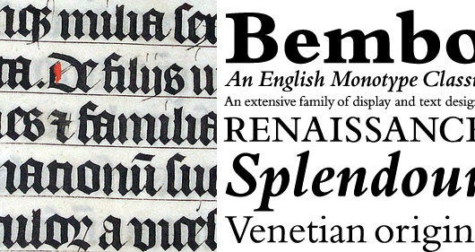
What’s interesting about Metafont is its unique approach to digital fonts. Most fonts are described programmatically as a series of outlines and then filled with a solid color. This allows for perfectly precise and accurate representation but Metafont takes a more fundamental approach. Knuth discovered what every student of typography eventually learns, that the roots of type are in handwriting. Before the invention of printing, documents were written and copied by scribes using a broad nib pen. These flat metal tips, held at an angle resulted in the thick and thin strokes we associate with calligraphy. The typefaces used in the first printed books were meant to mimic the familiar handwritten books they replaced and even today many typefaces owe their thick and thin lines to the tradition of hand drawn letterforms.

Comparing type
Calligraphy in a Latin Bible of AD 1407 compared to Bembo, a modern typeface with roots in hand written lettering.

While fonts in other systems consist of outlined letterforms Metafont “draws” each letter, simulating the broad nib pen and the actual strokes you’d use to write them by hand. The resulting fonts are not only beautiful but their construction allows for greater control and variation. Rather than simply scaling to different sizes, fonts in this system can be further optimized for things like contrast, stroke, and x-height – essentially redrawn at each size like earlier metal type.

Comparing systems
Compare glyphs rendered with Metafont (left) and Postscript.

Knuth created TeX and Metafont because he wanted to extend the care he took in his writing to the design and printing of the physical books. He shared them with the rest of the academic community by putting them into the public domain and they’re still popular today, especially in the publication of mathematic and scientific journals.

I’m impressed by Knuth’s refusal to accept the status quo. When it didn’t meet his standards, he simply made something better. But even more I’m inspired by the focused dedication to his life’s work that led him to put down the familiar and immerse himself in a completely different field for an entire decade in order to realize his art.

The new Basecamp: Perfectly proportioned

Jason Z.
Jason Z. wrote this on 28 comments

It is said that the discovery of The Golden Section in Classical Greece was the result of the quest to identify the ideal proportion and balance in life and art. Throughout history and to this day The Golden Section has inspired the work of countless biologists, artists, musicians, historians, architects, and psychologists. We here at 37signals are no exception. When we began designing the new Basecamp we knew that adhering to these principles would result in software with pleasing, harmonious proportions.

Take the Projects Screen, for example. The tightly aligned Project Cards layout fits precisely inside a perfectly proportioned Golden Rectangle. Plotting the numbers of the Fibonacci sequence (1, 1, 2, 3, 5, 8, 13, 21, 34, 55, 89, 144) on a horizontal and vertical axis produces a mathematical spiral that the user’s eye subliminally follows to land on the first card in the group, an ideal and harmonious place to begin their work.

golden rectangle

Furthermore, you’ll notice that each Project Card displays up to ten people per card. This again is by design, as 10 is the sum of the first three prime numbers (2, 3, 5). More over, the shapes of the avatars are circles, which is unanimously an infinitely perfect shape. But we couldn’t leave such an important element of the design just to chance. Here’s how we created perfect circles for the new default avatars:

Construction lines

Starting with a square, duplicate it and rotate 45º. The difference between the base line of the original square and the apex of the rotated square equals the diameter of the circle. To put it another way, when a line AB is sectioned at point C, it does so in such a way that AC is the same ratio to AB as CB is to AC: AC:AB = CB:AC.

Projects designed for people

One of the best things about the new Basecamp is the single-page projects. With everything about your project in one place, this is where the bulk of work in Basecamp gets done.

Because this page would be used primarily by people, we studied the proportions of the human body. By using the body as our inspiration we think we’ve created a page that fades into the background so people can focus on their work. Just like that OXO Good Grips potato peeler feels so great in your hand, the new Basecamp is like an extension of your own body. In fact, if you shine a black light on the new Basecamp, you can see the precise anthropomorphic principles in use:

thermal imaging

We think the new Basecamp is our best work yet. It’s a return to our roots. To the basics. To the foundations of human civilization. This kind of attention to detail isn’t easy and it’s no accident. After all, 37 is a prime number, too.

Another -9999px

Jason Z.
Jason Z. wrote this on 29 comments

Today, Jeffrey Zeldman shared a new alternative to the venerable Phark CSS image replacement method better known by its surely-that’s-far-enough negative 9999 pixel indent. I’ve long since found my own way so it is with a touch of nostalgia and a humble bow to Messrs Fahrner and Phark that I share my favorite alternative.

The idea is still based on a fixed size element (that matches the dimensions of the image to be displayed instead of it’s text equivalent. Overflow:hidden reliably ensures that whatever we push outside the box is invisible. The difference is in how it’s pushed. Instead of a negative index, I prefer to set the height of the element to zero and instead set the top padding to the desired height. The element still ends up the right size and the text is gently nudged from view via padding. Here’s an example:


.replaceme {
  width: 100px; /* image width */
  height: 0;
  padding-top: 50px; /* image height */
  display: inline-block;
  overflow: hidden;
  background: url(images/image.png);
}

Curious to hear what method you use.

Who is the star of your product? Do you want people to think your product is awesome, or would you rather they felt awesome about themselves because they used your product? Does the UI say “Look at how beautiful this app is” or “Look at how beautiful your content is”?

Jason Z. on Oct 20 2011 13 comments

CSS: Taking control of the cascade

Jason Z.
Jason Z. wrote this on 37 comments

One of the best things about CSS is the cascade, itself. It can also be one of the worst things about CSS. Styles applied to an HTML element are automatically inherited by their children. Cascading is what allows web designers to set styles and keep them consistent throughout a website without repeating themselves. With a single line of CSS you can, for example, set the typeface that will be applied to every element on every page of your website:

body {
    font-family: Helvetica;
}

Because every element is a child of the body, those elements will inherit the font style unless that property is otherwise overridden with a more specific rule. That’s where things get tricky. We might want to use Helvetica throughout the website except in the sidebar, where we’ll use Georgia. To reset the font-family rule for the sidebar element we must write something like this:

body aside {
    font-family: Georgia;
}

This is how we write CSS. We set styles at the top level and then proceed to override the inherited rules with increasingly specific selectors. There are esoteric rules of inheritance built into the CSS cascade that let designers target elements by id, class, or by relative position in the document. Each time you reset a style using specificity, overriding that style on a subsequent child element requires an even more specific selector.

Within complex website designs this can begin to feel like an arms race. You add classes and containers to your mark-up and more elements to your selectors. As you add increasingly specific (and increasingly long) selectors it becomes equally difficult to override them later. This problem is compounded after the initial composition of the CSS is completed and you begin to edit, maintain, or add new styles later in the life of the website. Even in the most carefully composed stylesheet it can be difficult to completely grasp the overall scheme – especially if you’re coming in behind the original developer to make changes. The safe thing – we’ve all done it – is to write a very specific selector for any new styles so you’re certain yours take precedence. Each round a salvo in the specificity arms race.

So what can be done? We’ve been experimenting with a few techniques that we think make a big difference. There are three parts to this formula: compiled CSS, structured mark-up, and a neglected CSS selector.

Continued…

Design Decisions: Basecamp mobile UI

Jason Z.
Jason Z. wrote this on 23 comments

With the launch of Basecamp Mobile just a couple of weeks behind us, we wanted to take a look back at some of the design decisions we made along the way.

One of the first challenges was simply how to take the Basecamp design and make it work on a much smaller screen. It needed to look like Basecamp and be familiar to people who have been using the desktop version for years. We wanted it to perform like a native app but we didn’t want it to look like one, it was far more important that it looked like Basecamp. This was a big factor in the decision to avoid using one of the existing mobile Javascript UI frameworks.

Early inspiration: iOS

For the earliest mock-ups it was easy to rely on the excellent UI conventions of the iPhone; most of us are iPhone users at 37signals (as are many of our customers), we did a lot of testing on the devices, and frankly the UI is very good. It was a great place to start. That meant the first version had an iOS-like navigation bar at the top of the screen with the title of the screen in the center. A button on the left navigated up one level in the hierarchy (backward). A button on the right worked in the context of the current screen. This was pretty much stock from the iOS Human Interface Guidelines. Here is one of the very first screenshots of Basecamp Mobile:

First look at Basecamp Mobile

This early mock-up was just static HTML. We used the iPhone SDK simulator even at this stage to make it seem as real as possible.

Finding our own way

We continued with this design for some time but a few problems kept coming up. We’d used the item type instead of it’s title in the navigation bar because titles can be very long. So now we had two bars that both titled the screen, but in different ways. And even using all that space it still wasn’t clear where you were. Where does the back button go? Which project is this list in?

Header variations

After a few more iterations we knew something wasn’t right. We were trying too hard to squeeze our app into a navigation idea that wasn’t the right fit.

Starting over

Right about this time I happened to be in Chicago so I sat down with Ryan and Jason Fried to brainstorm some new ideas. We were sure that the iOS style navigation bar wasn’t going to work. We had to be able to show a lot more information than it was capable of—especially since titles were often much longer than the available space offered (usually just a word or two). Here are the pieces that needed to be included:

  1. Back button
  2. Title of the screen or item
  3. Name of the project
  4. Context actions (Add and Edit)
  5. Account theme (header color)

I went immediately to work quickly sketching a single header with more dense information.

Continued…

Providing great user experience with feedback

Jason Z.
Jason Z. wrote this on 22 comments

Feedback is an essential part of software user interface design. It’s especially true when designing applications for current mobile devices. Tapping a touch screen is less precise than clicking with a mouse. Touch screens also lack the tactile and auditory feedback of a physical key or button. Slow, unreliable cellular data access adds to the confusion. A user might wonder: Is the app broken or do I have a poor connection? Was my tap registered or did my fingers miss that tiny button? Making sure users get clear feedback in response to their actions and to changes in state or conditions is key to a great software experience.

When we designed Basecamp Mobile we decided to use a variety of methods to keep people informed about the current state of the app. Different conditions can require different feedback, so we had to carefully consider multiple types of feedback. Here are some examples:

Touch

It was important for us to make taps in the app feel responsive. Even if there could be a delay before the associated action executed it was essential that the user knew the tap was successful. Anything that can be tapped in Basecamp Mobile has a selected state that highlights the item immediately when the user touches the screen. Here you can see how a selected item on the project screen:

Touched state

Loading states

Basecamp Mobile is an HTML5 app that uses local storage to cache both content and the app itself. The app runs entirely in the browser, rendering HTML with Javascript and loading only your account content from the server when needed. Each screen has a number of states depending on the status of the screen’s content. A single loading indicator wouldn’t cut it—the feedback had to be appropriate to each situation. Here are some of the states we had to consider in the design:

Initial load

Basecamp Mobile is loading assets the first time you run it or when the local cache is empty. The large animation is the only element on the screen making it the focus. The lack of any other UI elements makes it clear that the only option here is to wait. Because people see this before they see the app, it’s even more important that we let them know what is happening.

App loading state

If this initial load is taking too long we let the user know. After a short wait, the app reassures people that it’s still working.

Slow loading state

If the screen still doesn’t load after a few more seconds the app offers some other options: Refresh the browser and try again or try the standard version. The latter option is useful for users who may be attempting to load the mobile optimized version on an unsupported device and need the option to switch back to the normal version.

Very slow loading

Loading content

In the next state, the app has loaded and the UI is now available, the app is only loading content now. The user can always cancel the action and go back to the previous screen. You’ll see this the first time you load a screen that you haven’t loaded before like a newly posted message.

Cold cache loading

Refreshing content

Basecamp Mobile caches screens as you visit them so going back and forth between them is nearly instant. Because the data could be old we need to check the server for changes, new items, new comments, etc. The screen might be perfectly fine, or it might need to load in changes. While this is happening we show a small, less prominent indicator. The page is fully functional but we want to let the user know that we’re talking to the server. This indicator isn’t in the user’s face or in the way of what they’re doing. It’s just a notice that the app is working and if you’re expecting something new, we’re checking. You can see the spinning icon in the upper-right of this screenshot:

Syncing indicator

The icon actually duplicates the functionality of the browser’s own loading spinner (visible in the top toolbar in the screenshot above) but we felt like people were likely to ignore or completely miss it. The approach brings the loading indicator a little closer to the action without making it more intrusive.

Loading previews

We took a similar approach with the To-do Lists screen. For each list we wanted to show the first few items on it. This makes it clear these are to-do lists and helps people identify the one they need. The previews load after the page is available because the content is helpful but not essential. A very subtle effect doesn’t distract but makes it clear something is happening. A series of spinners would have overwhelmed this screen, but the subtle gradient shine moving over the word “loading” informs without distracting.

List preview loading

Final thoughts

Presented like this it may appear that the app is just a series of waits, it’s not. Most of these indicators are actually on the screen for just seconds, but that is sufficient time to quiet a user’s doubts and ensure they know things are working. It feels great to click through the app and always feel like you know what’s happening, that things are working.

We use prominence of these indicators to tell people how important it is that they wait. The amount of surrounding UI is a clue about what else they can do if they don’t want to. You certainly have to wait for the app, itself, to load. But you can pass right by a To-do list that’s fetching a preview of it’s items. Just the right UI feedback makes sure users know this without having to think about it.

There is no place for just shitting all over other people's work

Jason Z.
Jason Z. wrote this on 143 comments
“Shit from the fucking Mac App Store, ‘designed’ by people who think they get interface design.”

That’s the byline for Read the fucking HIG, a blog that pretends to expose apps in the Mac App Store which violate Apple’s Human Interface Guidelines. Let’s talk about what it really is: a anonymous coward’s collection of flippant, vulgar, and vicious rants directed at the result of other people’s hard work.

Designers want to assert that they’re more than just window dressers. The design community is full of cries that clients don’t understand our UI designs are carefully crafted user experiences built by caring professionals who rely on their experience, taste, guidelines, research, and testing to champion the user.

But here we have a blog by someone who seems to care about good design making juvenile comments about how ugly these apps are—based only on screenshots. That’s right, “Read the fucking HIG” doesn’t even bother to download and use the apps (well, unless they’re free). A screenshot in the App Store is all that’s needed to determine what is utter shit unworthy of the Mac App Store, really, of existing at all.

This kind of drive-by critique is sadly common. Missing are constructive commentary and suggestions for how the designer can make their app better. All the poster can muster is a knee-jerk reaction to the superficial aesthetics and a couple of f-bombs. Done! It adds nothing to the conversation and dimishes the value of design. How can we expect our clients or users to respect the care we put into design if we don’t respect it ourselves? Instead of considering what went into the design, we point at laugh at someone’s “terrible design”, retweet and reblog then go on with our superior existence.

“Where the heck were you when the page was blank?”

The above quote by legendary copywriter, Paul Butterworth, was cited frequently during critique sessions when I was in school. Looking at the end product it’s impossible to know the journey that the designer took, to appreciate what went into it. You don’t know about the constraints, the compromises, or external forces that shaped the design before you. Certainly the end user is not going to be privy to those details either, but as a designer critquing the work of another designer you should know there is more to it. No one is trying to make shitty software. They’re doing the best they can with the constraints they’re given and the talent they have. Not everyone is a maestro. Maybe these folks are just beginners. Is that how we welcome them into the fold? The point is, they’re making something. That’s awesome.

Hiding behind your Twitter avatar and telling the world how terrible everything is is pretty easy. It’s even funny sometimes. Putting yourself on the line and making something original is really hard work. Which one do you want to be. Which one deserves our respect and attention?