I'm a designer splitting my time between making and marketing Basecamp. In a past life, I crafted the web at Threadless and interviewed people far smarter than me.
As an ad-agency refugee, I’ve struggled with my fair share of design debates with copywriters, project managers, clients, and everyone in between.
Maybe you’ve been there, too. The copywriter you’re paired with doesn’t think the marketing page you’re working on “feels right yet.” (As it turns out, the tone of voice is just off.)
In dramatic fashion, your client thinks the design you just presented is “way off base.” (You just happened to use a color they absolutely detest.)
It’s been five years since I’ve had a client meeting, yet the road blocks of vague feedback still come back to haunt me within the programmer to designer relationship.
The other day, Nick and I were debating the look and feel of shared code snippets. Or, so I thought…
Last month we launched the redesign of our blog. During the process, we wanted to make it feel distinctly ours with a visual nod to its very name—signals and noise.
I wanted our blog to feel special, aesthetically unique, but not gaudy. I took a quick survey of our blog structure and found a great area for opportunity to explore style: our post categories. From design, programming, business, support, writing, to sysadmin, anyone from our team can categorize a post they write.
To give each post an identity, I riffed on these category themes. From there, the obvious presented itself: try illustrating waveforms to harken back to “signals and noise.” Although I had a focus on illustrating, I still started with words, and more specifically, questions to myself.
What does “writing” look like?
So, with Illustrator fired up, I started generating waveforms that would wear the identity of “design,” “programming” and so on. It quickly became an exercise in shape, color, and line densities. The process was fun, and the results were full of surprises.
Design: balance, rhythmProgramming: elegance, as described by JeffBusiness: an exchangeWriting: claritySysadmin: structure and easeSupport: understanding, as described by MichaelContinued…
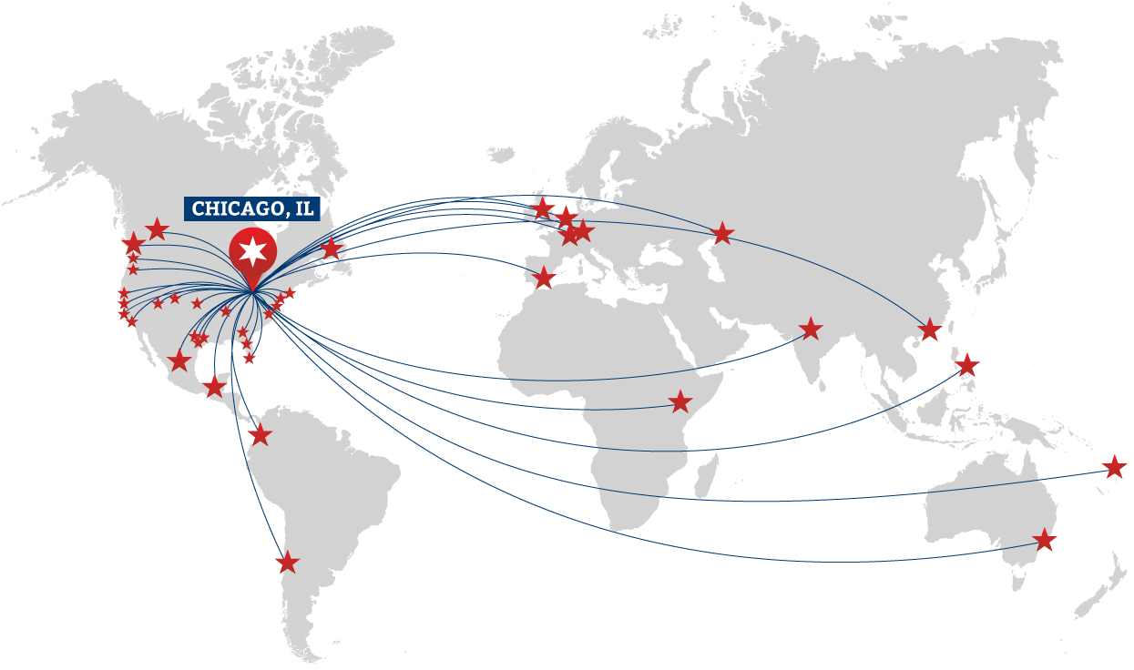
Since the day The Starter League opened their doors, people from all over the world have traveled to Chicago to learn how to program web apps.
It didn’t take long before design-focused classes made their way into the curriculum. In Carolyn’s class, people learn how to research and shape great user experiences. Shay’s class takes those experiences and turns them into something tangible for the web. Now we’re thinking there’s room for even more. Today, we’re excited to announce the next addition to the growing list of design offerings at The Starter League.
We’ve been sharing our process and company values on Signal vs. Noise since 1999. It’s where we’ve planted the seeds for Getting Real and REWORK. And for many readers, it’s their first taste of 37signals. Yet, we haven’t given the look and feel any serious attention since 2005.
So I decided to tackle a much-needed redesign. In planning the overhaul, I wanted to focus on creating a beautiful, clear, focused reading experience.
Designing Outward
“Blog” has such a temporary, read-and-forget tone to it. On SvN, we take our time writing and editing every article. So rather than treating this like a “blog,” I shifted the mindset to that of a tenured publication. So, the entire redesign process started with typesetting the post, and designing outward.
Instead of poring over other blogs, I spent a week studying books, magazines, and of course, Bringhurst. Capturing the right feel for body text was step one—it sets the tone from here on out.
Perhaps it’s me, but there’s something about 13px sans-serif faces on the web that feels like “my Rails app just spit this out of a database.” I want you to read articles, not text rendered on a screen. Kepler, set at a comfortable size, wound up being a beautiful serif that added the touch of humanity I was looking for. Setting the headlines in Acta added to the look I was going for, and Freight Sans wound up being a great sans-serif pairing.
We have a million fonts, a million colors, and a million piles of shit leaving our fingers all day long. It’s just sad to me, because when you look at this [vintage ephemera], it’s just about communication. One font and a thing called hierarchy.