What’s New in Basecamp 3.9 for iOS

This release is all about usability improvements. Download it for iPhone and iPad from the App Store now.

Find tab improvements 🔍

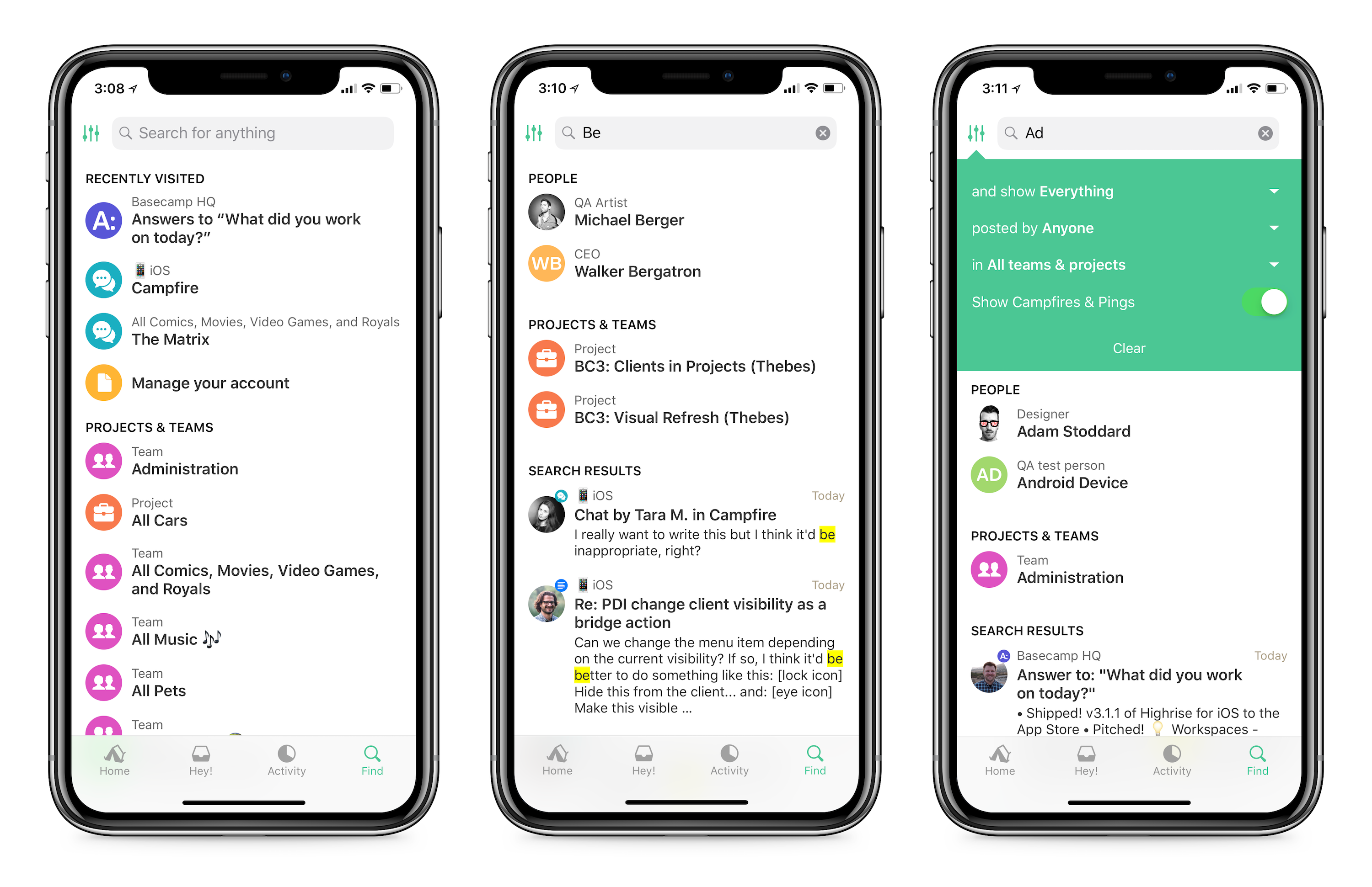
The Find tab now lets you quickly jump to anything you recently viewed without having to type a word! When you open Find, you’ll see your most recently visited pages, making it super easy to quickly get back to something you were viewing. Or start typing to instantly search in place for anything in your Basecamp account. You can also use advanced filters to define even more specific search terms. Go forth and find!

New project and team pages ⚡️

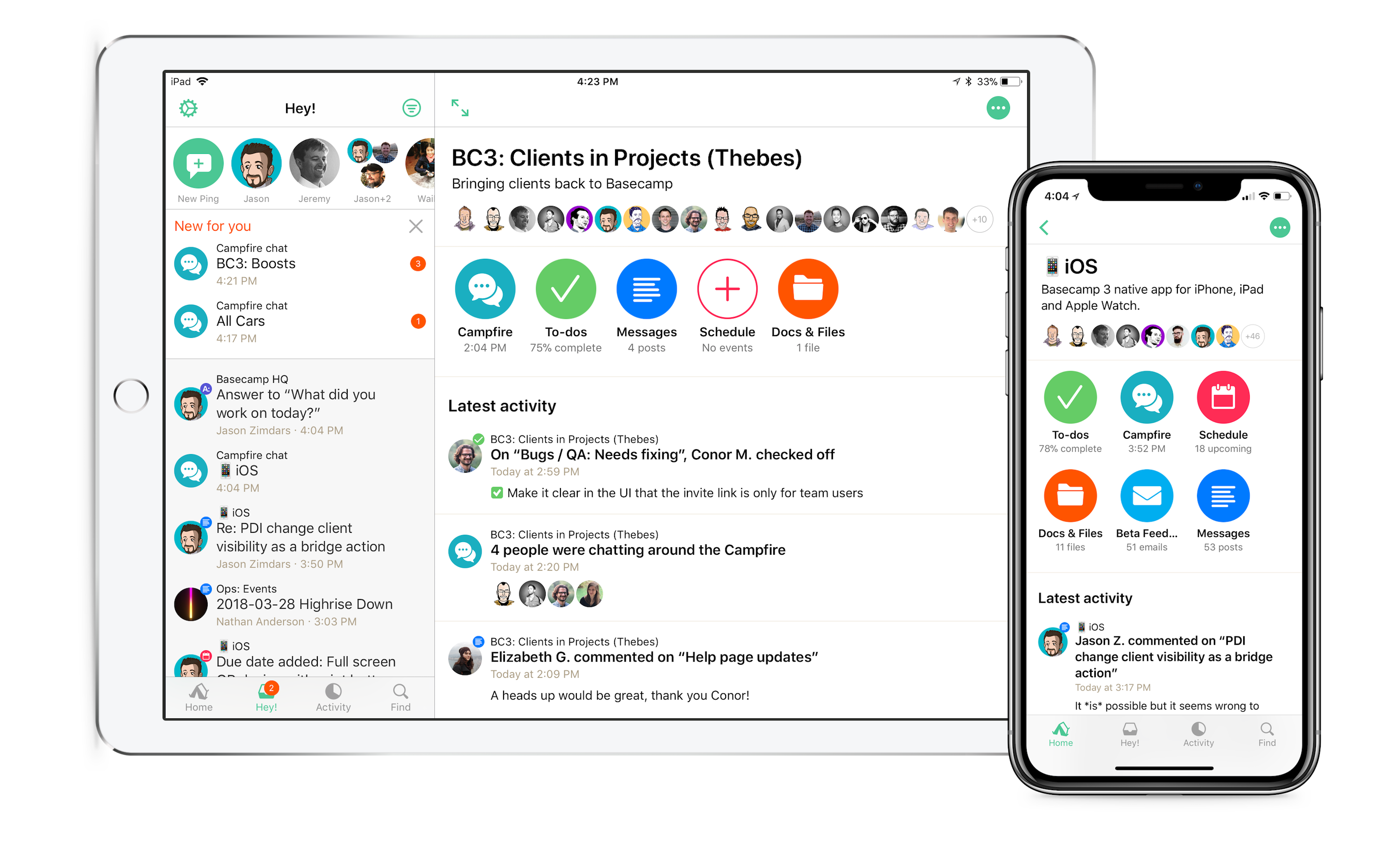
The old project and team pages were… slow. We decided to speed them up, as well as feature your team’s latest activity more prominently with this new design. Instead of nearly identical cards for each tool, you’ll see a unique icon in a bright color, making them easier to recognize. Each icon also has a bit of data underneath, hinting at what’s in each tool so far. We’ve been testing these internally for quite a while and the increased speed has been such a relief. We hope you love it too.

Improved image viewing in Activity 📷

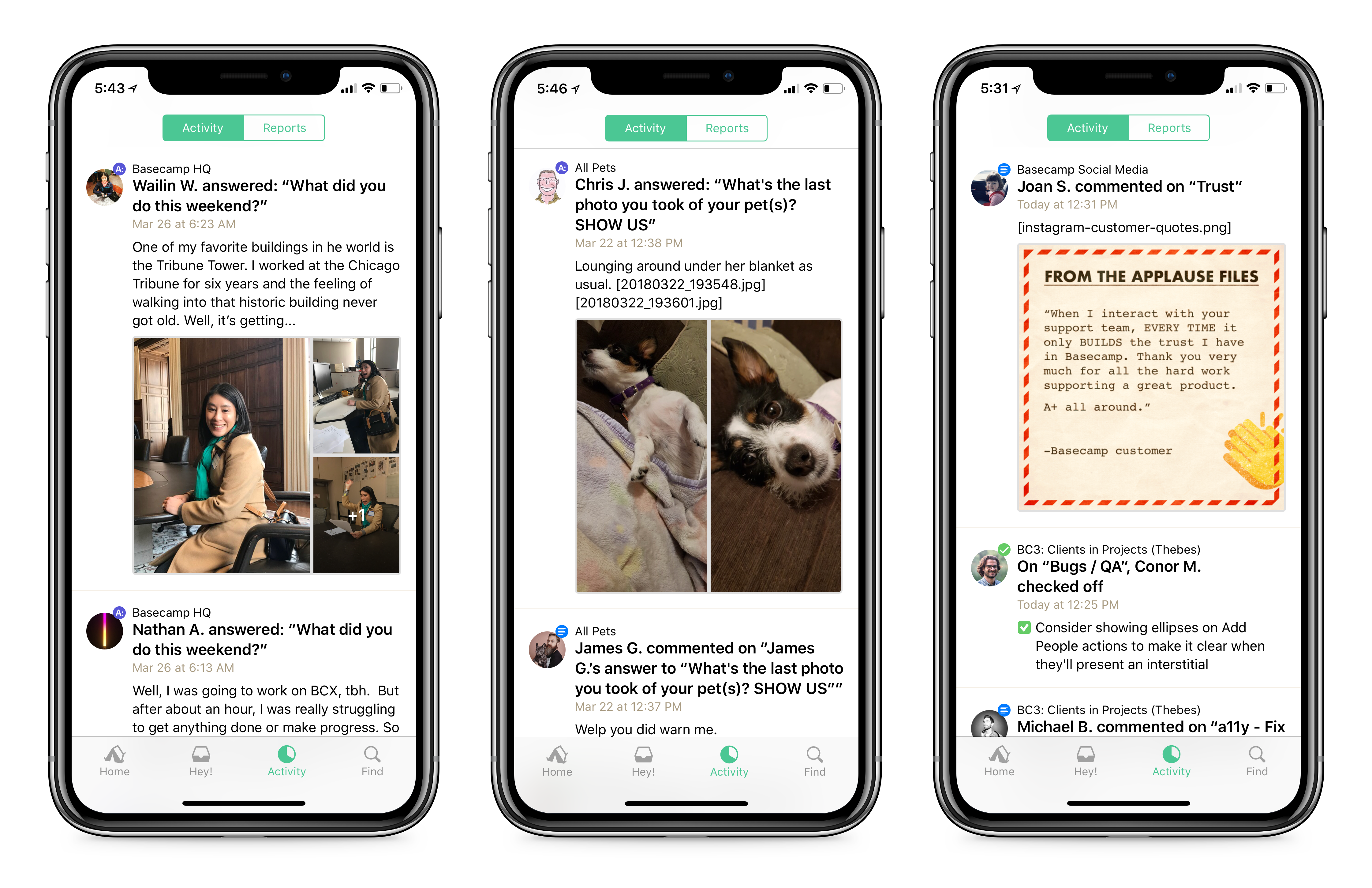
Image previews in the activity feed are now much larger and easier to interact with. If there are multiple images in an attachment, we’ll group them together in a nice grid, too! You can tap on any photo to view it in the media viewer right from the activity feed, or tap into the thread if you want more details and context.

Simplified navigation and tool indexes 🗺

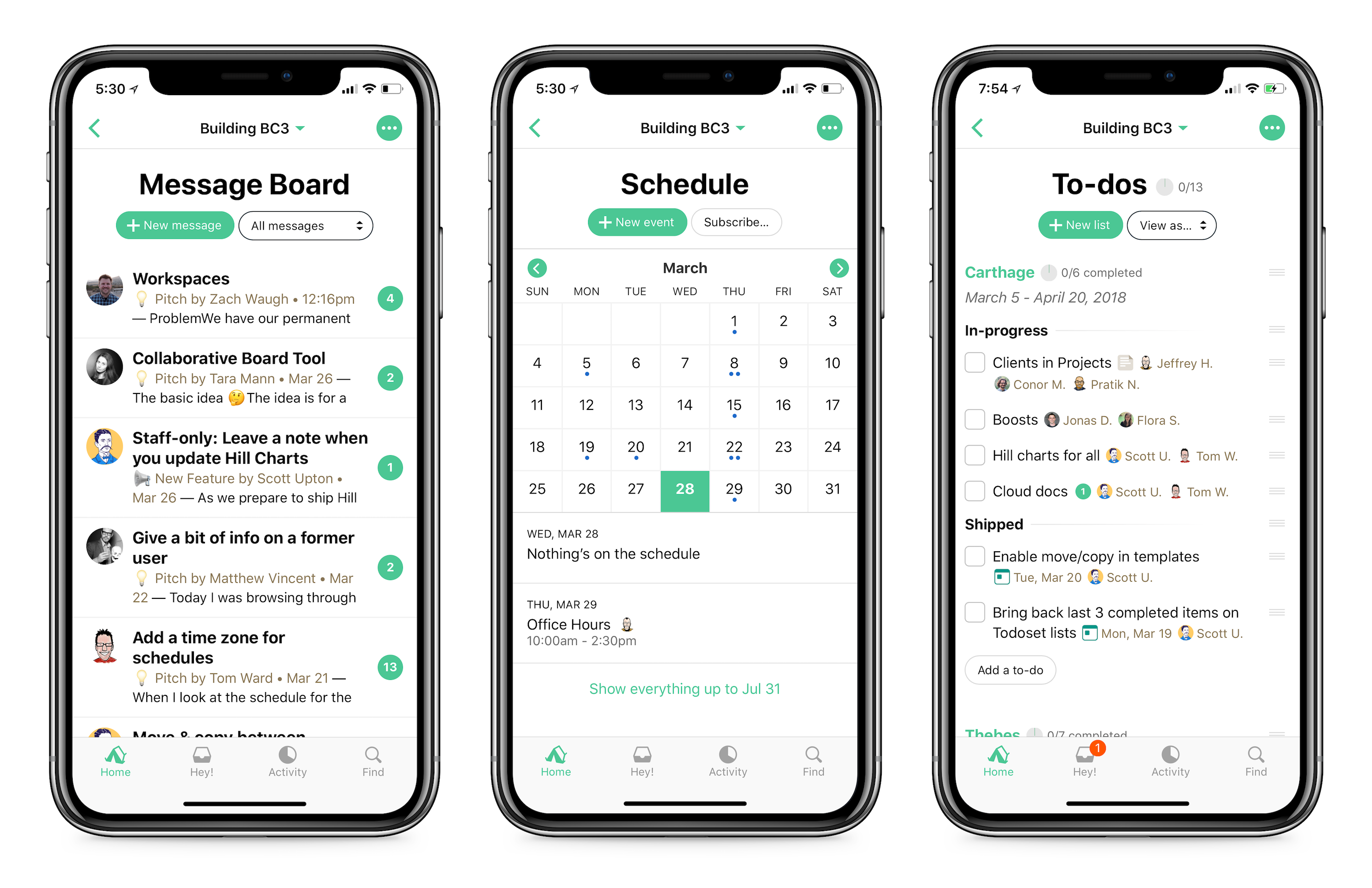
The nav bar now just displays the project or team name, as well as a button to launch the menu to jump to another tool. The screen’s title is displayed larger, and there’s a big “add something” button on every screen so you can’t miss it! We experimented with a lot of complicated designs for this and ended up going with the simplest option. Sometimes you need to overthink to realize you’re overthinking, I think. Now I’m overthinking this.

New UI for uploading attachments 📎

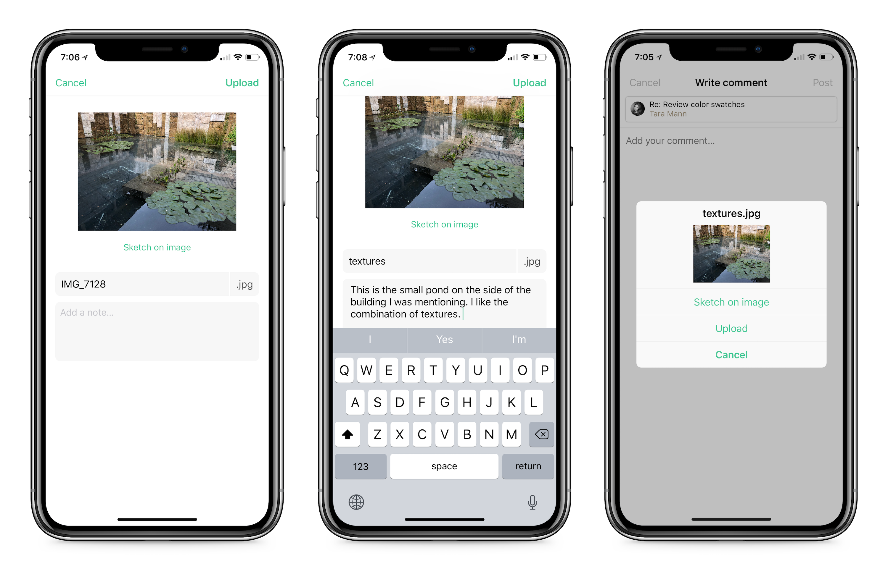
You’ll now have more room to access additional options when uploading individual attachments to Docs & Files, like sketching, adding notes to your upload, or changing the file name. Cool!

Support for clients in projects 💼

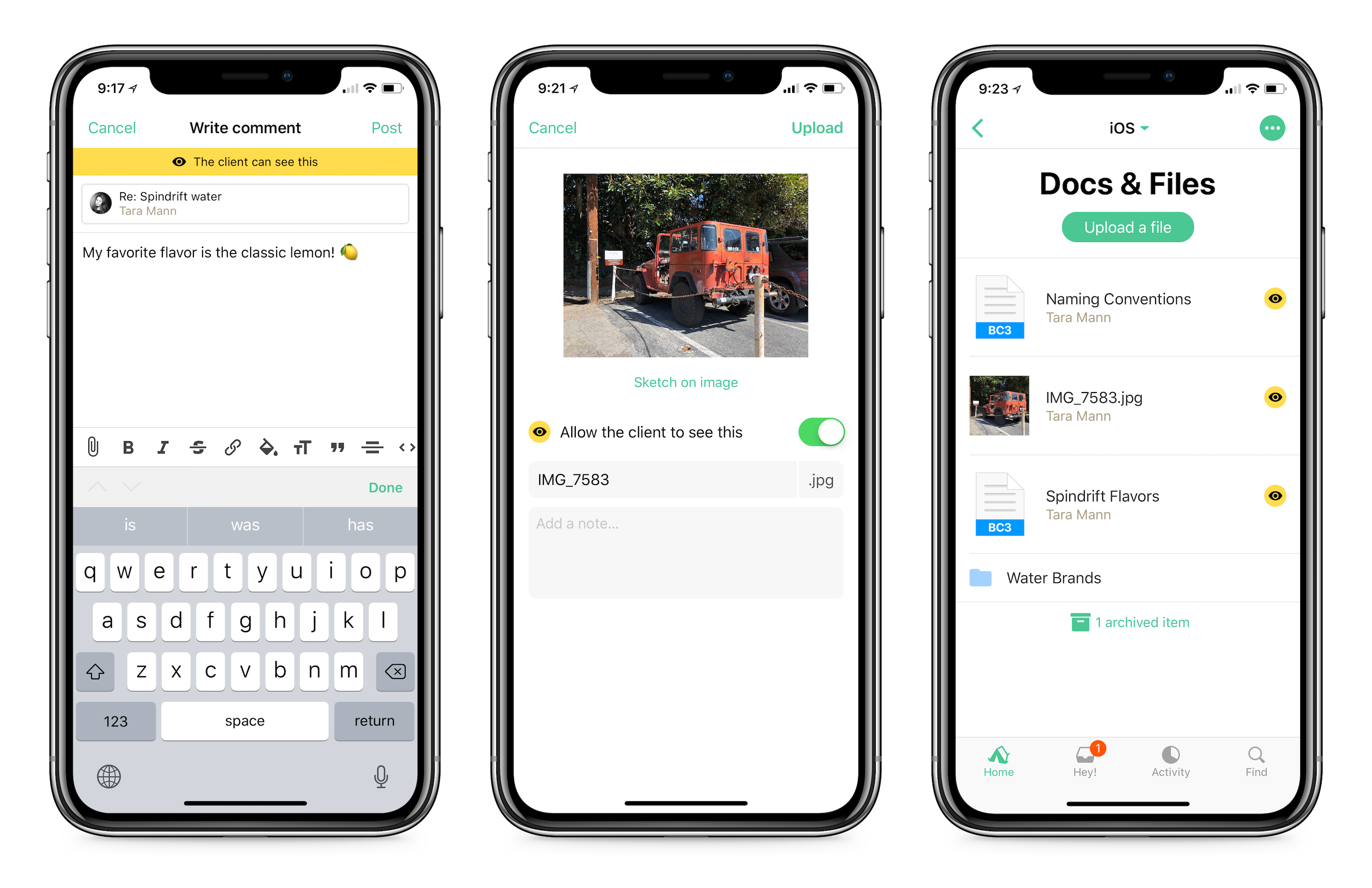
All new clients in projects features will work on iOS right out of the gate! Read more about this entirely new way to work with clients in Basecamp over here.

And you know, “bug fixes and performance improvements….” 🐛

  • Scrolling within a field while you’re writing is much smoother now. “Less janky,” you might say.
  • Updated theme choices, so you can pick from a lighter or darker version of each theme color.
  • Fixed some drag and drop issues!
  • Fixed missing file-type icons for non-media attachments in Activity.
  • And various other bug fixes that are boring to explain.

Thanks for reading and feel free to reach out with any comments, suggestions, concerns, feedback, bugs, doughnut recommendations, etc.

😎 Team iOS, 
Jason Zimdars, Zach Waugh, Dylan Ginsburg, and myself.
Unnecessary Qualifiers


Present without apologies

Most people struggle with confidence at times, especially in the workplace and I’m no exception. I often find myself presenting my design work and my opinions with a variety of qualifiers, as if pointing out my perceived flaws before someone else can will negate them. This is just as much a reminder to myself as it is to anyone else, but please, present your work without apologies.

Here are a bunch of unnecessary qualifiers and why they’re unnecessary. When I find myself typing one of these, I take a step back, read over what I was trying to say, and rewrite…

Don’t say these things:

IMO (in my opinion)
Obviously it’s your opinion, you are saying it. If it’s not your opinion then it’d be appropiate to mention whose opinion it actually is.

IMHO (in my humble opinion)
This sounds particularly apologetic, don’t do it. And by the way, calling yourself humble is not humble.

“Not to be that person, but…”
Nobody thinks you’re that person, maybe you think you’re that person. If you’re about to be a troll, then maybe you are that person… no, you’re not a troll, you’re not that person.

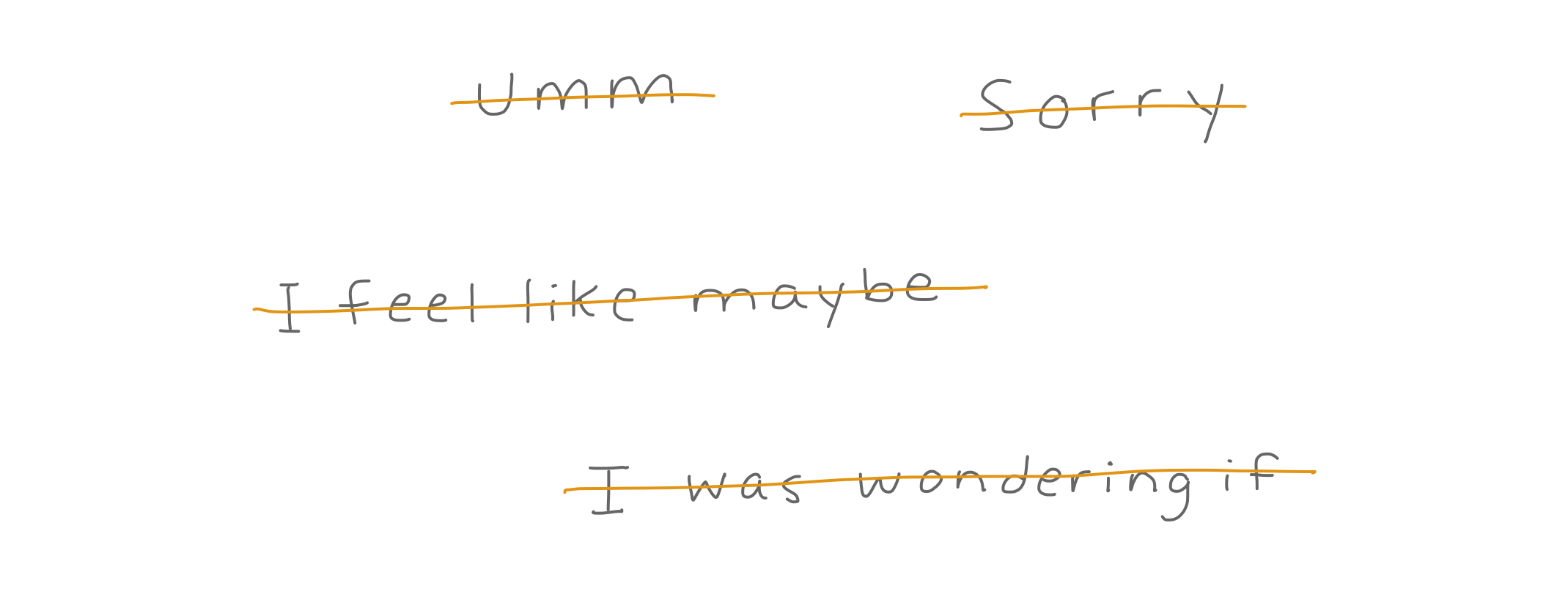
“Hmmmmmm.”
You don’t have to feign a thought bubble via text. Wait until you’re done thinking and then write down whatever it is you wanted to say. Don’t pretend to fumble on an idea.

“I feel like maybe…”
This feeble attempt at feedback is lame, also, it doesn’t make sense grammatically and reads like a word search.

“Not to be pedantic but…”
Nobody thinks you’re pedantic.

“I was wondering if…”
Just say what you were wondering about instead of saying you were wondering.

“Just did this little thing, it’s no big deal.”
Don’t sell yourself short.

“Sorry.”
No no no no no. Don’t say this (unless you legitimately did something horrible, but asking someone a question is not something horrible).

Wait, so what do I say? 😳

At first it can be intimidating to present ideas without a veil of apology, but it’s an important step in building your confidence.

One of the nice things about our asynchronous work style at Basecamp (where I work as a designer on our iOS team), is that I naturally write more instead of saying things out loud. This forces me to review each and every word I say. If I’m giving feedback on a design, it is in the written form. If I’m presenting an idea for a feature, it is in the written form. This has forced me to curtail my excessive usage of fluffy words like “like” and “umm,” things I had been saying habitually and subconsciously for years.

When writing, I like to use an emoji or two to communicate that I’m not angry or upset about something. It can be easy for someone to read something as terse and critical when it’s just a sentence or two, but that doesn’t mean you have to apologize. If you’re worried about “seeming mean” (one of my primary sources of anxiety) try writing down the confident version of your thought and then maybe add an emoji after. For example, when giving feedback on a design, you might say: “This feels noisy and could benefit from a few refinements, what if we get rid of the meta data on this screen? 🤔” ← that little guy lets them know you’re simply thinking, not being a big scary grim reaper with a critical axe in your hand. Or “Definitely didn’t mean for this to be the final copy! 😬” when you’re worried about seeming defensive but simply want to mention your intentions.

What I’ve learned through my angst and real life is experience, is that people almost never think you’re mean, or arrogant, or overly confident. They are usually happy to get your opinion, and having honest dialogue (especially around design critique) is essential to healthy collaboration. So please, ditch the qualifiers.