We’ve written quite a bit in the past about our approach to building hybrid mobile apps. Basecamp 3 represents the latest generation of this architecture, taking everything we’ve learned from previous versions.
The first app for Basecamp 2 app was iPhone only, written in RubyMotion as a thin wrapper around UIWebView. Next, we did a new universal app for Basecamp 2, written in Xcode + Objective-C, still a using UIWebView, but with a bit more native code thrown in. For Basecamp 3, we’ve replaced Objective-C with Swift, UIWebView with WKWebView and added Turbolinks, with even more native code, and a deeper integration between native and web.
Defining Hybrid
First, it helps to be clear about what we mean by “hybrid”. That term is used in so many different contexts, that it’s almost meaningless. In our use, we’re referring to standard native apps where a significant portion of the content is rendered using web technology. I explicitly say content there because it is an important distinction. We’re not using a framework that attempts to mimic native controls using HTML/CSS. We’re not using a framework that tries to compile another language to native code, or make a cross-platform app from a single codebase.
For us, it means using Xcode + Swift, and conforming to all the platforms conventions regarding navigation/presentation. The building blocks of our app are composed of UINavigationController, UITabViewController, UISplitViewController, UIViewController, etc. Within those containers, we have many screens where the content is built using UITableView or UICollectionView, we have even more where that role is filled by a WKWebView.
Under the hood
Basecamp 3 for iOS is written 100% in Swift 3.1 (soon to be 4), using the latest version of Xcode. We only have a few dependencies, but the ones we do have we manage with Carthage. The core library for enabling this hybrid architecture is Turbolinks. We use Turbolinks on the web, and our companion frameworks for iOS and Android let us use it in our native apps as well. The framework handles communicating with Turbolinks.js and allowing the use of a single WKWebView, shared across multiple different screens.
Router/Navigator
In addition to Turbolinks, we have a number of other components to support it. Most of our navigation in the iOS app is URL-driven. A url can come from a number of sources (web link, push notification, universal link from another app, native action, etc), and they all go through the Router. This router is responsible for figuring out exactly what action to take for a given url. The router may open the url in Safari if it’s for another domain, display a media viewer if it’s an image/video, or in the common case, create a new view controller to display. The router hands off a view controller off to the Navigator which handles the presentation. Most view controllers are pushed on the current navigation stack, but we also support presenting certain screens (like new/edit views) modally, or replacing the current screen when appropriate.
Bridge
The last component that makes up the hybrid architecture (though we have a number of other components not related to the hybrid part) is what we call the “Bridge”. This is a umbrella term for all the various parts of the app involved in native→web (or web→native) communication. The primary code here is a local JavaScript file (written in TypeScript) embedded in the app and injected into the web view using WKUserScript. This provides native code an API for communicating with the web view without needing to directly query the DOM or do complex JS. Using a WKScriptMessageHandler, we can respond to messages sent from the web view through the bridge.
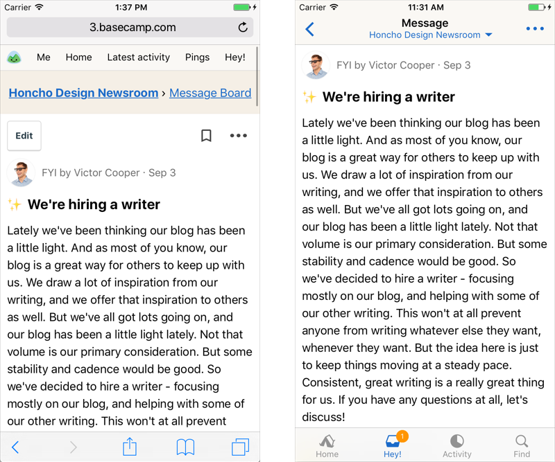
Above is one example of the bridge in action. We use it to hide many elements that are normally displayed on the mobile web that don’t make sense in the app. Since we provide a tab bar for top-level navigation, we don’t need that displayed here. Since we have a navigation controller, we don’t need the breadcrumbs for navigation. Finally, we hide the web edit/bookmark/actions menu and instead provide a native version.
Examples
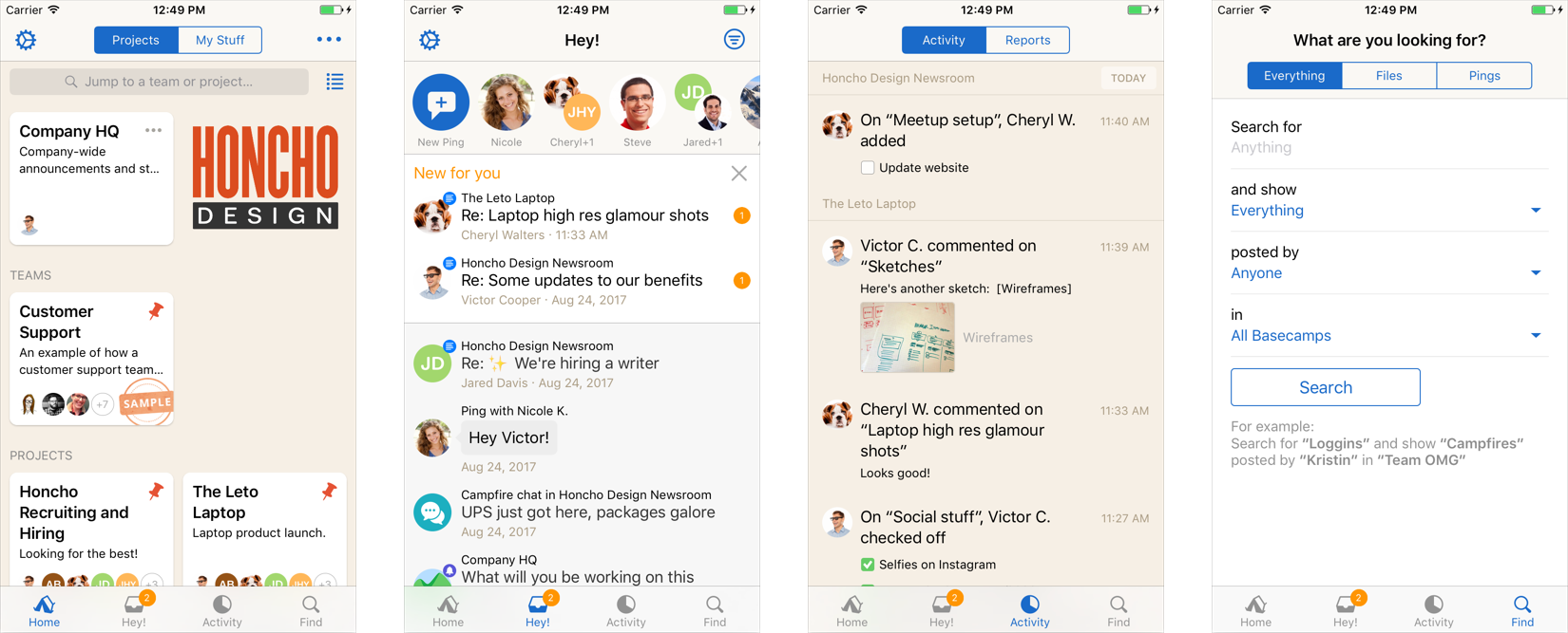
This is easier to visualize what this looks like in practice with a few examples. In the images below, I’ll use a purple overlay to indicate web view, and a green overlay to indicate native UI.
Main Tabs
Basecamp 3 for iOS has 4 main tabs (Home, Hey!, Activity, and Find). Each one of these tabs are 100% native. These are the primary points of interaction in the app, and we wanted them to be as fast as possible. We also wanted to provide a different experience from the desktop that we thought made more sense on mobile, such as a unified Hey! for all notifications that also included recent Pings.
Message
When you tap a notification in Hey!, say for a new message, then we push a new TurbolinksViewController on the navigation stack:
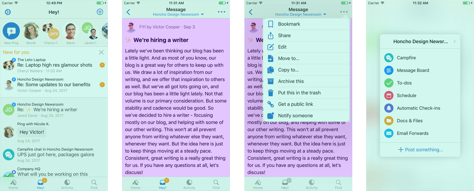
This is a typical screen where all the content is a web view. Through our bridge, we pulled data out of the page to display in the navigation bar. Similarly, we used data from the DOM to populate a native actions menu popover displayed when you tap the “…” button. Since this dynamic and provided by the page, we can change it server-side at any time. Finally, if you tap the nav bar title, we show a native “tools menu” that provides quick access for navigating around a project.
Campfire
We also have screens where the content is a mix of both native and web. This is the case for Campfires:
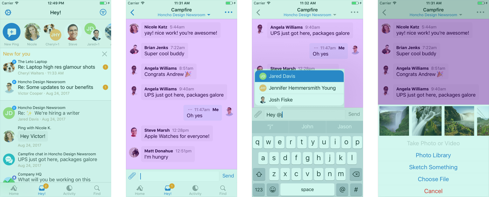
The main chat content here is web, but we decided to use a native view for the input. This fixes a number of issues with the web input like maintaining the correct position when scrolling, and we can also have better control over things like interactive keyboard dismissal. When typing someone’s name, we use a native mention auto-completer. Tapping the paperclip button shows the attachment picker, which is a native element that we use throughout the app with some nice touches, like quickly picking recently taken photos. All these components can work seamlessly together on the same screen.
Summary
Those are just a few examples, but demonstrates the flexibility of this approach. The key to this architecture is that we’re not locked into one method or framework. Native or web isn’t a binary choice, but instead a spectrum:

For each screen of the app, we can adjust where we sit on that spectrum. We can decide a native screen gets little use and isn’t worth the maintenance, so we change it to web. We can decide a web screen isn’t providing the best experience, and convert it to native. We could decide to try React Native and mix that in as well. Whenever Apple releases a new API, we can immediately support it since we’re not depending on a 3rd-party framework to be updated.
One thing we deeply value at Basecamp is independence of teams. If we had to coordinate the development and release of every feature with the web, iOS, and Android teams all working in lockstep, we’d never ship anything. This architecture allows our web team to build a new feature and ship it simultaneously across all platforms. By default, we have a view controller that can display any url in Basecamp 3, so any new urls will just work in the app. We can iterate and experiment on the web, ship immediately on all platforms, and later make it native if feel we can improve the experience.
This also lets us the mobile teams focus on how to best serve the platform. One of our goals is 100% coverage in the mobile apps, you should never have to go to the desktop because the apps don’t support something. With our solid foundation provided by the web, we can deliver on that goal, and then focus our efforts on platform-specific improvements. These include features like rich content push notifications, universal links, hand-off support, iCloud Keychain support, share extension, today widget, and more. Some of those things would be impossible or non-trivial if we didn’t have full native support at our disposal.
Thanks for this detailed post. I’m wondering, has this stood the test of time well, and would you do anything different if you set about doing it again now – perhaps using flutter and the web view within there?
Thanks again 👍