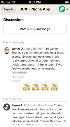
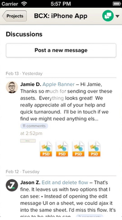
Some of my favorite feedback on Basecamp for iPhone has been that the app feels wicked fast, and all native. The app actually is a mix of web and native UI, but it’s difficult to see where the line is drawn. The majority of the content shown in the app is web: From the login screen, to posting a message, and even uploading photos on a comment, that’s all done using UIWebView.

Chrome inspired us that web views could be pushed to the next level, and we wanted to make use of our existing fast, mobile HTML5 views. Going web wasn’t always solid: Some views started as web, went native, and ended up back in a web view. In the end, the app evolved into a simple web content browser with a native feel on top. It’s certainly a compromise, but we’ve been really happy with the hybrid architecture so far.
Why web views?
The tech issues with using UIWebView weren’t all solved out of the box. By default the scrolling acceleration is slower than a normal UIScrollView. Caching data with HTTPS didn’t seem to work, so we dropped in SDURLCache. Handling refreshes with content that pops in “above” the current scroll position like a UITableView/UICollectionView is not perfect yet. Despite these issues, there’s plenty of benefits:
- Rapid iteration on our mobile web views without pushing a new build
- All mobile web users on any device benefit from new features
- Document and flow style layout in HTML/CSS is immensely easier than native calculations and sizing
- Concurrent development of web/native features since the logic is separate
- No need to worry about CoreData or syncing data up
Native UI is used still for several parts of the app where animations and interactivity are more important than the content displayed.
Where’s the line?
The line between native and web inside of the app is kind of blurry, but there’s a simple rule I’ve used: All content inside of projects are rendered by web views, and everything else is native. A good example of what’s native is the project menu to switch views inside of a project:

For this menu and your list of projects, we used native UI since the layout doesn’t change that much and the interactive feel here had to be as smooth as possible.
Here’s an example of the web views in action: diving into a discussion thread and the author’s page from a comment:

There’s native UI mixed in for the web views as well. There’s a standard UINavigationBar above the content, and we have mimicked the “stacker” effect from the web app using a lot of native animation and gestures.
Browser to app communication
Communication between what’s inside of a UIWebView and in your app isn’t always easy. Most clicks inside of web content are intercepted and then custom behavior gets injected, such as stacking a sheet with new content. Sometimes the web views need to talk back to the app though, and we’ve been using HTML5 data attributes for that. There’s two instances of this so far in the app:
data-remove-sheet=trueon a form will pop the sheet off the stack after submission, such as after posting a new message.data-replace-sheet=trueon a link will wipe the existing stack clean, which usually happens if you visit a different project than the one you’re on.
Finding these data attributes are possible thanks to some simple JavaScript and stringByEvaluatingJavaScriptFromString:
def replaceSheet?(path)
  replaceText = web.stringByEvaluatingJavaScriptFromString <<-JS
    var link = document.querySelector("a[href='#{path}']");
    if (link) {
      link.getAttribute("data-replace-sheet");
    } else {
      "";
    }
  JS
  replaceText == "true"
end
This is pretty ugly since we can only get the URL of the link or form making an HTTP request, but it works great.
Hybrid future
The web view approach isn’t right for every app. For Basecamp, we were able to build on the existing infrastructure we had with the mobile views, and make a stunning native wrapper for that content. The pain of dealing with UIWebView’s idiosyncrasies might not be worth it if you’re used to rendering content natively and dealing with the consequences.
We drew the line where we could ship an app that has a great, native feel and still be able to quickly modify how the data in the app is displayed without waiting for Apple to approve it. If you’ve been down this hybrid road before, or just starting, I’d love to hear your experiences either way, good or bad.
Thanks to JZ for feedback, animations courtesy of Ryan, Mig, and Phosphor.

JB
on 15 Feb 13Great insights Nick. I’m considering this type of architecture. This makes easier to mantain and evolve both worlds.
One suggestion: Could you make the first animation slower? And/or without loop? Difficult to read the text after the animated .gif and difficult to see what are you doing in the mobile screen. (the 2nd .gif is easier).
Congratulations for your great work! JB
JB
on 15 Feb 13Sorry, it’s not .gif.
It’s JS with Phosphor
Regards,
JB
Hal Gatewood
on 15 Feb 13I’m curious about security and logging in with a WebView. Since you authentic through the “browser” do all api calls automatically work as if you are going through the same session?
This series of posts about your app have been very helpful! Thanks.
Nick
on 15 Feb 13JB: We’ve just started to play with Phosphor…hopefully the next ones will be smoother!
Hal: We use normal cookie authentication over HTTPS, so it’s just like logging in with Safari or Chrome.
chan
on 16 Feb 13nick. thanks for these articles. we’ve just started venturing into iOS-hybrid apps and these posts have helped keep us focused.
thanks!
Ryan
on 16 Feb 13Android app or GTFO.
Fred
on 18 Feb 13I hope I wasn’t too late to weigh in my comment.
Not being a native app doesn’t mean it is inferior app. It turns out that latest phones and tablets are capable enough to render hybrid app smoothly despite the complexity of html rendering. It’s definitely one step up to match the responsiveness you would get from a native app. It’s great on iPhone5.
Well, the only catch, as developer you have to do a lot more work to fake the native experience. Like what you said, native has smooth scrolling as compared to hybrid app less inertia momentum scrolling (UIWebview specifically). It doesn’t come in handy for some de-facto components we have with native framework. You probably have to sail alone to the new less conquered sea of technical challenges to pull such a stunt.
Some inputs to improve the app: - When you pull down the menu, you probably should highlight current active menu. I am sure you can tell which menu is active by highlighting the text menu. - When a paragraph is clickable with slide in navigation, an arrow indicator would be nice. Some old folk like me will not immediately catch that. - The first screen when I tapped a project, you should probably slide in an empty page view with loading indicator. Otherwise I would think that the tap didn’t register. Similar to what you did when I tap “Progress” row, it slides in a new empty page. - Search bar should probably stick at the top all the time, maybe it’s my personal preference. - I like the nice dragging out the stacked sheet effect when you want to cancel “Post a message”. A back button would be nice, just in case I am not sure where to tap when I would like to cancel it. - Some contents on the stacked sheet seem to get chopped off. Padding issue? - Clicking some of unsupported documents lead to an empty page on mobile safari. Would be better to have an option to forward as email, or a tiny url to pass the link around. Or just disable it. - Autocomplete people list seems to get chopped of at the bottom. Maybe you should limit it to be above the keyboard. - On copying forward email address, it could be a button that tell the native clipboard system to copy the email string. Less steps is better.
As complimentary, a lot of things I like on the new basecamp mobile app. - It is clean, less cluttered than some of the basecamp native apps counterpart. - It looks familiar, at least to the current BCX on desktop. - Strange, but I like it. Less dependent on push notification despite being able to do so. I guess it is less annoying. Updates are available in emails and probably a click away from grand master status updates page. - And the rest of the thoughtful small little details you have put into the app.
Sorry for the long post, tl;dr Basecamp mobile is great.
Anonymous Coward
on 19 Feb 13Great way to do this! I’m a begginer with mac platform developing and all tips are very valuable for me.
I have one question: is this software good? For backuping and restoring of course: iPhone Backup Extractor
George Hammerton
on 19 Feb 13I’m a big fan of native development vs web views in principle, I mean we’ve gone to extreme lengths at Create DM in the past to create native interfaces even when we’re pulling live content in from an online source but having said all of that… You guys have done a really terrific job of the Basecamp iOS app.
For regular users who don’t spend their whole lives developing native apps I’d imagine that they’d never notice. As compromises go, you’ve managed to strike an excellent balance.
I love it. Bravo! :)
Dan
on 20 Feb 13I’m curious: Why did you choose to build your own web/app communication, rather than using something like Apache Cordova (Phonegap?)
This discussion is closed.