Highrise launched in 2007 and was a leader in teaching folks about some successful marketing split tests. Today we’ve got a few new lessons. First let’s talk a bit about strategy, and then I’ll share a couple important results we’ve seen.
When to stop
Here at Highrise, we split test constantly. Since these can take quite a lot of time to reach statistical significance, and I want to keep using our time efficiently, it’s important to have another test ready in the queue as soon as one completes. Even if it’s changing a word on a single button.
But it’s super easy to get stuck. We run dozens and dozens of experiments and often end up with nothing. No changes. Or the new stuff just makes things worse.
So when do you stop? It’s helpful to come up with some baselines. We look at other products out there, our past, and our sister product Basecamp. How are we doing compared to those baselines? In some cases we’re behind, so those are ripe areas for testing. Other areas we’re on the baseline, and have decided our time is better spent elsewhere.
Don’t get lazy
Here’s a lesson that came to us at great cost: we weren’t measuring enough variables. When I took over Highrise in 2014, we immediately started split testing an entire new marketing site design. We compared the old and new site’s signups. Waited until we had a statistically significant result. And bingo. Saw the new site was doing better, and switched all our traffic over to it.
We were befuddled then when we saw our growth plateau. What were we doing wrong? We’ve been improving the product at a super fast pace. People seem really happy.
Turned out we were measuring the wrong thing. We were split testing total signups which include free and paid.
When we dove in, we saw our new marketing site had actually hurt our paid conversions but improved our free conversions masking the overall impact. And those free conversions weren’t upgrading at a high enough rate to make up for it.
But that’s not the whole story either. People who were still signing up for our paid plans, were now more often signing up for the cheaper plan instead of what was our most popular plan — a more expensive one. Totally changing our revenue mix.
The lesson: measure more detail than you think you need to. Put the extra work into splitting up the different variables that are important to you in your split test regime.
It could also be worth paying for a data scientist to come in and make sure you’re doing the right thing. I’ve been split testing marketing sites for many years, but it took Noah Lorang at Basecamp to open my eyes that we were doing something pretty stupid. And it didn’t take him long either. This doesn’t have to be an elaborate project. Just make sure you you’re testing the right things. Don’t get lazy. Or you could pay an expensive price like we did.
Some interesting results
Too many plans
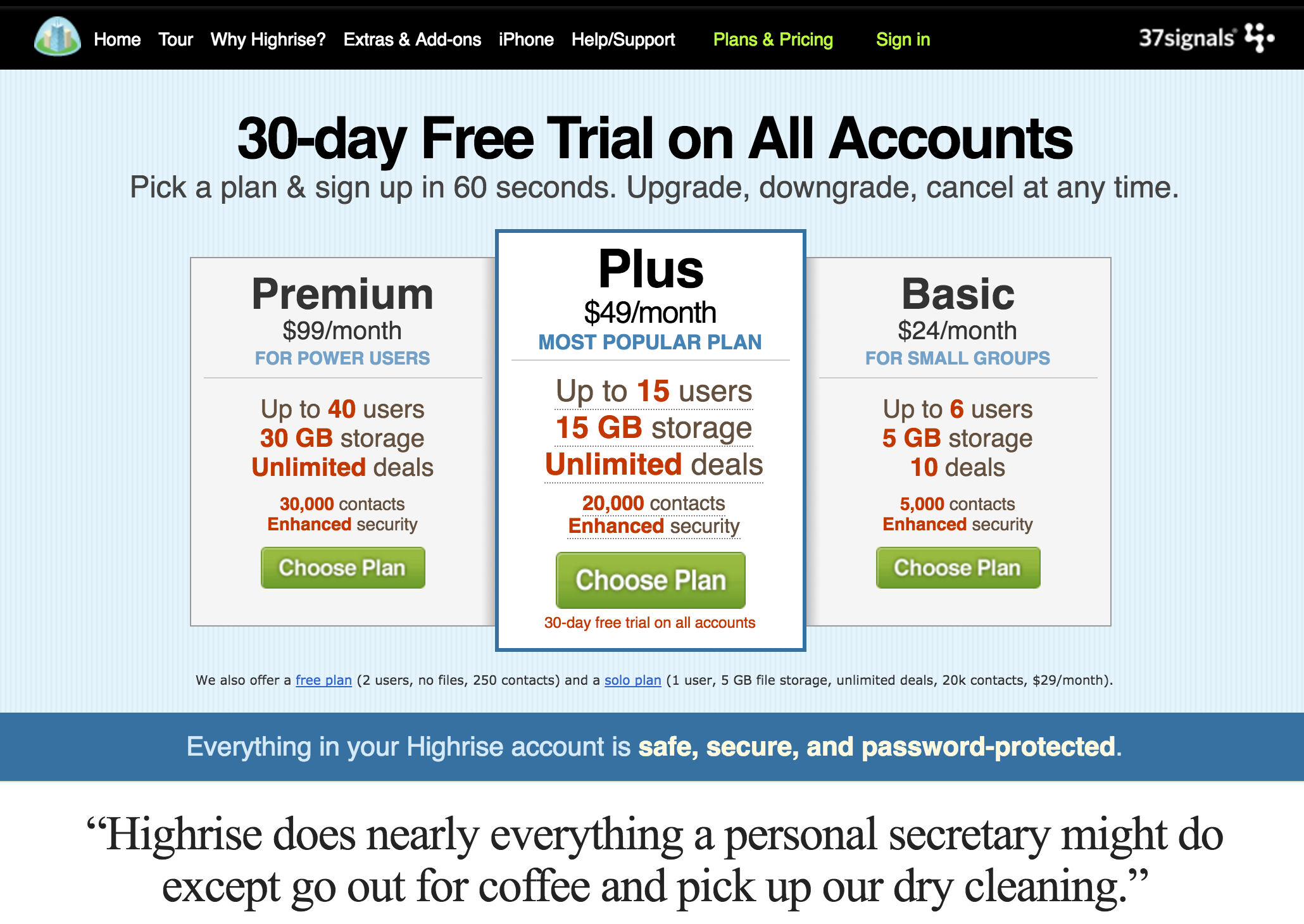
One change we made when we relaunched our marketing site was to our plans page. We went from this:

to this:

I wasn’t in love with the change, but I didn’t hate it either. It brought our new, more minimal, aesthetic to the plans, and it also addressed one thing we heard from some customers: “Do you have a bigger plan?”
We did! We just didn’t advertise it. So let’s add that. Can’t hurt?
Well it did hurt (like I mentioned above — we just didn’t see it soon enough). Paid signups went down and people started signing up more for the Basic plan.
When we moved back to something more akin to the old design:

Paid signups went back up 51.4%. And our new revenue improved 67.6%!!
Quite the mistake and improvement. Why the difference? Probably easy to guess that more plans doesn’t mean better. Too many choices. The extra choice probably just made for too much anxiety and killed people’s desire to sign up. And the original design, really made things a no-brainer: “Here, don’t debate, just sign up for this.”
The free link also became bigger in our changes that weren’t working well, encouraging folks to bail into that plan. So we bumped the font size back down to what it was originally.
Revisit old hypotheses and assumptions
Another interesting result we just bumped into was an explainer video we had on our features page.

I remember when we added that over a year ago; we split tested it of course. Though again, a mistake we made, we only split tested total conversions.
Recently we decided maybe the explainer video wasn’t up to date enough (Highrise is improving at a very fast clip), but before removing it, we tested three things: removing it, leaving it at the bottom of the page where it was, or moving it to the top.
Removing it improved our free signups by 53.2%! And didn’t change our paid signups at all.
Why would getting rid of a video sitting at the bottom of a page that doesn’t get a ton of our traffic make that much of a difference?
It’s also an important reminder that not all customers behave the same way on the site. Maybe folks who are more anxious about signing up spend more time pouring over the details of our features and how we present them. Then they bail into a free plan. What can we do to take advantage of that information? Maybe offer the free signup at the bottom of the features page? Improve our call to action on that page stressing free trials? Lots of options when you get more granular about what you’re testing.
It’s also worth rethinking a lot of assumptions and hypotheses that we thought we knew a couple years ago. Not just because our testing is more thorough. But also because maybe these things have changed since then. Maybe an image or a video or some copy that converted well just doesn’t have the same impact today. Maybe the consistency of those images with other assets have changed (logos and styles in screenshots). Maybe, simply tastes have changed since we tested those.
Just a couple recent lessons from us. Stay tuned for a lot more. There’s some really interesting changes we’ve been testing and haven’t gotten quite right yet, but have angles on improving…
P.S. You should follow my YouTube channel, where I share more behind the scenes of Highrise and how history, psychology, and science help us run our own business. And if you find yourself overwhelmed while managing your customer relationships, customer support, or the tons of people you communicate with, check out how Highrise can help!


