
I was an A/B test skeptic. Maybe we don’t want to be second-guessed. Maybe we don’t want to cater to the lowest common denominator. Designers are taught—explicitly and implicitly—to follow certain visual rules and the final design will work great. The whole A/B testing concept probably came from from “strategy analysts” or “MBAsses”. Anyway, now I’m a believer in A/B testing.
How I Learned to Stop Worrying and Love the Bomb
Designers, you’ve been in critiques where Clients, Art Directors, Creative Directors, Project Managers, Copywriters, Executive Assistants, and other Designers have picked apart your work. You listened with agony when they questioned your choice of this shade of red or this typeface. You winced when they said that photograph wasn’t “right”. Your vision is already changing based on a series of opinions!
Next time say, “I hear your concern about the shade of red. Why don’t we test that? I feel strongly about the color red, but it sounds like you need to be convinced it won’t affect X.”
Increasing our Signups through A/B Testing
A few weeks ago Noah and I talked about the testing we’ve been doing with the Highrise marketing site. Here’s a summary of the findings we posted:
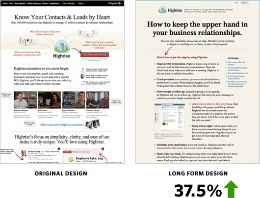
37.5% more people signed up for Highrise with the Long Form design.
Jason Fried’s mantra while testing was: We need to test radically different things. We don’t know what works. Destroy all assumptions. We need to find what works and keep iterating—keep learning. (I’m paraphrasing here…) We tried out a radically different design with these results:
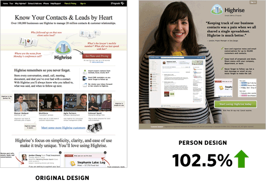
The Person Page was far shorter. There was less information about Highrise. However it had a 47% percent increase in paid signups than the Long Form design. Why exactly was the Person Page working? What might happen if we added more information to the bottom?
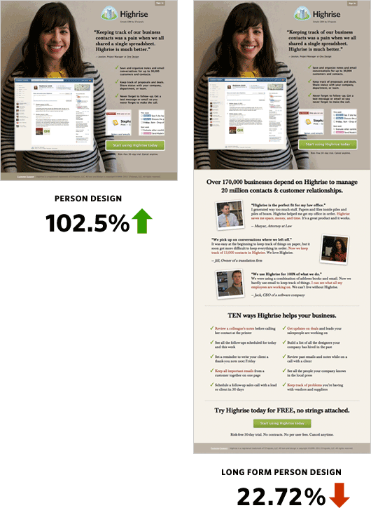
The crazy thing was when we added more information to the bottom of the Person Page it performed over 22% worse than the original design!
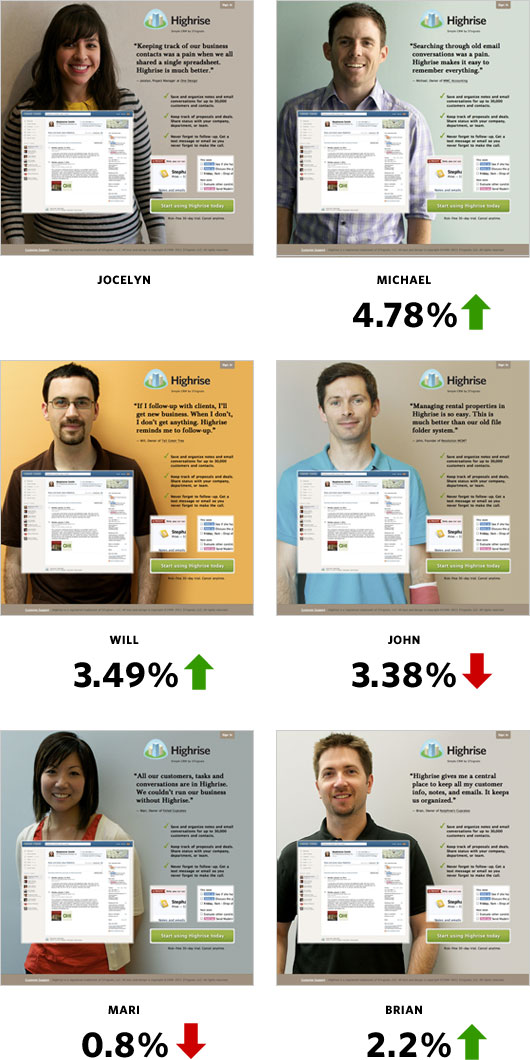
Changing People
Jocelyn from One Design—a Chicago design company—could also be the secret sauce to the effectiveness of the design. Her quote is direct and simple. She looks friendly and very non-techie and approachable.
I got in touch with more of our wonderful Highrise customers to see if some would be interested in posing for our homepage. Michael, an accountant at MWC Accounting; Will, a programmer at Tall Green Tree; John, founder of Revolution Management; Mari, owner of Foiled Cupcakes; and Brian, owner of Nutphree’s were gracious enough to have me interview them for the site.
I was curious to see if Jocelyn was the key to the winning design. Here’s how she fared:
Conclusions
- Big photos of smiling customers work
- A specific person didn’t quite matter among the set of people we tested
I hope you gained some insight from our series of behind the scenes articles. Please try to roll in A/B testing into your schedule! If you work in an internal Design Department then this is a no brainer. It’d be interesting to see Interactive Agencies add testing to the design process.
We’re still testing too. You may not notice such drastic changes to the Highrise site anymore, but trust me we’re tweaking and measuring behind the scenes. We’ll also be applying some of these findings to future marketing efforts. However, as Jason says, we will always test, improve, and learn. I want to be the first to come up with a design that beats our Person Page. Thanks for reading!
Please note: What works for us may not work for you. Please do your own testing. Your conversion rates may suffer if you copy us.
Darcy Fitzpatrick
on 23 Aug 11Thanks for sharing this. For what it’s worth, the lighting in some of those photos is pretty bad. I can see you’re going for the causal look, but having someone’s face almost completely obscured in shadow is just going to read poorly. I’d be curious to see how the A/B test would go if you redid these with professional photographs – keeping the casual feel, but achieved with careful attention to detail.
Mike Lee
on 23 Aug 11Out of curiosity, do you know if the gender of the user had any influence with their CTR of the person in the photo? I’m guessing your A/B test had a large enough sample size to make this a non-issue, but I’m just curious.
Jason
on 23 Aug 11I wouldn’t be surprised if the background color on the various “people” designs also has some impact on the conversion rate. They are quite different in character. If these cases, the brighter ones always have a higher rate than the darker ones.
NL
on 23 Aug 11@Mike – we had the sample size—no significant difference in CTR based on gender. Good thinking, though!
Andrew
on 23 Aug 11Yes, some of the photos aren’t perfect. If they were, I’d suspect evil marketing gimmicks, using ‘model’ customers giving ‘scripted’ recommendations. This has a home-grown appeal, which perfectly targets their market. Any visitor can identify and empathize with the example ‘other small business owners’ shown.
However, I do love the graphic boldness and minimal (typical) marketing info. I’m psyched to see your positive results with such a different look, and veering so far from the traditional.
This appears to be an excellent example of putting the ‘social proof’ at the top of the page.
Alpesh Shah
on 23 Aug 11Interesting to see these results. I should show this to my staff, since when we were working on making a decision on what Project Management suite to move to, getting the short form page for Highrise delayed our decision by at least a week. We knew we wanted to switch to Basecamp, but couldn’t decide on if we wanted the suite since we couldn’t learn anything about Highrise from the site.
Rob Sandie
on 23 Aug 11People on frontpage trend has now begun.. nice work Jamie/Jason!
Sebastian Hoitz
on 23 Aug 11What results did your cohort analysis give you? How many converted to paying customers? How many never returned after signup?
I can imagine that a lot more people sign up for a free version on the short homepage just because there is not enough information on there.
Anonymous Coward
on 23 Aug 11Awesome results, thanks much for sharing!
santiago
on 23 Aug 11Great post ! Thanks for sharing some of your learnings
This reminds me of Frank Capra telling (in his autobiography) some tests he was doing in the 30’s to make his movies better
(since movies had became talkies, he thought it was a whole new medium and he felt like trying to learn what actually did work)
JD
on 23 Aug 11Sebastian, we are measuring that.
Sebastian Hoitz
on 23 Aug 11@JD Awesome! Are you going to do a follow up post on that too?
jon
on 23 Aug 11The guy that got a +5% looks like he could be a model. I wonder if there was a correlation between the relative perceived attractiveness and conversion rate.
For example, if you asked a large pool of people to rate them in order of least attractive to most attractive, would that match the order of effectiveness?
Des Traynor
on 23 Aug 11Using results from someone else’s A/B tests to improve your website is like wearing someone else’s glasses to improve your eye-sight
JF
on 23 Aug 11Using results from someone else’s A/B tests to improve your website is like wearing someone else’s glasses to improve your eye-sight
Very true. We’re testing similar designs on the Basecamp site right now and not seeing the same results. Each product, market, and customer base is different.
Please design your own pages and run your own tests or you’re just hurting yourself.
Alex
on 23 Aug 11Thanks for sharing. And nice work! Now, how do I get the smiling pics of my customers – thats the challenge…
Darcy Fitzpatrick
on 23 Aug 11@Andrew Not suggesting perfect. I’m in full support of the choice to go with the home-grown look. But bad lighting only looks cheap. Just like a bad font choice might. Would you suggest they take less care in choosing their fonts in order to maintain a more home-grown feel as well?
To be clear, not suggesting glossy. But you can do casual and home-grown without sacrificing quality.
@Des Traynor Brilliant.
Mike
on 23 Aug 11Just wondering which technical tools you’re implementing your a/b testing with? Are you using something like ABingo or Google Website Optimizer?
thanks
NL
on 23 Aug 11@Mike – we talked a bit about that in the previous part of the series: here.
Anonymous Coward
on 23 Aug 11Thanks for sharing. Very interesting info, and actually love the simple percentages used to intuitively display the results of your study.
P. Tavares
on 23 Aug 11Hello everyone! I think it’s great that you guys are willing to learn, experiment and share your process with the world, but at the same time I am bothered by this thought:
If you had a person in your company with an academic and professional background in marketing, shouldn’t this person already know this kind of stuff?
Don’t get me wrong, I’m not a marketing/sales guy, I’m actually an engineer. And as such, I must admit it often seems that anyone can do “easy stuff” such as design and marketing, if you have a modicum of sense/taste and time to experiment.
But on the other hand, if some people study this subject at undergraduate and graduate level, shouldn’t your experiment be something very basic to them, and possibly still amenable to major improvements?
If this is the case, why not hire a pro, instead of making programmers or designers reinvent the “marketing wheel”?
Lance Jones
on 23 Aug 11Split tests are fun to run (and can obviously improve conversion rates) but they yield limited information… you have no idea what elements of these large, sweeping changes are responsible for the lift or why. All you know is that you saw a lift… everything after that is just a guess. You have the traffic to support multivariate tests… do you run those? I’ve found MVT tests to reveal much more about the impact of specific design elements—which then enables you to apply those learnings to other pages or other 37signlas Web properties.
ms
on 23 Aug 11Great review. But didn’t you wonder how results would be if you didn’t test again all White males? I believe it has been observed that White consumers actually respond better to ads with Black models in the creative.
William Lubelski
on 23 Aug 11How does this data support the conclusion “Big photos of smiling customers work” ?
Did you test the person layout with a non-person background image?
From these screens, it would seem that that the concise copy, a good screenshot, or a clear and nearby call-to-action could just as easily be the more important factors.
It seems that you’ve tested the relevance of WHICH image without testing the relevance of AN image.
-Will
Jason
on 23 Aug 11It doesn’t sound like you have retention information for these tests yet, and I’m curious about that because I wonder if the reason fewer people signed up on the long form version is that they self-selected out of the product based on the additional info. The question I’d be asking is do those folks stick around (or more likely at what rate do they stick around)?
Doubling sign-ups is no small feat, though. There’s almost no chance you haven’t moved the needle even if you get some additional churn. Nicely done.
Drew
on 23 Aug 11In the A/B test run using images of different customers, the image isn’t the only thing that was changed. The testimonials were changed too (I’m assuming because you don’t want to attribute a testimonial to a person who didn’t say it :p).
It would have been interesting to run additional tests with Jocelyn using different testimonials to see what, if any, impact the testimonial has.
t.h.
on 23 Aug 11Hi, thanks for usefull informations. It’s great post and A/B test. Do you have tried to replace/change sides? (Jocelyn to the right and text to the left)
Maxim
on 23 Aug 11It would also be interesting to see whether it varied a lot depending on whom the picture was shown to demographically. E.g is it more effective to show boys to girls and girls to boys or otherwise as people actually project the image on themselves.
Andrei
on 23 Aug 11I’m curious whether all this A/B testing confused any customers who expected a consistent look and feel to what they’d seen before (say, on Basecamp).
Do you think this would be an issue, especially with radical redesigns in the B part?
JD
on 23 Aug 11P. Tavares, I’ve learned through the years that you can’t really apply a formula and make it work time and time again. Each scenario/problem/idea is always new—even when there are shades of familiarity. That keeps the world spinning, man.
Shali
on 23 Aug 11Great post! Have you guys done tests with moving your CTA around? Right now when I load up your person page, the CTA is below the fold on my Macbook Pro. Just wondering if keeping that up higher will also increase your click throughs?
Suhail
on 23 Aug 11Could you be appealing to different personality types – visual/sensory based versus data/analytic based people. Could the conversion results indicate which type visits your site more? If the “people” form could maybe lead to the long form you could get the benefits of both. Was the breakdown by browser type for the two marketing form similar? Very interesting.
Enrique Delgado
on 23 Aug 11@William Lubelski: I think you have a point on this one. My co-worker pointed me to this article about the effect of people’s faces on pages. It may be that the same layout, without a face would have converted even more: http://usableworld.com.au/2009/03/16/you-look-where-they-look/
David
on 23 Aug 11How about now testing real videos of real clients using your system?
Gordon Bowman
on 23 Aug 11Very cool. I’d be interested to see if a picture of multiple smiling people fared better than one smiling person?
And are you thinking or rolling out similar testing across your other products?
Tim
on 24 Aug 11This is interesting, guys, thanks for sharing.
I’d also be interested in what adding video would do. I use Basecamp free, and for working with my dev (Sydney, I am in Mel) it’s been awesome. He was blown away by it.
How do you capture the simpleness and plain awesomeness of that UX and the resulting joy, in copy. Very tricky!
Jocelyn
on 24 Aug 11I want to thank the Academy… :)
Love to the Jamie!
Chris
on 24 Aug 11You haven’t commented on it, and I hope everyone can take this in the right inquisitive spirit (ie. hopefully I don’t sound sexist!).
It looks like photos of men performed better than photos of women. Was this your conclusion? I wonder if it’s because your audience tends to be young male entrepreneurs, and the photos of Mike, Will and Brian reflect them in some way? I’m a guy, and I’d have to admit that if this selection of people were selling something to me, the guys look like knowledgeable geeky engineer types, and the girls look like friendly and relaxed marketing types. Again, sorry if this comes across as sexist, it’s not my intent, just honestly responding to the images and interested in the way a specific audience group responds to imagery.
John performs worse than the girls – no offense to John, but he has a cast on his arm and looks pretty pale – it’s not an attractive photo of him. If there was a better picture of him, he might have performed better in the test I think.
yohami
on 24 Aug 11wow, thanks a lot for this insight.
Gary Sevounts
on 24 Aug 11Great post. Thanks for sharing results. A/B testing is definitely the way to go. Makes a subjective discussion objective really fast. I have seen all along long forms not working well, but never had such a quantitative breakdown. Good stuff!
Rodge
on 24 Aug 11I’ll never forget the story about Google’s (well known) designer that finally quit after continually being asked by the engineers to prove his designs with testing. Finally he couldn’t change a 5px border with them asking for the split test.
Conor Coughlan
on 24 Aug 11Using results from someone else’s A/B tests to improve your website is like wearing someone else’s glasses to improve your eye-sight
Kris
on 24 Aug 11I wonder what adding location and different nationalities would show?
Especially if you aligned it to IPs. Examples; a natural UK looking person for a UK IP. an Australian for an Australian IP. a Zulu for a South African IP. (Just kidding lol) With a site like 37signals who is international could this personalization for local help? I think it could. Could adding “Chicago” to Michael help? — Michael, Owner of MWC Accounting. Chicago
My assumptions for this come from the demographic of the winners and the decrease on Mari/John. Is it because Mari and John look significantly different? Or are people just largely discriminatory to people who have broken arms? (am kidding again lol)
I'm anonymous
on 24 Aug 11It’s interesting you got a dip with Mari.
I have a question. If your A/B testing showed that your customers are more likely to sign up when shown a white person, would you stick with people who are white?
At what point do you say – “No, we’re not going with this better performing design because we disagree with the implications created by the design”?
Ty
on 24 Aug 11Like Jason, I’d like to see a future post that addresses your results of converting these increased signups to paying customers.
Joe
on 24 Aug 11Thanks for sharing. Really interesting to see how adding a personal element to a page improves conversion. We’ve seen good success in adding a person that’s looking at the major call-to-action. Our working theory is that visitors will want to look at what the person is looking at.
Did all these results reach statistical significance? And were follow-up experiments ever run on any of them to confirm the results?
Thanks.
Dondi Michael Stroma
on 25 Aug 11What are the p-values? Are these results statistically significant?
Rob
on 25 Aug 11I noticed that when I visit the site, different wallpapers come up. How have you taken into account multiple exposures of the site to a potential customer?
Geoff
on 25 Aug 11@Kris – great questions and ideas. Think we’ll try something like that on our own site. Now, the challenge: how to get pictures of customers from hundreds of different cities!?
Andrew
on 25 Aug 11Here’s a question for you – are people signing up just to find out more about the app because you haven’t provided them with enough info at the outset? If so, your free trial drop out rate will increase.
For me, there is no-where near enough info on the 102.5% page to make a good decision on whether this is something I would want to sign up for. Are people signing up just to get their questions about app functionality answered?
Jeremy Page
on 25 Aug 11Dope analysis. I have always favored the low-info landing page, glad it was confirmed again that less is more (usually).
Dennis @ Reedge A/B Testing
on 27 Aug 11Excellent article and insights. Nice ideas to give a try, but as you said do not copy these results but draw inspiration from then to try something new.
fipe
on 27 Aug 11I think a more accurate way of knowing which picture works best would have been to have the exact same content & design. I’m not at all surprised that Will does better than John. Aside from the fact that John’s picture isn’t the best you could have picked, the background colour in Will’s pic is a lot warmer/friendly plus the picture is much better than John’s.
Kris
on 28 Aug 11@Geoff, go to fiverr or freelancer or some outsource site.
Xavier Noria
on 29 Aug 11I find interesting that the same page with more content at the bottom gives different results.
A posteriori my guess is that people see all that content and think they should have a look at it to follow or not. That goes against an impulsive sign up.
Another interpretation is that with more content you have more information to decide whether you’re interested. With less content you need to sign up to learn more.
Let’s conjecture a lineal combination of the two of them :).
Bjarni Wark
on 30 Aug 11Thanks for sharing your info, I like it and yes a smile can help : )
This discussion is closed.