By Noah Lorang, Mr. Data at Basecamp.
We’ve always felt strongly that we should share our lessons in business and technology with the world, and that includes both our successes and our failures. We’ve written about some great successes: how we’ve improved support response time, sped up applications, and improved reliability. Today I want to share an experience that wasn’t a success.
This is the story of how we made a change to the Basecamp.com site that ended up costing us millions of dollars, how we found our way back from that, and what we learned in the process.
What happened?
This story starts back in February 2014 when we officially became Basecamp the company. This was a major change — a rebranding, the discontinuation of some products, the sale or spinoff of others, and more. As part of that process, we decided to redesign basecamp.com (our “marketing site”) to reflect that it was not only the home of Basecamp the product but also Basecamp the company.
The result was a fairly dramatic change, both in content and visual style. The redesign extended well beyond just the landing home page (you can browse the archived version before and after we became Basecamp), but the most noticeable change was to the main page, which you can see below.
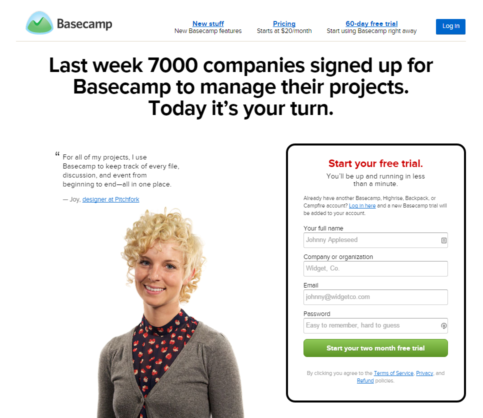
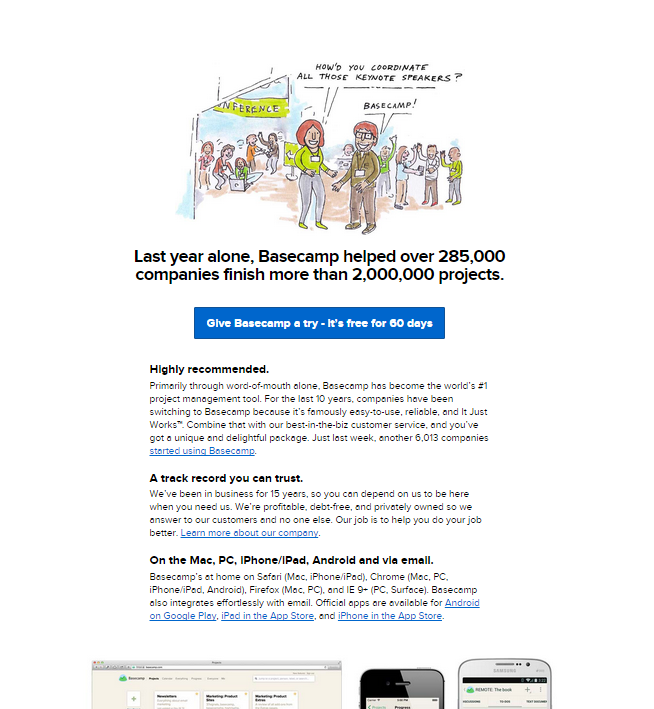
One very significant change here was that we removed the signup form from the homepage. This wasn’t necessarily the most considered decision; we hadn’t done extensive research or testing recently on the role of the number of steps required to signup for a Basecamp trial. Over the years, we’ve long debated the value of a fast signup (which might bring in more people initially) vs. a well considered signup (which might have fewer initial signups but still retain all of the committed people who would ultimately become paying customers), but as far as I’m aware, we didn’t explicitly decide that we wanted to go for a slower signup. It was one of the many decisions that we made in the course of “Becoming Basecamp”.
We didn’t A/B test this new marketing site initially for a variety of reasons: we were too busy to prepare dramatically different variations, we wanted to present a consistent image at this time of big change, and we liked what we had come up with.
Immediately after we changed the marketing site I noticed that conversion rate had fallen on the marketing site; a smaller portion of people visiting basecamp.com were signing up to try Basecamp than had been before we changed the site. This wasn’t an unexpected effect: we had more traffic coming to basecamp.com because we were redirecting visitors from 37signals.com and we picked up some tech press coverage and traffic from other low-converting sources, so a smaller portion of people signing up wasn’t initially concerning. In the immediate aftermath of Becoming Basecamp, the absolute number of signups held steady, which fit with our expectation as well.
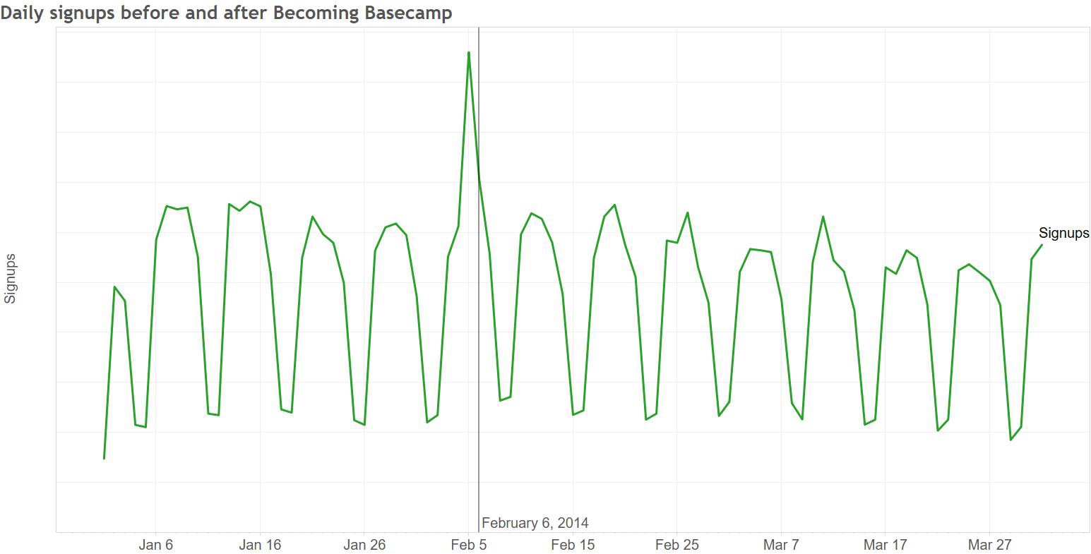
In the first couple of months after we changed the marketing site, signups trended lower than they had at the start of the year. This, too, wasn’t a hugely concerning event by itself: our biggest signup month is always January, and things slow down through late summer and then pick back up again in the fall. Because demand for Basecamp is driven in part by normal cycles within small businesses (many of which start new projects at the start of the calendar year), there’s a fairly strong seasonality to new signups.

It took a while to conclude that the decline in signups we saw through the summer of 2014 was more than normal seasonality. When things didn’t pick back up in the fall, it was clear that there was something else going on. In an internal writeup of our 2014 performance, I wrote:
Things didn’t improve through the first half of 2015, and we discussed it intermittently without making any major changes. Finally, in July we launched an A/B test that brought a signup form back onto the homepage, with immediate and dramatic results: signups increased by 16% in the with-signup-form group compared to the group without. The net impact upon finishing the test and rolling out the change to 100% of traffic was clearly visible:
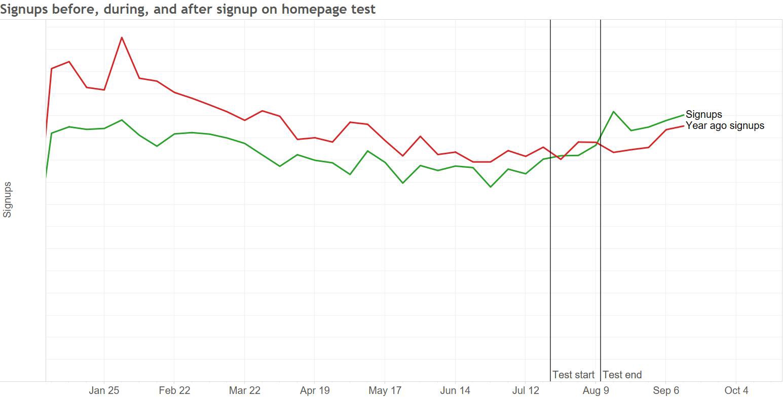
We’re of course thrilled to have this performance back: at our scale, this sort of improvement is worth millions of dollars in revenue. The period of degraded performance was in no way threatening our livelihood (2014 was our highest revenue year ever, and 2015 is on track to beat it), but it certainly hurt.
Where did we go wrong and what can we learn?
There’s an obvious lesson here: in the specific context of Basecamp at the moment, we get more net paying customers when we make it as easy as possible for people to get started. The marketing site for the new version of Basecamp we’ll be launching soon will include a signup form on the homepage, but this is just the surface level learning from this experience.
The deeper lessons are really about process, and there are two key things that I hope we take away from this experience:
1. We don’t know what will work.
We didn’t A/B test this change, which meant it took a long time to notice what happened. An A/B test of the new marketing site vs. old, conducted back in February 2014, would likely have caught the lower performance of the redesign within a couple of weeks. In an A/B test, you hold many external factors constant — the same seasonality effects apply, you can send the same mix of sources to each variation, etc. This lets you draw a more direct connection between what you are changing (the design, and more specifically the number of steps in the signup flow) and signup rates.
Because we didn’t test the redesign, we were limited to making longitudinal comparisons to see how the new marketing site compared to the old. With seasonality and other external effects (for example, when you rename your company and discontinue some products), it’s really hard to identify which of the many things that contribute to the ultimate number of signups we see had what impact, so it took us a while to nail down exactly what was happening.
It’s easy to decide not to test a change — you’re busy, you just know it will be better, you don’t want to risk the confusion that’s always possible anything you’re running a split test. In the future, it will be easy for us to justify spending the time and effort to test a marketing site redesign thoroughly in the future — we’ve learned the hard way what can happen if you don’t do that.
While we’re unlikely to make exactly this same mistake again, it’s worth considering where else we might be making a similar mistake that we aren’t even aware of. Are there areas of the product where we make untested assumptions that might have a big impact either on us as a business or on our customers success at using Basecamp? Can we test our beliefs in a quantifiable way?
2. We didn’t communicate effectively.
Because we’re such a small company, many of the decisions about things like where to put the signup form are made by individuals or very small groups without a lot of broader discussion. In this case, that discussion might have brought up the risk associated with removing the signup form from the homepage, and we might have made a different decision back in 2014.
We also failed to take action quickly once we knew what was going on: over six months passed between when we clearly identified the problem and when we took action to address it.
We’re a very project-driven company: we tend to focus on a limited set of things at any given time and work on those very actively. In the time between the redesign and now we’ve collectively worked on a lot of different projects. We launched The Distance, added many new features to Basecamp, worked on many behind-the-scenes projects, and have been hard at work on the next version of Basecamp coming out soon. We also shifted a designer who had been working on things like our marketing site to work on Android, and we explored a bunch of new marketing ideas around advertising, sponsorship, etc.
All of this led to us just not spending a lot of time thinking about our marketing site, and that’s reflected in the pace of testing and refinement that it’s seen. We conducted only 1/3rd as many A/B tests in 2014 as the year before, and made significantly fewer commits to the marketing site’s repository. This all helps to explain why we were so slow to act: with no ongoing project working on the marketing site, we just weren’t spending any time thinking or talking about it.
As a data analyst, I could have done more, too — I knew that we should have A/B tested the redesign when we did it, and I knew that we needed to try bringing back the signup form months before we actually ran a test. In both cases, I either didn’t find the opportunity to make my case or didn’t do it vociferously enough to change the outcome. In hindsight I certainly wish I’d banged the table more loudly.
These were certainly painful and expensive lessons to learn, and we’re fortunate that the fundamentals of our business are strong enough that this wasn’t anywhere near an existential crisis. We’ll be a better company as a result of having gone through this, and hopefully we won’t make the same or similar mistakes in the future.
Originally published at signalvnoise.com. Check out Basecamp at basecamp.com.
