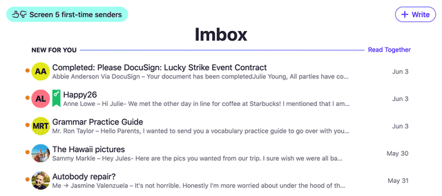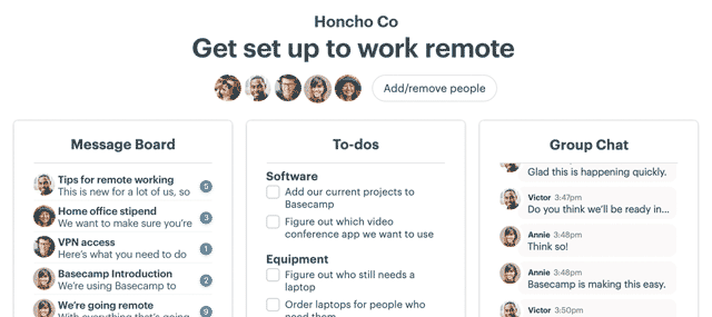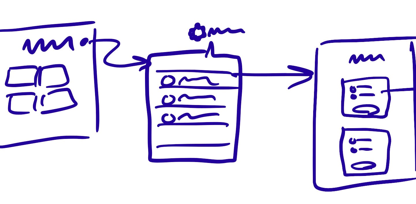
Here at Basecamp we do a lot of paper sketching. Usually we jump straight to code after making a rough sketch. But it’s not a black and white rule. Sometimes we make tappable prototypes to test an interaction, or a pixel perfect Photoshop image to communicate a concept. How do we choose which level of fidelity is appropriate for each project?
I think about it like this: The purpose of making sketches and mockups before coding is to gain confidence in what we plan to do. I’m trying to remove risk from the decision to build something by somehow “previewing” it in a cheaper form. There’s a trade-off here. The higher the fidelity of the mockup, the more confidence it gives me. But the longer it takes to create that mockup, the more time I’ve wasted on an intermediate step before building the real thing.
I like to look at that trade-off economically. Each method reduces risk by letting me preview the outcome at lower fidelity, at the cost of time spent on it. The cost/benefit of each type of mockup is going to vary depending on the fidelity of the simulation and the work involved in building the real thing.
Suppose we have four levels of fidelity…
- Rough sketch (on paper or an iPad)
- Static mock-up (eg. Photoshop or Sketch)
- Interactive mock-up (eg. Framer, InVision)
- Working code prototype (HTML/CSS, iOS views)
(I didn’t include wireframes in the list because we don’t make them at Basecamp. For us a rough paper sketch is the same as a wireframe, without the extra time wasted on sharp lines and shiny presentation.)
Depending on the feature you’re working on, these levels of fidelity take different amounts of time to create. If you plot them in terms of time to build versus confidence gained, you could imagine something like a per-feature fidelity curve.
Eg. take a simple CRUD web UI, where you’re just navigating between screens.
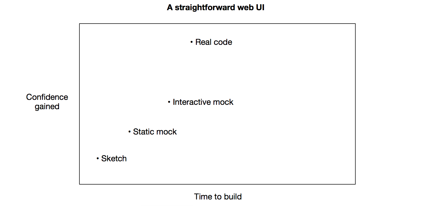
It doesn’t take much more time to build the real version than it does to mock it when the design is simple. If you were to build out an interactive mock first, you would end up spending twice as much time in total without gaining much out of it.

Contrast that with a complicated Javascript interaction. Or a native iOS feature that requires programmer time to build out.

If it takes substantially more time to build the real code version, then it may be smart to do an interactive mockup first.
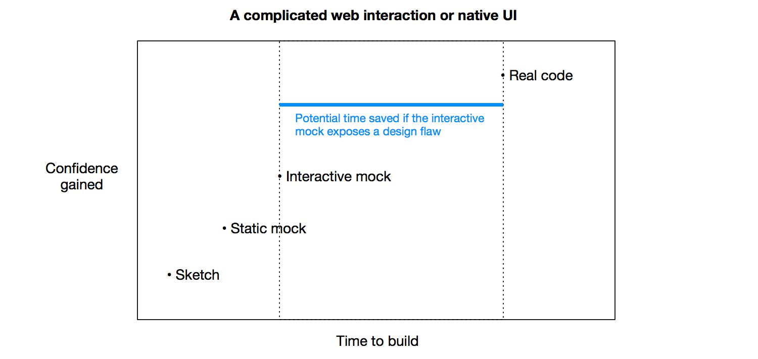
Here’s one thing to be very careful about. If you put too much fidelity into anything that’s not code, you can end up spending lots of time on deliverables that are thrown away in the end anyway. This often happens when people fiddle with colors, positioning, fonts, etc too early.
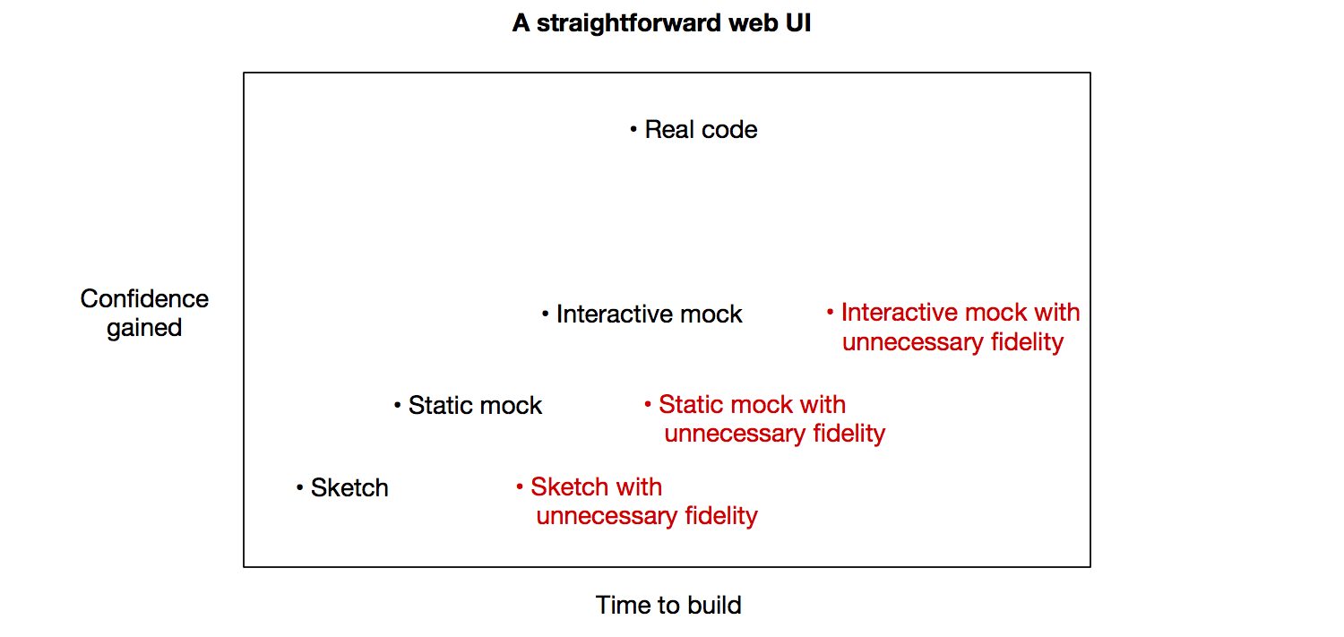
These illustrations show that mockups aren’t good or bad, and there isn’t a black and white answer for when to make each kind. But there is a trade off to be made. Being conscious of that trade-off can help you make more rational, economic decisions when people have differing opinions about what to do next in a design process.
We still mainly draw rough sketches on paper or on our iPads when we’re working on UI for Basecamp 3. Now that we offer full-featured iOS and Android apps, I’ve learned that prototyping tools can be useful before building the heavyweight UI code those platforms require. See Basecamp 3: Mobile Prototypes for more.
