Interactive prototyping was essential to designing Basecamp 3 for iOS and Android. In this article we’ll look at how we chose a prototyping tool and take a peek at a few of our prototypes.
At Basecamp design happens through iteration. We don’t make highly-polished comps but instead work right in Basecamp’s code making hundreds (even thousands!) of tiny revisions until the design is just right. We can then see and click the work-in-progress design just like our customers will the finished product. We’ve done it this way for years —our workflow and development stack are highly optimized for it.
When designing Basecamp’s mobile apps it was a completely different story. Even for the simplest of changes the difference between refreshing a web browser and building an app to a device (or simulator) is orders of magnitude slower. It’s worse when you consider that making even seemingly minor visual changes to iOS or Android designs in native code can take much more time than you might expect. Over the course of a day that time adds up. All told, we had to find a better way.

Solution: interactive prototypes
We knew right off that static Photoshop mock-ups weren’t going to cut it. We wanted to see and touch our designs on real devices. It was tempting to simply make prototypes in HTML, CSS and JavaScript—tools we’re very familiar with—but it turns out they’re a poor fit for the kinds of designs we wanted to try. Simple things that are essentially free in native code can be difficult or quirky in web browsers. For example, full-screen transitions or fixed navigation bars.
So we set out to find a prototyping tool that met these requirements:
- Fast. Above all a suitable tool had to be faster and easier than putting something together in native code or even HTML/CSS. It was equally important that the round-trip was short between making changes, previewing them, and making further tweaks.
- Real devices. We wanted to see and touch designs on real devices, desktop emulation alone wouldn’t cut it.
- Shareable. Prototypes would serve two purposes: Quickly sharing work-in-progress designs for critique and sharing the final, high-fidelity reference designs with our programmers.
- Cross-platform. We’re all developing on Macs but it was important that any tool worth considering would be suitable for prototyping both iOS and Android app designs.
We looked at a ton of tools and put several through their paces including Quartz Composer w/Origami, Form, Pixate, and Briefs before settling on Framer.
N.B., We evaluated these tools nearly one year ago at the beginning of Basecamp 3’s mobile development so some of the reasons we choose Framer over the others may no longer be true. In fact, Quartz Composer was my favorite tool to use—the springy-band UI is unique and super-fun—but it lacked on-device preview at the time, a deal-breaker for us that has since been corrected. What I hope you’ll find interesting in this article is how Framer met our requirements and what we learned about those requirements after we had been using it regularly
Why we picked Framer
The excellent Framer Studio for Mac is a one stop tool for developing, previewing, and sharing prototypes. It consists of two panes: code and preview. Make a code change on the left, try it on the right in real-time. No refreshing or rebuilding.
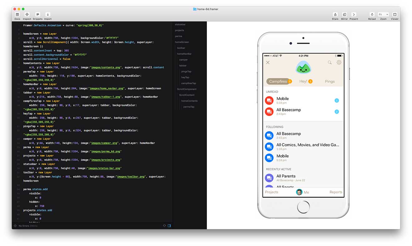
Framer’s previewer also includes a nice selection of device frames to wrap your prototypes in including various models, sizes and colors of iPhones, iPads, Apple Watches, and Android devices. It’s so easy to fire-up Framer and drop a screenshot into a prototype that it’s even become my go-to tool for making device artwork.
Framer prototypes are written in CoffeeScript, a language in which I was already familiar that compiles into JavaScript. As much as I loved using Quartz Composer it wasn’t intuitive and I had to learn a lot to become proficient. Framer’s UI, on the other hand, is code. It felt more like writing web apps. Integrated access to the excellent documentation on its framework made getting started easy. I’d expect most web designers who are comfortable with HTML, CSS, and JavaScript could be productive with Framer in a matter of hours.
When it’s time to share a prototype, Framer pushes your prototype to the cloud and provides a private link you can share with anyone—all with a single click. They’ll be able to interact with it in their web browser or on their device just by opening the URL. And if they have a copy of Framer Studio on their Mac, they can open your prototype and edit it themselves. It was dead simple to drop a URL in Campfire when we needed feedback.
What surprised us
Sharing was one of the key requirements in choosing a prototyping tool but it’s also the area where our expectations were the mostly incorrect.
The first surprise was that sharing a URL, while handy, didn’t provide enough context. In almost every case our prototypes would focus on one particular feature or flow so not every element was interactive and there was no obvious way to communicate to someone what they could tap, or in what order. It turned out the simplest workaround was to record and upload an animated GIF demonstrating the flow. That alone was good enough almost all the time and the actual Framer prototype was only reviewed when someone really needed to see the interaction at full size and high frame rate. LICEcap was an excellent tool for quickly capturing screen recordings as GIFs.
It turns out the second scenario: sharing and iterating on prototypes with our native programmers was largely imagined, too. Though we designers may have agonized over the specific timing of every animation, it wasn’t necessary for the programmers to install Framer Studio to get it right and I don’t think any of them ever did.
Similarly we found that seeing prototypes on actual devices didn’t matter as much as we thought it would, at least not at this stage in the design. Instead we used Skala Preview in conjunction with Photoshop to get our designs right at the screen design stage. By the time they were animated in Framer, size and proportion were already right.
A few examples
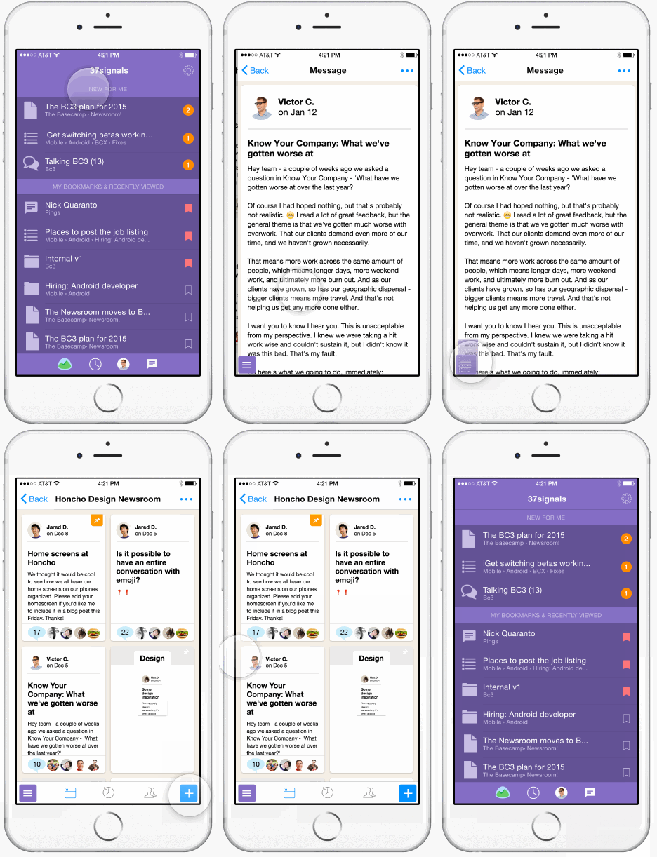
This first animations shows an early concept in which a menu button would persistently float over all screens giving you quick access to new content via notifications. Click to try the interactive prototype.
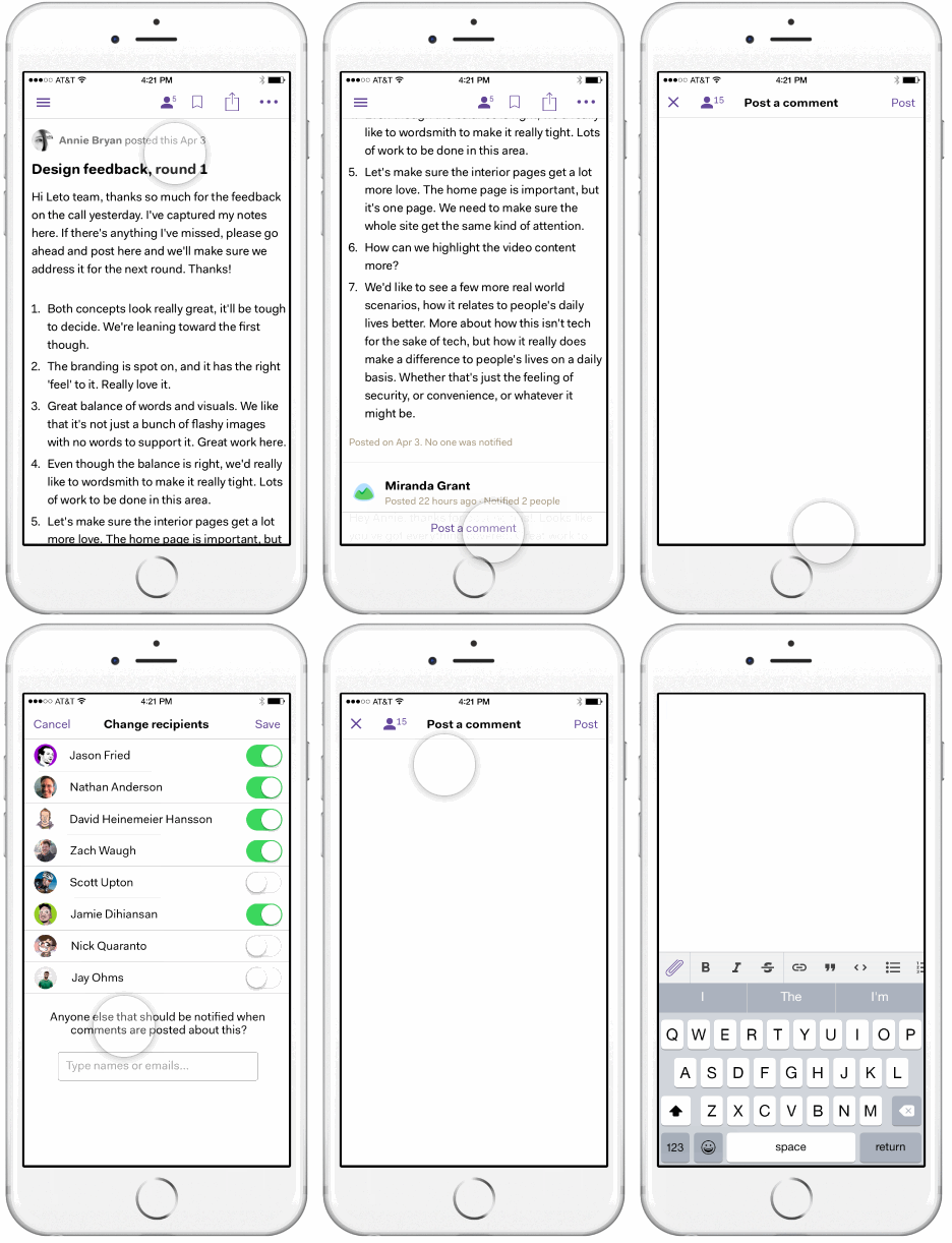
Here’s a idea for writing comments in a full-screen composer.
Finally, this is the prototype that lead to the final home screen design in the app today. Again, click to try the Framer prototype.
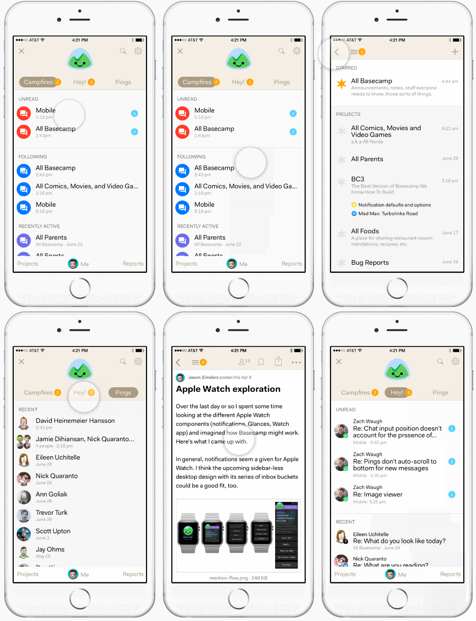
In a future post we’ll look closer at this design and how we got here. Until then I’d love to hear more about how you’re using interactive prototypes in your mobile designs.

Mark Horgan
on 13 Nov 15Thanks for sharing those prototypes Jason.
On iOS I found I needed to use a frameless browser like <a href=” https://appsto.re/ie/O3uP3.i”>Frameless to view the first 2 prototypes properly.
JZ
on 13 Nov 15That’s true, Mark. If you don’t want to go to that trouble you can also bookmark the page as a home screen web app. That lets it run chrome less, too. Frameless is really handy, if you’re running Framer Studio, though, because it lets you push prototypes to your device wirelessly.
Anonymous Coward
on 14 Nov 15Why did you choose to pick just one tool?
Was that so everyone could share and work on the code? To avoid having multiple apps to view it?
JZ
on 16 Nov 15@Anonymous – yep! That’s not to say we had to choose only one but it seemed to the right goal for all the reasons you suggested.
Julia S
on 16 Nov 15Hey JZ,
I’ve been using Flinto to prototype some basic interactions. While very new and sometimes glitchy, it lets you pretty much transition anything on the UI. It comes with a free iPhone app that you can test your prototypes on.
Jordan Dobson
on 16 Nov 15I would say one of the biggest benefits of Framer is the community.
Thier facebook group almost has 10,000 members now and finding a solution to an issue is quite simple if you just search on the Framer JS Facebook group or ask a question if you can’t find an answer.
There are also sites like Framer Code and many video tutorials on the framerjs.com site that get you up and running quickly.
The other benefit is that things you learn in Framer are totally transferrable to other things as a designer… as you are learning Javascript essentially. Javascript isn’t going anywhere soon and it allows you to prototype new ideas & technologies today… you don’t have to wait for the appplication to include support for it. If you can do it in browser you can do it today.
Also, There are tons of meet ups in cities like New York, San Francisco, Seattle and beyond… I hold the Seattle Framer JS meetup and we regularly have 25+ people present each month. :D
Thanks so much for sharing your process!
Jeremy
on 16 Nov 15Thanks for the thoughtful article! Curious why you didn’t consider invisionapp?
JZ
on 16 Nov 15@Julia and @Jeremy – I was aware of Flinto and Invision and did investigate but not to the point of taking them for a spin. They appeared to be part of a class of tools that I’d already characterized (perhaps unfairly) as “slideshow makers”. In fact, most of the browser-based tools I investigated seemed to match this description. They’re handy for taking a serious of static comps and stitching them together into a tappable prototype, basically mimicking a UINavigationController. I was looking for something with a bit more power and flexibility. Often I wanted to prototype interactions involving multiple elements on a single screen. I wanted to invent, tweak, and finely tune animations and timing. The few I did try “Briefs” (and one other I can’t recall) seemed too limited.
This discussion is closed.