Yesterday we announced the official Basecamp app for iPad. Just like our other apps for iPhone, Android, and Kindle it’s a hybrid—a native wrapper around a mobile web core. We’ve written about this setup before but today I wanted to really get into the details to show how it all works and how we’ve been able to launch four distinct apps with a handful of developers, just 5 people in all.
How it works
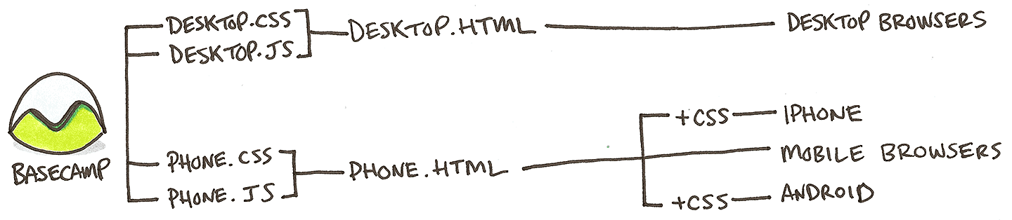
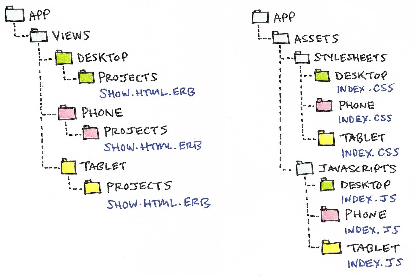
Basecamp has variants for desktop, phone and tablet. Desktop is the default browser experience we launched in 2012. When it detects a mobile device or a native app declares itself, Basecamp renders the phone variant. The phone variant has its own set of templates and its own images, CSS, and Javascript assets. Nearly every screen in Basecamp has both a desktop and a phone template. Here’s how it looks:
While developing Basecamp for iPad we introduced a third variant: tablet. Basecamp’s phone.css already includes responsive styles which allow it to adapt to portrait and landscape layouts as well as larger phones, tablets and everything in-between. The tablet variant uses these phone styles as a baseline and then layers on additional CSS for specific tablet designs (like those for the iPad app). Responsive design has plenty of drawbacks if you’re trying to take a complex app designed for the desktop all the way to phones but it’s fantastic when you need a nip and tuck from phones to tablets. Furthermore, the tablet variant can have its own templates when a nip and tuck isn’t enough. Making a new variant template means new cache fragments so we generally tried to go as far we could with responsive designs before making that trade-off.
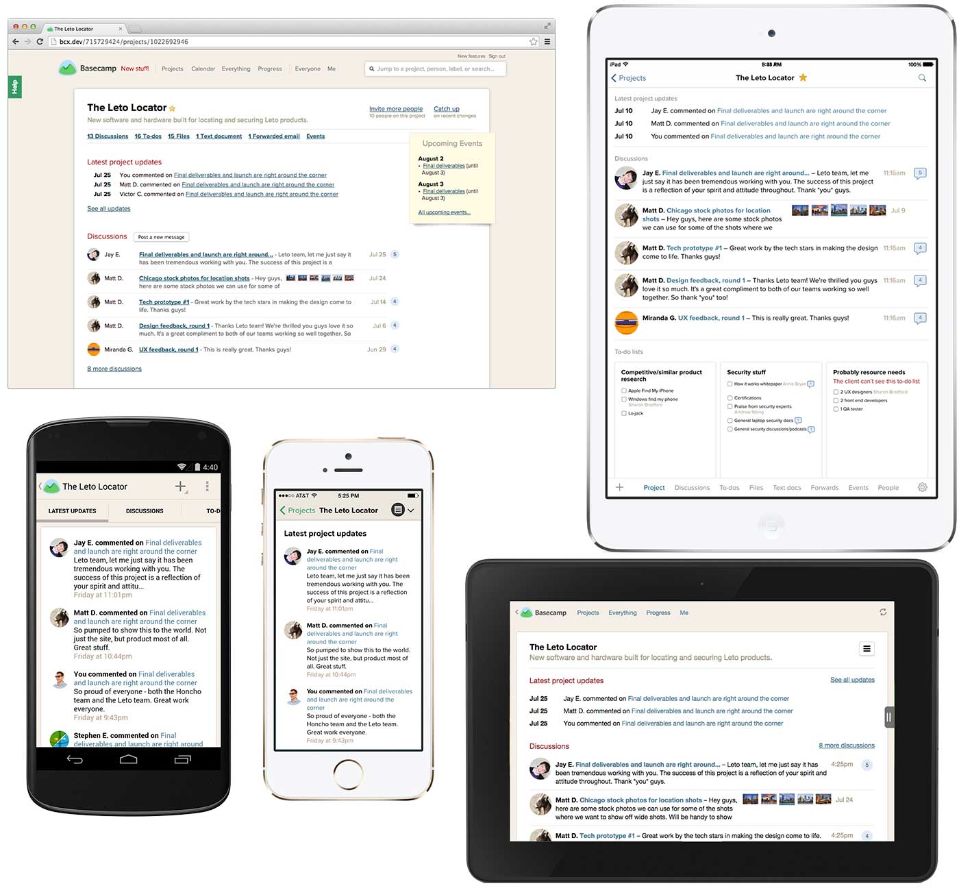
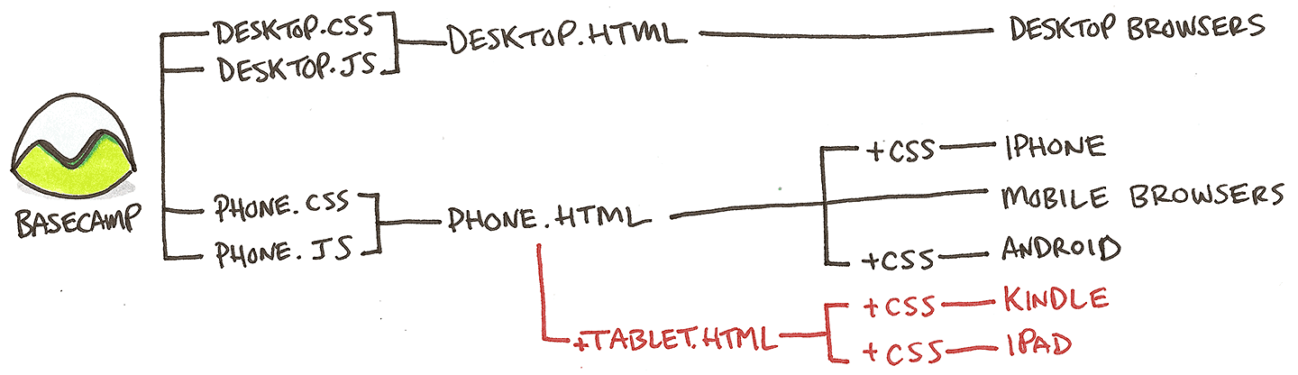
The Project screen is one place where we made that trade and it’s also a great way to see all of this in action. It has a unique design on desktop, phone and tablet. The tablet design is further enhanced when the tablet variant knows it’s rendered in our iPad app. To do that Basecamp for iPad has a unique user-agent string and declares itself (and certain capabilities) by setting classes on the HTML element when containing the mobile web views. Here’s the diagram from before with the tablet variant added:
How we got here (on the cheap)
Basecamp for mobile web was a by-product of building Basecamp for iPhone with just one designer and one programmer. That existing foundation gave us a huge leg-up when it came time to bring Basecamp to Android. Because we had a ton of work already done in the web views we could spend time focusing on improvements just for Android. We crafted CSS to make the web views feel more at home on the platform and leveled-up with an even more native hybrid navigation. A team of two full-time programmers and a half-time designer made Basecamp for Android in about 6 months.
Basecamp for iPad’s team was the same size. Their by-product, the tablet variant for iPad actually debuted months ago in Basecamp for Kindle because Amazon’s HTML5 Web Apps let a lone designer package that up in a few hours. We’ll be able to use the tablet views again when it’s time to improve support for Android tablets.
That’s not to say our approach is only about repackaging the web views. Relying on the web core allows to to spend our time on something other than reimplementing the same features for yet another device. The Basecamp for iPad team added new features like editing individual comments which also arrived on iPhone and Android because the feature was built in the web views. And we continued the progression we started on Android moving navigation and actions from the web views into the native wrapper where users expect them. iPad further leveled-up by introducing a fully native UI for working with to-dos. Because so much of the work was already done, we had the freedom to add features not available in mobile browsers like drag-reordering which opened us to up a rich single screen UI for managing your to-dos. It’s a huge improvement.
The Future
Basecamp originally launched in 2004, re-launching in 2012 as a completely new product with a ground-up redesign. It’s always been primarily a desktop experience for our customers—people at their desk getting things done. But that is changing as mobile becomes more a part of people’s lives and even more so as the line between desktop and mobile becomes meaningless. In the future everything is just a computer and they’re all quite capable.
Basecamp mobile in all it’s permutations today is still an add-on to this desktop app. It makes some fundamental assumptions about what was possible and practical on phones when it was released (Basecamp mobile launched when the iPhone 4S was top of the line) and there are features in the desktop version that may never make it to mobile because they’re technically or conceptually impractical. There’s nothing wrong with that, of course. 100% feature parity shouldn’t be the goal. Every device, platform, and situation has its own forces, constraints and jobs that affect the design. Basecamp for iPhone, for example, has a very tight feature set compared to desktop but customers find it useful because it has the right set of features.
Today’s devices are larger (phones) smaller (tablets), and most importantly more powerful. HTML, CSS and Javascript performance are better than ever, the future looks especially bright for hybrid web apps on the latest versions of iOS and Android. Practical compromises in 2012 might be irrelevant today or in the very near future.
So how might we do things differently if we started from scratch today? One option would be to make the phone variant the golden path. Perhaps instead of being completely separate, desktop could work more like today’s tablet variant layering enhancements on top of phone. Here’s how a more adaptive and additive approach might look:

This approach makes more sense as computers and mobile devices converge in terms of capability. Plus designing for a small screens first has numerous benefits that push up into the tablet and desktop designs. It’s so much easier and more effective to adapt designs and features to a more spacious and resource rich environment than it is to squeeze them into a smaller container. Just like it’s easier to move your living room furniture from an apartment to a house than the reverse. In the later case you might have to get rid of a few pieces or replace them with simpler versions (Where’s my recliner? Useless!). Sound familiar?
Even as an add-on this hybrid approach has made it possible for us to deliver a lot while staying small. We’ve learned a ton along the way and I’m excited to share this look at where we’ve been and where those lessons could take us. Thanks for reading!
Lee
on 31 Jul 14When I look at the 4 screens in the images provided, my first thought is why don’t you just take the effort to go responsive? All the screens look identical except for ‘high level’ layout so save your variants for layouts if you have to.
JZ
on 31 Jul 14Because simply making the layout responsive would have also meant that phones still had to download and execute the CSS and Javascript from the desktop site. The mobile optimized HTML, CSS, and JS we get using the above approach are a small fraction of the size of their desktop counterparts.
We wrote about this with details examples awhile back: /posts/3269-behind-the-speed-basecamp-mobile
Devan
on 01 Aug 14Interested to hear how you do the device detection. Do you run detection on every request from the browser, or just once and then set a session variable to make further renders quicker? Or is this something handled deep within the Rails framework (Apologies, I am a Sinatra guy, not Rails) :)
Faruk
on 01 Aug 14Did you use Rubymotion at this process ?
Note: Ryan had written that the app is built in rubymotion.
JZ
on 01 Aug 14@Devan we have very simple detection in a Rails controller that happens server side. I say simple because we’re not worried about very specific devices. Instead we’re checking the user agent for things that are very clear indicators of mobile something like: /(iPhone|iPod|iPad|Kindle|Android|Windows Phone|BlackBerry|BB10.*Mobile)/. We’re do very little with the complexity that requires us to fork behavior for specific devices.
In the case of our native apps we can send a custom user agent string with more information about the specific device and its capabilities. That let’s us confidently level up for those devices.
@Faruk Basecamp for iPhone was made with Rubymotion. The iPad version is a separate app written in Obj-C in Xcode.
MDS
on 01 Aug 14Thanks for sharing – this concept has been “stuck” in my mind since the post about Basecamp for Android. I really liked the detailed breakdown of the views and how that works for each platform.
Would love to see some of the “guts” from the client side. You mentioned that you add extra data to your views for the iOS version (`data-replace-sheet`) – is it a similar approach on the Android client to creates the navigation/ActionBar? I assume there is some magic happening with the Javascript/WebView bridge, but would be keen to know more.
Matt De Leon
on 01 Aug 14Great read. Phone-first approach seems interesting but ultimately where you start depends on what you need to ship first to customers. I recall an earlier SVN article about skipping phone-first because it just wasn’t needed to launch.
Also, 6 months to build an Android app could seem long or short. It seems fast given the breadth of functionality, but maybe long given the re-use of code from the iPhone version. What were some of the challenges specific to Android?
Nihar Sawant
on 04 Aug 14I need to create an iPhone app but my sources are limited and I have little knowledge about iPhone Development. After reading and trying ‘real-world’ app like Basecamp on iPhone, it gave me huge confidence to go for Hybrid Development. Thank you very much for that.
I went through some articles you have published on Hybrid App Development. In one of the articles – Backstage: Basecamp for mobile you have mentioned ‘Less Javascript, No Framework’. How did you achieve this? I am dependent on AngularJS and developing an app in ‘stone-age’ Javascript from scratch seems quite unrealistic; especially while making ajax calls, maintaing models or URL handling.
It would be great if you can share more about architectural pattern followed by these apps.
JZ
on 04 Aug 14@MDS – that integration is a work-in-progress. The ‘data-replace-replace’ sheet is the first generation implementation. It’s a special behavior the iPhone app looks for in the DOM to trigger a specific native behavior. We use a similar approach in Basecamp for Android where buttons in the web views have special attributes that are identified in the DOM for special handling. For example an “Edit comment” link in the web view knows about permissions so the native app doesn’t have to implement that feature. Instead if the link is present in DOM, then the native app adds it as an action on the action bar. For iPad we’ve leveled up on the approach again. In this case, Javascript in the web views finds the native-capable actions and exposes them to the host app via a JSON response. This is a more agnostic approach that will let future client apps opt-in to features it can replace or enhance rather than having to make special cases for each platform.
“What were some of the challenges specific to Android?” @Matt De Leon – the biggest challenges were learning the platform. We had no experience so we had to learn everything. The programmers on the project started from scratch and we had a lot to learn on the design side, too. We didn’t want to simply port the iPhone app but instead really embrace the platform and make something that felt at home on Android. It turns out that Basecamp’s deep, hierarchical structure is well suited to Android—maybe more so than iOS which favors flat, linear navigation. I personally wasn’t a full-time Android user before taking on that project so I came at that fresh in that respect, too.
@Nihar Sawant – that’s awesome, you should go for it. There are a couple of keys to using plain old javascript. 1.) We’re rendering HTML on the server so modeling and URL handling aren’t necessary. Since that article was written we have did add Underscore.js primarily to support date handling in the calendar. 2.) Remember that javascript support in mobile browsers is quite modern and many frameworks are used because they’re good at supporting less modern browsers. When you’re developing in the mostly WebKit world of mobile, you don’t need all those fallbacks and polyfills. http://youmightnotneedjquery.com
This discussion is closed.