You’re reading Signal v. Noise, a publication about the web by Basecamp since 1999. Happy !

Jason Z.

About Jason Z.

Jason Zimdars joined Basecamp in 2009 as a UI designer. Most recently he worked on Basecamp for iPhone and iPad. He thinks about Basecamp constantly.

Design Decisions: Basecamp for iPhone iOS 7

Jason Z.
Jason Z. wrote this on 8 comments

Today iOS 7 arrived and along with it our freshly updated Basecamp for iPhone. Perhaps there were some existing apps that just worked on the beta releases of iOS 7 but Basecamp wasn’t among them. And while we knew some under-the-hood changes would be required to support the new system, we didn’t anticipate changes to the design or how much we’d like them.
Here’s a quick before and after look at what’s changed.
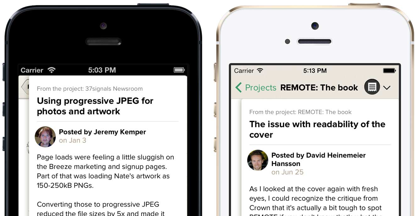
Navigation bar

Basecamp was already using a tinted stock navbar so updating to iOS 7’s aesthetic meant embracing the flatter look and borderless “Projects” button. Tinting the button green was a nice opportunity to add some personality and expand our already-in-use color for tap highlights. We weren’t happy with the default opacity and blur effects when scrolling content up under the navbar so we created a custom background image with a very small amount of translucency. It’s a similar but subtler effect.
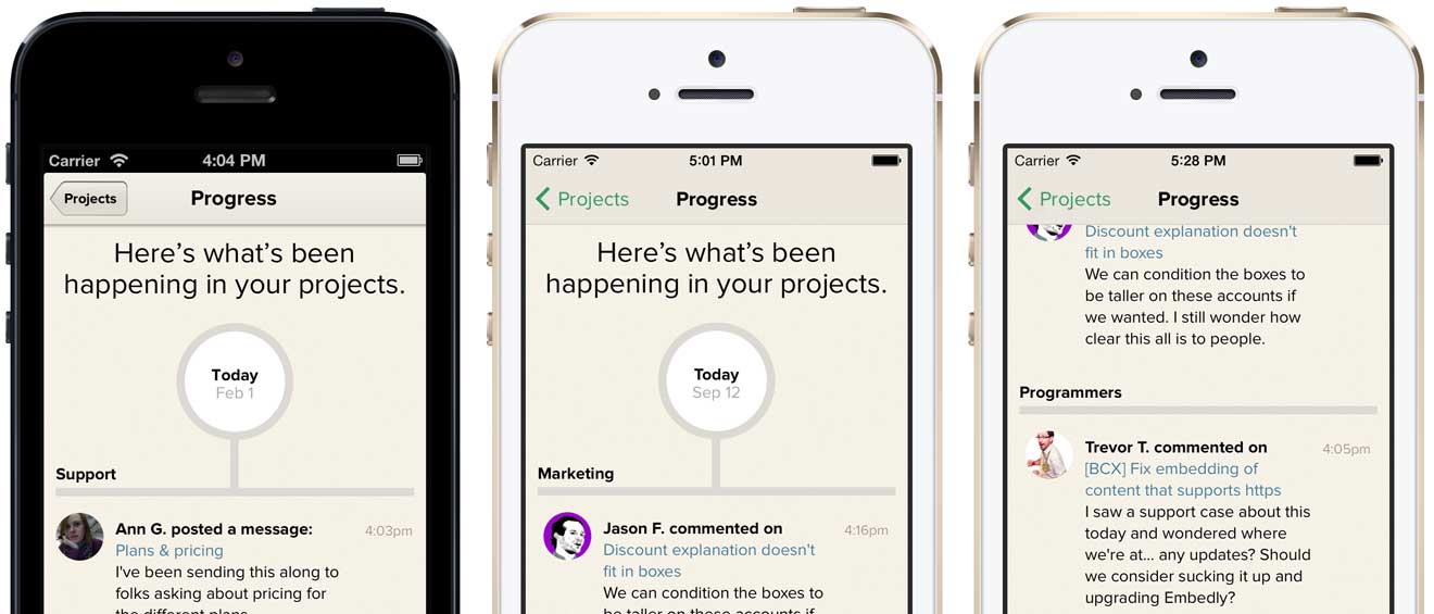
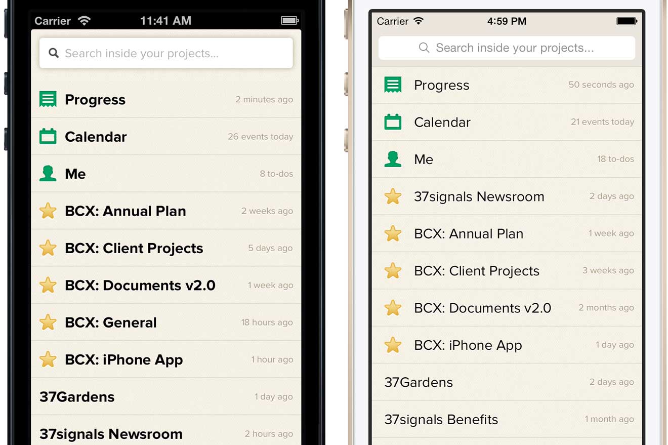
Page stacking

Arguably the most unique part of Basecamp for iPhone is the page stacking navigation. As you tap through projects, new sheets stack on top of the one you were looking at before. Getting back to where you were is simply a matter of swiping the sheets off the top of the stack. It’s a unique and intrinsic part of Basecamp.

In the iOS 6 app stacked sheets overlapped the navigation bar but that design didn’t work with the way content now scrolls underneath the navbar and status bar in iOS 7. Updating the design so that sheets tucked under the navbar felt like a compromise at first glance but we’ve come to realize that the page stacking metaphor is still intact—with the added benefit that you can now access the project menu anytime and jump to another section without first dismissing the stack.

Typography

Proxima Nova is a strong part of Basecamp’s identity so there was no chance we were going to switch to iOS 7’s default Helvetica Neue, but that’s not to say we weren’t influenced by iOS 7’s lighter sensibilities. In general, the system seems to avoid multi-facet contrast by tending, for example, to rely on just type size or color when iOS 6 would have created contrast with size and color and weight. The lack of that heavy navbar, in particular, seemed to free us from the bolds we used on the project menu. Basecamp is improved by embracing these cues from the OS.
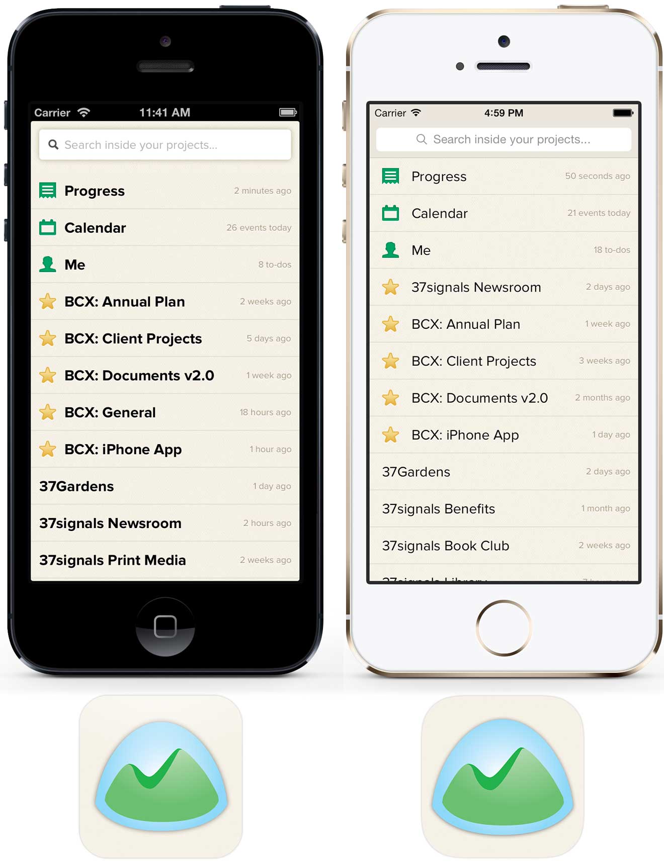
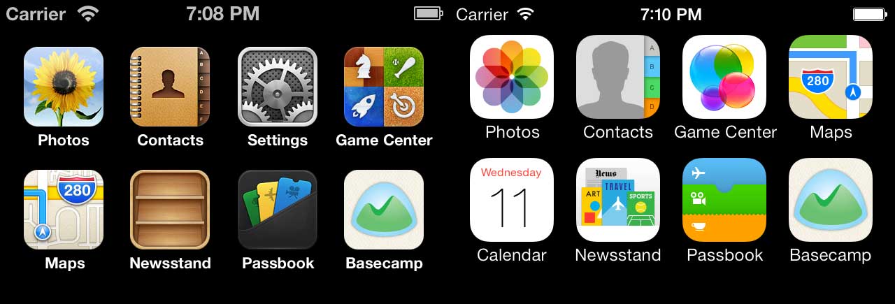
App icon

The new icon designs for Apple’s built-in apps might be the most discussed change in iOS 7. While we didn’t attempt to flatten the artwork or brighten the colors, we did enlarge Basecamp’s logo inside the icon bounds. The larger logo looks better inside the new rounded rectangle radius and feels more at scale with the built-in app icons—it just reads better. A very small change that makes Basecamp feel more at home on the new OS.

We’re still getting cozy with Apple’s newest OS, but right now everything feels fresh, light and new. The newly updated Basecamp for iPhone was released today alongside iOS 7. Be sure to get the latest version when you upgrade or when your shiny iPhone 5s/5c arrives on Friday!

Download on the App Store
chrome-buttons.png

Recent versions of Google Chrome on OS X mangle native input buttons. I don’t know precisely when it started but no amount of CSS brute-force seems to correct the text alignment. Have you found a work-around? Do you know a little birdie on the Chrome team?

(Update: Paul Irish kindly responded and filed this bug on the Chromium project.)

Jason Z. on Apr 25 2013 6 comments

Embracing slow time

Jason Z.
Jason Z. wrote this on 23 comments

When you work in a traditional office and have a question, instant gratification is hard to resist. It’s so easy. Just stumble over to a co-worker’s desk, make sure they stop whatever it was they were doing, blather on until the lights of recognition come on in their eyes, then await the answer. Unless your query concerns inflammable materials currently engulfed in said flames you’ve likely wasted their time – in fact, you may have even wasted your own.

One of my favorite side-effects of working remotely is the way slow-time communication forces you to stop and think before you speak. When I have a question for one of our programmers, for example, here’s a bit of what goes through my head:
How should I ask this question? He’s online, I could just send a quick IM…
...but is this important enough to risk interrupting with an instant message? No. I’m not even sure I can even explain it one line at a time like that.
What about email? Nah. It’s about some specific code, maybe I should ask on Github.
It’s complicated. How can I explain this as directly as possible? I can post a comment right on the helper method…
...but is the problem really in the helper or is it because of the collection set in the controller? It’s definitely in the controller, let’s start there. Wait a second…!
It’s usually at this point that I either figure out the answer for myself or come up with a new way of considering the problem, never having to even ask the original question. I didn’t bother my co-worker, I didn’t look like an idiot trying to articulate the question on-the-fly, and most importantly I figured out the answer!

People who struggle to work remotely often bemoan the lack of in-person collaboration jumping from this tool to that tech in an effort to recreate the magic that only happens when we’re all in the same room. There are definitely advantages to face time, but too often it seems like facial expressions and waving arms are substituted for clear thought and courtesy.

The next time you have a question for a coworker, try writing it out as if they were 1000 miles and 3 time zones away – even if they’re sitting right next to you. You might surprise yourself with the answer.

Design decisions: Projects on Basecamp for iPhone

Jason Z.
Jason Z. wrote this on 6 comments

Designing the mobile version of an existing app is about so much more than screen size.

The fundamental concept of the new Basecamp is this: a project on a single page. Projects resemble a nicely organized paper document with wide margins, familiar proportions and plenty of white-space. In a glance you can see what’s happened in the project, what’s left to be done, and any relevant files. You can almost imagine peeling the sheet off the screen and handing it to a co-worker to get them up to speed. It’s an iconic design.

We knew that this design would be instrumental in making Basecamp for iPhone feel like Basecamp so it’s no surprise that we attempted a very literal reproduction in an early version of the app.

It’s all here: the clean, white sheet topped with the project’s name followed by sections with snapshots of the latest Discussions, To-dos, Files, etc. A virtual clone in smaller package. We were pretty happy with this mini-me design for awhile, but the story doesn’t start here.

Continued…

Writing tip: say the opposite

Jason Z.
Jason Z. wrote this on 10 comments

Here’s a great bit of advice from Jakob Nielsen’s 2001 post about writing company taglines:

…look at how you present the company in the main copy on the home page. Rewrite the text to say exactly the opposite. Would any company ever say that? If not, you’re not saying much with your copy, either.

Great copy doesn’t remind people what they already know and expect about your product, it tells them why they should care.

Read this: Revising Prose

Jason Z.
Jason Z. wrote this on 4 comments

There are plenty of books that will teach you to be a better writer, but I’ve never found one so immediately useful as Revising Prose by Richard A. Lanham. Following along as Lanham revises example upon example of real world writing is like exercise for your writing muscles.

My favorite takeaway is this tip for improving the rhythm and cadence of your writing. Many of us have learned to read text out loud as a method to reveal awkward transitions or generally dull passages, but you can also spot poor rhythm visually. A red flag for dull cadence is a run of sentences that are all of similar length. Try adding a carriage return after every sentence or phrase, the rhythm is evident:

Diagramming sentence length: dull vs. dynamic

While other books have increased my knowledge of writing, Revising Prose changed the way I write and how I think about writing. Buy a copy at Amazon.

Most artists and designers I know would rather work all night than turn in a sub-standard job. It is a universal truth that all artists think they a [sic] frauds and charlatans, and live in constant fear of being exposed. We believe by working harder than anyone else we can evaded [sic] detection. The bean-counters rumbled this centuries ago and have been profitably exploiting this weakness ever since. You don’t have to drive creative folk like most workers. They drive themselves. Just wind ‘em up and let ‘em go.


Linds Redding, A Short Lesson in Perspective
Jason Z. on Nov 2 2012 14 comments

Easy retina-ready images using SCSS

Jason Z.
Jason Z. wrote this on 16 comments

If you’re interested in adding retina image support to your website or app and you happen to be using SCSS, here’s a handy shortcut that makes it dead simple.

Just include this SCSS mixin in any rule and specify the high resolution image’s path and device independent pixel dimensions. Here’s an example:

div.logo {
  background: url("logo.png") no-repeat;
  @include image-2x("logo2x.png", 100px, 25px);
}

Putting the high resolution alternative in the same rule as the normal image instead of putting it in a separate @media query rule or in different stylesheet altogether is a big win in terms of clarity in our CSS. It’s easier to read, easier to understand and easier to maintain.

The image-2x mixin detects high resolution displays like this:

@mixin image-2x($image, $width, $height) {
  @media (min--moz-device-pixel-ratio: 1.3),
         (-o-min-device-pixel-ratio: 2.6/2),
         (-webkit-min-device-pixel-ratio: 1.3),
         (min-device-pixel-ratio: 1.3),
         (min-resolution: 1.3dppx) {
    /* on retina, use image that's scaled by 2 */
    background-image: url($image);
    background-size: $width $height;
  }
}

The mixin not only makes development easier, but it centralizes the definition of high resolution displays so it can easily be changed globally as more devices come to market. The @media query is based on the one in Thomas Fuchs’ Retinafy book but, for example, we’ve already modified it to define the Google Nexus 7 with it’s 1.3 pixel ratio as a retina-capable device.

A key insight here is that with SCSS, @media queries can be nested inside other rules. Such that these both work the same:

@media print {
  body {
    // print styles
  }
}

body {
  @media print {
    // print styles
  }
}

Purists of hand-crafted CSS may rail that this method results in the rule being repeated in the compiled CSS each time we use this mixin and that’s true. Basecamp is light on images so we’re talking about a handful of repetitions, not dozens or hundreds. It also seems likely that as SCSS continues to improve, these rules will be smartly combined. For now that trade-off is worth the improved clarity and convenience in our code.

Behind the speed: Basecamp mobile

Jason Z.
Jason Z. wrote this on 19 comments

Speed is a core value for 37signals and it’s easily Basecamp’s most important feature. When you have the luxury of that kind of focus, decisions about the product are easier to make because you have something to measure against. Will this feature make Basecamp slower? Is it worth that trade-off? So when we designed the mobile web version of Basecamp we knew that speed would be just as important as it was in the full desktop version. What was different was how we got there.

On the desktop, Basecamp’s speed is the result of some nifty tech that minimizes network requests, reduces page rendering and aggressively caches content. Moving through a Basecamp project is nearly instant as new content appears in real-time without re-loading the page. It’s great! I typically keep Basecamp open in my browser all day long as my co-workers’ activity streams in on the Progress screen.

When it came to the mobile version the goal that Basecamp should be super-fast was the same, but there were new forces at work: low cellular bandwidth, small touch-enabled screens, slow JavaScript performance, and context considerations (what’s useful and functional on mobile). It was tempting to turn to responsive design techniques on this project. Basecamp was already functioning fine on mobile browsers, but it required a lot of pinching, swiping, and zooming. CSS media queries would have let us craft a mobile layout for all kinds of devices with a limitless array of screen configurations. We’d be on the exact same codebase with all the same features – and new features would automatically be available on mobile when they launch as long as we remembered to test and optimize them.

Only using responsive design for Basecamp mobile would have been like fitting a Prius body to a Hummer… under-the-hood it would have been all wrong.

On the surface it sounded great, but there were some big problems. The JavaScript that powers the real-time feel of Basecamp is heavy both in terms of file size and resource usage. This is no problem on the desktop where bandwidth is abundant and CPUs are excessively fast, but mobile browsers aren’t nearly as capable of processing JavaScript and the initial download would have been oppressive.

Not only would the browser have to download and process all that code, but much of it would have gone unused. Making a design responsive generally means taking things away. You hide features, menu items, sidebars – anything that isn’t needed in the mobile context. They’re still present in the document and the mobile browser still has to download and load into memory all the CSS and JavaScript that defines them. Not to mention the additional CSS overrides that you added to the stack in order to define the responsive layout in the first place. Only using responsive design for Basecamp mobile would have been like fitting a Prius body to a Hummer. It might have looked like a mobile web app, but under-the-hood it would have been all wrong.

Continued…

Backstage: Basecamp for mobile

Jason Z.
Jason Z. wrote this on 27 comments

Today we announced the new Basecamp mobile, a special version of Basecamp fine-tuned for speed, easy reading and easy tapping on mobile phones and tablets. It works automatically in your mobile device’s web browser – no app needed.

Basecamp mobile devices

This has been a top request in the new Basecamp since launch and we’re really thrilled to finally deliver. It’s live for every Basecamp account today.

How it all came together

The project started from a simple need. Up until now the mobile experience on Basecamp has really meant one thing: email. Email notifications from Basecamp work great on the phone – you can even reply to them and your comment will show up in your project. But clicking a link to Basecamp on your phone was miserable. Tiny, slow and really tough to read. So we thought, What if you clicked to read a discussion on mobile and we served a nicely formatted mobile-optimized view? No navigation, no interaction, just a clean, readable page. So we set off to prove the concept. The result was an instant hit (read the discussion in our Basecamp project). The new mobile pages were even nicer to read than the email itself and, because they were plain HTML and CSS, they were wicked-fast.

So we kept proving and kept asking questions. If you’re reading the comments about a to-do you might want to see the entire to-do list, let’s see what that looks like. What if you want to see the all the Text Documents in a project – or even the project, itself? Can we try that? So we started to connect the dots, linking pages and optimizing views every time we missed something else. Pretty soon we had a fairly complete mobile version of Basecamp. It doesn’t do everything but it does a lot of what you want to do most on-the-go, without a bunch of stuff you don’t need.

Designed for the job to be done

We didn’t set out to build a feature-for-feature version of Basecamp that magically fits on a mobile phone screen. We built it for the job to be done on mobile. What you hire Basecamp to do when you’re using your computer at your desk isn’t is the same when you’re on your phone at the airport. In the evenings, I use Basecamp on my phone to see what I’ve missed. Checking the Progress timeline, adding my comments, searching for and viewing attachments – Basecamp for mobile is ideal for these tasks. By having the focus of a clear job to be done it was easy to make decisions about what to include in this mobile experience and what could be left out.

Continued…