November 30, 2004
Hollywood runs and hides
Pat Sajak (!) wants to know why Hollywood isn't standing up for their own kind after the brutal shooting, stabbing, knife-note-affixing, and throat slitting of director Theo van Gogh in Amsterdam in early November. Theo van Gogh created a short film highly critical of the treatment of women in Islamic societies.
Can you conceive of a filmmaker being assassinated because of any other subject matter without seeing a resulting explosion of reaction from his fellow artists in America and around the world?
Fair question. No, great question. What's up Hollywood?
Holiday E-Commerce Ideas
There's less than 30 days till Chrismukkah (or less than 400 days till Chrismukkah 05). Is your site ready?
November 29, 2004
Falwell on Meet The Press
Jerry Falwell quotes from Sunday's Meet The Press:
"Well, the fact that he's a gay Republican means he should join the Democratic Party." [when asked about the creator of "Desperate Housewives," a self-described conservative, gay Republican]
"I wouldn't vote for my mother if she were pro-choice."
"I'm just trying -- I'm trying to do what Martin Luther King did." [responding to a claim that the right wing wants to "privatize public policy and make public private lives"]
"Give the little babies the right to vote." [on abortion]
"If you had been the president in World War II, we'd all be speaking German now." [responding to a fellow panelist's assertion that "Jesus isn't pro-rich, pro-war and only pro-American"]
And there was also this quote from his co-panelist, Dr. Richard Land, President, Ethics and Religious Liberty Commission, Southern Baptist Convention: "We're not against women working outside the home unless the husband believes that it's not the right choice."
Noteworthy New Sites
A couple of noteworthy sites were recently launched by some friends of 37signals. Maggie, of Mighty Girl fame (well, famous among dozens), is behind the shopping blog Mighty Goods. My first Mighty Good purchase: this Universal Travel Adapter, on sale for only $10, which did a fine charging job for me during a recent trip to Europe.
Closer to home, the fine fellows at skinnyCorp launched 15 Megs of Fame, a site that gives listeners a free way of discovering new music online. It also collects listener ratings in order to create a "robust recommendations engine."
Confidence at SurveyMonkey
SurveyMonkey provides a list of their competitors at the bottom of their pricing page. They're confident that they have an excellent product at an excellent price point, but they want you to make up your own mind. That's calm confidence. Would your company ever do this? If not, why not?
November 26, 2004
Are. Taglines. Dead.
This is really eerie... I was just going to post about how some of today's leading brands don't have taglines, but John Zagula, co-author of The Marketing Playbook, beat me to it.
For what it's worth, I'm thrilled to see some big influential brands blowing off the tagline. They're usually BS, except for the occasional needle-in-a-haystack "Just do it" gem. It's odd that something that rarely hits the mark is often front and center in a brand's marketing message. And doesn't the fact that many companies change their taglines so often reinforce their ephemeral nature? If it's important enough to go right under your logo and your name, why does it change so much? Does your logo and your name change that often too?
Side note: When we first launched 37signals (with our Manifesto), our tagline was "Simple for sale." However, we didn't use it much and had some others that we liked so we decided to just share our entire list instead. Oh yeah, and here's some tagline love from the gurus over at eNormicom.
November 25, 2004

November 24, 2004
WIRED... Brought to you by Best Buy

I've been a fan of WIRED's most recent redesign since Doug Bowman first unleashed it in 2002. It was one of the first high-traffic sites to embrace web standards and throw table-based layouts out the window. And now WIRED appears to be pushing the envelope again: Using the flexibility of their CSS-based design, WIRED now brands its site with the colors of a lead sponsor (in today's case, Best Buy).
There's been a lot of discussion here lately on the merits of advertising across various media, most recently regarding RSS feeds. I'm curious to see what the response is when a very prominent technology weaves the look of a large sponsor into the very fabric of its web presence.
Interfaces and Time
I've come to realize my cell phone sucks. For example, whenever I choose a text message recipient, my phone prompts me to choose between all the numbers listed under that contact. Unfortunately, it just lists the numbers without telling me which one is cell, office, or home. I have to either know or guess. That's just plain dumb.
It got me to thinking about interfaces and time. You really need to live with an interface in order to assess it properly. Sure, you can judge aesthetics immediately. But, often, the only way to realize whether an interface is truly successful or crappy is to buy and use the product for weeks or months. And by that time, it's usually too late to do anything about it.
Even product reviews suffer because of this. Reviewers usually use a product for a day or so and then write a review. But the impact of annoyances like extra required clicks or missing icons can often take weeks to sink in.
It's no wonder interface design often gets short-shrift from the suits. It's a long-term customer satisfaction factor in an arena that's focused on short-term sales success.
November 23, 2004
New Basecamp permissions
![]() A quick Basecamp update... Based on extensive customer feedback, last week we launched a brand new permissions system that allows you to give your clients the option to post to-dos and milestones. Prior to this, clients could only post messages.
A quick Basecamp update... Based on extensive customer feedback, last week we launched a brand new permissions system that allows you to give your clients the option to post to-dos and milestones. Prior to this, clients could only post messages.
In addition to posting their own to-dos and milestones, clients can also complete (or check off) to-dos and milestones that are assigned to them.
This brings Basecamp closer inline with our big picture vision that Project Management is Communication. And, since communication is two-way, we wanted to give people the option to get their clients more involved.
Here's some more info on the new permissions system, or try Basecamp free and experience it first hand.
How Do You Think The Deer Feel?
Quotes from an AP story on the recent shootings in Wisconsin:
"When you're hunting you don't expect somebody to try to shoot you and murder you...You have no idea who is coming up to you."
-Bill Wagner, a hunter from Oshkosh
"A lot of hunters' morale around here is really low...They don't really feel the joyous time that the hunting season is around here."
-Jay Koenig, a hunter from Rice Lake
November 22, 2004
Uncontrolled overexposure burned the donut
Looks like the darling of just a couple of years ago is experiencing a reversal of fortune. Krispy Kreme, the company and stock everyone thought was a sure bet (I mean, come on, this is fat America and we love our donuts), is turning out to be a dud.
Atkins definitely hurt, but I think it's more than that. The article suggests:
Some investors have also said company expanded too quickly and that its doughnuts lost some of their cache once they were sold in places like supermarkets and convenience stores.
I think that's a big part of it. By putting their prepackaged donuts in supermarkets, airports, and convenience stores, they've really hurt their brand. They're unable to control the experience anymore. Anyone who's been to a KK store knows the magic is in the hot donut. But, when they are prepackaged and left to sit on a supermarket display they just lose their luster. And that definitely hurts their brand. The "DAMN these are good donuts" response turns to "Umm, I remember these being better." And that's not the response you want.
I sure hope they can stage a comeback, cause their "concept" is genius (hot tasty donuts you can watch being made on a fascinating machine -- how American is that?!), but as a corporation they definitely need to go on a diet before they're back in shape.
Product plug: Campaign Monitor
We recently switched from Topica to Campaign Monitor to manage our email newsletters and mailing lists. We couldn't be happier with it. If you manage a list you deserve to be happy too (cause, let's face it, list management can bring you down). CampaignMonitor can get you there.
From the beautiful interface (they even use the Basecamp-inspired Yellow Fade Technique and Blank Slates), to the elegant reports, to the overall intuitiveness and ease-of-use so often missing in newsletter/list management software (including most web-based solutions), we have to highly recommend giving them a look.
Plus they have an interesting pricing model. There's no monthly fee -- it's just pay per use ($5 plus a penny per recipient). Neat idea.
Finally, they built this product because they needed it. And when people build products that they 1. need, and 2. know, and 3. care about, they always yield better experiences. Do check them out.
November 19, 2004
You lose the hill
"You should never build on top of something directly. If you build on top of a hill, you lose the hill." -Frank Lloyd Wright
November 18, 2004
43 Things, the pre-launch
So, for the past couple of months we've been working on a top-secret client design project for some robots in Seattle (hey, there they are! and, wait, didn't some of those guys work at Amazon?). We've been taking on less client work lately so we can focus on our internal projects/products, but this one was too interesting on a personal and professional level to pass up. Plus we like companies with numbers in their names.
So, what is this thing? Well, the full site will be launching soon, but today they launched their teaser site code-named "Twinkler" (yes, after the pony). Have a look and play around a bit. Do a little "goal shopping." And, while you can't do much yet, you can certainly get a head start on thinking big (which is what the site will be all about).
Over the next 43 days the Robots will be letting more information out and slowly inviting people to jump in before the launch. Here's what the robots say about it. If you're looking for more clues, read up on the age of the amateur by Josh Petersen.
November 17, 2004
Long Copy vs. Short Copy
MarketingExperiments.com recently set out to see what impact the length of sales copy has on a website's conversion rate. The results: long copy clearly outperformed short copy in all three of their tests.
This is something we've wrestled with at BasecampHQ.com. We like to be as descriptive and informative as possible. But there's a downside to this approach. Many visitors are intimidated by large blocks of text and just tune out the site and the tool when they see long copy. We've heard from some visitors that a large amount of copy can make the tool itself seem complex (i.e. if it takes this much text to explain it, can it really be simple?).
Other online tools have taken a less-is-more approach for their home pages. Blogger and Flickr both give only minimal info upfront and try to get visitors right into using their respective tools. This is fine for those already familiar with what these sites offer. But how about those who don't know much about what's happening at these sites? Are they turned off by the lack of a lengthy upfront description?
We recently decided on a hybrid approach for BasecampHQ.com. It's more of a two-level presentation. Up top is a quick summary that gives a few bullet points and lets people dive right in. Below the summary is a more lengthy explanation of what Basecamp is and why it's cool. It's a lot of text but we think it really helps define what Basecamp is and why it's different than other tools out there.
Of course, the bottom line isn't whether your copy is long or short. It's whether it's good or bad. As MarketingExperiments.com writes:
The long vs. short debate often overlooks the most important factor when it comes to website copy: quality. High-quality short copy will outperform poorly written long copy every time. The best possible copy should be developed and tested before you even begin to worry about the long vs. short debate.
November 16, 2004
RSS Ads
Anyone who subscribes to our RSS Feed will notice that we're now running targeted ads every 3rd post. The ads are provided by Overture and powered by FeedBurner. RSS-based ads will become the norm soon so we're excited to be involved in this pilot program and look forward to seeing how it works out.
November 13, 2004
Elusive Humidity II
About this time last year I posted about the trouble with most humidifiers. Well, I finally found that perfect one -- the Venta Airwasher (you can buy them at Bed Bath & Beyond or direct from Venta). Nice and quiet, good design, solid German engineering, super easy to clean, no wicks/pads or white dust, has a 10-year warranty and purifies the air as well. Its simple, unique technology isn't just different, it's better. Definitely more expensive than the rest but I've learned that with humidifiers you get what you pay for. Highly recommended.
November 12, 2004
The Clip-n-Seal design contest
Our friends at Clip-n-Seal in Seattle have teamed up with IDFuel to launch a design contest. Contest participants are encouraged to design a new, interesting or unusual Clip-n-Seal product concept (you know, something other than this). Here's a sample concept to get your creative juices flowing. Good luck!
November 11, 2004
Writeboard Preview: Easy time-based versions
 Today we unveil the first little Writeboard preview -- simple time-based version tracking.
So, we'll be talking more about exactly what Writeboard is and what it does shortly, but for now let's just say it's a simple web-based collaborative text editor that's tailored for editing smaller "chunks" of text and not complex 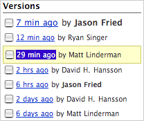 multi-page documents. Most of the collaborative writing people do is just on a paragraph or two of text. And often times it's just a few lines or even just a one or two word product name.
Now, if you collaborated on text with others, or if you edit your own text alot, you've probably run into the situation where you've wanted to jump back a few versions. Sure, you can hit Undo a bunch of times, but then you have to hit Redo a bunch of times to get back to where you were. And, then if you only want to jump back a few versions, and then ahead a version, it's easy to lose track of where you were and what your latest version was. You know this.
Sure, you could save different versions of the document as separate files with separate version numbers, but you know how much of a hassle that is. Opening multiple files, figuring out what's different between them, and then keeping track of verison numbers isn't something you should have to worry about when you are writing. Writing and editing text shouldn't require file management skills.
In with Writeboard. Writeboard lets you save as many versions of a document as you want and they are always listed right there in the sidebar. The one you are on is highlighted and they are automatically sorted by relative times (with the most recent version on top). This lets you quickly jump back to that version you did "two days ago" without having to remember if that was version 1.07 or version 1.11. Further, if you are collaborating with multiple people, their names are attached to the versions so you can quickly see who's written what.
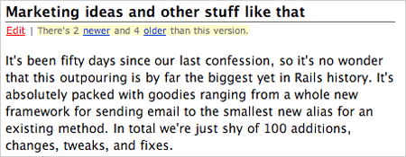
Writeboard also provides an easy way to move through the different versions of a document without having to go to the sidebar. The header of each Writeboard document has a little area that says how many versions are newer and older than the one you are currently viewing. Click "newer" to move forward in time, and "older" to move back in time. It's really simple and fast.
We'll have a lot more to share shortly so stay tuned. And Writeboard will be available really soon. Sign up for the announcement list to be notified the second we launch.
Until next time...
November 05, 2004
Sorry to fan the flames here...
...but I don't think I've read anything more, to use her word, ignorant in a long time. And I love how this story is preceded by: "Slate asked a number of wise liberals to take up the question of why Americans won't vote for the Democrats." Do you think wise people really act like this? Calling others ignorant, unteachable, predatory, resentful, amoral, avaricious, and arrogant cheats? I guess we have different definitions of wisdom.
Come on Adobe
What's the deal with Adobe? I buy the new version of InDesign online, but in order to download it I have to first download the "Adobe Download Manager." Then, when I run the Adobe Download Manager it tells me all my web browsers need to quit before it can download InDesign. InDesign is 400 megs so it's a long download -- and I have to keep my browsers closed during the entire process. What the hell is that? Then, after I download it, I run the updater to update my copy of InDesign 2 to InDesign CS and it tells me I need to quit all my applications. So, I have to quit everything and stop working in order to just update InDesign? What the hell, Adobe? I'm filing this one under a really bad customer experience.
November 02, 2004
VOTE! VOTE! VOTE!

A great use of Basecamp milestones, by Johnathan Hudson. Civic duty completed.
November 01, 2004
What the country looks like on Nov 2
The size of each state is distorted to emphasize its share of electoral votes.
Coming soon: Writeboard (write, share, revise, compare)
Since this should be a slow news week, we figured we'd preannounce our next "little" thing: Writeboard.
Writeboard is a web-based hosted service that lets you write, share, revise, and compare. I'm not going to go into details, lest I give away too much too early, but I will say it's quite useful and we think you'll like it. And, just like Basecamp, there will be a free and pay version -- with a twist.
Just as we did with Basecamp, we'll be posting feature/benefit highlights here on Signal vs. Noise leading up to the release. And when we launch we'll launch for real, none of this beta stuff.
So, go sign up for the announcement and we'll let you know when we launch. Writeboard is coming soon.
EXTREME Cluster Ballooning
Up up and insane. Well, I guess why not (40 balloons are better than 1, right?), but wow there's something too "circusy" about that.
"Usually, the pilot tries to head away from cities and particularly airports, toward areas where there are suitable fields for landing"
Usually?!
[via Coudal]