July 31, 2003
Old Posters Don't Die, They Just...
It is with regret that I wither into my previous existence on this site. Thanks for the opportunity to present usability/design issues that are important to me. With the exception of that damnable cow thing, I did try to stick to usability/design topics. Hopefully you found the topics valuable as reference material, and as an opportunity to discuss.
When you work for a company that has an homogenous, slow-changing user group that numbers more employees than work at Microsoft (which I find strange), you do tend to get a bit myopic. As such, I welcome the different points of view that are expressed daily on SVN.
The Web revolution has been over for a while, and after a couple of years of stagnation, the Web evolution is kicking in. It will be important to continuously question standards and research, update skills (both methodological and UI development), and never give up hope that user-centered design will someday become the process and not just a tool.
July 30, 2003
WebAIM Screen Reader Simulation
To give you an idea of how a screen reader functions, WebAIM (Web Accessibility in Mind) has produced a simulation with three tasks to complete using screen-reader-like functionality.
The example they use is made up (the University of the Antarctic), but it should give you at least a small "look" into what it is like to navigate the Web via a screen reader.
They also have a cognitive disability simulation, and a low vision simulation.
July 29, 2003
A Battle on the Verizon
As part of our search for the new member of the 37signals team, I asked a select group of finalists to redesign the Verizon Wireless homepage in 5 days (note, the home page I linked to was the original one they were asked to work from -- Verizon has since redesigned their home page). I gave them no directions -- except to make it better in their eyes.
The goal was to see: 1. Their design skills in action, 2. Their thought process (what's important, what isn't important, how should the page be prioritized, etc.), 3. How they worked with little to no direction, and 4. How they worked in a high pressure, quick deadline environment.
Well, now that we've added Ryan Singer to the 37signals team (more on Ryan shortly), I thought I'd share the designs and open them up for discussion (permission was granted by the designers). The designs themselves are anonymous so I'd appreciate if the designers would keep them that way (at least for the next few weeks). Also, some designs were submitted with detailed documentation of the design process, while others were submitted with a simple link. For this review I've chosen to just display screenshots of the final design comp. Thanks to everyone who was involved -- you are all very talented professionals. We will definitely stay in touch.
Design 1, Design 2, Design 3, Design 4, Design 5, Design 6, Design 7
Double Tab Sets?
I linked to an article at Mark Simonson's site on the Arial-Verdana thread and noticed the designer has some nifty retro-looking fonts and logo designs.
It was curious to see a double tab set layout (top and bottom) on some font pages too. Though the triple tab set layout seems like a bit much.
Button Mix
You know those short musical snippets that NPR plays between stories? They're called "buttons" and you can listen to a selection of NPR directors' favorite ones -- the full length versions -- on the current version of All Songs Considered. You can listen in Real Audio or Windows Media.
Arial vs. Verdana
We're curious... Between Arial and Verdana, which HTML-based font do you prefer online? Which do you think is more readable? Which do you think is cleaner? Which do you think is better for a web-based e-commerce UI? This is across the full spectrum of common sizes you'd find online (from small 9 point to large 20+ point). And, when you leave your comment, please let us know if your browser renders aliased or anti-aliased text. Thanks.
July 28, 2003
Armstrong Makes it Five
The Washington Post (brief registration) showcases an editorial by Lance Armstrong's co-author in Extra Ordinary in Ways Unseen:
Lance serves no purpose if people think that he survived cancer or wins races solely through some specialness, some rare gift. The most useful purpose he can serve is to tell people it's an absolutely universal human experience to be tired and ill. So "hero" is simply not a word that he's very interested in.
For those of you who closely followed this year's Tour de France, it was a case study in tenacity, sportsmanship, and suffering. Americans may not hold cycling as high in their minds as baseball, football, and basketball, but Lance Armstrong deserves every bit of praise he has received for his efforts over the past decade. In a sport where athletic ability and teamwork usually win the day, Armstrong has demonstrated that true greatness requires far more.
July 26, 2003
Taco Bell's Gas Promotion
Taco Bell is running a new promotion where you can win free gas. Insert joke here.
July 25, 2003
Product Tours
Anyone have any great examples of HTML-based product/site tours? For now I'm not interested in flash-based tours, but if you have a really good one, please post it too. Thanks.
July 24, 2003
Lobster Tracking
Who caught that (sensual?) lobster that you're eating? You may be able to find out at LobsterTales.org which attempts to trace a lobster's journey from lobsterman to diner.
July 23, 2003
Complete and Udder Waste of Time
Okay, there's been waaay too many design/usability topics (even for me) here lately. And even though it isn't Friday, I encourage you to spend at least 3 hours today making this cow dance.
This has been around for a while, so you may have seen it, but they do have new stuff. Heck, I probably like it because the site's name matches closely with my online bunburyist name.
Note: If you run Safari, and block pop-up windows, turn that feature off.
Smart Product Alert
Recharge your cell phone over USB. Smart product.
Usability tip: Pad Little Links
Small text links like numbers or short verbs may serve an interface well but make for tiny mouse targets. While working on a new 37signals service (codename: Misto), we found that adding some CSS-based padding helps people activate the target 4px sooner than expected.

PDFs: Adobe's Robert McDaniels vs. Jakob Nielsen
McDaniels offers a point-by-point rebuttal of Jakob's July 14th assertion that PDFs are unfit for human consumption. This is McDaniels' second rebuttal -- the first one was published back in June of 2001. Thoughts? [Link via Webword]
July 21, 2003
Announcing BloggingWorks Business Blogging Workshops
We're teaming up with our friends at Coudal Partners to offer BloggingWorks -- full-day workshops on the rapidly growing Web trend of business blogging. So far we've scheduled two dates: September 19 and October 3rd. Each workshop is limited to 30 people. The workshops will be held in Chicago. More details are available at the BloggingWorks site.
More and more businesses are reaping the rewards of business blogging, like increased project management efficiency, stronger team communication, and timely site updates. If you don't know how business blogs can help your company, it's time to get up to speed at a BloggingWorks workshop.
Anil Dash, VP of Business Development at Six Apart (makers of Movable Type and the upcoming Typepad -- both of which we'll be discussing in our workshops), said about BloggingWorks, "I can't think of any two companies more appropriate for running these events." Thanks Anil!
July 20, 2003
Dasher comes to Mac OS X
Some of you may have seen Dasher, an ingenius predictive text-entry interface geared for the disabled. A Mac OS X version is now available in addition to the existing Windows, Linux, and Pocket PC ports. Great stuff.
July 19, 2003
Common Cents
I really enjoyed this post over at Kottke's site. There's definitely some good lessons to be learned here -- especially "People trust you when you trust them." I'd also wager that there's a positive side effect to Ralph's technique: a good amount of people probably don't even take their change -- they leave it as a tip. Unfortunately I don't think Ralph's "I trust you to make your own change" concept would scale well, or be all that appropriate for a smaller-volume, larger-staff business. But, the trust, speed, and innovative way to build regular customers lesson is a valuable one. After all, for many people donuts and coffee are commodity items. And, in today's price-competitive global economy more and more products (and services) are becomming commoditized. Ralph has found a way to differentiate his product through speed and respect -- two things early morning (read: rushed) customers really appreciate. Thoughts?
July 18, 2003
Better PDA Interaction
Newer PDAs are faster and more featureful but they're still a pain to use thanks to small buttons on small screens. It's time to make common tasks more comfortable by enlarging the points of interaction.
Here's one solution, a better Address Book that uses smart zooming and broad stylus gestures. These two ingredients could make it possible to forget about screen size and keep that PDA away from your face.
 |
We start with the standard Palm Address Book, held a comfortable distance away. To see an address, we tap anywhere and hold. |
 |
The entry zooms up, Mac OS X Dock style, and the neighboring entries are proportionally zoomed. |
 |
Dragging vertically scrolls the list and moves the "zoom focus" up or down. |
 |
Release the stylus to select an entry. The most important data appears at the top in large type. |
 |
Drag the data itself up or down (as with Photoshop's hand tool) to move it within the viewing window, or tap the large Back button to start over. |
Who else is tired of peering into that little box? Other ideas?
Winged Migration
Wow. This trailer to "Winged Migration" gave me chills. Can't wait to see this on a big screen. Here's a link to the movie's official site and one reviewer's praise.
Any single segment would be enough to earn "oohs" and "aahs." Cumulatively, the effect is almost overpowering...The crews didn't just take pictures of birds flying overhead. At Perrin's insistence, they got closer to airborne birds than any photographer has ever been...The photographers used a variety of techniques, but the most effective involved remote-controlled, ultra-light aircraft modeled to look like the birds being photographed. Once the flocks got used to their visitors, the photographers were able to navigate the flying decoys to within inches of their subjects.
They've finally lost it..
Metallica is now suing a Canadian band for using the chords E and F. There's an official statement on their site too.
This has to be about as Onion as any real news can get.
No They Didn't
From an email from my friend Jim:
"If you were an energy company called POWERGEN & you had a subsidiary that operated in Italy, what would you call the company's website? probably not www.powergenitalia.com, but... they did: www.powergenitalia.com
July 17, 2003
Your Two Cents
Seen the beta of BitPass yet? It's a new micropayment concept where you buy big blocks of BitPass "cash" so you can spend little bits here and there without having to go through the hassle of individual charge card payments. Is this the next Flooz, or is this one going to work? Are micropayments good for anything other than gumball machines?
Usability Objectives
If you are going to test a design, you need to know the criteria to pass the test. Thus usability objectives. What I want to know is, how do you define usability objectives, and when do you define them? How do you document them?
I am required to state my objective like this: xx% (can't say 100%) of users will be able to complete the application within x time, with x instances of assistance, and less than x errors (an error is defined as...).
Frankly, I can't stand it. I want to know how many people can complete the task, then I want agreement on how many people we (the design team/client) are willing to let not be able to use it. That's it.
July 16, 2003
The Power of a Handwritten Note
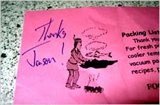 Ahh... With all the heavy talk about what makes a good customer experience these days, it's refreshing when something nice and simple hits home. A few days ago I ordered some Western Red Cedar Planks from Just Smoked Salmon. Yeah, the site isn't what I'd call "perfect," but it does the job. But, what really did it for me was the packing list that was included in the box. It had my name handwritten in the upper left corner. A simple handwritten "Thanks Jason!" was really all it took to positively separate this buying experience from almost any other one I've had online -- and it didn't cost them a dime.
They get it. They understand that software doesn't care. Hardware doesn't care. Technology doesn't care. Expensive CMS systems don't care. Million-dollar investments don't care. Marketing messages don't care. Logos don't care. "Branding" doesn't care. People do. People care. They care. They care enough to take 5 seconds to thank me in their own writing. And now I care about them too.
A handwritten note attached to an online order is the closest equivalent to a firm "thanks for shopping with us" look me in the eye handshake. That's personalization. Well done. As I've said before, it's the little things -- those minute details -- that make a good experience.
Speaking of fun with haptics...
Here is an image gallery (with links to more info) on the Haptics Community Web Page. This site seems to be a clearing house for haptic-related info. Need a job in haptics? How about doing a haptic literature review? Want to attend a conference haptically?
Or do you just enjoy saying the word haptic?
Personally, I can't wait for the Smell-O-Scope.
Major HCI Leaps Ahead?
Killer augmented interfaces like those seen in Minority Report and the Matrix: Reloaded are finally creeping into reality thanks to tripped out grad students.
 Soon we'll be painting in 3D by waving our hands and sitting around virtual objects instead of huddling around monitors. There's even a free, cross-platform augmented reality toolkit available for adventurous hobbyists.
Check this video (8mb mov) of modelling a flower.
July 15, 2003
When in Doubt... Blame France
It appears Tony Blair will blame France for Nigerian uranium confusion:
France is expected to be blamed for the split between the CIA and MI6 - on the grounds that Paris intelligence agencies shared hard evidence with Britain, but refused to show it to the US. Aides to both the Prime Minister and George Bush, the US president, are anxious to draw a line under the dispute before Thursday, when Mr Blair is due to address a joint session of the US Congress.
Gotta love the simplicity of this "solution" to the issue of who knew what when.
Remote vs. Co-Located Design Testing
Because we don't test users, we test designs.
We do remote testing sometimes. We've used Vividence, and NetRaker. We've NetOp'ed into the participants computer and talked with them over the phone. But is it good enough? Does remote testing really get good data? Or better data than co-located testing (assuming co-located testing has value)?
Have you used remote testing? How well has it worked for you? Did it depend on what type of testing you did?
Your Blog Profile
I'm curious... What sorts of blogs do you visit or frequent most often? Blogs with full entries that are usually updated once or twice a day (like Kottke or Signal vs. Noise)? Blogs that have mini-entries that are updated multiple times a day (like Coudal)? Blogs with full entries/essays that are updated less frequently (like Daring Fireball)? "Essay-based" blogs (like What Do I Know or Anil Dash)? Or constantly updated blogs with entries of all sizes (like Boing Boing)? Do you prefer blogs with single or multiple authors? Or are you all over the map? Or...?
July 14, 2003
Meetups I'll Pass On
Amish, Bipolar, Beekeeping, Fashionista, UFO, Body Modification, Divorce Support, Dragons, Ex-Jehova's Witness, Flat Earth Society, Goth, Klingon, Motherless Daughters, Ninja, and Teen Vampires. And, Jason Fried.
Advertising BS
This NYT article on Red Lobster's new ad campaign (for some reason they're done with the old ads that featured animated shots of dozens of lobsters on the go w/ "Nowhere to run to, nowhere to hide" as the backing music) reads like an Onion article making fun of silly marketing and ad execs. Check out these ridiculous quotes about the emotional connection diners have with Red Lobster and the "sensual experience" of eating shellfish.
"It's about sharing what's unique about Red Lobster. It's about an emotional connection, with each other and about a connection to seafood."
...
Darden says the campaign is backed with extensive research from Tatham showing that consumers view eating shellfish as a uniquely tactile, even sensual experience. But it is also social, the research suggests. "Seafood (especially shellfish) has the power to bring people together like no other food," Tatham says in its analysis.
...
"This campaign really captures kind of the heart and soul of what people feel about both the brand and about eating seafood. There's a real connection they make over Red Lobster."
Not to be outdone, Whiskas' ad team claims to be "the brand that has the best understanding of cats' instinctive behavior." Apparently, they also are able to judge when animals have "sold out" (no citation of "extensive research" on this one though).
"We're appealing to people who appreciate cats' weird, quirky behavior," Mr. Payne, an art director, said, also citing their belief that "they haven't sold out like dogs."
July 11, 2003
It's Not About The Money... When You Already Got It
Everyone is praising Karl Malone and Gary Payton for giving up money to join the Lakers. They say that they care more about the rings than they do the money. Well, sure they do... When you already have untold millions and millions, and you are at the end of your career, and you've been to the finals and lost, and have no chance of winning with your current team... Yeah, then the ring is more important than the money. Maybe I have it all wrong, but it feels sort of "cheap" to me.
I wonder, however, if this will start a trend... Great players at the end of their careers joining the best team in the league just to get that token ring before they call it quits.
Sum Sum Summertime Books
Our way-too-creative office mates at Coudal recently launched a list of field-tested summer reading recommendations from well-read folks around the world.
Our contributors tell us where they read the books they've recommended, giving each review a sense of place. In some cases, title and locale have little to do with one another. In others, destination played a role in the selection. It's clear in every review that location impacted the reading experience. Perhaps you'll find the perfect book for your own summer sojourn.
Our very own Matt Linderman serves up a musical recommendation. And, oh yeah, don't forget to buy yourself one of those beautiful, hand-crafted limited edition posters. You'll especially want one after watching this inspirational short video documenting the process of hand-screening the prints. If you watch, be careful: You'll feel guilty if you don't muster up $22 to support such beautiful work.
Got your own summer reading recommendation(s)? Add 'em here.
July 09, 2003
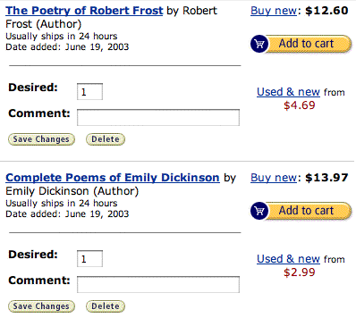
Amazon Wish List Wish List
Amazon's current Wish List screen does not allow people to:
»Display more than 25 items on a screen at once
Right now I need to scroll through four pages to see all 100+ items I have in my list.
»Delete multiple items at once
Right now I can only delete one item at a time and then have to wait for the page to refresh. This is a complete pain and it's the reason I don't bother to delete items -- and why I wind up with 100+ items.
»Purchase multiple items at once
Right now I have to add products to my cart one item at a time and then go back to the list after it's been added.
»Automatically remove Wish List items once they are purchased
I've already purchased several of the items on my Wish List...why are they still listed?
These faults seriously undermine my desire/ability to use my Wish List. My proposed solution is a Wish List view (it doesn't have to be the default) that is more functional. A more "data-like" table that lists all Wish List items on one screen where I can quickly delete/purchase multiple items. Also, the Wish List should offer an option to "Automatically delete items after they are purchased."
Here's a mockup of how this view might work...
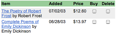
...instead of this...
Always On Addiction
Do you surf the web during meetings? Need to check your e-mail constantly, even during non-work hours? IM, email, and talk on the phone all at once? "The Lure of Data: Is It Addictive?" (NY Times) discusses pseudo-attention deficit disorder (aka an addiction to being always on). According to one doctor, the sensations created from always being wired is comparable to narcotics - "a hit of pleasure, stimulation and escape."
Its sufferers do not have actual A.D.D., but, influenced by technology and the pace of modern life, have developed shorter attention spans. They become frustrated with long-term projects, thrive on the stress of constant fixes of information, and physically crave the bursts of stimulation from checking e-mail or voice mail or answering the phone.
The Secret
What's the secret to...
...A good pumpkin pie
...A good martini
...A good fountain pen
...A good piece of furniture
...A good day
...A good...
July 08, 2003
Putting Risk Back into the Outdoors
I couldn't agree more with this Denver Post columnist:
I know it's selfish, egotistical, narcissistic and arrogant of me to believe this, but we need more places in our national parks designed not to prohibit, but to seriously discourage most people. We need to plant more poison ivy, more poison oak. Import mosquitoes. Post warnings about wolves and mountain lions. We need more risks, fewer snack shops and absolutely no souvenirs made in foreign countries. We need maps without the notation, "You are here."
National Parks should be left as wild as possible so that future generations can experience them as they always have been -- not decorated with souvenir shops, "low-impact" toilets, and dotted with paved "trails."
Yes, These Are Televisions
Sony KP-51WS500, Toshiba 65HDX82, Panasonic PT-53WX42, Mitsubishi WS-55311, Pioneer SD-533HD5, Hitachi 65SWX20B, JVC AV-36320.
"Which TV do you have?" "Which TV should I buy?" "Hey Mom, which TV did dad say to order?" Talk about a bad experience. I wonder which manufacturer is going to break from the pack and actually give their TV a name I can tell a friend over the phone.
Coolest Company Name/Logo Combo Ever?
Rogue Amoeba. Got another?
Cell Phone Number Portability
It seems like every American cell phone company is against the new number portability law that goes into effect on November 24. If you don't know, the new law will allow U.S. customers to switch cell phone providers and keep their number (which is pretty easy to do everywhere else, but not here in the U.S.).
I wonder which cell phone company is going to be the smart one and use this new number portability reality to their advantage. It seems to be that this is a huge opportunity to be the "people's cell phone company." Which one is going to say "We love the idea... We'll rescue you from your bad cell phone experience... Keep your number, come on over to us, and you'll wish you could have done this years ago." I wonder which company is going to buck the trend and offer people the incentive to switch instead of keeping this new law quiet and muffled with fees (Sprint and AT&T announced they will charge their customers around $1.50/month to pay for the number portability investment). Or, are they all too insecure to suggest that leaving your carrier with your number intact is a Good Thing? Anyone want to place any bets?
July 07, 2003
Unlikely Colors
I used a blue shampoo this morning. What up with that? Blue? Who thought that would be a good color for a shampoo? I guess green packaging was once considered a no-no in the food world, but Nabisco shattered that rule with SnackWells.
July 04, 2003
Safe Web Colours
I may have posted this site in the comments section a while back, but I often use it as a tool, so I thought I would bring it up again.
British Telecom has a site that shows color comparison (side-by-side) palattes for colo(u)r-deficient vision.
The palatte is available in RGB and Hex values and shows examples of "normal" (or not deficient) colors and how the color would look to someone with Protanopia (can't see reds), Deutanopia (can't see greens), and Tritanoptia (can't see blues).
Here are some brief stats on color deficiencies. These stats are US-based. Anyone have stats for other countries?
July 03, 2003
Future Task Analysis
Greetings all. Fajalar here, guest posting in my offline persona of Matthew Oliphant. Glad to be here and love that SVN is such a good place to discuss design, usability, and square-foot gardening.
Actual post continued within the comments view.
I was having a discussion this morning with my coworkers about one of our deliverables, Future Task Analysis (FTA). We split the Task Analysis portion of the design process into Current Task and Future Task documents.
At a high level I would define FTA as a definition of all the tasks the users will attempt to accomplish within the purposed system. But how do you define them? There are a number of ways, but thanks to a new-and-improved Quality Review process here at work, we are being forced to do it one way. The problem is (surprise surprise) that it is difficult to get everyone to agree on what that one way should be.
I don't think we should be limited to one way, but I am curious... How do you define, document, and use FTA? How do you gather your info, how do you document it, what goes into the documentation, who uses it, how do they use it (at one point in time and throughout the life cycle of the project), and is it beneficial?
I know, a lot of questions, but I put this out there to generate some discussion in order to glean what's being done in "the industry." Also, I know there are designers/usability-ers out there who are just starting and may not even know that FTA is important. And, of course, because this continues to be an area where there is still discussion (to put it politely), I thought it might be good for us to tinker with it.
Mailing Lists: Plain or HTML?
So, we're using Topica to manage our mailing list. We've been really happy with it. And, hey, if you aren't already on it, you can subscribe by emailing [email protected] (or scroll down a bit and enter your email address in the "37signals Mailing List" form in the sidebar). We'll periodically send out a note with usability tips, interesting articles, and a 37signals-related tibdit or two. We'll never sell/trade your info so no need to worry.
Back to the point... What's really surprised me is how many people have signed up for the HTML-version of the newsletter (you can choose plain text or HTML when you sign up through the form on the sidebar). We don't currently publish an HTML version of the newsletter (people who signed up for HTML just get the text one), but I'm starting to think about it considering the influx of HTML-newsletter lovers. In the past few months, it's almost been 50/50. Does this surprise you? Are you an HTML-newsletter fan or would you rather just get text? HTML-newsletters feel a lot more "spammy" than plain text to me, but maybe I'm missing something. Any insights? Opinions?
July 02, 2003
American Traveler International Apology Shirt
Planning an international trip? Want to tell people that you disagree with the Bush Administration's policies? Then get yourself an American Traveler International Apology Shirt. Funny. [link from Kev]