Sketch Pad is a cool New York Times column that asks architects or designers to create a vision of what an apartment, house, loft or shack now for sale might look like in order to “help real estate shoppers learn to see past ugly paint, too-small kitchens and a warren of rooms.”
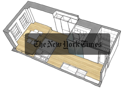
In one of the columns, Updating the Trundle Bed, architects Yen Ha and Michi Yanagishita of Front Studio give an imaginative makeover to a tiny, 380-square-foot studio. It’s a great case study that shows how embracing constraints can lead to creative solutions.
The big-picture goal was to get rid of clutter and give the idea of separation without actually closing off rooms. The top initial question: Where to put the bed? The solution: Raise the end of the living room about 18 inches, and slide the bed under it. This narrated slideshow explains the thinking behind the design (and lets you see the images without the gray bar in the middle).

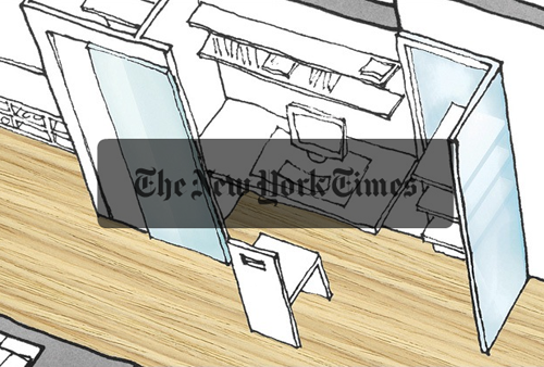
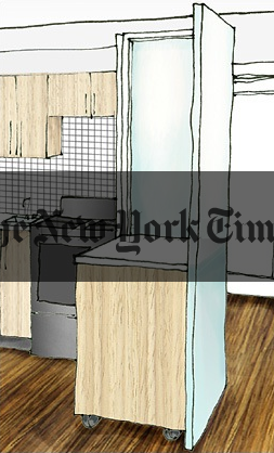
Other similar hideaway solutions followed. The office and the kitchen are enclosed by translucent panels which don’t close them off the way walls would: “In a solution like a Rubik’s Cube, the corners can swing outward, opening the kitchen and the office to the living area. Make dinner or type a letter, then shut off the area for the rest of the evening.”

The idea for hiding the bed came to the architects during a trip to a Korean restaurant…
“In Asia, lots of things have double uses,” said Ms. Ha, who was born in Vietnam…
“We were frustrated thinking of all these different solutions, and we got hungry,” Ms. Yanagishita said. “We went to have Korean food in a restaurant on 32nd Street. We were eating kimchi — pickled cabbage — and we noticed the raised platform we were sitting on.
“Then all the little pieces came together like a Japanese puzzle box: things slide out, things fold in, things tuck away. It is clean, we hope, without any fussiness.”
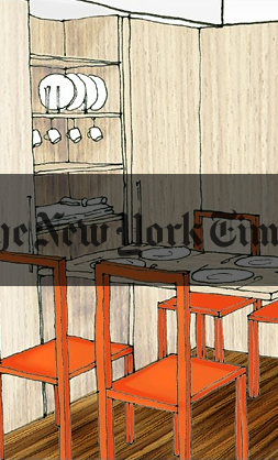
Here’s a look at how the dining room table hides away and the kitchen panels close off the space:


The architects end the slideshow by talking about their goal of making design look effortless:
We want our design to seem and feel effortless in the space so it’s not forced upon. We don’t want some sort of design element that’s really just stuck in… like some sort of signature piece. Our architecture tends to be seemless. Effortless is really a great word. It shouldn’t appear as if we did something and yet it should appear as if we did something.
This doesn’t really make any sense: “It shouldn’t appear as if we did something and yet it should appear as if we did something.” Yet any designer knows exactly what they mean.

Colin
on 29 Apr 08I wonder what publication those sketches came from.
tyler rooney
on 29 Apr 08thanks for posting this. it genuinely made my rethink my opinion on studio apartments.
Chris Palmieri
on 29 Apr 08This private/open balance is a constant struggle here in Tokyo.
My friend Paul hired an architect to take on his one-room flat, and they built a sweet looking igloo bookshelf that offers privacy for when guests come, without blocking air, sound and light completely.
Eric
on 29 Apr 08That was great until she said “It shouldn’t appear like we did something, yet it should appear like we did something”.
mr. murphy
on 29 Apr 08um, these folks every heard of a murphy bed?
JohnJohn
on 29 Apr 08Give me a huge house in the country any day. Those apts are cool in design, but make me claustrophobic. I can’t imagine trying to share that with someone.
Jay
on 29 Apr 08I like the idea of this column, but its execution is sometimes frustrating. Too often they don’t show the floor plans before and after, though this article was an exception. I also think the renderings suffer from the same idealism as those of new buildings. For example, in this article’s illustration with all the compartments closed, the dining table chairs disappear. And the illustration at the top of this piece shows an impossible view, given that the table is meant to be only a few feet from the near wall.
These might be nitpicks and there are many good ideas here, but if they’re going to say “look how nice you can make your apartment” I think they should strive to be realistic.
mbc
on 30 Apr 08This does raise interesting design opportunities for most scales of properties not only small ones. I’m planning & designing the conversion of a two story building of about 1500 square feet within which I want to maintain as much of a feeling of openness and space as possible. Effective use of space for storage and utility purposes (cooking, washing, eating etc.) provides the opportunity for space & light…
Benjy
on 30 Apr 08I’ve seen a number of these types of transformations in the NYT, on HGTV, in Dwell, etc. They are really impressive in their creativity, engineering and ability to maximize usage of the space—in theory.
But I always wonder how much the residents of these spaces really take advantage… or do people get lazy and not move the necessary furniture, put away stuff that needs to be put away, religiously pare possessions to the bare minimum. Does the reality of daily life mean that the bed’s always out and that floor space is lost, or boxes in the office mean it can’t close, etc.?
Or maybe it’s just that I’ve never lived in a place like NYC where square footage is such a premium…
This discussion is closed.