A collection of graphics shown at news sites at 11:20pm (EST) last night as election results were coming in…
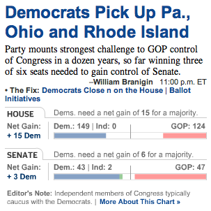
The Washington Post tightly integrated the headline with the graphic (most of the other sites had the graphic sitting on its own with no text explanation). Also, the color blocks moving left or right to the line in the middle was an effective method to display the “prize” and how far away each side was from it.
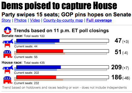
USA Today also did a good job of providing text context with a headline. But it confusingly stacked color bars (one for this race on top of another for current seats) and used poorly placed labels to try to explain it.
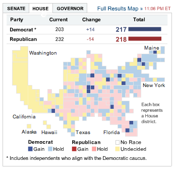
The NY Times made visitors choose between House and Senate graphics. And the blank white area made it look like a few states in the northwest had disappeared (or been taken over by Canada).
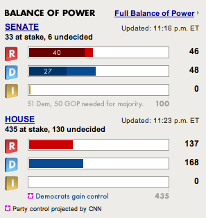
CNN used different colors within blocks but didn’t explain what they meant.
![]()
The Chicago Tribune offered this plain jane graphic.
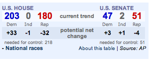
The LA Times version was also pretty plain but at least provided context by showing the net change in addition to the current numbers.
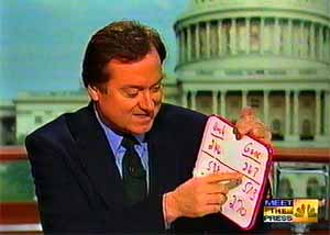
While we’re on the subject, let’s pause to remember the glory days of Tim Russert and his trusty whiteboard.

Daniel
on 08 Nov 06For the record – Tim Russert is still essentially using a whiteboard – or an electronic version that can be projected on to a larger screen.
New tech, old-school info delivery.
Justin Reese
on 08 Nov 06Don’t forget this excellent and informative graphic from The Onion.
Don Schenck
on 08 Nov 06Don’t know the white board. The white board is legend. No one can dis the white board.
White board zen.
Dave
on 08 Nov 06Very nice comparison of how different news sites handled the election returns.
I went around to most of these sites, and even more, but couldn’t find one I was particularly satisfied with (and was also updated when new information came in).
The Washington Post was clearly the best of the night.
However, for simplicity’s sake, you just cannot beat a dude with a marker board. Maybe CNN.com should just do a live feed of something like this.
Jeff Croft
on 08 Nov 06I really liked the Post and the The Times’ coverage graphics. And as long as we’re checking out Election graphics, I have to say that I think ours at the Journal-World, designed by Nathan Borror, was as good as any of the big boys (albeit focusing on the hyper-local level, rather than the national picture). For example: http://www2.ljworld.com/elections/2006/nov/07/races/state_treasurer/
Mark
on 08 Nov 06I left MSNBC.com’s Democracy Dashboard popup open all night. While it didn’t seem to refresh itself consistently, live data for each state’s key races was up-to-date, and it used auto-style guages to illustrate the House and Senate shifts, which were also stated as +/- values for each party.
Gayle
on 08 Nov 06Speaking of Canada, here’s how the CBC interpreted it graphically:
http://www.cbc.ca/news/background/us-politics/us-midterms-gfx.html
Scott
on 08 Nov 06Note that CNN has an row for independents, but decided not to use it for the two Senate independents.
David Williamson
on 08 Nov 06I really liked the way the Star Tribune of Minneapolis handled the election results. It was one of the first pages I checked and once I got there I didn’t need to go anywhere else. The election information was right at the top and in the middle of the page (it has since moved down a little) with all the major election results. Their myVote system also was really easy to use and find poll results with. Three simple steps to determine your district and it pulled up a page with the results of everything on the ballot in that district, updated as results came in.
I was very impressed with the way the Star Trib covered the elections especially with the fact that they didn’t make me try to decode the results myself, they presented them in a very easy to understand format.
Matt Abrams
on 08 Nov 06MSNBC had a nice Democracy Dashboard. Click Live Results on the following link: http://www.msnbc.msn.com/id/3032553/
Christopher
on 08 Nov 06Tim Russert was definitely using a white board last night.
Joe Ruby
on 08 Nov 06That USA Today graphic is horrible.
Karl Martino
on 08 Nov 06I’m a little biased (from Philly after all) but I think the Philadelphia Inquirer did a terrific job with their Election night graphic:
http://inquirer.philly.com/graphics/election_2006/
The right mix of local and national information.
Martin
on 08 Nov 06It took me some time to understand that the white space in the Washington Post graphic are the seats where the results are not in yet.
Maybe this is obvious for US folks, it was not for me (we use a different voting system).
Brandon Blatcher
on 08 Nov 06Cool, I did the same last night, camparing and contrasting. For my money Drudge had the best graphic, cutting the heart of what the race was really about on the national level.
Georgia was trending Repub so I didn’t care to much about local races :).
Joe Ruby
on 09 Nov 06Oops, make that /USA Today/NY Times/.
math
on 09 Nov 06“Give you the big amount gold for free!The activity starts now!Experience it
together now!” cwow
David Bailey
on 09 Nov 06Take a look at how the BBC news website handled the Bristish general election 2005. Of all the UK coverage of this battle for the House of Commons, this website was probably the best designed.
The Beeb did a pretty sterling job of the US Midterms as well.
Philip
on 09 Nov 06Tim Russert dragged out the ol’ white board on Tuesday night. Maybe it was a good luck charm for the Dems. Good ol’ T.R. ... he once got very drunk in D.C. with a friend of mine.
Khoi Vinh
on 11 Nov 06Regarding this comment about our coverage at NYTimes.com:
the blank white area made it look like a few states in the northwest had disappeared (or been taken over by Canada)To my knowledge, we didn’t receive a single complaint from a real user that the white areas caused confusion, whether along the lines of tectonic shifts nor Canadian annexation. :-)
This discussion is closed.