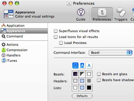
Superfluous visual effects at Quicksilver

Doeke Zanstra writes, “Preference pane of Quicksilver.
I really like the option ‘superfluous visual effects.’ It makes me
feel…spoiled.”
Unspecific message at Logitech

Brian Parker writes, “Congrats Logitech! You win the Least Helpful Search Results Award. Not only did you not return any relevant result but you also managed to tell me that: ‘Your search was either too broad… or too narrow…’ I think that’s about as helpful as having the GPS in your car instructing you at an intersection to: ‘Turn left or right.’”
Shaming at Yikers

Thomas Balthazar write, “Here is a screenshot from yikers.com. They have a strange way to welcome their first time visitors: ‘Your
first visit to Yikers.com? Shame on you!’”
Got an interesting screenshot for Signal vs. Noise? Send the image and/or URL to svn [at] 37signals [dot] com.

Demetrios Kyriakis
on 21 Dec 06Sorry for being offtopic but:
A year ago, you announced Sunrise (CRM) as “comming soon”.
Are there any news about it? I think all SvN readers are curious about any progress with that CRM.
Thank you
D.
Walker Hamilton
on 21 Dec 06shame on me for not previously gambling away the college fund with Yikers!
tom
on 21 Dec 06I love the logitech message.
Dr. Pete
on 21 Dec 06I completely agree on the prevalence of useless search errors. For one of my clients, I’ve been toying with some “intelligent” search errors. Their search is multifaceted (keyword, dates, city, etc.), so we replaced the “no results found” error with a page that breaks down the results by the individual elements.
So, for example, if you searched on “human resources”, Chicago, and December ‘06 (to simplify it a bit), the no results page would return something like:
204 results found for “human resources” 698 results found for Chicago 1,203 results found for December ‘06
Each line links directly to the search results for that subset; I’ve found it not only gives users an option for what to do next, but encourages them by showing them that the site has a wealth of data.
Jeremiah
on 21 Dec 06I think what Demetrios Kyriakis should be asking is:
Are you guys still working on Sunrise? We want it to be awesome, so we’ll wait. But, we do want to make sure that we arn’t waiting for nothing.
Personally, my office needs a CRM and I DO NOT LIKE what I’ve seen so far from other companies. If Sunrise takes too much longer my company will have to subscribe to someone else out of necessity. Once that ball starts rolling, I’m positive I won’t be able to entertain sunrise as a viable solution.
long time listener repeat commenter
on 21 Dec 06Demetrios… They said the same thing about an update for Backpack… Don’t hold your breath.
Blake
on 21 Dec 06Demetrios brings up a good point. I’ve almost forgotten about SunriseCRM.
Any word ???
Ben
on 21 Dec 06Has anyone noticed the “ebay” results, when very few items are found? It uses a visual display of the words you enter along with “strikethrough” text to indicate which portions of the search did or did not include results. The display also includes a “numer” display so you get an idea for which word in your search caused the “problem”...
JF
on 21 Dec 06To those asking about Sunrise: When there’s something new to share about a product or anything else we’re working on we’ll be sure to post it on here on Signal vs. Noise. Until then there’s nothing new to report.
Let’s please keep this thread on-topic. Any further off-topic posts will be removed. Thank you.
Tim
on 21 Dec 06When I see an error message like the Logitech one, I assume that there is a programmer building the search code, and a designer building the results page, and there is absolutely no communication between them.
The programmer looked at the specs that said “don’t return more than n number of results” and then decided it was okay to return the same value for 0 results or more than n results. Maybe it was a poor spec, but it could’ve been solved in a few minutes with some communication. The designer obviously realized that it was a problem, but couldn’t fix it himself and ended up having to settle for some lame message and force the user figure it out.
Dilly Boy
on 22 Dec 06Agreed. Messages like the Logitech one (or the announcement for the Sunrise release and Backpack improvements) should be more clear / less unclear.
Mariana
on 22 Dec 06Thank you for the post! I think that you could be interested on this. Greenpeace presents a new website in Web 2.0 where people can give ideas to improve the next expedition to Antarctic to protect the whales. You can post your idea or comment and vote other’ s ideas. The whaling fleet has left Japan, and is headed directly to the Southern Ocean. 945 whales will be killed – unless we do something to save them. http://whales.greenpeace.org/global
Take a look to this video: http://www.youtube.com/watch?v=o6CbG7qopX0
This discussion is closed.