Last week we launched Haystack, a new way for clients and web designers to find each other. We designed early concepts for Haystack this past spring/summer. I thought you’d be interested to see some of the designs that we didn’t use, but helped get us to the final launch.
The Webdev Pages
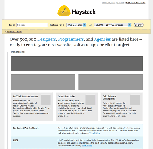
Initially the idea was to base Haystack on the Yellow Pages. Designers, Programmers, and Agencies could create a free text-only listing. There would be multiple tiers of ad space that would sit prominently above those free listings. The consensus: Too broad: let’s focus on Web Designers. Not visual enough.
Company Cards
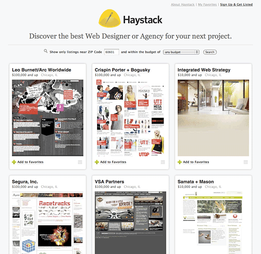
The design started to gel once we decided to focus on Web Designers. We created the company card. A quick glance gives you an idea about the designer’s work, location, and typical budget range. The company cards in a grid looked great, but all the cards were the same. We needed a way to differentiate Pro accounts from Free accounts.
The Black Card
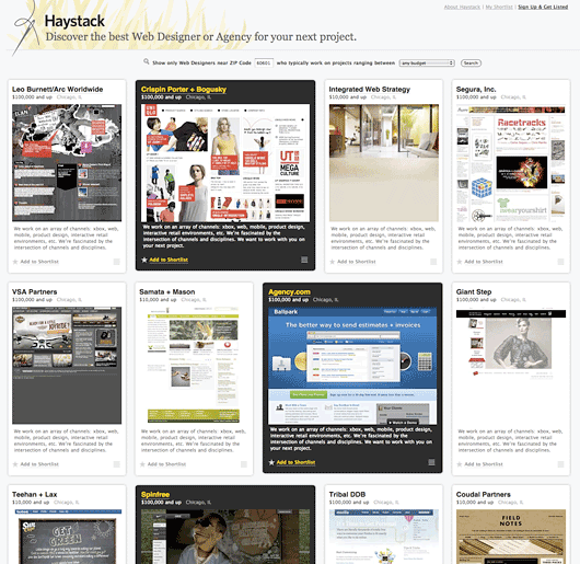
We knew that the Haystack directory had to be randomly sorted. Otherwise Haystack would give unfair advantage to designers whose name started with an “A” or early-adopters that signed up on the first day. Here we see Pro accounts (the black cards) randomly interspersed with Free accounts on the grid. In the end, we decided to revisit the original concept where Pro accounts were displayed above Free accounts.
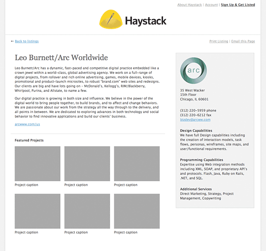
Company perma page
The first company perma page was structured more like a fact sheet and less of a portfolio page. Remember: the original idea was to support both Programmers and Web Designers. Note the “capabilities” area on the right side. This was a nice idea, but we thought it might add too much complexity for launch.
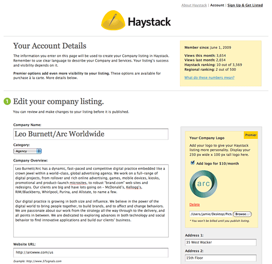
Account edit screen
Here’s a first pass at an Account screen. There are a few interesting ideas here: some rough page analytics at the top and a la carte upgrades. Instead of a la carte upgrades we decided to go with a 2-tier model: Free and Pro.
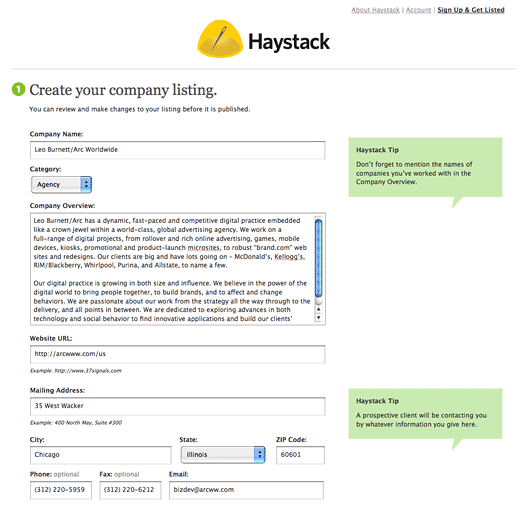
Haystack sign up
We were toying with the idea of making one massive sign up screen where you’d enter all the information about your company. After you submitted the form you could choose to upgrade your listing (add a logo for $10, a portfolio gallery for $50, etc).
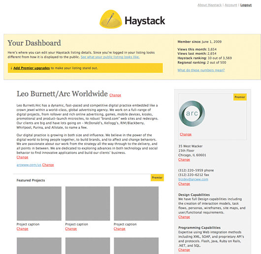
The Dashboard
The Dashboard was where you’d go after you created your account. Here you could add different “Premier” upgrades. Kind of like leveling up in a video game.
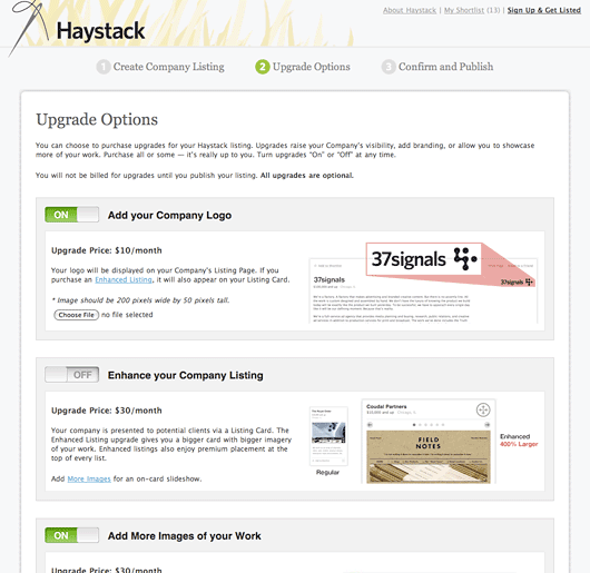
Upgrade your account
Here’s yet another take on the a la carte upgrades model. This is what you’d encounter after entering your basic company information.
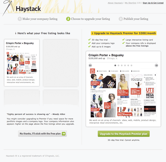
Close to final Upgrade screen
In late Spring our company went on a retreat to Kohler, Wisconsin. There I had the opportunity to show off what I’d been doing with Haystack to my co-workers. Jason Fried, Ryan Singer, and I broke off into a little 30-minute brainstorm about Haystack upgrading. There we decided to ditch a la carte upgrades.
The sketch below is very similar to where we ended up today.
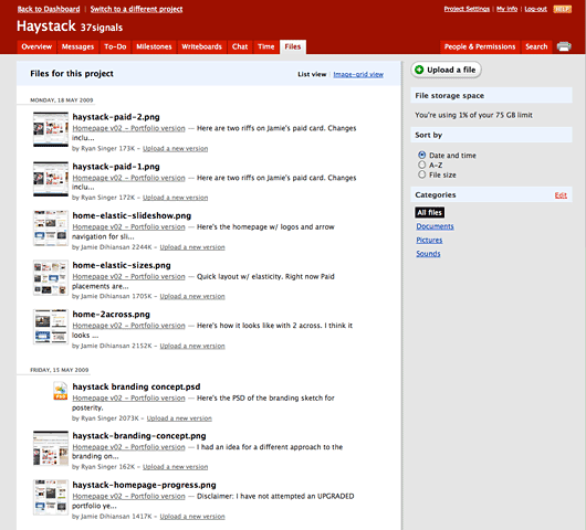
All the iterations in Basecamp
We kept all the designs in Basecamp so that we could see how Haystack evolved over time.
Thanks for reading. I hope this has been an interesting peek into our design process here at 37signals.

allan branch
on 27 Oct 09Haystack is rad, very refined for a first release from 37signals.
Greg
on 27 Oct 09As always, thanks for providing a look behind the curtain.
Mark Richman
on 27 Oct 09What tool(s) do you use for design? Do you just create the prototypes directly in Rails, or are these Photoshop/Illustrator mockups?
Chris Enns
on 27 Oct 09Thanks for taking the time to post/archive this kind of stuff.
Esteban Utz
on 27 Oct 09Great insight! Thanks for sharing the evolution of this app.
Esteban Utz
on 27 Oct 09Any reason why the logo changed from the usual 37signals style to the way it is now?
Eoghan McCabe
on 27 Oct 09Hi guys,
Why did you decide to break your logo convention? Because it’s a site rather than an app? Or was there another reason?
Thanks, Eoghan
Scott Orchard
on 27 Oct 09Thank you for showing the design process behind the finished product, very insightful.
JD
on 27 Oct 09Mark Richman: What tool(s) do you use for design? Do you just create the prototypes directly in Rails, or are these Photoshop/Illustrator mockups?
Mark, for the first round I went entirely HTML (using Photoshop and Illustrator to create the initial Haystack logo and placeholder banners). When I created the cards I did a rough shell in Photoshop (to get the dimensions right), broke it up, and went into HTML/CSS.
For the black card design, that’s all in HTML/CSS. I just tweaked the black card’s classes in CSS. It was really difficult to get the sizes correct in Photoshop (with text descriptions, etc). The only way to get it sized right was to go right into HTML.
Brandon Durham
on 27 Oct 09I’m curious about the logo as well.
David Trang
on 27 Oct 09Great, you guys really did well by just focusing on one job role. What I love about this site is that it puts big design agencies and one-man freelancers on a pretty even playing field, even for those who don’t pay.
Question, what will happen once a city hits a certain amount of listings? Say, 500? I was just browsing through Chicago and noticed the auto-refresh functionality once you hit the bottom of the page. Just wondering why you didn’t go with the typical pagination route.
Can’t wait to see what else is in store in the future.
Benjamin Kohl
on 27 Oct 09Very cool. I am considering signing up for an account sometime soon.
Jason Lander
on 27 Oct 09This is such a great concept and a really fabulous design. Do you guys intend on expanding this to other creatives – developers, designers, photographers, etc?
Jay Schumacher
on 27 Oct 09I am also very curious about your decisions around the logo. I find it interesting that you had the snow-globe style logo in your original sketches and then switched…
JD
on 27 Oct 09That early Haystack logo was never “official”. It was something that I did in about 10 minutes to put something in the header design. There wasn’t much debate about it other than it took up too much space in those early iterations.
Ryan actually put together the idea for the Haystack branding you see on the site today. No big boardroom debates. Just when he posted it to Basecamp we all said, “We love it!”
Jamie, Baymard Institute
on 27 Oct 09It’s always interesting to get a glance of what’s going on behind-the-scenes.
Thanks for sharing.
stefan Hartwig
on 27 Oct 09Whoa, i’m spotting some old school business names in some of those mockups. Spinfree and Giant Step!
Ben
on 27 Oct 09Very cool, thanks for the thoughtful insight.
I like the more 37signals-esque logo from the earlier comps. Looks way better.
Sebastian
on 27 Oct 09I don’t understand your decision either. The earlier design, with the yellow logo, looked a lot more appealing.
Love the whole idea though.
bayes
on 27 Oct 09why you didn’t use border-radius and box-shadow properties for entry box? the code would be much slicker :)
Fernando Emmanoel Borba
on 27 Oct 09Very interesting post!
JF, Would you mind disclosing how long it took to release the service?
Sometimes I think that my projects take so long to get done.
Rizwan Reza
on 27 Oct 09Though I understand and appreciate the focus of Haystack as a design directory service, I don’t understand why companies like Hashrocket, a web app company, can also be listed there. It clearly says web designers all over. Is that okay?
Jay Owen
on 27 Oct 09What is most interesting about your progress overtime, is that it is often more about taking things away, instead of adding things to it.
The big mistake many sites make is that more features and more stuff is better, when maybe a little less to start with is actually the best path.
Thanks for sharing this.
Nathan Fitzsimmons
on 28 Oct 09I noticed in the last shot that a “Premier” account was going to be $300/mo. (wow!). How did you come up with the $99/mo. pricing, or why the change?
JF
on 28 Oct 09Good catch, Nathan.
We changed to $99 a few days before launch. The job board is priced at $300, but that’s a one time thing. $300/month is a different story. So we decided that $99/month was the better price point for Haystack.
Natasha Fernandez-Fountain
on 28 Oct 09Hello, and thanks for this post. I really enjoy it when people share their failures just as much as their successes!
But I just have a small question that I feel will help wrap this all up for me: over how long a period are we looking at here? Were these arrived at over days, months, or years?
JD
on 28 Oct 09Natasha,
We started designing the screens in late April/May. The project was on pause for much of the summer waiting for programmer time. We started programming in early September and launched on October 21.
nlx
on 29 Oct 09Shame the site is so US-centred… the Word Wide Web you said ?
If you make your site available in different languages and don’t emphasis on US cities your audience will grow on a more word wide way. It’s very difficult to it when it’s not the case from the begining. Look at Linked-in : now the site is available in french and all but the market have been allready taken by some frenchies. Remember even Ebay with his aura had to buy the n°1 french auction site and change his name to ebay to get some audience…
wahyu
on 29 Oct 09Nice post and product. Just realized that the pattern of getting more records when you scroll down and display the records using ajax just like haystack did, is conflicting with having a footer on the page. because you will never be able to see the footer. maybe fixed that footer position so that it can be seen?
Dane Maxwell
on 29 Oct 09JD, 3 questions I’m very curious about.
1. how many hours do you estimate you spent programming the first iteration? (and then how many more to get to the last?)
2. How many people were on the programming team?
3. The “getting real” approach is to design the entire interface first, then hand it over to the programmer. Because the interface was designed, did you have to give any further instructions to the developers, or did they just run with it, because the design made it so clear?
Dane Maxwell
on 29 Oct 09Quick side note, that auto loading of the designs is slightly annoying.
Only because on a psychological standpoint I want to feel like I’ve made progress to the bottom, but it keeps auto-loading so I never get there. A simple “load more designs” link would feel more natural.
Some sort of human interaction required to load more designs.
Keep the same technology where it loads on the page right now (w/o the page refreshing), just require a click to do it.
This discussion is closed.