Haystack is off to a great start. We launched two weeks ago on October 21st, and so far over over 2,500 web designers have been listed. Lots are finding clients as well. That’s exciting.
We’ve been hard at work improving Haystack. Here are some of the improvements we’ve made since launch:
Call to action footer
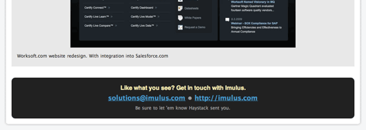
At the bottom of each company page, we’ve added a call to action after their portfolio shots. This way it’s easier to scroll through someone’s work and then get in touch with them. It says “Like what you see? Contact via email or web.” Here’s what it looks like:
Updated and New flags
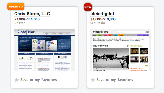
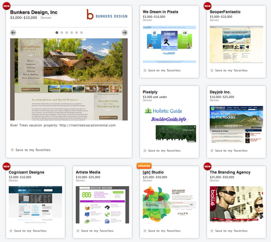
We wanted to call out new listings and listings that were recently updated. So for the first 48 hours, a listing card gets a “NEW” badge. Any listings with updated descriptions or new portfolio images get an “UPDATED” badge. Here’s what they look like close up and also in context.
Cities and countries page
Our original solution for displaying cities other than the original top 15 cities we set up wasn’t very good. It was terrible, actually. So we’ve been working on a way to expose more cities and countries and make it easier to browse these locations. We’ve gone through a variety of iterations, and we’re pretty happy with our latest solution.
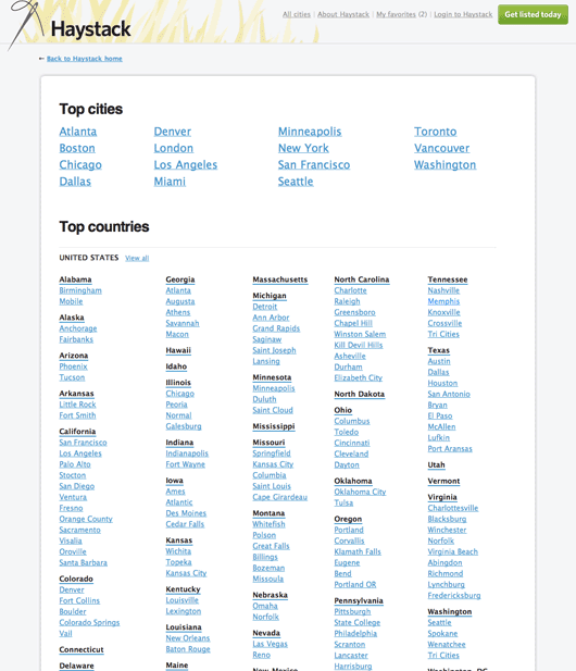
The US is broken out into states. States with only a few listings are just shown as states. States with more than a few listings, and multiple cities, are broken out by city. You can either view listings by cities, or see an entire state at once. Here’s Illinois:
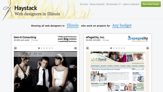
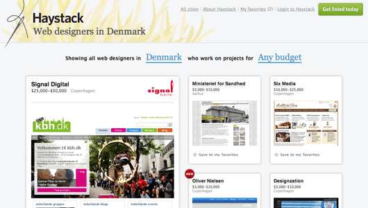
Other countries with lots of cities and listings are also grouped by city, but smaller countries with only a couple major cities are shown by country. Here’s Denmark:
Success stories
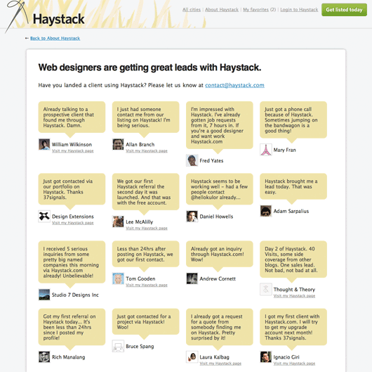
As the success stories start rolling in we wanted to list them all in one place. We’re most proud of this page since it means Haystack is working. Here’s what the success page looks like:
We’ll keep improving
We’ve got some other stuff planned which we’re working on now. We’re also working on building traffic and increasing visibility.
Next week we’ll share some of the most interesting listings and some really creative ways to “hack” the portfolio images and logo images spaces we offer.
Until then, thanks again! If you’re a web designer, get listed on Haystack. And if you’re looking to hire a web designer be sure to browse the listings on Haystack.

koto
on 05 Nov 09my finger is tired because of the never ending scrolling. otherwise nice.
Spencer Fry
on 05 Nov 09Congrats on your success!
Jay Owen
on 05 Nov 09Simple improvements that make a difference. Nice work!
It still seems that companies listed in the “top cities” get more “exposure” than those that are in any other city. We are thinking about doing some testing on this to see how the numbers work out as far as click throughs when listed under the closest top city to us and our actual home city of Jacksonville (http://haystack.com/jacksonville)
We recently updated out first slide to something more catchy than “just another screenshot” and have seen a considerable increase in click through to our site after that change. Obviously we don’t have any way of knowing how many are actually looking at the page on Haystack (one of those “would be nice” features), but it’s interesting either way.
Scott Meade
on 05 Nov 09Jason, Haystack is a site/service/offering you should really be proud of. It combines all the best elements of 37signals capabilities in design, community, and entrepreneurial business support. Good job.
Gregory
on 05 Nov 09Sigh … why on the frontpage do you still have a footer that can never been read since the page automatically grows.
Just go to haystack.com, scroll to the bottom. For about 1 second, you see the footer information – then the page grows and you no longer see the footer.
Very frustrating. It’s like a game for me to read everything in the footer and it’s a game I can never win.
JD
on 05 Nov 09Gregory, If you really want to read the footer you can scroll down to the bottom of the All cities page. Or you can in fact scroll down on all the pages in Haystack (it’s the same footer).
If you select a City/Budget combination you will encounter a much more manageable list of designers to choose from.
JF
on 05 Nov 09Gregory: Because the footer doesn’t matter as much as just scrolling to browse matters. The experience of browsing by scrolling is far better than always having to click “Next” “Next” “Next”.
Gregory
on 05 Nov 09@JF, if you can never get to the footer on the front page b/c it listing 1000s of listings, why even have a footer?
Ian Silber
on 05 Nov 09I love Haystack, but I’m gonna have to agree with Gregory, something about the footer running away from me was really frustrating.
JF
on 05 Nov 09Gregory: Because a footer goes at the bottom of a page. Which is exactly where it is in Haystack. The page just isn’t fully loaded when you hit it.
There are other solutions… We could wait to load the footer only once all the other listings have been loaded. We could do a variety of things. But it’s not important enough to focus on right now. It works good enough most of the time. It’s a distant 10th place.
web laureate
on 05 Nov 09keep up the great work. i love browsing through all the design groups on haystack - good for giving me new ideas. in appreciation, i wrote this for you --
http://web-poet.com/2009/11/04/haystack/
- hope you like it ;)
PF
on 05 Nov 09Really well done. I’m curious if you think people will try to “game” the system by frequently updating (thus keeping the bright orange badge on display). Or is there a method for preventing such behavior in place?
JF
on 05 Nov 09I’m curious if you think people will try to “game” the system by frequently updating (thus keeping the bright orange badge on display). Or is there a method for preventing such behavior in place?
Possibly, but we don’t know. We don’t worry about problems until they’re real problems. So we couldn’t put a system in place now to deal with that possibility.
allan branch
on 05 Nov 09That guy on the success page, top row and second from the left, mustached and handsome. He looks familiar. :)
Will
on 05 Nov 09Any plans to weed out the companies advertising their non web-related services?
http://haystack.com/company/1634-real-goods-solar
I’m all for solar power, but not on a board listing web designers :)
Morning Toast
on 05 Nov 09My only problem with the “endless scrolling” is it makes it hard to remember where you saw a posting. Maybe it doesn’t matter if their position is always changing, but I know I use the pagination as a bookmark of sorts.
I may see a post/image/whatever on Page 4 of the site, leave and then want to come back. I’ll remember Page 4 and can jump right to it. With the infinite scroll I have to do more visual searching with a lot more trial-and-error.
At least the infinite scroll doesn’t reset when you use the Back button. Nicely done, something I wish other endless scrolling sites could figure out.
JF
on 05 Nov 09Morning Toast: You can add any card you like to your favorites so you never have to worry about where it was. Just click the “Save to my favorites” link, bottom left of any card, and it’s always there for you. You can even share your favorites page with co-workers or collaborators.
David Andersend
on 05 Nov 09This is what I call an entrepreneurial masterpiece. Not anyone could pull this off since not everyone has the visibility of 37S, but I can’t imagine this not turning into a nice fat cash cow with net margins in the stratosphere. Very smart.
Jess
on 05 Nov 09I really think that the Heystack is a nice way for displaying a broad range of choices in the web design field. But how did you come up with the segmentation scheme based on price/budget?
I know a lot of agencies that can handle big budget projects, but that will also do smaller projects really well.
Why not segment on skills, specialization or some other preferred time span for projects?
JF
on 05 Nov 09Jess: We plan to add additional segmentation later, but this isn’t designed from a design firm’s perspective – it’s designed from a client’s perspective.
Clients want to know three things early on in their search:
1. What’s their work look like? 2. How much does it usually cost? 3. Where are they located.
That’s what Haystack is all about right now. A focus on the fundamentals and basics.
Lee
on 05 Nov 09How long until tons of sites feature the never ending scroll?
DHH mentioned on the podcast that it was inspired by zappos, but the never-ending scroll would actually be much better than what zappos currently has, a long scroll that eventually leads to a page link.
Andrew
on 06 Nov 09a counter of visits to the profile only accessible under the account management area would be a nice option, but a great product I have enjoyed using thus far
Blue Sail Creative
on 06 Nov 09I think you should be focusing on the only thing that matters which is firms getting leads from your service.
The UX and the UI of the site are great and help, but my biggest thing is people looking for websites may not use ur service.
Ugur Gundogmus
on 06 Nov 09I agree with Gregory. Scrolling is annoying. Big time. It just never ends. I am sure you will fix it in the future, but I don’t think it’s a distant 10th place:)
Rohit Arondekar
on 06 Nov 09“Here’s Denmark” link is wrong?
Matt Henderson
on 06 Nov 09@JF:
The infinite scrolling you’ve implemented (or something related) seems to be a little fragile. Several times in Haystack, I’ve been looking at a city with “N” ads, then returned to a screen which I know has far more ads (like the home page), but couldn’t scroll past “N” (using Safari 4 on OS X).
Luke
on 06 Nov 09The Haystack domain is blocked in my office by Scan Safe – seems it may previously have been a warez site.
Abhijit Shirsath
on 06 Nov 09Thanks to all team for such a wonderful product, I haven’t entered too much in my haystack profile but yet i have got 3- 4 leads asking me to provide freelance.
Thanks again to all 37signals, haystack going to help all the designer community
Regards, Abhijit Shirsath
Sarah Le Studio
on 06 Nov 09As a designer who doesn’t have much time for marketing, I’m loving the existence of Haystack and appreciate your continuing efforts in making it better each day!
Chad Sakonchick
on 06 Nov 09Over $11k in Pro subscriptions in 2 weeks!? Wow, envy sets in…
Kyle Faber
on 06 Nov 09this is definitely a great resource.
so many people that have [at least] some decent taste in design come to this site, and to be able to get in front of them is an amazing opportunity.
we’ve had 3 referrals [non-converted at this point] since adding ourselves about two weeks ago. the potential is great… very great indeed.
cheers to another grand slam by the 37sig team – you make our lives easier.
Brandon Cox
on 07 Nov 09I agree about the usability issues asociated with “endless scrolling” and the footer, which arise from the ongoing shake out between print and interactive design.
Could a position:fixed footer be a potential solution? “Endless scrolling” has never felt right compared to “next next next” as it betrays what the scroll handle does and indicates.
And, this product is great.
Mike
on 08 Nov 09Love Haystack! A beautifully designed directory!
RE: “endless scrolling”, I don’t have an issue with it. Personally, I like it. Given the business model, it works. For example, if the “next page” method was used, the sponsored design agencies would can potentially take up the first few pages. For those wishing to view more firms in a shorter period of time (including those that may not have paid to be featured), the endless scrolling works.
Keep up the great work!
Leif Miltenberger
on 09 Nov 09I give the never-ending scrolling a thumbs-up!
This discussion is closed.