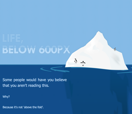
In “Life, below 600px,” Paddy Donnelly talks about “giving the fold the finger” (i.e. making visitors scroll isn’t really THAT bad) and uses the 37signals home page to support the cause. “What I’m proposing is for you to think twice about these ‘rules’ which are preached so often around the web and aim to create something original.”

Chris
on 22 Feb 10It looks like he used you as a counter-example. The 37signals site has all the main stuff above the fold. Below the fold is just the further explanation.
ML
on 22 Feb 10Chris, he writes:
Tim
on 22 Feb 10Disagree.
37S used as example of not following the trend (that doesn’t mean they don’t lead into content from ATF)
Chris
on 22 Feb 10I meant that he unknowingly used 37signals as a counter-example. He states that 37signals disregards the fold, then shows a page that has all the important stuff presented nicely above the fold.
Michael Kozakewich
on 23 Feb 10Frankly, they miss the point. The fold is still there, it’s just to the right instead of the bottom. If your design is too wide, users with smaller screens or smaller windows may miss content to the right.
Like always, we have to make our sites to work for a broad audience. I constantly read designers ranting about cutting off some old technique or standard because they think it’s not needed anymore. When you get right down to it, you’ve always got to use common sense, and get away from blind attachment to a single facet of these design methods: Yes, people know how to scroll, but it’s not easy to scroll left and right. Yes, page-zoom lets people increase their text size when you design in px instead of em, but that also drastically increases the page width. Yes, IE6 usage is dropping, but you can still offer a package for IE6 designs at a higher price. And so on.
So forget ranting about the fold, and instead think about how your layout affects your visitors.
Greg Laws
on 23 Feb 10We were just having a little debate about this very topic today. The sites I find appealing have more of a balance between above and below the fold. I like to get hit with enough information above the fold to grab my attention and piqué my interest, but give me more meat below the fold to keep me interested. I’d much rather scroll down through content layed out well on a longer page, than have to click through to a bunch of shorter, more crowded pages.
Dan Boland
on 23 Feb 10I haven’t heard a serious “fold” debate in about three years, and even then I felt like it was an old, settled debate.
Greg Laws
on 23 Feb 10@Dan, I agree with you that the “fold” debate is basically settled among the web design community. Problem is, it still happens many times a day between web designers and their clients who think users won’t scroll.
Paddy’s use of 37signals.com as an example was good, in my opinion, because its design has a good balance above and below the fold. Enough content above for me to determine if reading the site is worth my time, and enough good content below to reward me for reading on.
Michael
on 23 Feb 10The main, “Getting Real” point is that most sites need to make their site worth reading before they obsess over the fold.
Grover Saunders
on 23 Feb 10There’s definitely a baby/bathwater situation going on here. While I agree that we’ve taken a lot of design philosophies and guidelines and turned them into rules THAT SHALL NOT BE BROKEN.
That being said, I think the idea of “above the fold” still exists, it’s just become impossible to quantify. Think I’m wrong? How many of you read every comment before posting your own?
John Maas
on 24 Feb 10I think a bigger impediment to users even stopping is using uncompressed images such as the one above which is approximately 686k when it could readily be 22k. As for the scroll, in the age of print newspapers, one was either buying a newspaper or not. One didn’t scan it to see whether today’s news was worth one’s time. It all comes down to content and whether your users find what they want.
Rudiger
on 24 Feb 10What’s a fold?
Isley Aardvark
on 25 Feb 10Before I saw that post, I didn’t even realize there was more on the 37signals homepage below the fold.
This discussion is closed.