We’ve been talking about designing blank slates for a long time. In fact, here’s a post from September 2003 about blank slates that pre-dates Basecamp (the web-based application being developed/discussed in that post was, in fact, Basecamp).
What’s a blank slate?
The blank slate is a screen you see when a data-rich app has no data. For example, if you’re using a tool to manage your projects, but you don’t have any projects in the system yet, you’d be looking at a blank slate. It’s important that the application designer consider this state carefully — you don’t want people staring at an empty screen. A blank slate should help someone get started.
Basecamp’s blank slates have been through many iterations. Here are some screenshots from March 2004 (just about a month after Basecamp launched).
Blank slates, redesigned
A few weeks ago we decided to redesign the blank slates inside each Basecamp project. Each section in Basecamp (messages, to-dos, milestones, time tracking, etc.) has a blank slate. The blank slate lets you 1. know there are no messages, to-dos, milestones, etc. in a project, and 2. gives you an option to get started by adding the first one.
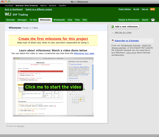
This is what the Milestones blank slate looked like before we rolled out the update last week:

I think this design served us well, but it’s also pretty loud. In fact, it doesn’t look blank, it looks full which can be a little confusing. There are quite a few elements on the screen including:
- The shadowed page
- A “Milestones” header with today’s date
- A yellow bar saying “Create the first milestone for this project” along with a brief list of features/benefits below the headline.
- A second headline that says “Learn more about milestones…” with another line below that.
- A big image with a “Click me to start the video” button.
- An “Add a new milestone” button at the top of the sidebar.
- A link to “Add ten at a time” below the button.
- A “subscribe to iCalendar” link with a paragraph of text below (also containing four more links).
Nine links, lots of images, a main section, a sidebar, multiple headlines, a pile of different colors, numerous font sizes/treatments, etc. That’s a lot going on. There’s a lot to consider and absorb just to get started. All these elements make milestones feel hard. That’s not the message we want to send.
What we really want to do here is quickly let someone know 1. what milestones are, and 2. how to add their first milestone. There’s a better way to do this than to hit them over the head with a lot of visuals, headlines, descriptions, and links.
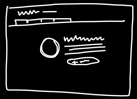
So we started with a sketch.

The idea was to go with a flat grey page, an icon/illustration for each section, a headline, a short descriptive paragraph (3 lines or less), and then a single action (a button).
We wanted something very straight forward. And very “empty” while still being informative, grounding (you know where you are), and action oriented (“now do this”).
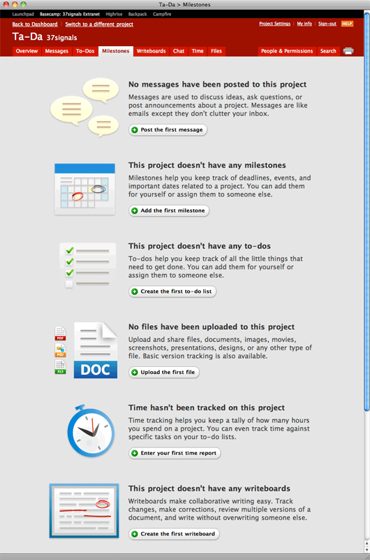
So we set off on designing them. While I was putting them together I built them all on a single page so I could make sure the language was consistent and the designs all felt part of the same family. Plus it was just easier dealing with a single HTML page. If I tweaked styles, I’d see the impact across all the designs at once. Here’s what it looked like during development:

We spent a couple days tweaking the icons and the words. Then we started plugging the new designs into Basecamp proper. We ran into some old code/conditions that we didn’t need anymore, so we cleaned up some code along the way too.
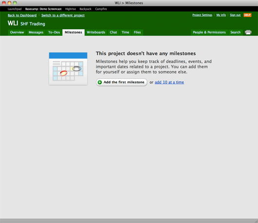
Here’s what the new Milestones blank slate looks like:

We deployed these changes last week. We’re still making a few adjustments here and there, and adding back a few things we lost along the way (the “add 10 at a time” was added back post-launch), but we’re really happy with the clarity of the new blank slates. They’re a whole lot less to look at and more directed towards a single goal: Getting started.

Michael S
on 10 May 10Nice clean approach.
Do you have any way to measure the difference the new version will make?
Sayam Khan
on 10 May 10When I’d sign up a new client, or hired a vendor, I’d just ask her to watch the blank slate video for each tab and they’d immediately get the idea. The videos were no-BS, fast-paced and saved me time.
I never had to train anyone or walk them through on the phone.
Since this update, I’m sending them emails with links to the videos.
The new blank slate is definitely clean looking but IMHO, adds to my workload.
Ryan Heath
on 10 May 10Very, very nice. Crystal clear, and definitely gives off an empty feel. Besides, your products are amazingly dead simple; no need for a video explanation :-)
Mike F
on 10 May 10Perhaps adding a text link to the video at the bottom would help.
Jeff Mackey
on 10 May 10I agree with Sayam and Mike that, while the new screens look great, links to the instructional videos would help with clients that are not familiar with Basecamp.
Harry
on 10 May 10Looks really nice with the green banner. Calming. How does it look with the red banner? In my mind, it’s making me anxious: the single action unit competing with the bold red on top… hmm.
Sean M Everett
on 10 May 10This improvement is light year’s beyond the initial design. The minimalist icons/wording with lots of white space helps something that could have been potentially cluttered lean clean and open. The soft gradients and very light use of drop shadows also make the graphics “pop” just enough. Can’t stand the over-used shadow/gradients that have become so over-used…thank photoshop for that one.
JF
on 10 May 10Re: videos… The videos were outdated using old designs – some a few years old. If/when we produce new videos we’ll link them up.
Mitch
on 10 May 10Love it.
Robert
on 10 May 10I like the thinking behind it but the new design is actually worse. For obvious reasons: Videos are gone; The layout changes completely when one creates the first milestone(and there’s no inline help present then anymore).
Also the descriptions aren’t (long) enough to communicate what for example how milestones really work. The videos were a lot better for that. Also I can remember enjoying the videos because I felt like “ah that’s easy a video is going to show me how it works. I don’t have to figure it out by myself.”
Erik Frick
on 10 May 10The new designs are delicious and much much cleaner, love it.
But I agree with what others are saying about missing the videos. Having the instructional video on the page is greaet! It shows the user EXACTLY how to use the feature.
I don’t think you need a huge graphic like the previous design (too bulky, would clash with nice new design) but an additional small link that reveals the video without a page-refresh would be very nice.
Christopher
on 10 May 10Great improvement. I always though the previous blank state look quite outdated. The new buttons are very Apple and love the simplicity. The icons/graphics seem to have a lot of room for improvement. An icon designer on your team could truly push your image forward. But enjoying the progress.
Ape-Inago
on 10 May 10As a relatively new user myself (in terms of actual usage, not time), this strikes me as being a very nice change. Guiding me toward the direction is a great default!
I didn’t even realize/remember there were videos with the page being so busy before, and seeing the difference between that and the new one, I can see why.
Very streamlined from a user perspective. Very nice.
I had an odd question related to the comments here. Do you have a routine or system for noting down good ideas as they pop up?
Brian Armstrong
on 10 May 10Great improvement. I like the abstracted graphics – did you make these from scratch in photoshop?
Juan Pablo
on 10 May 10Great change. I used Basecamp where I worked before and I always commented that those pages were not in the 37signals-style. I think this is highly clear and easier to use
Jeffrey Tang
on 10 May 10Love the redesign. I introduced Basecamp at work a few weeks ago, and my boss kept complaining about the old blank slate pages. The new ones are much better.
Wilco
on 10 May 10Design is nice, but miss the video’s very much.
Régis
on 10 May 10Like it… but I think the old version was better. The video was really important.
The new version just makes the page emptier.
ps: the icons and copy is very nice though.
Roy
on 10 May 10I encountered the ‘Project doesn’t have writeboards’ one last week. For an instant it felt like an error message to me because of the red squiggles in the icon.
Noam
on 10 May 10I love the new designs – much better than before! It’s hard to get rid of stuff, especially when you worked hard to create it. But when you do let go and focus on what matters for the goals at end, the result is awesome.
Sure you worked hard for the videos back in the days when you created them. Sure you worked hard to design that blank slate to offer all the relevant options to the new users while still keeping it simple. And for sure you worked hard to create all these options. So it’s naturally difficult to not make them all available on the blank slate UI – but I find it much better that way and I’m sure this will prove to be much more better for the new users getting to these blank slates.
Videos, options, and useful features are good either for people interested in learning about your product, or to users who are already familiar with the app. Users that get to the blank slate pages already signed up so learning more about the app is not so relevant. At the same time they’re not quite familiar with the app yet – so it’s definitely not the time to introduce too many options. Much better to stick to the immediate goal at hand – get them started using the app!
Thanks for a great post and for sharing this!
Noam.
DRoss
on 11 May 10New design is better but feels off being centered. Being left aligned with maybe a little left padding (like 20-30px max) might look and feel better.
Just weird my eye has to go to the center of the page, across the huge icon, to read the text when everything above it is left aligned. Lead my eye down the page smoothly! :)
DRoss
on 11 May 10Actually, no left padding might be better. Then it wouldn’t feel like it was floating at all.
nico
on 11 May 10Oh! Great! I hated the old screen… and love the new one!
Adam
on 11 May 10Love the new design. Fantastic.
Thomas van der Pol
on 11 May 10Chiming in to say I miss the videos as well – they were short, to the point and very enlightening. The current design looks amazing but doesn’t help a new user nearly as much to get started.
Adam Hermsdorfer
on 11 May 10Its amazing how less is more!
annu
on 11 May 10Love the new design for one simple reason, it is simple! And I have never wanted to watch the videos on the old design.
Paul S
on 11 May 10I like the design and simplicity, but I think there is one thing missing.
If you are a new user with an empty Basecamp you will presented with this screen. But when you enter information, the layout changes and the [add item] buttons are in a different spot, and there is a lot of other information.
The Blank slate is a great place to inform the user about the interfacethey will be using all the time. And that opportunity is now lost.
Denny Deaton
on 11 May 10We did something similar on Humzoo when users create an account. They are presented with 4 actions to chose from, very simple, clean and directive. They can style their site, write a blog, upload some photos or upload a video.
Overall, I think the new designs are a great improvement over the old page. One thing that I did notice immediately (which has been mentioned already) was that the titles felt like error messages. They all either have “no” or “doesnt” in them. I’d recommend rewriting the titles to have a more positive and encouraging meaning. Let the user know what they are missing out on, not what they are missing. Encourage them to start using that function and let them know why they can’t live without it.
JF
on 11 May 10One thing that I did notice immediately (which has been mentioned already) was that the titles felt like error messages. They all either have “no” or “doesnt” in them. I’d recommend rewriting the titles to have a more positive and encouraging meaning. Let the user know what they are missing out on, not what they are missing.
Fair point. I messed around with a variety of headlines, but in the end these were the clearest. But you’re right that they may be a bit jarring in the negative. I’ll revisit.
Anonymous Coward
on 11 May 10@37signals
Even though the new designs are prettier, they give you no sense of what those screens will look like once populated with data.
JF
on 11 May 10Even though the new designs are prettier, they give you no sense of what those screens will look like once populated with data.
I’m not convinced this matters anymore. I used to believe all this additional information was necessary, but it’s been my experience that people skip over it. They just want to get something done. Adding that first to-do list, or message, or milestone – that’s why there’s there and that’s really want they want to do. The quicker we can point them in that direction the better off they’ll be.
Max
on 12 May 10If you add videos, please add subtitles in the languages that are already available. The new translated interface is awesome.
Ka Wai
on 13 May 10Jason-
RE: The “negative” messaging of the titles, using the exact same words that show up in the buttons below could work well:
“Post the first message”, “Add the first milestone”, “Upload the first file”, etc.
The repeated messaging in the buttons might just emphasize the point faster (especially since most people might not read the paragraph bit), rather than feeling redundant.
Baz
on 14 May 10Great design. For my own projects I generally look around me for inspiration and this made me thinking. Especially as your last reply on the comments that users don’t really need that much information…
I agree with that, in my experience the less information, the less confusion.
Benjamin
on 14 May 10I don’t see the problem in using negative words like “no” or “doesn’t” when the whole point of the redesign was to better convey the feeling the emptiness due to lack of content. They don’t sound like error messages. They sound like the easiest way to tell someone they have not posted any milestones. To spin it any other way would just sound confusing to the user.
This discussion is closed.