
When we set out to build finger-friendly controls for iOS devices in Basecamp, two major constraints informed our design.
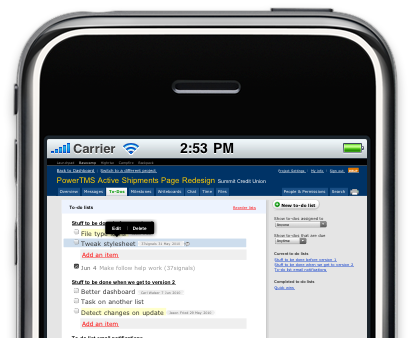
 In Basecamp on a PC, when you hover over a to-do, milestone, or file, you’ll see edit and delete controls. But as has been covered here and elsewhere on the web, there’s no way to hover on a touch device. So our solution to this first constraint is to show the controls when you tap instead of when you hover.
The second constraint is that the controls must be finger-friendly. That is, they should be sized such that they’re always big enough to operate with a thumb, but never too big to fit on the screen.
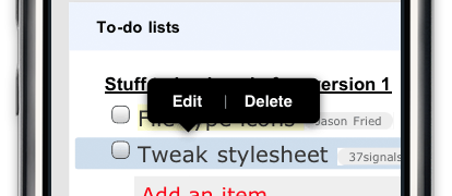
Our first attempt at these controls turned out to be too small when zoomed out…
…and too big when zoomed in.
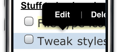
There’s a sweet spot where the controls are just the right size for a finger.
We could use Mobile Safari’s <meta name=viewport> tag to fix Basecamp’s page width to this sweet spot, so our controls would always be the right size. But then we’d need to redesign everything else in the app around the new width.
The solution
Instead, we developed a JavaScript technique for dynamically scaling elements based on the current zoom factor. The technique provides a magic class name device_scale that you can apply to any element you want to remain the same size regardless of zoom.
Here’s how it works. The script creates a stylesheet and installs event listeners to watch for changes in the page’s dimensions as a result of panning, zooming and rotation. When the dimensions change, the script recalculates the ratio of device width (number of actual pixels on the screen) to page width (number of virtual pixels on the page) and updates the stylesheet accordingly:
.device_scale { -webkit-transform: scale(/* <ratio here> */) }
To use this technique in your own applications, just include the script and sprinkle in class=”device_scale” as appropriate.
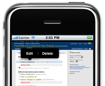
Now Basecamp’s controls are sized the same regardless of how far you’ve zoomed in or out, and we didn’t need to redesign the entire application to account for it.
Here’s the script:
(function() {
  var hasTouchSupport = "createTouch" in document;
  if (!hasTouchSupport) return;

  var headElement  = document.getElementsByTagName("head")[0];
  var styleElement = document.createElement("style");

  styleElement.setAttribute("type", "text/css");
  headElement.appendChild(styleElement);

  var stylesheet = styleElement.sheet;

  window.addEventListener("scroll", updateDeviceScaleStyle, false);
  window.addEventListener("resize", updateDeviceScaleStyle, false);
  window.addEventListener("load",   updateDeviceScaleStyle, false);
  updateDeviceScaleStyle();

  function updateDeviceScaleStyle() {
    if (stylesheet.rules.length) {
      stylesheet.deleteRule(0);
    }

    stylesheet.insertRule(
      ".device_scale {-webkit-transform:scale(" + getDeviceScale() + ")}", 0
    );
  }

  // Adapted from code by Mislav Marohnić: http://gist.github.com/355625
  function getDeviceScale() {
    var deviceWidth, landscape = Math.abs(window.orientation) == 90;

    if (landscape) {
      // iPhone OS < 3.2 reports a screen height of 396px
      deviceWidth = Math.max(480, screen.height);
    } else {
      deviceWidth = screen.width;
    }

    return window.innerWidth / deviceWidth;
  }
})();
Justin Michael
on 15 Jun 10This is great stuff! Can I assume this is coming to Backpack soon?
Eric Anderson
on 15 Jun 10Seems like a kludge to me. I assume this only works on Steve Jobs approved devices.
Siggi Árni
on 15 Jun 10@Eric
That’s what the title says :)
Kevin Ansfield
on 15 Jun 10@Eric
Android uses the webkit engine as well, so I assume changes won’t be needed or if so they will be minor
Chad
on 15 Jun 10As I understand it: ‘var hasTouchSupport = “createTouch” in document;’ Will return false on Android, so it won’t work as is.
Radoslav Stankov
on 15 Jun 10Really good stuff. Especially the play with the dynamic stylesheet :)
Marc
on 15 Jun 10I assume when you typed: .device_width { -webkit-transform: scale(...) }
...that you meant to type: .device_scale { -webkit-transform: scale(...) }
???
SS
on 15 Jun 10Good catch Marc. Fixed.
Mathias
on 16 Jun 10Nice script! In case you’re interested, I slightly optimized it and saved the edited version as a fork of your gist.
Jason Lynes
on 16 Jun 10Sam,
Rad solution. Absolutely love.
One question: How does the user know those actions are below a tap? Since tap is also a click, which often takes me away from my view, how can you make that new tap functionality more obvious?
Struggling with similar problems, look forward to seeing this in action.
Aaron M
on 16 Jun 10Thanks for the post, that should come in handy.
dude
on 16 Jun 10Are you also cooking up a solution for drag&drop e.g. rearranging todo items?
Grover Saunders
on 16 Jun 10So can I ask why this has been so long in coming? I appreciate that you have plenty of things to do, and none of us want feature bloat, but if I was a paying Basecamp customer and I waited three years for the interface to be usable on an iPhone….well I wouldn’t be a paying customer anymore. And Basecamp is the product you actually care to update most often!
I didn’t come here just to bust your balls, but this is the main reason I’m no longer a paying Backpack customer.
Jonathan Dickinson
on 16 Jun 10Any idea if this works on android?
Joshua Clanton
on 16 Jun 10@Grover – I assume they are adding this functionality primarily due to the iPad, rather than the iPhone. That makes sense because there are Basecamp iPhone apps, and optimizing the web interface for iPhone would be redundant.
With the iPad the resolution is desktop equivalent, so only relatively minor modifications like this are necessary.
Cesare
on 16 Jun 10@jonathan I bet, since HTML rendering engine ismthe same. But I just bet :)
Grover Saunders
on 17 Jun 10@Joshua
Though I appreciate the effort, I’m not sure that’s a reasonable explanation. The very premise of this article is that you need to have a solution that’s friendly when zoomed out or in on an iPhone. As to apps, with one notable exception, all the native apps for 37signals products that I’ve tried (and I’ve wasted a lot of money on every one I could find) on iPhone are extraordinarily mediocre at best. And many of them have only come out in the last year or so.
foljs
on 21 Jun 10@Eric Anderson Seems like a kludge to me. I assume this only works on Steve Jobs approved devices.
Yeah, only on the mobile devices that matter most to a web business…
But it should also work on webkit-based Android phones too. I hear those things are very popular in rural Nebraska, though I doubt if, say, they have even 1/5th the basecamp users that the “i” devices have…
Raj
on 21 Jun 10I have the same question as Jason Lynes. How do you make ‘tap’ as an affordance for the end user? I am just curious to see the solution.
Micah
on 21 Jun 10I’m going to 2nd Jason Lynes’s comment and 3rd Raj’s.
“How do you make ‘tap’ as an affordance for the end user? I am just curious to see the solution.”
This discussion is closed.