Note: This post contains screenshots of Safari alerts. So please don’t get alarmed unnecessarily.
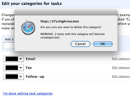
The problem: In Highrise, explaining “uncategorization” (what happens when you delete a task category) is difficult…

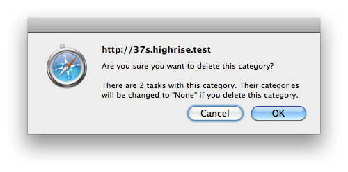
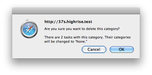
“Uncategorized” feels unintuitive and sounds ominous. Let’s try this: “There are 2 tasks in this category. Their categories will be changed to ‘None’ if you delete this category.”

Now we’re saying “category” 4 times though. Let’s kill “if you delete this category.”

That’s nice and tight.
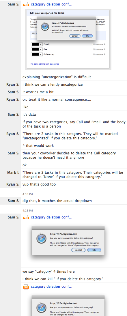
Here’s the Campfire discussion where it was all hashed out:

Related:
Design Decisions: Calling out to existing customers on signup
More “Design Decisions” posts

Justin Reese
on 06 Jul 10Whoa, you guys had me wondering why Safari wanted me to delete a category on the SvN home page. Full-size alert screenshots = scary!
Great copywriting, tho.
Tom
on 06 Jul 10What you want is an amazing batman delete action caption once they’ve decided http://tomcoote.co.uk/demos/batman_delete.html
Dick Kusleika
on 06 Jul 10I like “The category of 2 tasks will be set to ‘None’.” I think having two sentences and the ‘if’ clause is unnecessary. The dialog is an implied conditional – everything on it will happen when you press OK and nothing will happen if you press Cancel.
Mark Morgan
on 06 Jul 10I know this post is about the copy on the alert, but is there a reason “Cancel/OK” isn’t instead “Keep/Delete”? Would that be a pointless redundancy?
Daniel
on 06 Jul 10Mark: I could be wrong but I think Cancel/Ok are the default, unchangeable buttons for browser alerts.
Joakim Bergman
on 06 Jul 10What I would really like to see in these kind of alerts is a note of the specific category I’m deleting.
Something like “Are you sure you want to delete the ‘Follow-up’ category?” would be really helpful to make sure I pressed the correct trashcan and would increase my assurance that the action I’m performing is the one I want it to be.
DR
on 06 Jul 10+1 for Joakim’s suggestion
Stefan Seiz
on 06 Jul 10Very nice! Now if you’d do this with a custom alert, you could define your own buttons and have the buttons be labeled “Cancel” and “Delete Category” which would be even better. OK for a destructive action always seems weird. Copy writing shouldn’t stop at button labels! If only javascript would let us label our own buttons in its predefined alerts…
Aaron M
on 06 Jul 10You could of course create your own alert window that adds a div. Though that would take work to style it and all.
Mickey Thomas
on 06 Jul 10So pleased to see this! I must not have been the only one with this on the wish list in the last survey.
I’ve already deleted the extraneous categories that were created while we figured out how we wanted to use tasks.
Zavie
on 07 Jul 10“Are you sure you want to delete this cathegory?” “Cancel” “OK”
This is not consistent. Shouldn’t it be “No” / “Yes”?
Or something reminding what the resulting action will be, like “Don’t delete” / “Delete”?
Not to mention that “deleting a category” might not be “OK” at all.
Jagath Narayan
on 07 Jul 10Why not have an “undo” button instead of using this dialog box. I know undo button is not easy to implement in all cases, but this one looks like a good candidate.
There are many proponents of choosing undo instead of dialog box. Aza is one of them, for example.
I am sure you guys evaluated it, but could you elaborate on why you went the dialog box route?
Steven
on 07 Jul 10Another good example of craftsmanship for software design and development.
Richard
on 07 Jul 10Another good example of analysis paralysis.
Robert Leeper
on 07 Jul 10Thanks for sharing the conversation. It’s good to see the attention paid to the small things that add up over time.
Jaanus
on 08 Jul 10Problem with this copy: You always say “Are you sure you want to delete this category?” But I may fall into a quick lapse after invoking the delete function and have no idea what category I am about to delete. A better copy would also reiterate the category in question: “Are you sure you want to delete category X?”
Daniel Zarick
on 08 Jul 10Why use “Ok” and “Cancel” instead of “Delete” and Cancel”? Attention is paid to the details of the prompt, but not the actual buttons.
Dan Gilbert
on 08 Jul 10I like the standard “OK” and “Cancel” button labels.
“Are you sure you want to delete this category?”
“Delete”.
From a conversational standpoint, this doesn’t really make sense.
“Are you sure you want to delete this category?”
“OK”.
That sounds natural to me.
“Are you sure you want to delete this category?”
“Cancel”.
This may not follow natural conversation, but “Cancel” makes me feel like I’m removing myself from the conversation, rather than responding to the question.
John Hyde
on 08 Jul 10+1 for button text that explains simply what will happen.
Best practice is to use a VERB.
Thunderbird email client has some irritating dialogs that force you to read carefully to decide if YES or NO is the right answer.
Anonymous Coward
on 08 Jul 10John, isn’t the idea of an alert to make sure the user reads the message carefully?
SS
on 08 Jul 10It’d be best if we could change the “OK” button to read “Delete Category,” but web browsers don’t let us modify button labels in a confirmation dialog. (Maybe someday!)
Implementing a custom dialog box would have turned this one-person, 30-minute change into a two-person, multiple-hour change and would’ve required additional design time. And implementing undo would have taken considerably more work than that.
Every change has costs and tradeoffs. Here, we decided to address a long-standing issue (the inability to delete categories with tasks assigned to them) with a combination of clear writing and the tools we already had at hand.
This discussion is closed.