A few months ago we redesigned 37signals.com — our main site. I want to share with you a few iterations and permutations I created along the way. I’ll also give a little insight into the discussions we had about each design: what we saved for the next version and what we axed because it wasn’t working.
First, a frame of reference
This was what the 37signals site looked like when I started this project. Each time Jason Fried and I talk about changing ANYTHING on this site he always says something like this:
Jamie, 37signals.com is VERY IMPORTANT. A ton of traffic to our app sites comes from here. We need to make sure that we aren’t abandoning clarity for cleverness. CLARITY is of utmost importance on this page.
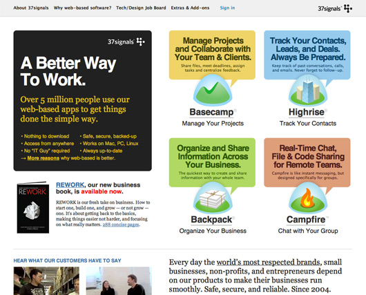
Actually, now that I think about it he says that about everything I touch. Kidding aside, 37signals.com is a very important site. Careful consideration should be taken when undertaking a redesign.
The never-launched enhancement
A year ago I worked on a short project to enhance parts of 37signals.com. Out of this exercise came the design below.
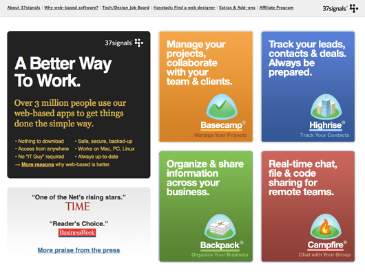
I liked how this design made our products look like, well, products. Basecamp, Highrise, Backpack, and Campfire are presented like shrink-wrapped packaged software. I also liked how easy it was to understand what 37signals does. We make incredibly useful software for your business. Here are our offerings.
I can’t remember why this design never launched. It could be that at the time we had bigger fish to fry. The forms that came out of it, though, would play a part in the bigger redesign project in later months.
One from the archives
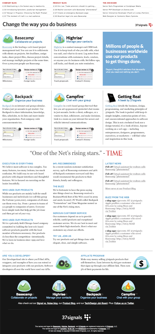
2 years ago I created a design for 37signals.com that I liked. It didn’t work out for a variety of practical reasons. However, I liked the direction: mainly typographic. I save all of my design hits and misses. I hope you do too. There were elements and concepts here that I would save for a later design. This was a kick-off point for me as I started out on the 37signals.com redesign.
Revisiting the manifesto
Like most of you here, I was always impressed with the original 37signals site. First let me give you some context about this original site. 37signals was a web design company. They would pitch companies or ad agencies to design web sites. This was before Ruby on Rails and before Basecamp.
The web landscape back then was all about the flash — literally. Every site that agencies were churning out were complete Flash sites with techno music pumping in the background. Agency websites were all about motion and flash intros. So you have to understand that this 37signals manifesto site was really counter culture. It was revolutionary in presentation and messaging.
Jason and I both arrived at this idea of revisiting the manifesto. How would the manifesto design look like now that we sold software?
Typographic
What if the site was a clear statement of what 37signals was? Just simple type. Such a design would be antithetical to what many people think of a software company’s website.
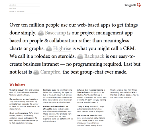
Feedback: The design is strong, but it relies too much on the person reading to figure out what 37signals is. Might be a cool one-off campaign thing, but not as the main website for our business.
3 blocks
Another idea was to break up the page into 3 blocks: apps, ideas, and REWORK. A person could scroll down the page and get a good sense of what 37signals was about from these 3 blocks.
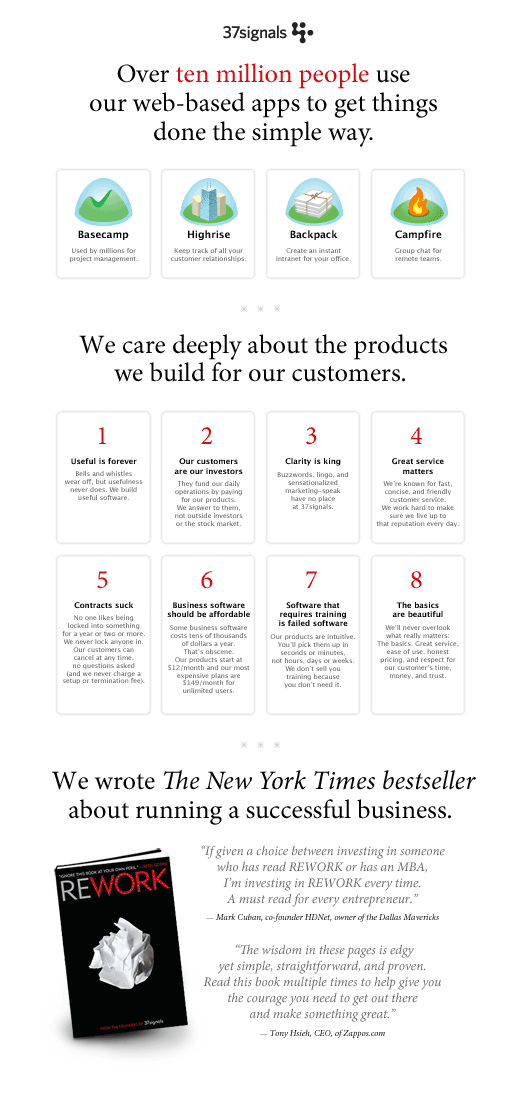
Feedback: There’s definitely something here that is working. Let’s see how we can take this further. This moves on to the second round!
Big and graphic
I always like to throw in a “from left field” design just to see where it goes. This isn’t thematically related to the “manifesto” idea. I thought it was worth exploring and seeing next to the other options.
Professionals might also see this as the design you hope the client won’t pick, but is there to divert attention to the other options. It shows some range, but ultimately its main purpose is to fail.

Feedback: Not the right direction.
The world map
How about we show that our apps are used by people all over the world? The diversity of our customers’ businesses and locations is a powerful story to tell. We could be doing a better job of telling this story. Our customers are not just from North America. They’re all over the world!
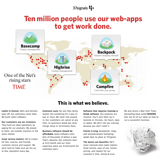
Feedback: We all agree that our world-wide presence is a great story to tell. However, front and center like this makes it a bit unclear. Do certain people in this country use Campfire? Do these people only use Basecamp? Ultimately that story is better told on the Customers page.
Ad-like
The idea behind this layout was to mirror an ad in a business magazine. Maybe it is similar to a one-sheet you’d get from a car dealership. A simple, tight layout that communicates everything about your company and products.
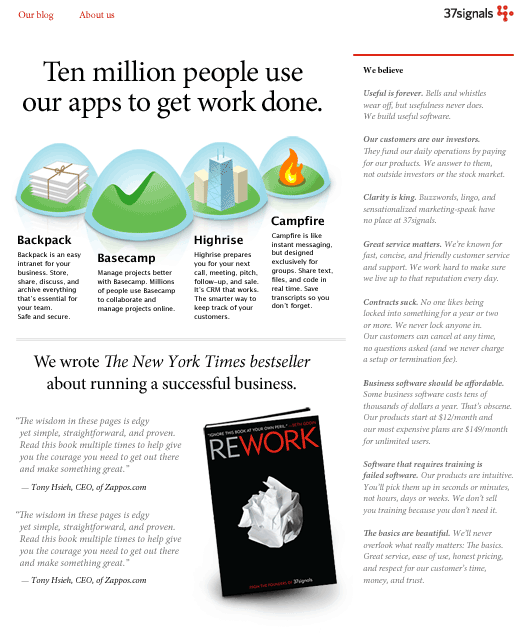
Feedback: I like this design a lot. DHH did to. In fact when I started producing the HTML he was confused as to why the design didn’t look like this one. The layout, though, is inflexible. It is something that we’d quickly outgrow.
3 blocks: Show world-wide use
This iteration of the 3 blocks layout added the map idea. Let’s show some customer faces on a map to get across the idea that our apps are used all over the world.
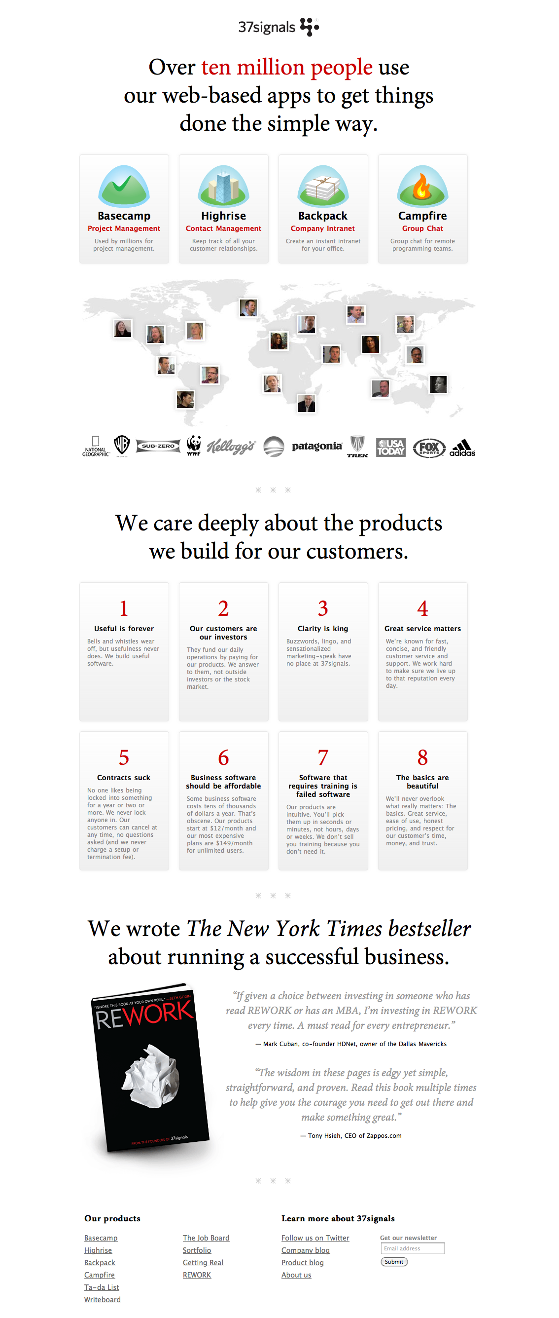
Feedback: Jason thinks the map is unclear. What is it? What are those faces doing on there? I think the idea is there. We have a heated discussion in Campfire about it. I ask to take another stab.
3 blocks: Map version 2
I make the photos bigger and also intersperse the pictures with logos of some of our customers. The idea here is to show that we have big brands as customers (depicted by logos) and also small businesses (depicted by pictures).
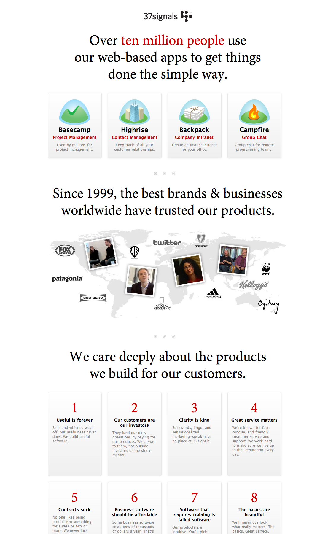
Feedback: Jason still doesn’t like the map. More heated discussion. His concern is that we’re not talking about the variety of businesses that use our products. I see his point. I shelve this discussion to work on the Manifesto part of the layout (depicted by the numbers and paragraphs under the map).
3 blocks: Make beliefs more typographic
The beliefs don’t need to be boxed in like the apps. Let’s see how they look without boxes.
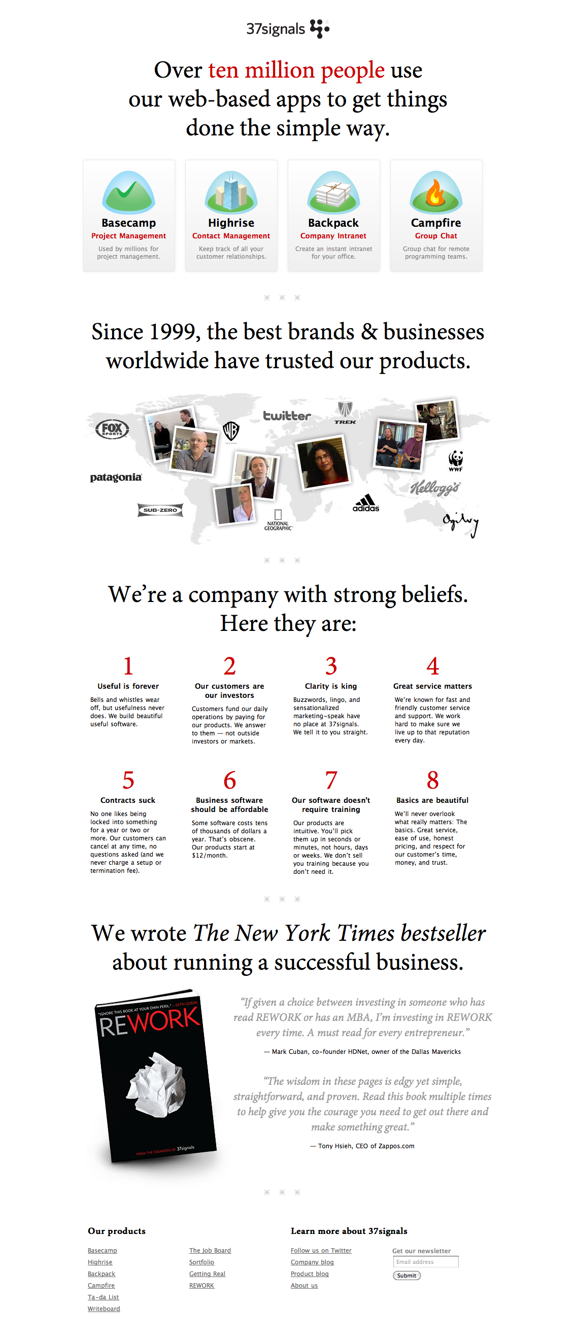
Feedback: Good, but still needs to be pushed a little further. Needs to be a little more elegant. Jason says all he sees is the number not the idea.
3 blocks: All typographic
OK let’s gray back the numbers and put the emphasis on the headline for the belief. I also have an idea for the Customers part (ditching the map).
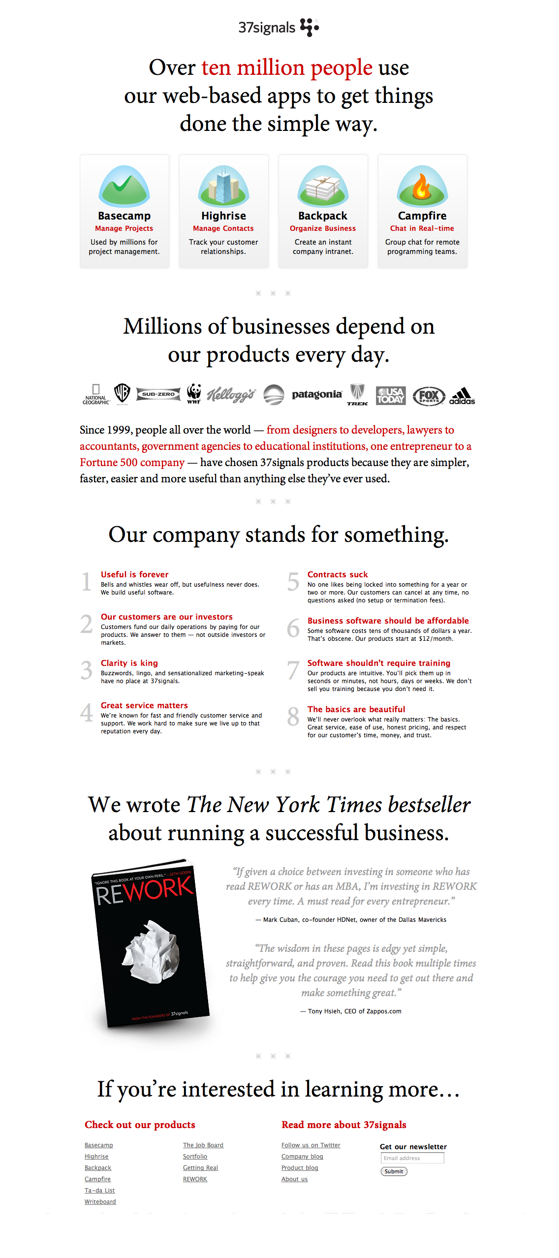
Feedback: Love the belief section. Jason still isn’t feeling good about the customer section. It isn’t showing the diversity in our customers enough. Oh yeah well f—!? OK back to the drawing board.
3 blocks: photos for each industry
I mock up a quick idea to have photos of different customers from different industries. This is depicted by the black and white sketch below.
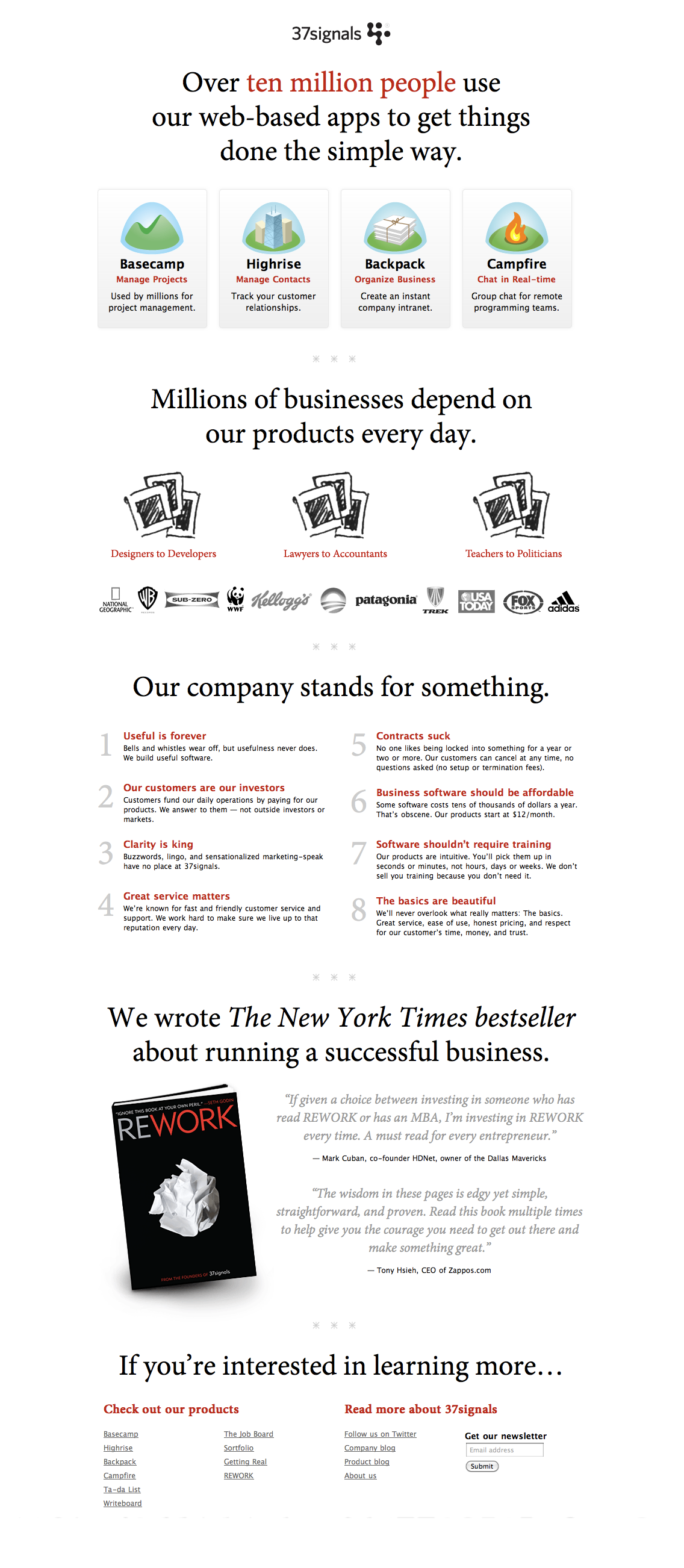
Feedback: Still not right. Too limiting, doesn’t show that anyone can use our apps.
3 blocks: OK, how about we kill it?
Looks pretty good removed.
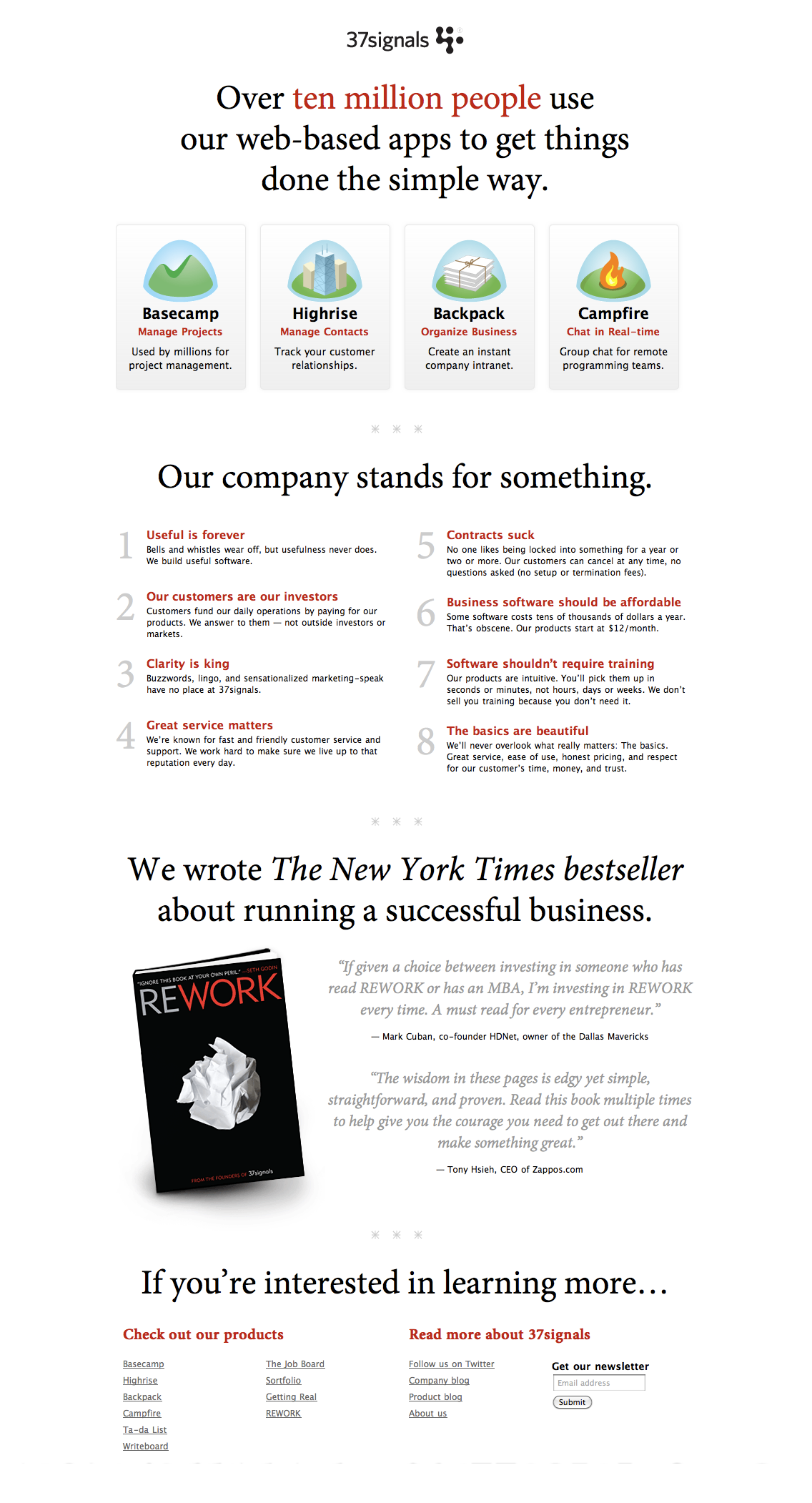
Feedback: But I’m not one to back away from a challenge. This story about the diversity of our customers is just too good to not tell.
The final design
After many more micro iterations and permutations we finally arrive at the final design. I’m really happy with the way it turned out. I hope seeing a little bit about how we got here gives you some comfort that we try many things internally before we get it right.
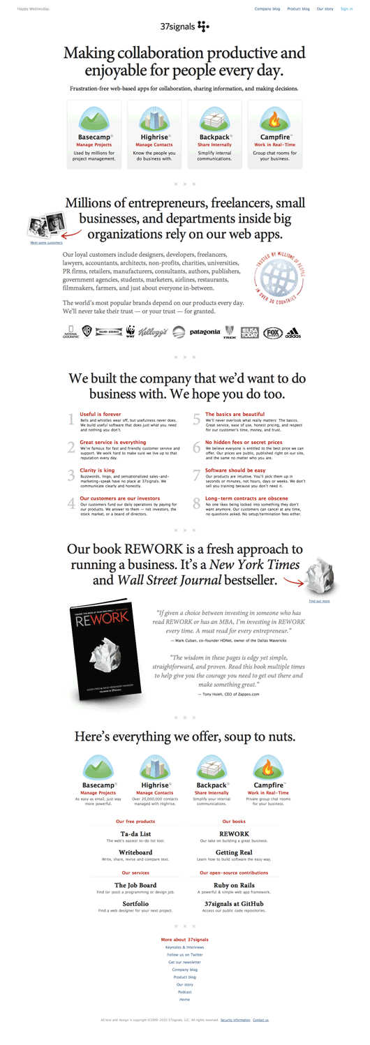
Feedback: We’re still working on it! Thanks for taking the time to read this post.

Brian
on 15 Dec 10Damn. I’m tired after reading through that.
Christopher B
on 15 Dec 10Thank you for sharing your process. Without a doubt several of the designs above I prefer over the current design due to elegance, clarity, and cleverness.
Hopefully some of these can be used for future versions incase the people in charge feel they are too modern for today’s audience. Would also love to see in a post some day, designs you have mocked up for the backend as like everything in the world their’s a lot of room for improvement. Thankfully, and most importantly, the functionality is there. Now it’s just a matter of bringing the ‘look’ up to the same par, as you clearly have the capability and skills to do so. Thanks again!
mwld
on 15 Dec 10the ad-like idea is really beautiful. (but no one would read any of the text)
Gregor
on 15 Dec 10»Happy Wednesday.« ? On such a prominent place? What’s the idea behind this one?
Nate
on 15 Dec 10Yeah, the ad-like one is my fav too. I’m curious about the growth feedback. You guys have had anti-growth as such a useful and important constraint for so long. Maybe that design would actually be a nice constraint for you guys to embrace again? After all, the clarity and impact of the 37signals.com page might suffer if indeed that page has to keep growing? Not meant as harsh criticism, just professional curiosity.
Justin Jackson
on 15 Dec 10Loved seeing the “back and forth” on this design. Really helpful to see the process; what you kept and what you removed. It shows that design is storytelling, and the storytelling requires good editing.
Oh, and I think the “Typographic” concept would work great as an email or landing page for a campaign.
Eric Anderson
on 15 Dec 10The million dollar question was had did the redesign affect the traffic to the products as well as actual sales on products?
Eric T.
on 15 Dec 10Jamie, there is a lot of worker in each iteration, how much time went into the whole process? Also, you said: “I save all of my design hits and misses.” Can you tell us how you organize that? Thanks.
JD
on 15 Dec 10Eric A, Traffic is good.
Eric T, Getting to the final design took about a week. It took about a week more to polish up the copy and the other interior pages to fit.
Re: the different versions, subdirectories and filenames like -01, 02, etc.
Matthew Stuehler
on 15 Dec 10Great. Now I know what 90% of all web sites are going to look like for the next 5 years.
Benjamin Lupton
on 15 Dec 10@Matthew, hahaha right on.
Very good post guys, cool to see how it all works together. How come you guys wanted to do an upgrade in the first place? Just to keep with the latest trends?
Scott LaPlant
on 15 Dec 10Jamie,
I think you did a great job with the redesign. My only quibble with it would be the last section that details the “More about 37signals” links like, Keynotes & Interviews, Twitter, Get our Newsletter, etc… It just doesn’t seem to flow with the rest of that page – almost seems like they were stuck in there as an after thought.
This critique is more about personal taste I guess than anything. Either way, I think you did a fantastic job on hitting the right note AND with dealing with the dynamic duo of JF and DHH ;)
It was a fun read about the process and the back and forth. I’d love to see more of these types of articles. I’d also say your writing style makes for good insight with a sense of fun behind it. Love it!
JF
on 15 Dec 10How come you guys wanted to do an upgrade in the first place? Just to keep with the latest trends?
We tend not to follow the trends. WE SET THE TRENDS, MAN!
Really, sometimes it’s just a matter of getting tired of something and doing it all over again. It’s a fun process, it forces us to think about things, it’s a good creative outlet, and it keeps us sharp.
Pixeldrummer
on 15 Dec 10Yours is one of the most effective sites I’ve seen for a while. There is so much ‘designerism’ out there that clutters up the core message, it’s refreshing to find a site that is clear, to the point and attractive as well.
I would be interested to know if you used a copy writer, as every word in your copy is well chosen. The hierarchy of the information is very good. What I liked especially well are your 8 points, specifically #1.
This company has vision, they’ve given you the time to go through the process to redesign the site. Too many don’t realize the value of that. I think you’ve reached the goal of engaging your visitors and make them want to know more.
Jonathan
on 15 Dec 10When I saw the new web design, I was happy that you finally made a change to the site. I was getting tired of the old design. I think customers or any web user gets bored and needs to know that someone is working behind the curtains. I also think web users NEED more clarity in their web experience. Part of the reason that users bounce and click is that they DON’T immediately find what their looking for on a site. That’s why we continue to set basic trends like big fonts and white space; more clarity.
KMB
on 15 Dec 10Looks like a scrapbook to me. All sort of different styles scrambled together. It’s missing some sort of consistence. You got comics, photos, worn graphic/stamp, even gradients. All that’s missing would be a mirrored logo…
I also don’t quite get the scrambled piece of paper next to the red arrow in the “Rework”-part. I do get the reference to the book-cover, but as the words from which the arrow starts are for newspapers the associations implied might not be right.
Last but not least: I would link the “REWORK” in “Our book REWORK is a fresh…”.
Geoffrey
on 15 Dec 10Great post! I always love to see the previous iterations of a great design—especially with commentary. Your final solution is obviously the right one.
The only thing that bugs me is the “jaggies” on those rotated photos with the white borders. There’s a few ways to fix that in Photoshop if you are so inclined:
I know, details, details… :)
hop
on 15 Dec 10When I open your homepage, at first glance I see some giant font sentences I’m not going to read and the serif font is badly pixelated (win7 Chrome). Black on white makes it even harder to read. This roll over nonsense is retarded.
Basecamp, your biggest (and most helpful product for my company) is not being sold. And ditto for the other three.
I can’t even read your side by side list of products near the bottom because of the font sizes, colors, centering and dual column layout combo. Ascending width links are… cute.
Sorry for the criticism but I know you have thick skin. If I make you a better page, judged solely at your discretion, will you pay me? And i’m not even a web designer, just a lowly industrial designer that hates bad looking anything :) Pretty no-lose offer.
Benjamin
on 15 Dec 10(37signals responds)
Wow, for a company so focused on design – it seems to me that not generating significantly more traffic for signups after the redesign is a HUGE let down. Yet it seems like 37signals didn’t really care.
It’s the entire point of having the marketing site (37signals.com) geared towards generating user signup? Maybe not.
netfreak
on 15 Dec 10One thing confirmed from this post ( eh, i knew it ) was the massive amount of design talent @ 37signals.
The thing I like the most about the final design is balance. Is clean, totally expressing 37signals, tends to be characterized simple, but the combination of typography along with the smart graphics, makes it perfect.
Maksymilian Sleziak
on 15 Dec 10Wow, superb blog post!
Anonymous Coward
on 16 Dec 10The current homepage and many of those iterated designs are way too wordy.
Iterating on visuals such as this when the fundamental elements, hierarchy and purpose is not clear is a waste of time. You’d be better working on paper sketches or wireframes first – getting the major elements right and then, once that’s agreed, looking at the visual design.
Don’t want to be rude, but the current homepage comes across as presumptuous – both that you’d think people would want to read through so much text and that they would be more interested in your company manifesto than they would in what benefits your products could bring to them.
Mark
on 16 Dec 10I have to agree with some of the others here. The inidividual segments are nicely designed, but splatting them all up on one page together is overwhelming. It comes off as the elevator speech that doesn’t end when the doors open. It’s a bit “desperate”, as if you MUST get the sale on this one exposure.
If you’re harking back to the manifesto site, why not have these segments broken down into individual pieces and a page refresh or secondary visit would give a random segment? That would, at least, keep in the goals of the ownership & company of doing the most with the least.
Bring me in to the store gently, like a luxury car dealer. Don’t knock me over with the whole product inventory, balloons, giant inflatable ape and salesman dressed as a patriotic cowboy as soon as I walk in the door.
Josh Bryant
on 16 Dec 10Is there a chance you could comment on your design process in terms of the tools you use? Do you primarily make all these in Photoshop? In code?
Anonymous Coward
on 16 Dec 10Mark: The design is “all on one page” if you scroll through all of it. The page is nicely segmented. The top is the most important. If you are looking for one of the products, it’s right there. If you want to know more about who these guys are, you scroll down. If the content keeps you interested, you scroll down some more. If not, leave or click one of the products. The structure works.
Dave G
on 16 Dec 10I’m glad you didn’t use the maps, at least not as they were mocked up here. I’m not sure about other countries, but the dots on the maps indicate that most of your Australian users live in the middle of the desert!
Mark
on 16 Dec 10@Anonymous—
I respectfully disagree. The most important part of 37Signals message is not the products, it’s the manifesto. The manifesto is reflected in their beginnings, their blog, their speeches, their books and finally their products. The manifesto is what attracts ~100,000 readers to this blog. The manifesto is the ‘product’ they’re selling—always has been, always will be.
The marketing message and structure of the homepage is exactly the approach of most companies: what -> how -> why. It should be exactly the opposite: why -> how -> what.
View this TedX speech by Simon Sinek to see what I’m getting at—
http://www.youtube.com/watch?v=u4ZoJKF_VuA
Ryan
on 16 Dec 10I am sad that this is such a monument to corporate ego since you guys build such fantastic products and clearly have exquisite design skills.
Compare the space given to your actual products to the space given to talking about the company.
People care a bit about the company behind the product. They care way, way, way more about the product. It’s nice you are proud of the book, the customer wins, the corporate philosophy. This would be an EXCELLENT cult recruiting website. But I thought your goals was to sell shit.
JF
on 16 Dec 10Ryan: Don’t be sad.
The goal with 37signals.com is to either tell people about the company, or to to get them on their way to the product site of their choice as quickly as possible. We give them just enough to get a basic understanding of what each product is. The product sites are where the products are clearly explained in detail. The 37signals home page is a launch pad to the other sites. We don’t want to keep people on the 37signals site.
Explaining 4 products with sufficient detail at the top of 37signals.com would require a lot more space and it would be quite likely that people would be overwhelmed by detailed explanations of 4 separate products.
Nathan Derksen
on 16 Dec 10I enjoyed reading about the process of creating the visual design. I do have a few thoughts about the final design:
- The rollovers on the products are extremely distracting. The rollover text is way too big and hard to read, and is really weird having it above the product rectangle, not below. I know you are trying to be stylistic and keep things uncluttered, but I think it actually impairs readability and comprehension.
- There are five different sections on the page, each given roughly the same weighting. I think that the two most important sections are the products section and the manifesto section, and those two should be more prominent than the others. The book and the diversity sections I would argue are side-stories and should not be given such huge emphasis, so that the more important ones can be given their due. They may be important to you as a company and I can tell you are rightly very proud of what the company has achieved, but I think that information is much less important to visitors and it should be given a reduced focus on the page.
- I like how the manifesto section itself is laid out. I definitely prefer it over the version with the boxes. Clear, easy to follow.
- How about people coming to your site to get product support? I see support links on the product pages, but from the home page there is no mention of help or support, even in the soup to nuts section. This is probably a significant audience, why not give them an extra hand by explicitly pointing them to where to find that? My thought is to remove the mouseovers from the product thumbnails and add below each product thumbnail the links to the important pages for that product, such as Tour, Plans and Pricing, Help/Support, Extras and Add-Ons, and Sign-In.
To me, this home page is primarily a marketing page and only targets an audience of purchasers. Of course your home page needs to market your products, but that’s not the only audience and I think the design is quite distracting and unhelpful for those who come to look for more than purchasing information.
Mike Rohde
on 16 Dec 10Thanks for sharing your process Jamie – always insightful to see in detail, how other designers think through challenges and arrive at solutions.
GBS
on 16 Dec 10Hey world, go build something and then apply all of your great advice/wisdom/feedback to YOUR company’s website. These guys aren’t infallible but they know how to speak to their audience, and represent themselves consistently. I wouldn’t want this design for MY site, but it suits 37S just fine. Next you’ll be suggesting paint colors for their office, please just stfu.
Matt
on 17 Dec 10@Benjamin: Maybe they aren’t worried about increasing click through rates because they were already happy with where they were. But, they understand that to keep them at that level they always need to be improving/updating the look of the site.
Drew
on 17 Dec 10Thanks, Jamie, it’s always a pleasure to see how other designers conceptualize and iterate.
Several months ago, 37s sought a designer to redesign SVN. Will they be given free reign, or will this aesthetic inform the redesign?
Tim M
on 19 Dec 10JF/JD: this is an awesome insight.
I agree with JF re-doing design to refresh is a good way to refocus on what the important parts of the business are, and therefore what the most prominent and clear things should be.
I’ve just been through this as part of some CRO work with Scratch Media and it was eye opening!
Keep it coming guys!
T
Darren
on 20 Dec 10The big text and the long layout makes me feel like I’m reading a comic at The Oatmeal. I guess I’m in the “I don’t understand design well enough to know that this is good” camp because it just looks really amateurish to me.
Keith
on 20 Dec 10Nice write-up of the process, and the result seems to fit your style.
I feel your final choice of headline, “Making collaboration productive and enjoyable for people every day”, is a little clunky. It may be improved by dropping the “for people” (it’s not aimed at polar bears or ocelots, is it?) but it still has a bit of a corporate-speak ring to it. The earlier versions concentrating on getting things done and simplicity seemed stronger. I wonder if it wouldn’t be better to drop the current headline altogether, and promote the subhead, “Frustration-free web-based apps for collaboration, sharing information, and making decisions”, into its place—that seems to say everything that’s necessary. Or maybe add one word: “Simple, frustration-free web-based apps for collaboration, sharing information, and making decisions.”
But hey, I’m no copywriter!
Mark B
on 20 Dec 10I think the new design works really well when zoomed out, like it is presented in this article but when visiting the actual site it feels jarring to scroll through as the margins seem to shift all over the page.
I think it’s the picture next to the ‘Millions of entrepreneurs…’ headline, the crumpled piece of paper along with the tapering at the bottom that create this effect.
Thiago Carvalho
on 20 Dec 10Needs a little more work but I loved it
Mike
on 21 Dec 10I really enjoyed (and appreciate) the peek inside the design process.
One nit-picky thing that bothers me is that the current design has a horizontal scroll bar at 1024×768 – seems like that could be fixed pretty easily though.
I’m also not wild about the product rollovers. I think it’s mostly the red arrows that bother me – they seem out of place, spaced inconsistently, and point to arbitrary terms.
Finally, I think aesthetically I much prefer the look and feel of the ‘never launched enhancement’ – it’s more of a break from the traditional 37Signals ‘look’ in terms of color palette and the like…
Again, an excellent and insightful post – I appreciate the insight.
Dp
on 21 Dec 10Just went onto the main site and after 30 seconds of being abused by lots of confusing content im not sure im any the wiser as to what these products offer other than the basic idea. I feel confused, bored and with no really wish to view anymore of the sight, even forcing myself to look at the site i find myself uninterested and yeah… still unsure as to what they offer.
eric
on 21 Dec 10millions
James
on 22 Dec 10The previous design made me want to interact and dig deeper into the site. The current design doesn’t make me want to interact with it. I give it a quick scroll and am more interested in clicking away without really reading what you have to say.
This discussion is closed.