Orvis

Gregory Maher writes:
I was just checking out some gear on the Orvis Web site and found this interesting feature. When checking out, you can round up your purchase for charity. Orvis will quadruple your offering making a donation to the McCloud River Redband Trout. Pretty neat.
30 second portfolio

Tim Van Damme writes:
When you arrive at The Consult’s homepage, you’ll see a link in the top right corner saying “Short on time? View our 30 second portfolio”. My first reaction was: “I’m always short on time, and I am indeed interested in getting a quick overview of your work!”.
Vista

Des Traynor writes:
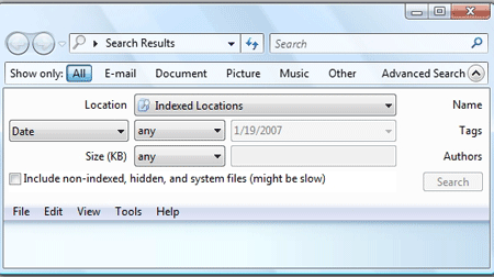
Found a screenshot that is the antithesis of Simplicity…
Is there ever, EVER an excuse for a dialog like this (taken from Windows Vista).
You’d think after the joke that was the XP Puppy Search, they might put more effort into these dialogs. (Note: I’m pretty sure this isn’t default search prompt, but thats still no excuse.)
Quizlet

Andrew Sutherland writes:
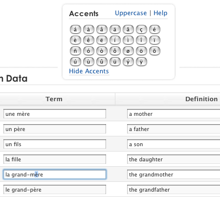
From Quizlet, a site for learning vocabulary…The cool part of this page (click image for full screen) is the Accents bar – you click on the input box you want the accent in, then click on an accent button, and it gets inserted. It’s very handy for people who are studying foreign languages but don’t know the keyboard combinations required for accented characters. Also, the accent bar slides to each input box you click on, so it is always close at hand.

Diego
on 02 Apr 077MB isn’t something I would choose to download if I’m short on time… Don’t think it is the same for everybody else though.
Diego
on 02 Apr 07Oh, and I know this is totally off-topic but please Translate Basecamp
Ed
on 02 Apr 07Diego, yeah, i agree… having to actually download anything to your computer isn’t quick… why can’t they just have a single webpage with the “30 second portfolio” on?! ;)
some guy
on 02 Apr 07that portfolio is beautiful but I don’t like it when things go fullscreen without notifying me first.
Nathan
on 02 Apr 07The Orvis feature is neat, but if the subtotal is $365.00 as shown, where do they round it?
Also, the Round up for Charity drop down menu has nothing shown. Perhaps it should be the suggested rounded amount?
Jeff
on 02 Apr 07That Quizlet feature is excellent, somebody should code a free version for people to use, or maybe a Greasemonkey extension…
But the Vista capture? Why is it that outrageous for an “Advanced Search” box?
Marcus
on 02 Apr 07I don’t find that Vista screenshot particularly horrifying, especially if it’s not the default search. For the options they’re presenting (some of which I’d love to have in Spotlight) it seems pretty well presented if you ask me.
Mario
on 02 Apr 07While I love the idea of rounding up your purchases for charity, and I do support wildlife conservation, does anyone else find it disturbing that they’re holding a DEAD fish?
Prophetess
on 02 Apr 07Mario: I somehow think that it would be very hard for them to get a picture like that with a LIVE fish in hand. :)
Nicole
on 02 Apr 07The thirty second portfolio certainly sounds clever. Then it crashed both Firefox and IE.
Andy Kant
on 02 Apr 07RE: Vista
To all of the people who are obsessed with simple: There are people like me out there that like to have GUI’s with low level options, even if it means a complex interface. I don’t want to be forced to choose moron mode or kernel hacker, and I’m glad that Microsoft realizes that because Apple sure doesn’t (God I hate my MBP).
Karl N
on 02 Apr 07I tried out the rounding for charity thing, and it rounded $45.00 up to $46.00.
Doesn’t that eliminate the whole idea of “rounding”? It seems like many of their items are even-dollar prices anyway.
james hathaway
on 02 Apr 07Thanks for the mention of The Orvis Company’s Round Up Campaign!
FYI: This fish is alive and well in this photo. As part of studying populations of fish to determine the health of the species, they are captured and counted. This one is being held for the photo before being released!
James Hathaway Conservation Manager The Orvis Company
edddy
on 02 Apr 07What kind of “advanced search” will be if it doesn’t do the advanced thing?
Note: I’m pretty sure this isn’t default search prompt, but thats still no excuse. It’s no excuse to post something that you don’t know (and yes, this screen is for ADVANCED search)Des Traynor
on 02 Apr 07Marcus, edddy:
There are far better ways to lay out an advanced search box. Vista was only out a couple of days out when I mailed that shot in, and I hadn’t installed it. I have now, this advanced search dialog sucks.
On the right hand side, you’ll see 3 words (Name Tags Authors), what are they doing there? The whole thing is a mess. Don’t get me wrong the functionality is really cool. It’s nice to be able to search for pdfs containing certain words from last year etc.
I just think they could have put a bit more thought into the layout of the dialog.
Chuck Cheeze
on 02 Apr 07While the feature of Quizlet is useful—- I wonder if Andrew thought he could get Quizlet noticed more by getting a screenshot if his own product published on the 37S blog?
From his own site, www.jalenack.com:Big Pimpin’ there, Andrew. Way to digg yourself.
Peter Jennings
on 02 Apr 07@ Chuck Cheeze Can’t say I mind Andrew promoting his own (free) web service – it may have taken me a while to find it otherwise. With Quizlet I now have a way to productively spend my mealtimes (learning Czech vocab), instead of just reading football sites. :)
I’m also very impressed by what Andrew has done with that site – very cool design for a 17yo student working in his spare time (or for anyone for that matter).
Jeff Kenny
on 03 Apr 07One of the things I completely agree with 37S on is that writing is a huge part of interface design. So, re: the Vista shot above, I found it really funny to see the items listed in the “Show only:” menu bar. The colon means that the words “Show only” go with each of the options to the right, but if you read them, only “Email” and “Music” actually sound correct. To make it easy for you all, here are the bad ones:
Show only: All Show only: Document Show only: Picture Show only: Advanced Search <—I’m not even sure this was meant to go with the other options, but its in the same line so one would assume it does.
Here’s a little tip to designers/interface people out there – read your screen out loud. If it sounds wrong it usually is.
Michael Zuschlag
on 03 Apr 07I have to agree that for raw number of controls the Vista dialog is not too complex for Advanced Search. While some things can be done to cut down on the number and weight of the controls while still providing the same flexibility, the real problem is in the graphic design: the use of shade, borders, and spacing fails to communicate the correct functions and relations among the controls, leading to a sense of confusion when using the dialog. For example, the Advanced Search disclosure button is within the Show Only frame. Show Only Advanced Search? The original Search text box at the top is stranded on a glass-surrounded island from the other criteria controls (which have their own redundant Search button), making it unclear if text entered there is included in the search. The vertical spacing among the controls is less than the horizontal spacing which (combined with the alignment) draws the eye down vertically when it should go horizontally to “read” the dialog. For example, the “any” dropdowns appear to go together when they are actually intended to go with the controls to the left and right. I’m also confused by the Name Tag Authors text on the right. Typical of Vista, static labels and active controls look the same. Are they decoration? Are they links that reveal more controls to set criteria for name, tag, or author? Are they like radio button to specify whether the string entered in Search box at the top looks in name, tag, or author? I’ve no idea. The File Edit View menu bar fades into the Advanced Search dialog suggesting it’s part of Advanced Search, but I suspect it’s actually for the entire window and primarily used for the search results when they are displayed. I count nine different background textures on a small dialog, which adds to the sense of clutter. This is so Vista. Graphic design that’s supposed to look good in a demo (Ooo! cool gradient shading! Nice rectilinear control alignment!) while detracting from functionality
adam
on 03 Apr 07Re: Vista…
I think the Vista Advanced search could be better but advanced screens are rarely pretty. One of the masters of simplicity also doesn’t have a simple advanced search screen… http://www.google.com/advanced_search?hl=en
adam
on 03 Apr 07Re: Vista…
I think the Vista Advanced search could be better but advanced screens are rarely pretty. One of the masters of simplicity also doesn’t have a simple advanced search screen… http://www.google.com/advanced_search?hl=en
Karl N
on 03 Apr 07The Vista screen would look better if they didn’t make everything hard to read with 3d effects and shading.
Darrel
on 03 Apr 07Yea, the 30 second portfolio sounded better before actually downloading it.
Seems a quicker portfolio would have been to just put 4 or 5 examples on one web page with some descriptive text so I can scroll through it in 20 seconds.
Darrel
on 03 Apr 07“I don’t want to be forced to choose moron mode or kernel hacker, and I’m glad that Microsoft realizes that because Apple sure doesn’t (God I hate my MBP ).”
Please elaborate!
MS, in general, seems always arbitrarily complicated. Telling a person how to change a setting in IE is always 5-6 more clicks than the same process in Firefox. Not only that, the 5-6 clicks will change from one version to the next, one OS to the next. It’s hard to keep up.
(FYI, you can slap Windows on that MBP fairly easily…)
“One of the masters of simplicity also doesn’t have a simple advanced search screen…”
I don’t think google has ever been great at simple UIs. They are great with simple features, but have always struggled to really make the UI simple.
Dustin J. Mitchell
on 05 Apr 07I don’t know how I’d go about getting a screenshot, but while I was wasting time with Wii Sports last night, I noticed that it periodically says “Why not take a break?”, with an icon of an unmanned wii and an open window, through which a refreshing breeze is blowing.
Might be something nice to feature in another screens around town..
Brenton Simpson
on 09 Apr 07I found one (eMusic). The login page asks for an email and has two options, “No, I am not a member of eMusic,” and “Yes I have a password” with a password blank.
It tries to be clever and get you right to the registration page, but it is lazily coded on the server side. This is what you get if you use the Wand in Opera (it autofills your password and submits the page):
“Although you selected the not a member option, we already have an account for that email address. Please enter your password, or click on the Forgot Password link below.”
They ought to have just checked the password against my account and let me move on. At the very least, have it auto-check the Yes button if I enter a password.
This discussion is closed.