Many months ago Jason Fried asked me to think about a cover idea for REMOTE, a new book that he and David Heinemeier Hansson were writing.
I thought REWORK, their previous book, had an iconic cover. The sole image of crumpled paper alluded to “back to the drawing board.” It’s a great cover.
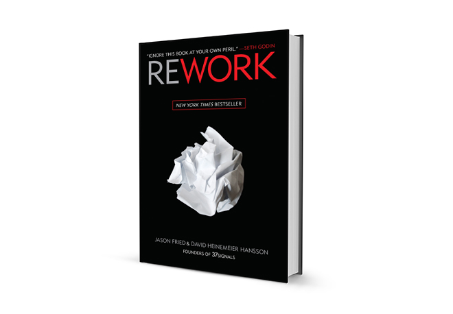
I decided early on to keep the main color scheme for the REMOTE cover: red, black, and white. I liked how the titles “REMOTE” and “REWORK” read like they’re part of a series. It made sense for them to have some relationship. I also wanted the book cover to be white. There was no meaning other than I wanted REMOTE to feel related but be visually different.
My first two covers were designed to be directly related to REWORK: title centered top with an image in the middle.
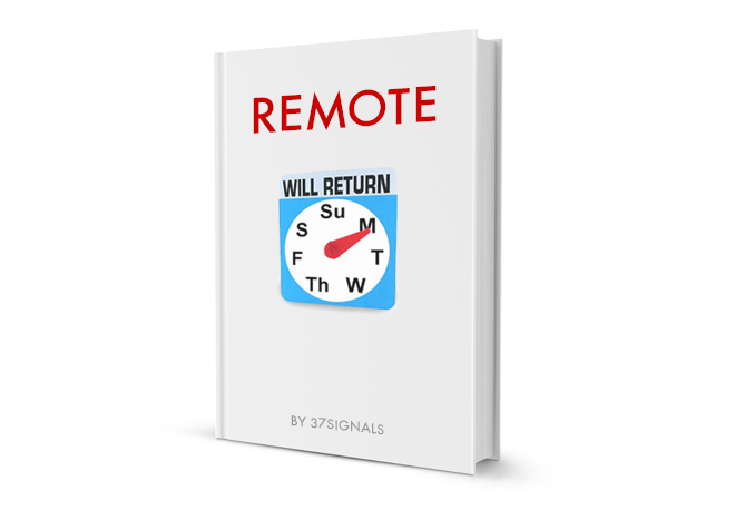
I also thought it’d be fun to try something similar in attitude to the crumpled paper.

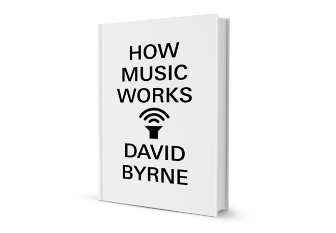
During this time, I was reading a book by David Byrne called How Music Works. Like all (most?) designers, I’m always filing away graphics, signage, type I see every day into my brain somewhere. I appreciated the boldness of the cover design (still do).
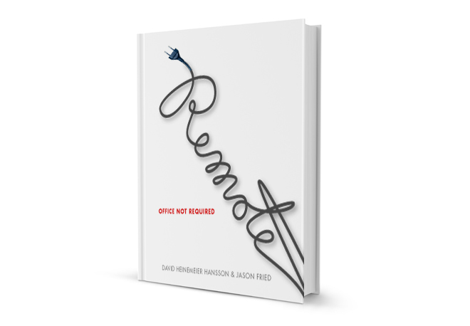
Could I make REMOTE typography that communicates remote? I imagined an unplugged electrical cord. So, I drew and scanned one spelling out the word “Remote”.
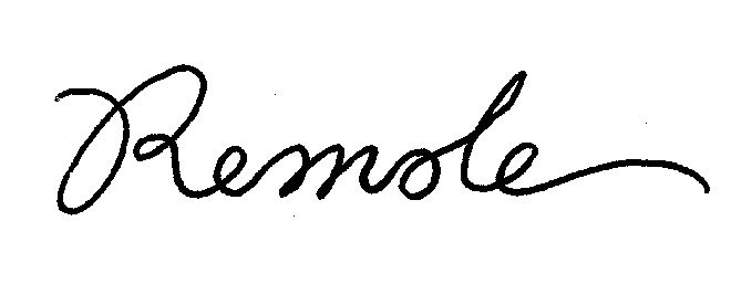
Then I traced it in Adobe Illustrator and set type around it.
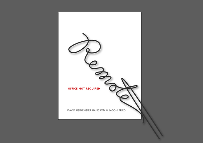
I still like this cover idea.
Then I thought about not alluding to any physical objects. Let’s not hold on to the crumpled paper. Let’s ditch cut neckties and electrical cords. Could I communicate “remote” with type in an abstract way?
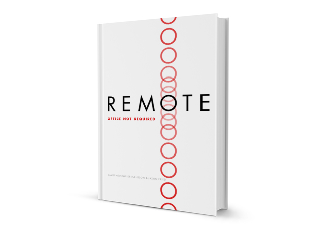
The “O” in REMOTE had a lot of potential. The perfect circle “O” (set in Futura) could act as an anchor.
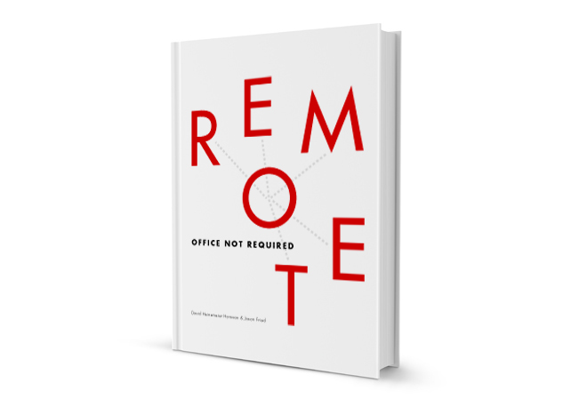
I uploaded that to Basecamp and 5 minutes later Jason Fried texts me: “You are a genius.” Actually, he didn’t say that. I can’t remember what he said because I don’t have his text anymore. He liked it.
We showed the cover to the publisher and they weren’t crazy about it. The publisher showed the cover to bookseller buyers and they didn’t like it. All the while, Jason and David kept pushing my cover design.
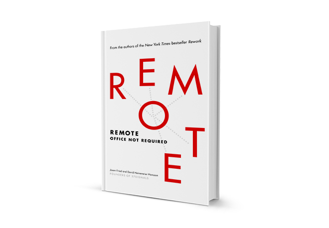
After a few tweaks and some uncertainty we had a cover for REMOTE. I’m honored that Jason and David advocated for my design. Thanks to Crown Business for going with the cover.
Pick up a copy of REMOTE if you don’t have it yet. I designed the cover.

Bob
on 13 Nov 13Awesome job on the cover Jamie! I really like the one with the vertical O’s as well, but the final result definitely conveys the “remote” meaning better. Great cover for a great read.
Small typo…
... bookseller buyers any they didn’t like it.
and*
Lester
on 13 Nov 13I’m loving the one you presented to the publisher. Perhaps even slightly more than the one with the few tweaks here and there, although I can see why those tweaks were made. Also really like the power cord one. And I really like the concept behind the cut necktie one.
On a completely unrelated note, do you have family members over here in the Philippines and are they all okay? Hope so.
Strong design, man.
twiz
on 13 Nov 13Thanks for sharing, I love the cover. +1 for the unplugged cord cover. This is truly great to see your thought process, please keep sharing.
Mohamad
on 13 Nov 13Thanks for sharing. Is there anything in particular the made you think to anchor the “O”?
@tomordonez
on 13 Nov 13I like the cover of the plug. Also the one with the vertical circles. When I first saw the actual cover the first thing that I read was ROT. My first impression was the word rotten. I honestly think the alignment of the letters is not right. I wouldn’t want anybody’s first impression to read “rot”.
B.C. Bailey
on 14 Nov 13Good job Jamie, and thanks for the interesting insight into the design process. One of the first things that caught my attention to Remote was the cover design. I think it will stand the test of time.
Travis
on 14 Nov 13@37signals:
I’m confused, so instead of Jason commenting within Basecamp – he decides to use an external system (his phone) to send you a text as a comment?
Doesn’t that defeat the entire point of using Basecamp has collaboration software? Where all interaction with within and captured within Basecamp.
Jamie, you even indicate the problem with sending the text as opposed to leaving the comment within Basecamp when you then say:
Seem very odd to me that the maker of Basecamp, a collaboration product, doesn’t fully use their own product.
Travis
on 14 Nov 13@37signals
Can you fix your blog comment formating. It say blockquote works as basic HTML and it doesn’t.
Jason
on 14 Nov 13Cool cover. Who designed it?
Rémi
on 14 Nov 13“I uploaded that to Basecamp and 5 minutes later Jason Fried texts me: “You are a genius.” Actually, he didn’t say that. I can’t remember what he said because I don’t have his text anymore. He liked it.”
@Jamie: Great writing. Seriously, I love the way you’re sharing this anecdote.
@Jason: Do you actually remember what you said?
Jason Fried
on 14 Nov 13@Rémi I probably said “fucking love it, you nailed it”
Cesar Contreras
on 14 Nov 13Cheers, Jamie. I love to see the process of creating good design. Definitely essential for designers to see this.
Michael
on 15 Nov 13It’s an awesome cover. The publishers might have had their revenge, though. Remote was inexplicably not available on launch day at our local B&N.
This discussion is closed.