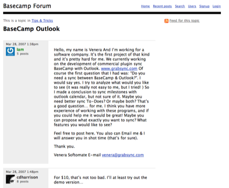
When we launched Highrise, we gave the forums a new look. We’ve since redone the Basecamp Forums too.
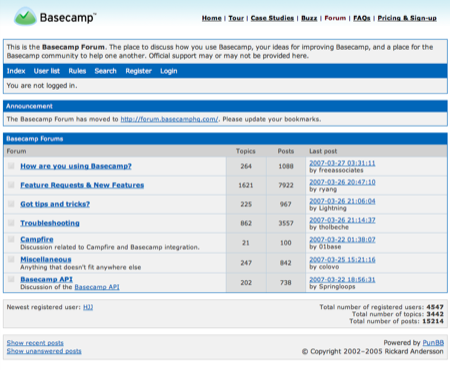
The old forums were heavy on borders and grids — “chartjunk” in Tuftese.
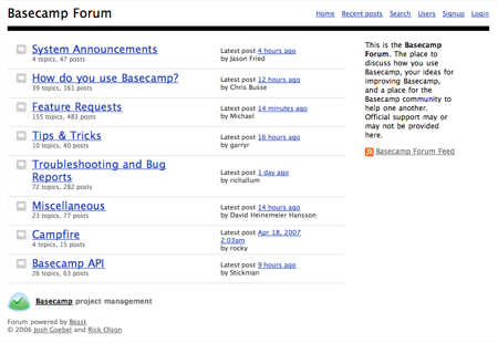
We customized the new forums, which are powered by Beast, so they’re cleaner and more open.
A public space
We give the forums a different look than our apps or marketing sites because we want people to feel like the forums are in a separate place — somewhere far away from the products they use everyday. The forums are a place where people can talk about the product without being inside it.
So we went with the clean, white, open design you see above. There’s something nice about having an open white space for people to discuss their issues and ideas. It gives the forums an “anything is possible” blank page feel.
Plus, it increases people’s sense of ownership too. The pages are dominated by customers: their avatars, their names, and their thoughts. With the old forums, it felt like people’s info and posts took a backseat.
A-B threads
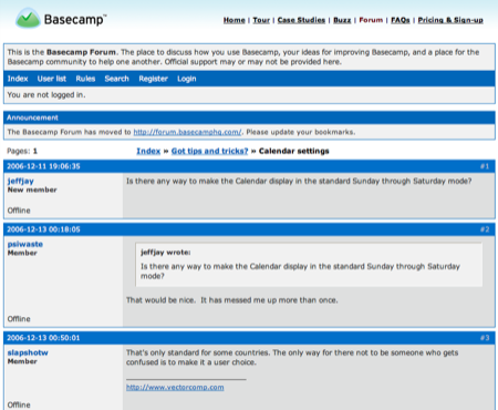
Another look: Here’s what threads looked like before and how they look now…
Josh
on 04 May 07Uh-oh, now I can no longer use the “Hey, 37Signals uses PunBB” excuse over at Rails Forum. I guess we better get on the ball. ;)
Jack
on 04 May 07At this point the search feature returns no results if your search phrase has more then 1 word.
I’m this is a bug not a feature. ;-)
thanks/
jack
rick
on 04 May 07Josh: the Ruby on Rails site isn’t powered by PHP anymore either. It’s almost like Rails is a real web framework :)
Nate
on 04 May 07Is there a script out there to move from punBB to Beast now? I was out there lookiing for one months ago and there wasn’t. If you guys did it yourself, mind sharing, please?
John P
on 04 May 07Wow. Both new screens are awesome. The name of the each thread is super clear, and loud, without using even bold text. Very restrained design. My compliments. Hard to exercise this much restraint in my experience.
The old ones were drowning in boxes. Really pretty awful. (I think Tufte uses the term “content jail” to describe heavy borders and boxes surrounding everything.)
Chin
on 04 May 07So in no way does this “decision” lie in the fact that that’s just the way Beast looks with a few stylesheet changes?
John: It is bold.
blackant
on 04 May 07After being involved in some customization work with Beast, I found myself disappointed with how clunky it is. It’s a step in the right direction away from the PHP-kitchen-sink packages, but it could still stand some degeekification.
Having said that, your frontend screens are fantastic – nice work.
Jason
Billy
on 04 May 07Um, Chin’s got an undeniable point. Cause of how this is the default and you, just, you know … took out the colors.
rabble
on 04 May 07Hey, you guys should give credit where it’s due. Most of the new design is the default Beast design, not a 37 signals innovation. Give Rick his props.
Anonymous Coward
on 04 May 07The beast design is an obvious ripoff of the 37s aesthetic. What’s your point?
ML
on 04 May 07Beast’s cleaner default layout, and the fact that it’s easy to customize, are big reasons why the new forums look the way they do. Using Beast, we were able to customize the new layout in less than a day.
John P
on 04 May 07@ Chin I don’t think they are bold on the first screen.
@ Anonymous – Not familiar with Beast. Still love the look and the open feeling. I’d like to see more of this, so if Beast becomes popular, and helps, great.
Most forums are awful. Text wallowing in heavy faux 3-D borders and wizzy char-junk icons.
This design is very restrained and elegant. So props to Rick. Props to 37s.
E.T.
on 04 May 07Its interesting how forums look 37-ish but don’t look like the apps. The design remined me of the book. Anyways, I like how simple and elegant these look. Truely unbloated designs.
Nice work.
Chinmay
on 04 May 07Something no one seems to mention is the prominent support for RSS in the new interface.
Yes, it’s not simply an UI change, but it does help the user a whole bunch; which is what good design is about, anyway.
Anonymous Coward
on 04 May 07Hey, you guys should give credit where it’s due. Most of the new design is the default Beast design, not a 37 signals innovation. Give Rick his props.
Are you kidding? Have you seen the default Beast UI? It’s a direct rip off of the 37signals product UI. This is not a unique design that Rick came up with. It’s a borrowed design which is not cool.
Ray Morgan
on 04 May 07I don’t think either of them ripped either off. This is a friendly community. And I am positive Rick / 37s (depending on who’s design this first was) cares the least bit that the others looks similar.
I give my props to 37s for their great new forum look, and Rick for being an awesome hacker to make such great (and free) software.
Josh
on 04 May 07Too bad it has an unlucky name. If you search for ‘beast forum’ on Google be careful not to click ‘I’m feeling lucky’ cuz you won’t be. Eww…
Scott Meade
on 05 May 07Regarding css of Beast and 37s: Rick and Josh addressed this from the start on the Beast forum:
http://beast.caboo.se/posts;search?q=sheet+of+paper
I see a big difference between cut and pasting someones .css and being inspired by what you find as effective design. I don’t think 37s or Risk or Josh clipped each others’ .css files but they are from the same design school – one way or the other. Look – read Robert Hoekman’s “Designing the Obvious” (which features 37s apps as examples of doing design right) and you will be inspired to build better designed apps with each page you read. But in so doing, you will find your apps start to look like those that have proven to be designed well. But don’t just rip off a design either: understand what you want in your app, what works and why. Build up from that understanding, don’t build down from a copy.
Rabbit
on 05 May 07That’s funny you posted this—before I left work (about 45 minutes ago) I was wondering why forums are generally so damn hard to read.
I wasn’t using the forum in question, but watching a friend use it (because, you know, that’s what we do at work). I kept thinking, all I see is a bunch of blue-shaded horizontal lines; where the hell is the forum?
Josh Goebel
on 05 May 07I actually did the design work for Beast (not Rick). Rick and I co-wrote the Ruby code while I was responsible for most of the UI and design decisions.
So regarding the design whether you want to “credit” me or “blame” me, I’m your man.
Scott Meade: I couldn’t have said it better if I said it myself. That’s totally how I view at things.
Martin
on 05 May 07The new forums are so clean now. Great update!
Bill
on 05 May 07Maybe I’m alone on this but the MAIN reason why I like PunBB is because of it’s design
Anonymous Coward
on 07 May 07I like PunBB a lot, but not because of its default style.
Chadly
on 07 May 07Great work guys. Beast + 37Signals: credit is due to both. This has been an issue I’ve thought about for so long. A forum, at its root, is a really simple thing.
Khoi Vinh
on 08 May 07I just don’t know how far in life you can get with a predominantly black and white Web site.
James
on 08 May 07I decided to redesign the standard forum layout for my final university project (also made it completely tag based) and came to a similar result when I went a modernism+golden ratio mad http://dieneuemodern.com/view.rhtml?piece=25
Except considered the left pane of the thread view to be wasted space.
Jeff
on 08 May 07I’ve written my own forum app several times over, sold it, gave it away, might sell it again, but I’ve always struggled with how it should look. Things like vBulletin are feature rich, but it makes you lose sight of 95% of the functionality: To facilitate conversation. POP Forums has been a lot of fun to develop for me, but I’m trying to get away from the noise and back to conversation.
Ward
on 08 May 07“I just don’t know how far in life you can get with a predominantly black and white Web site.”
Funny, Khoi… (-:
Khad Young
on 09 May 07That’s hilarious. I didn’t even notice who said that. I am falling out of my chair right now.
This discussion is closed.