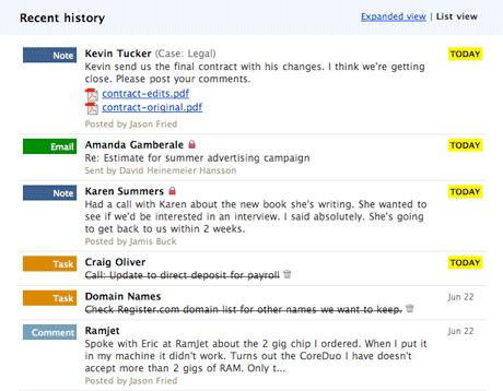
Last night we pushed a new feature for Highrise called the List view. The List view is a condensed view of the Dashboard, people pages, company pages, and cases. It looks like this:

For this design decisions post, I want to focus on one small detail that we believe makes a big difference.
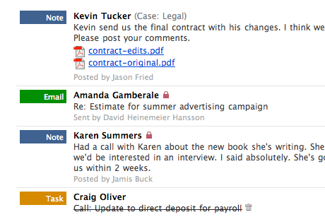
Below the each note or email you’ll see “Posted by…” or “Sent by…” attribution lines. Originally we had that text in a dark grey (#666):

We didn’t think it was easy enough to spot the name so we tried a lighter grey (#999):

Now it’s too light. We tried a variety of colors and shades of grey, but they were either too close to black, too close to white, or they stood out too much.
Then I went back to a technique I used to use way back in the days of designing UIs for FileMaker Pro databases: Use a light golden color. Internally we call this an “uncolor.” It’s barely a color, but it’s not a shade of grey. Here’s what it looks like:

The light gold stands out just enough without standing out too much. It’s a color that’s not colorful. It’s subtle, but we believe it does the job well.
This “Posted by…” information isn’t as important as the primary content so it doesn’t need to pop, but it should be easy to spot if you’re curious. By focusing on a tonal value other than grey, you can quickly pick out these attribution lines from among the black text. It provides another layer of detail without clutter or camouflage.
We hope you like the little details as much as we do.

Ezra
on 27 Jun 07I noticed that you published the hex codes for the light grey and dark grey that you tried, but not the hex code for the “uncolor”. Is that a trade secret? :)
Hank
on 27 Jun 07I think the #666 looks just fine, and the non-color looks sort of ‘dirty’.
Doesn’t it seem like one of the grey options would work with whatever template/theme the highrise account happens to be using – but that the anti-color would be contingent on it’s surroundings not making it look bad?
rick
on 27 Jun 07Trade secret? You can easily inspect the css, or figure it out with a screenshot.
Josh
on 27 Jun 07I’m really curious: How come you guys decided that “posted by” meta data needed to stand out some here, but last month, you made the complete opposite decision for Basecamp?
That would seem to be an important facet of this design decision…
Matt
on 27 Jun 07I’ve checked out this post on two of my monitors at work, and two at home, and the result is wildly inconsistent – on 1, the gray seems preferable, on another, the uncolor is better, and on the other two, the difference is negligible.
Do you have any standard practice for figuring out what looks the best on the widest variety of monitors?
Also, I deeply appreciate obsessing over small details – I do it all the time myself. However, when I see someone else do it, I’m sometimes struck by the sense that THAT particular detail doesn’t matter as much, which makes me question my judgement about deciding which details are worth this level of thought.
The light gray looks good even though it’s a little light; the uncolor looks good even though it doesn’t have quite enough contrast. Ultimately, I don’t see either one as significantly better.
Of course, I could be in the minority on this one.
JF
on 27 Jun 07Josh: Basecamp and Highrise are different products with different use cases and different vertical/horizontal space constraints.
In the case of Basecamp, keeping track of specifically who is doing what in a project is more useful which is why we gave the “Posted by…” stuff its own column. In Highrise we don’t believe the attribution is quite as important so we put it under the other content.
Personally I’d prefer to put it under the content in both Basecamp and Highrise, but Basecamp has more vertical space issues to consider so taking up another line per Dashboard item didn’t seem like the best decision at this time.
Chad Crowell
on 27 Jun 07Josh I titally agree- and I am sure 37S has a good reason. I like the uncolor, frankly, if nothing else just due to the fact that its not grey- its too easy to get caught in using shades fo greys and blues on a site. They are almost always nice to look at but something with a different hue makes it less, well, grey.
Chris
on 27 Jun 07This is one of the details in design that I always appreciated from 37 Signals. The use of color or “uncolor” makes the biggest difference in prioritizing and organizing elements on a page. The subtle difference between grey to a hint of gold seems just enough.
While looking at these screen shots, I feel that a better design decision was the use of the bold and bright blocks that visually separate each element (Task, Note, Email). It allows quick scanning of content and an immediate association to the type of item.
Strange how similar topics get posted at the same time. We just recently posted about colorless UI design and dashboards in social software. Of course, Basecamp was mentioned as part of the review.
RS
on 27 Jun 07There’s more at play than just color. In Basecamp, “Posted by” appears in a separate column. Spacial arrangement affects the salience of elements as much as color does.
In the case of Highrise, “posted by” is not separated in space from the other information. It’s clumped into the same block as the excerpt and title. So we wanted to tweak a different knob to separate it. Jason’s screenshots show that tweaking the brightness knob wasn’t working, so we switched to the color knob. In Basecamp, you could say we used the space knob :)
Tim
on 27 Jun 07For those of you interested in what people are talking about in reference to last months decision to change Basecamps “posted by” comment, see the link below.
http://www.37signals.com/svn/posts/427-design-decisions-new-comment-lines-at-basecamp-messages-screen
JF
on 27 Jun 07Tim, I think people are actually referring to the Dashboard and Overview redesigns.
With Highrise List view, the Basecamp Dashboard, Basecamp Overview, and Highrise List are very close. There are some subtle differences, but they are designed in the same spirit.
RE
on 27 Jun 07I didn’t go to art school, but isn’t that “uncolor” usually referred to as a warm gray? ;)
Seems we always think of gray as just a shade of black in the hexadecimal world. Time to start painting again…
Josh
on 27 Jun 07[Note: I tried to post this an hour or two ago, but apparently it didn’t go through.]
Interesting, thanks guys. I always enjoy reading these posts, even if I don’t always agree with them (though in this case I really like the use of the “uncolor”). I’m not a designer, per se, but these posts really help me better understand design decisions and better communicate with designers who do work for me. :)
fitzage
on 27 Jun 07The new list view was what made me reactivate a paid account today. I find it much easier to digest than the other view.
I did notice the “uncolor” and I think it does an excellent job. I’m the only person on my account, so I don’t really need that information at all. However, I like the way it’s easy to comprehend without being in-your-face.
Gregor
on 27 Jun 07It looks like older version of files still have the direct link to my server.
Kaspars
on 27 Jun 07The left column with the message type (task, comment, etc.) is playing the main role in composing the vertical rhythm for scanning the entries – how the eyes jump from an item to item (which is great!).
The vertical white space between them, however, has no meaning. It’s just a noun after noun after noun.
If you would put the author name beneath the post type, the vertical column would shift the information load away from the main content, making the single entry balanced. It would also be more easy to differentiate:
Who did What and When.
In that case, you could still use #666 and 80% font size (compared to body), because it would contrast with the background hues of the item type name.
The result would be: Note posted by Jamis Buck says ...
unname
on 28 Jun 07JF, I think Tim’s reference to the old post is what people are referring to…?
bowerbird
on 28 Jun 07yeah, yeah, but what color is your bikeshed?
-bowerbird
Thijs van der Vossen
on 28 Jun 07Great idea, I’m definitely going to steal that.
A suggestion though; if you take screenshots on a Mac, make sure you first set Font Smoothing to ‘Standard – Best for CRT’ to turn off sub-pixel rendering.
Right now, these screenshots look like crap for everyone still using a CRT and for people using an LCD panel where the subpixels are in a different order.
Especially for subtle color differences like these it can make a huge difference.
Soo
on 28 Jun 07i wish i worked for you guys!
Dan
on 28 Jun 07Good call Jason. The barely noticeable difference between the dull #666 and the “uncolor” does make a huge difference to me in that line’s readability. Rock on! :]
Yong Bakos
on 28 Jun 07You are a true design nerd. David Siegel would be proud.
HEX Spoiler alert
on 28 Jun 07AA9C84
JF
on 28 Jun 07You are a true design nerd. David Siegel would be proud.
David Siegel once told me to quit trying to design web sites. He said I’d never be a good designer and I should look for another line of work. That’s what I remember about David Siegel.
Jon Davis
on 29 Jun 07Proving that even the ‘experts’ can be wrong sometimes. ;-)
z
on 29 Jun 07Jason, how do you know that wasn’t David Siegel’s intention to give you the right kind of push? it would seem that it worked nicely ;)
(disclaimer: i don’t know David personally so just guessing, but i have seen this type of thing happen in life, also with dramatic success)
btw, thanks for uncolor, great tip!
JF
on 29 Jun 07Z, oh I know it wasn’t said with the best intentions.
This discussion is closed.