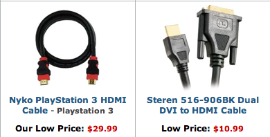
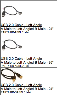
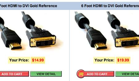
Why do so many companies selling cables show you this bird’s eye view…


...when what you really want is this view of the ends:


It’s not the cable that people care about. It’s the plug. The real question that needs to be answered: “Will this fit where I need it to fit?”
Makes you wonder how often web apps miss the point and show people the cable instead of the plug: Showing a list of features when people want benefits. Telling facts when people want stories. Showing screenshots when people want explanations.
Related: We were recently discussing Common Craft’s neat video tutorials that explain complicated concepts in “plain English.” Lots of sites try (and fail) to clearly explain social bookmarking or RSS. But Common Craft nails it.
The videos aren’t fancy. They’re not techy. They don’t show off interface widgets. But they succeed where it counts: They show how these tools fit into people’s lives. They show the plug, not the cable.
Common Craft explains wikis.

Rob
on 18 Sep 07It’s strange you mention this now, as I just spent a maddening two weeks trying to buy a video connection cable for my new Macbook. The official Apple site is very bad at explaining what cable you need for which machine, so as I work near London’s Apple store I thought I’d get some face-to-face advice (I couldn’t tell which cable I needed from the packages on display becaude I was unable to examine the ‘plugs’ closely enough).
The first time I went in I was advised to buy a cable which turned out to be incorrect. I went back and asked another assistant who tried to sell me the same cable I was returning. He then told me I had to buy TWO cables (one, an adapter). Got home…didn’t work.
I went back yesterday and finally chanced on someone who knew exactly what I needed without even thinking about it and sold me the (one) cable I needed.
I love Apple but the endless iterations they have regarding connections and ports can be very frustrating especially when they don’t keep their staff up-to-date with what’s required.
Anonymous Coward
on 18 Sep 07Maybe they think people are concerned about how long the cable is, and can’t conceptualize the descriptiong “5 ft. cable” any better than “HDMI plug”.
Lee LeFever
on 18 Sep 07Show the plug, not the cable. I dig it. Thanks for the kind words Matt.
Andrew
on 18 Sep 07Man, that’s an annoying and condescending instructional video. As the video would say “Boooo”
Matt Pennig
on 18 Sep 07Wow, that CommonCraft video, was horrible to listen to. The content was great, but I was being shouted at the whole time by somebody who sounded like they were in a HUGE hurry. Not a good experience for learning.
Seth
on 18 Sep 07I totally agree! This is another example of why you always need to think of who will be purchasing your product. I know exactly what I’m looking for, in most cases, but my mother would be lost.
It is such an easy thing to do right that it amazes me that so many companies have done it wrong.
But then again at my day job we will typically not do something until another big company does it first.
Alexandre Simard
on 18 Sep 07I dig it too. It’s an important concept that the cable example makes very clear. Thanks!
I liked the Common Craft video. My only complaint would be that it’s too fast and hyperactive.
Benjy
on 18 Sep 07Maybe they think people are concerned about how long the cable is, and can’t conceptualize the descriptiong “5 ft. cable” any better than “HDMI plug”.
Except that the cables are typically shown rolled up anyway, so it’s not easy to determine what 5ft. is either!
Andrew
on 18 Sep 07I think that the problem with the training video is that it is from a “geek” perspective rather than what would get across to an average user.
ML
on 18 Sep 07Man, that’s an annoying and condescending instructional video.
For some it may be condescending. But for others it may be just right. Depends what audience you’re going for.
pwb
on 18 Sep 07Also, why cannot device manaufacturers put the company and product name on the power bricks? I have literally dozens of power adapters that I have no idea what item they power.
Edwin
on 18 Sep 07That is a pet peeve of mine. It seems to be a common problem especially when the person selling the product doesn’t actually have inventory and is only using drop shippers.
I was looking for an Ethernet switch recently and I needed to wall mount it. One vendor’s product didn’t say if it was wall mountable and, while they had 2 pictures of the front and one of the back, they had none of the bottom, and, hence, lost a potential sale.
--Josh
on 18 Sep 07Based on that line of thought, wouldn’t it be even better to show/also show the port it plugs into? Because that’s what really matters.
And, FWIW, there are plenty of times where I’ve wanted to know what the cable portion looked like as well. For example sometimes it is hard to tell from plug-end pics whether a component cable is actually a single cable with the leads broken out at the end or if it is three separate cords bound together. In a lot of cases for video cables the size/style makes a difference for where you would like to run it.
Paul P Magee
on 18 Sep 07I love those video’s – absolutely superb. But I have one suggestion, which also applies to most instructional video’s I come across – slow it down 20%.
The viewer is seeing this information for the first time – it takes more time to sink in that in does for you to explain the concept!
After all you already understand it. In additional to generally speaking a bit slower (even if it feels uncomfortable when you make it) I think it’s also good to have micro breaks in between concepts. Again, just to increase that ‘comprehension time’.
It all comes down to helping the viewer feel smart whilst they are watching. If you’re going too fast, they won’t get it, they will feel dumb and they will quit early.
I love the bootstrapping nature of these video’s though, and it get’s across nicely that comprehension is more important that a Hollywood quality production.
Arik
on 18 Sep 07Easy question to answer. Showing the entire cable (birdseye view) gives a very very rough guestimation of length, thickness of cord, etc which are all important in a cable purchase.
I like the birds eye view, especially on computer cables. I hate getting into the product detail page and realizing its not what I wanted at all.
This is just one of those things that doesn’t really vouch for an opinion and just only requires some good old customer intuition. Any customer who works with cables much shouldn’t have a problem with a either view.
J
on 18 Sep 07The mistake CommonCraft made was that teaching a beginner is not the same as teaching a child. My mother is a professional with a graduate degree. She doesn’t know what a wiki is, so a simple, straightforward tutorial would be great for her. This one, however, is insulting. It’s like the “for dummies” books.
A more specific problem with the tutorial is that little paper cut-outs of screen elements are in no way more helpful than a screenshot, or better yet, a video cap that shows a mouse interacting with the page. You say “They don’t show off interface widgets.” How is showing a paper cutout of a printed interface widget better?
JF
on 18 Sep 07The mistake CommonCraft made was that teaching a beginner is not the same as teaching a child. My mother is a professional with a graduate degree. She doesn’t know what a wiki is, so a simple, straightforward tutorial would be great for her. This one, however, is insulting. It’s like the “for dummies” books.
What’s insulting about a creative, novel way to explain a technical product? If you’re insulted that sounds like your problem, not the problem of the people making the instructional video.
Do you think she’s be insulted by Kathy Sierra’s books since they have cartoonish, folksy drawings?
Mark
on 18 Sep 07My impression is that you get the cable instead of the plugs in the catalog photos because it is simply less expensive to set up the shot. That, combined with the likelihood that purchases of such cable of probably sufficient enough in their technical know how, that they already know what kind of cable / port name hookup they are looking for.
I do agree with your sentiment, but given the choice of doing some research or paying more for an already too expensive cable, cause they went for the beauty shot, I’d take the time to do some research.
Paul
on 19 Sep 07The video didn’t seem insulting or condescending, except for the first moment where they introduce edit and save. Most people know about edit and save, so those few seconds of video could have been done a better way by just referencing a word document interface instead, with an actual snapshot of word or open office, or the save to draft feature of their email client since the video started talking about email.
The video might come across as a little confusing actually when it talks about the camping list, since viewers might think that you only use the collaboration software for lists. It isn’t until the end of the video that the idea of links and pages is discussed, but I’m not sure it was entirely clear. Maybe using the idea of an email document that everyone can save and edit, and which is never quite sent but rather eternally kept as a shared draft would be better.
Free Nature Photography Wallpaper
on 19 Sep 07very simple yet effective video!
Jonathan
on 19 Sep 07This is a somewhat ironic post from 37s. As a designer of a web site, how do you go about “showing the plug” to your users? The best answer we have to that is “ask the users” (or better yet, observe them).
This, while rather over-simplified, is the essence of what is termed “user centric design,” and also happens to be something that 37s appear aggressively to reject in their book “Getting Real.” Perhaps the plug/cable realisation is something that will make 37s more sensitive to what their users want, rather than what 37s think they want.
RS
on 19 Sep 07The best method is to be the user. Then there’s no guessing games.
The next best thing is to work very closely with your customer. This does not mean you study them like lab rats. It means becoming friends with them, learning their concerns, and speaking their language.
For a deep look at what “speaking their language” can mean for software producers, check out Eric Evans’ Domain Driven Design.
Marc Duchesne
on 19 Sep 07Matt : thanks for the heads up. Very nice way for teaching. Pretty similar to what Im going to produce myself in another domain – fiberoptics networks.
Thanks again, _Marc
This discussion is closed.