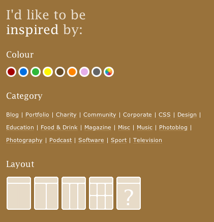
Design Shack
David Appleyard writes: “I noticed this at a recently re-designed CSS gallery and thought it was quite an original idea! A fresh take on navigation through designs.”
iSquint
Rosano Coutinho writes: “When most progress indicators aren’t accurate, they rarely admit it, but the one in iSquint does. Somehow, makes me feel less negative towards the software and the innacuracy.”
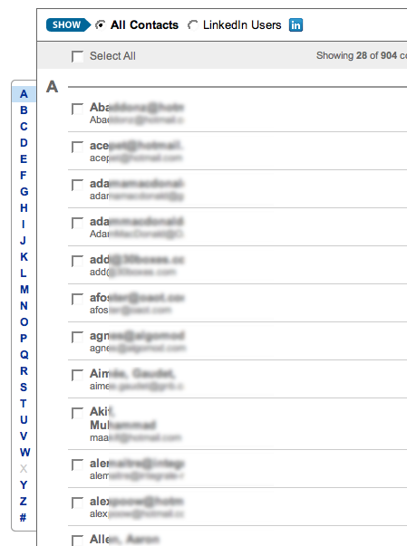
LinkedIn
Dan Martell writes: “I was impressed with the way LinkedIn displayed the contacts they had found in my old hotmail account, and how I could easily click to the left to narrow the view.”
Have an interesting link, story, or screenshot for Signal vs. Noise? Contact svn [at] 37signals [dot] com.


Erik
on 02 Oct 07In the interest of privacy, you might want to mask the emails in the LinkedIn portion.
Sara
on 02 Oct 07The iSquint version of progress indication is a great sample of what could be called “re-inserting humanness” by design choices that go very much out of the ordinary in places where people are fully conditioned to look for a defined set of options.
It is, in this regard, very similar to Pownce’s “gender” options (guy, girl, dude, bloke, bird, chicky-poo, etc.) Do any other examples come to mind?
Dennis Eusebio
on 02 Oct 07I like the address book left tab, great interface.
carlivar
on 02 Oct 07The address book left tab is just an electronic rollodex basically. I agree, good job.
iSquint has made an appearance here before I believe. They have a humorous Help menu.
Bob Warfield
on 02 Oct 07I love the Design Shack idea. Web apps need to be more cognizant that people have differing learning styles. Offering them a chance to gravitate towards the style that attracts them most is brilliant:
http://smoothspan.wordpress.com/2007/09/18/logicemotion-on-web-20-personality-types-roundup-of-personality-posts/
Best,
BW
kev
on 03 Oct 07iSquint’s big brother, VisualHub’s warning when you open the advanced panel is “Don’t! You’ll screw everything up!” I was entertained by it.
David Appleyard
on 03 Oct 07Many thanks for featuring Design Shack on Signal vs. Noise.
Bob: We’re always trying to showcase our sites in new and different ways, and also recently launched an iPhone version of our site which has had a good response.
Jason
on 03 Oct 07Ah, progress bars. My nemesis, we meet again.
It drives me bonkers when they’re not even close to accurate. But at least iSquint is honest about it. I am also a VisualHub owner and like its “honesty” as well.
One of the many things I like about my Tivo - the progress bar / time bar on recorded programs is dead-on accurate, visually and numerically. My Comcast DVR is just atrocious. The time marker looks like you have maybe 1/10th of the program left, the timer says you’re at 26 min out of 30 min - then the program just ends. So annoying. And don’t you dare even try to fast forward or rewind in that last 4 minute area, it just zooms back and forth at seemingly random intervals.
Mike Lin
on 03 Oct 07Thanks for featuring LinkedIn’s ‘other contacts’ display … the same UI is also used for viewing the people you’re connected to.
Nursegirl
on 08 Oct 07I love iSquint’s dialogues and help menu. All of it so funny and human. I keep thinking that I need to invent a reason to buy VisualHub, but I really don’t need it.
This discussion is closed.