Typography.com
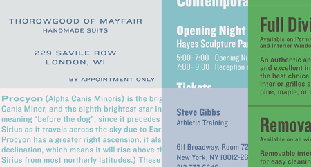
Typography.com has a smart way of showing off fonts. They show them in context with multiple layouts instead of just the standard ABCDEF or “quick brown fox” treatment. Knockout is one example.
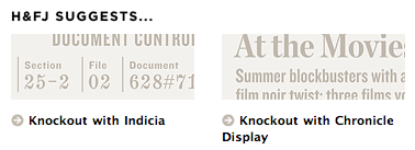
The “H&FJ Suggests…” feature at the bottom of the screen is a nice way to suggest font pairings too. Kinda like a sommelier but for fonts (typolier?).
Catalog Choice
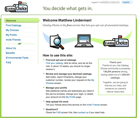
Under assault from Pottery Barn catalogs? Then check out the clear copy and design at Catalog Choice, a free service that lets you opt-out of unwanted catalogs.
A different looking tumblelog
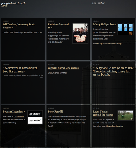
Paul Giacherio’s tumblelog offers a griddy layout.
100 To-dos

A very, um, thorough life to-do list. From the new book “To-Do List: From Buying Milk to Finding a Soul Mate, What Our Lists Reveal About Us”. (Inspired? Get your list on with Backpack or Ta-Da List.)
Have an interesting link, story, or screenshot for Signal vs. Noise? Contact svn [at] 37signals [dot] com.

Peter Cooper
on 13 Nov 07Odd, I was browsing typography.com the other day! Their Gotham font is amazing (but, alas, too expensive for my tastes).
Another great interface / trick I came across while browsing type sites is the in-page “self service” preview used by Fountain (example page). That type at the top right is actually live and you can go edit it. Very slick and well integrated, although possibly easy to miss.
Damien Huze
on 13 Nov 07OMG! Catalog choice seems like a great idea. 2 weeks ago my wife decided to start calling each company individually to opt-out. We will give this a try.
Chris Hajer
on 13 Nov 07If you want to opt out of all catalogs (something that doesn’t seem to be possible at the Catalog Choice site) you have to pay the Direct Marketing Association $1 to do it.
https://www.dmachoice.org/MPS/
Chuck Teller
on 13 Nov 07Chris – DMA only takes you off the prospect list, catalogchoice.org takes you off the customer list. If you are already a customer, the DMA list will not stop the catalogs.
Matt – glad you like the UI. The ease of use of the site has been a big contributor to our success – over 130,000 members in the first month. The design credit goes to Alex and Matt @ Makalumedia.com
John Douthat
on 14 Nov 07That TODO list is inspiring.
But deep down, my inner project manager is screaming “Cut Scope! We mustn’t fall victim to feature creep, or we’ll never get this done!”. Perhaps he should Get Real and Build Less.
But something tells me the list isn’t so much a TODO list as it is a CANDO list. It is a smörgåsbord for life, a list of the possibilities, so you will always know what is accessible, even when you’re nose-deep in the trivialities of life.
Alex Shackman
on 17 Nov 07the knockout and verlag fonts are fantastic, but way out of reach for a graduate student. any suggestions for less pricey substitutes?
This discussion is closed.