Flight Thru Instruments is a US Navy pilot-training manual from the 40s designed by the Graphic Engineering Staff at General Motors. The information graphics are stunning, colorful, and clear.
Here’s the full Flickr set. Hat tip: Airbag.
You’re reading Signal v. Noise, a publication about the web by Basecamp since 1999. Happy !
Flight Thru Instruments is a US Navy pilot-training manual from the 40s designed by the Graphic Engineering Staff at General Motors. The information graphics are stunning, colorful, and clear.


Here’s the full Flickr set. Hat tip: Airbag.
Anonymous Coward
on 07 Jan 08The best corrective action is to reject the landing and execute a go-around procedure.
wildstbee
on 07 Jan 08Great site to visit for artitecture. I love this site though i am not a navy pilot.
Alexandre Simard
on 08 Jan 08Beautiful, colourful, yes. Clear? I don’t know. I find the first one very busy graphically, and at the same time not saying a lot.
Clipper
on 08 Jan 08@Alexandre: Perhaps it’s a bit busy but it sure imparts a heck of a lot of information in a single graphic-
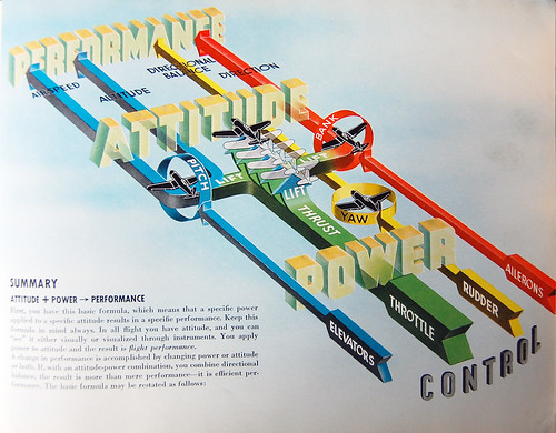
The four arrows represent the airplane controls.
Blue Arrow: Elevators control the airplane’s Pitch. The circle shows that Pitch is the position of tail/nose around an axis running along the wings. It affects the plane’s Airspeed and Altitude.
Green Arrow: The Throttle is responsible for Power which affects Thrust. Along with the wings, these are responsible for Lift.
Yellow Arrow: The Rudder controls Yaw. The circle shows that Yaw is the position of tail/nose around an axis running vertically through the pilot. It affects the plane’s Directional Balance.
Red Arrow: Ailerons control Bank. The circle shows that Bank is the position of wings around an axis running along the fuselage from nose to tail. It affects the plane’s Direction.
The Red, Yellow, and Blue arrows also affect the plane’s Lift and Attitude. In turn these also affect the plane’s Performance.
This graphic has summarized a great deal of highly technical information concerning the interconnection between the controls that a pilot uses to affect an airplanes performance. If this all seems simple (and as a private pilot I can assure you, it’s not) put that down to the effectiveness of the graphic design.
Carla
on 08 Jan 08hmm… I won’t exactly call them “clear”.
Clipper
on 08 Jan 08Please don’t confuse ‘clear’ with simplistic. Something can be clear yet still be complex enough as to require some study. I’ve seen a lot of graphics attempting to explain the flight controls and this is by far the clearest and most beautiful I’ve seen to it in one go. Even basic aerodynamics is a complicated subject and it takes a little time and effort to grasp it. Also, bear in mind, the graph at the top is not intended for the lay public but Navy pilot trainees.
For instance, many new pilots don’t realize that elevator input (pitch) affects both altitude and airspeed. The split of the blue arrow into two demonstrates this.
For clarity in expressing a vast array of information in a single graphic, I’d say it compares favorably to Milnard’s famous map of Napoleon’s march into Russia:
http://www.ddg.com/LIS/InfoDesignF96/Kelvin/Napoleon/map.html
Emmanuel Paraskakis
on 08 Jan 08I’ve been through a bunch of manuals for Private Pilot and Instrument Rating training. These illustrations are the clearest I’ve ever seen.
Alexandre Simard
on 09 Jan 08It’s not really ‘one go’, though. More like four parallel gos. The graphic does not tell how the four controls interact one with another. It would have been clearer as four separate graphics each explaining one of the four controls. Then maybe there would have been some place left for a few examples of two or more controls handled at the same time.
The huge 3D-letter words “Power”, “Attitude” and “Performance” are not technical terms pertaining to the controls themselves. As far as I can tell, they’re there purely for motivational purposes. They’re noise. Huge noise.
And I can not tell from this graphic which part of the plane is actually the “rudder”, and what my controls impart to it.
Clipper
on 09 Jan 08Ah, a misunderstanding. “Power”, “Attitude” and “Performance” are indeed technical terms. Please plug those three terms into Wikipedia together and see what you get. :)
Power refers to the force coming from the engine which the propeller converts to Thrust.
Attitude is not how the pilot feels about his flying ;) but refers to the plane’s position in the air- a plane climbing typically is in a ‘nose high attitude.’ In fact, one of gauges on a plane’s instrument panel is called the ‘Attitude Indicator.’
A airplane’s Performance is the how its design performs under sum of the forces acting on it- lift, drag, weight, thrust. Aerodynamic engineers use the term all the time to embody a limited set of criteria. These are technical terms with specific meanings with regard to airplanes.
Which part of the plane is the rudder? Well, the graph does not detail the location of propeller, ailerons or elevators, either. If someone’s knowledge of airplanes is that rudimentary, then it is perfectly reasonable that they would find the graphic opaque. They are not the intended audience. I suppose Milnard’s graph of Napoleon’s March would be difficult to grasp for someone unfamiliar with the term ‘Army.’
But it is clear from the graph that Rudder affects Yaw and swings the plane around an axis running vertically through the pilot- it swings the nose right to left. But that doesn’t ‘steer’ the plane. A plane turns like a bicycle, you lean (bank). You wouldn’t dream of turning a bike by remaining upright and just turning the handlebars. The handlebars on a bike provide (like the graph states) ‘directional stability.’ This is how a rudder works on a plane. And because pitch and bank affect lift but yaw doesn’t, the yellow arrow bypasses the ‘lift’ crossbar.
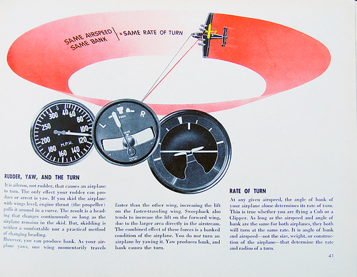
This is one reason I disagree on your point that the graph does not show how the controls interact. In fact, that is what I admire most about it. Most pilot training manuals do indeed use separate graphs (just like the second graph dealing with turn and bank ratios). This graph, by itself, won’t a train a person to fly but it clears up some common misconceptions- ie: Most new pilots assume that the throttle (power) affects airspeed but it is actually the position of the elevator- dive you go faster, climb you go slower.
Sorry if I come off a bit evangelistic but this touches on my two passions: I’m a private pilot and an MFA.
Clipper
on 09 Jan 08From the text:
“SUMMARY ATTITUDE+POWER -> PERFORMANCE
First you have this basic formula, which means that a specific power applied to a specific attitude results in a specific performance. Keep this formula in mind always. In all flight you have attitude, and you can “see” it either visually or visualized through instruments. You apply power to attitude and the result is flight performance.
A change in performance is accomplished by changing the power or attitude or both. If, with an attitude-power combination you combine directional balance, the result is more than mere performance- it is efficient performance.”
Alexandre Simard
on 10 Jan 08I stand corrected. Thanks for taking the time, Clipper!
Clipper
on 10 Jan 08You’re welcome. As I said this combines my two passions- art and flying. And the book is not even for novice pilots but those beginning to learn instrument flying. By this point they’ve already had ??* hours of instruction in the plane and have at least soloed. That is- taken off, flown around in a circle and landed without an instructor on board.
*Being wartime I don’t know how quickly they were pushed through, today it’d be 40 hours minimum before a pilot begins serious instrument training.
This discussion is closed.