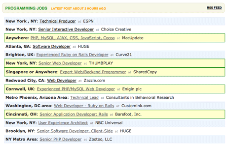
A few days ago we introduced a couple new features to the Job Board and Gig Board.
Attach your logo to a job
You can now upload your logo when you post a job. Adding your logo is entirely optional, but it’s a nice touch if you have one handy.

Highlight your job post
Highlighted job posts have a yellow background and green border. Depending on demand we may have to increase the price, but as of today it’s $25 extra to highlight your job.

Linebreaks!
Job postings uses to be single paragraphs but now you can enter multiple paragraphs. We’ve also relaxed the 1000 character limit so you can post longer job ads if you’d like (although we believe concise, to-the-point job ads are more effective).
We hope you find the changes valuable. Now go get or go post a job!
Special thanks to Jeff for doing a great job on this project.

Eric Mill
on 31 Jan 08The highlighting feature will reduce the usefulness and simplicity of the board, not to mention its honesty. $25 to change the border-color and background-color of a div?
As you guys know, people expect “highlighting” to indicate something of importance. If the user doesn’t get the $25 thing, they’ll assume that the job is better or more premier in some way, even though it just means the company has more money to spend.
Its different than if you put a “Elite List” at the top of the screen or something. Something that a.) doesn’t use highlighting, and b.) is clearer to the user that these ads are set aside because they paid more.
What I’m saying is: the highlighting is a little douchey.
Tim
on 31 Jan 08I imagine that the Job/Gig Board is the most profitable service 37signals offers … and it’s all b/c of this blog.
It gives me inspiration to build a strong blog as well.
JF
on 31 Jan 08Fair feedback, Eric. We’ll monitor it and see how it goes. We’re always open to changes if we think we can make something more useful or valuable.
ceejayoz
on 31 Jan 08Looks a little cluttered when there are two next to each other – the double thick line between them isn’t fun to look at.
Matt Radel
on 31 Jan 08It’d be swell if highlighting came into play after I’ve done a search and come back to the page later. For example, if I consistently search for “Cincinnati” I’d like to see jobs with matching locations highlight when i come back to the page. That way I can take a quick glance at the page and see what’s local. It’s nice that the locations are bold – but they’re ALL bold, and I still have to sift through them visually.
Of course, that might get a hair annoying for folks in Chicago, New York or Boston where 90% of the jobs seem to be.
Anyhoo, just a thought.
Mike
on 31 Jan 08It would be nice to have the location of the job post in the title for the rss feed.
Something like this:
Some Company: Senior Guru (Chicago, IL)
Andrew
on 31 Jan 08Also, “Championable-level interactive developer”? Meaning “someone at the level that would cause us to champion them?” To clients, I guess?
That’s breaking new ground in recruiter-speak neologisms, right there. Impressive stuff.
Stefan Seiz
on 01 Feb 08A bit of OT nitpicking ;) Casual web 2.0 writing - sure - but can you have a Logo “handy”? A screwdriver, yes - but a logo…
Jason
on 01 Feb 08The Job board has lost its clean look, as the grid no longer holds up. The amount of colors and bad box highlight choices as well as the logo additions are bad choices.
Stick to your statement : “Less is more”
Terry Sutton
on 01 Feb 08I have to admit that I’m with Eric. As follows:
The fitness center i want(ed) to sign up with has two plans:
$40/mo if you sign up for the whole year $50/mo + $60 ‘activation’ fee if you go month to month
For this reason alone, I will not join the gym. I don’t believe people should pay for stuff that should be free.
The job board ‘extras’ kinda feel like ebay’s ‘extras’ now – they make things into a bit of a mess.
Disclaimer: I absolutely do not subscribe to the EverythingSuckism approach to life’s commentary, but I had to weigh in on this new anti-37signals development.
Jimbo
on 02 Feb 08It’s a small point but in job board posting on SVN I’ve often seen ads that go, “SomeCompany is looking for a Web Designer Wanted” – grammatically not great, but more importantly it also detracts from the professionalism of the Job Board by giving the impression that the ads are being generated by a blind, faceless system (I know they actually are generated by a faceless system, but you get my drift).
I know you encourage job board advertisers to preview their ads before posting, but maybe a little more prompting is needed to show the different variations on an ad that will appear online?
That nit-picking aside, I think it’s a great system and kudos for the continuous and useful updates.
This discussion is closed.