Facebook
Sean Iams writes:
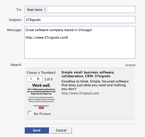
Very cool feature on Facebook: When you’re typing a message, and you happen to include a valid link (i.e. http://www.37signals.com) in the body, Facebook automatically looks up the site and pulls back a description and a list of images that help explain the site. You then have the option to send the message with the image + description as an attachment or send the message without any attachment. It drastically clarifies the message with no additional effort whatsoever. Quick, simple, and easy :)
MyPunchBowl
Matt Douglas at MyPunchBowl writes:
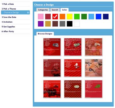
Thought you would be interested in this “pure design” feature. On MyPunchbowl.com (party planning site), users choose a party theme. Like most sites, you can choose by category and search by terms.
However, MyPunchbowl also has the ability to search by color—so if you’re looking for a red based theme, you can find it easily. You know what? Men seem to not care about this feature, but female users LOVE IT.
Nashbar
Ian Leckie writes:
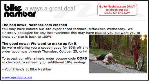
Just got this email from Nashbar. What a great way to handle a technology problem that affected some of their customer’s experience with them…. love the “OOPS” coupon code too ;-)
Quest Diagnostics
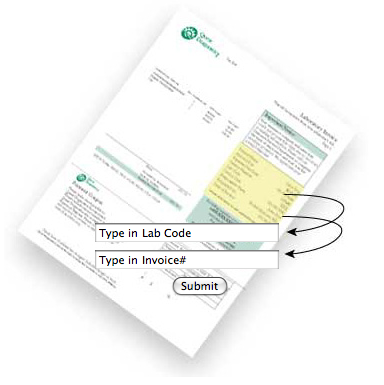
Quest Diagnostics mails you an invoice and then has you pay at its site. They use arrows to show you exactly where the information you need to submit is on the invoice.
Bearskinrug
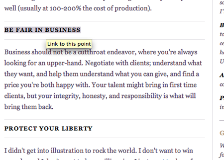
A smart little detail at Bearskinrug: The main points of the article have anchors for linkability.
Have an interesting link, story, or screenshot for Signal vs. Noise? Contact svn [at] 37signals [dot] com.

Kyle Slattery
on 06 May 08Another great thing about Facebook messages is if you include a link to a video on a site like Viddler, YouTube, etc., it automatically embeds the video so you can watch it right within Facebook.
Sam
on 06 May 08That Facebook auto link detection feature actually drives me crazy. They have the right idea, but they need to work on predictability; it seems to behave erratically.
Christopher Jobson
on 06 May 08Screens Around Town is consistently one of my favorite things you post here.
Kevin Milden
on 06 May 08That Facebook message thingy is sick. I could see why it would irritate people but I dig the concept.
Tim
on 06 May 08I’ve always thought that Facebook link business was a little weird. Everytime someone shares a link with me, it looks like a mini-advertisement. I think maybe if they play with the formatting to make it look less like an ad, it may flow better.
mkb
on 06 May 08Facebook link sharing is lovely compared to the atrocity that is snap.com (used by LiveJournal and some WordPress blogs)
Grant
on 07 May 08Great stuff – love the bearskinrug detail
austin_web_developer
on 07 May 08Another cool feature is the way you can add and remove people you are emailing in facebook, after adding them, all you have to do is hit delete/backspace to remove a person
(as opposed to only being able to click on the ‘x’ to remove it)
Stephen G
on 07 May 08Always love Screens around Town … But just how long do you hold entries?? I notice the Oops coupon is either really old or has a generous expiration … :)
Alvin
on 07 May 08I love that Facebook feature. I still get surprised once in a while when surfing Facebook at how they change and improve things quietly in the background. There’s this feeling that they’ve put a lot of thought into being as intuitive and simple as possible.
Have you guys seen the sliders for the news feed preferences? You can access it at the bottom of your home page news feed. Not too sure about how I feel about the way it works now, but it sure is something new (at least to me) and again, very intuitive.
Here’s a screen.
Tamlyn
on 07 May 08The Bearskinrug example is actually quite confusing. The headers in the left column all link to themselves but the headers in the right column link to other sites (and some aren’t links at all). There isn’t enough visual or conceptual separation between the two types of link. I suppose the target audience of the site is designers so perhaps this doesn’t matter.
@Alvin those sliders have been on Facebook for at least a year and have very little effect as far as I can tell. But I agree that FB in general doesn’t get enough praise for their good design details.
Laura Roeder
on 07 May 08I recently encountered that facebook thing and thought it was an ad! I chose not to include it in my message because I felt odd adding what looked like an advertisement.
a_b
on 10 May 08hello
Alex Bentsen
on 12 May 08We actually implemented a feature similar to MyPunchBowl on NIKEiD. It allows you to sort thousands of sneakers designed by other people by color. Check it out on nikeid.com – click ‘Design Search’ in the upper-right.
This discussion is closed.