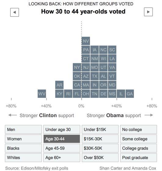
 Interactive NY Times graphic. See it in action.
According to “You need this to get a job in journalism,” multimedia experience is becoming increasingly important in newsrooms.
Journalists who can flourish in both the Web newsroom and the print newsroom today:
• Can package the news online.
• Can create original multimedia.
• Have solid journalism credentials.
• Have strong technical skills.Journalists who expect to get a job will “walk in the door with”:
• A proficiency in Photoshop, HTML and blogging software.
• An understanding of Web publishing systems (content management systems).
• Experience in the production of multimedia — including the use of audio and video editing tools.
Related: Q&A with Fiona Spruill, editor of the NY Times Web newsroom

Brian
on 05 Jun 08Anecdotal fun, but one might want to know why all 50 states aren’t represented before considering it meaningful.
Derick
on 05 Jun 08I saw this yesterday and was wondering how long it would take before showing up on SVN…. It’d be great if this visualizer were to end up somewhere with an API attached a la google charts.
ceejayoz
on 05 Jun 08@Brian – I would suspect, but I didn’t check, that this only shows primary states. Caucuses don’t lend themselves to exit polling due to the different way they’re conducted.
Mike
on 05 Jun 08It doesn’t show which candidate won what state for All Voters. I can’t remember who won which state.
Bryan
on 05 Jun 08very interesting visualization, thanks for the link. this makes it look like a race/generation tug-of-war.
Shan Carter
on 05 Jun 08Here’s a link to the graphic embedded in an html page. It’s a little easier view. Graphin on nytimes.com
kangarool
on 06 Jun 08I saw it, and initially really liked it but then became disappointed. It seems to invite me to filter with the variables on offer. So, I wanted to click on, say, “Females” but then ALSO on “White”, “45-59”, ”$30K-$50K” and “College Grad.” It’s entirely possible this can be done, and I’m just not seenig how to actually do it.
If you have all the factors and the numbers plugged in, why not allow filtering the figures (by clicking multiple variables) to give a real snapshot? I guess it’s probably because the data’s not available for the different permutations. But I really wanted to see just beyond “Blacks” voted this way, or “Women” voted that. It would give better context to the news headlines.
Abi
on 06 Jun 08Awesome visualization! NYTimes has been doing some really good visualizations off late. And fortunately for them, this (and blogging, free access, etc.) may be the reason they survive despite the demise of all the other newspapers.
I only wish they would remove their annoying compulsory login. It serves no purpose anyway.
Justin Bell
on 09 Jun 08I used to work at Statistics New Zealand as a web person. This is how stats should be. Interactive == fun.
Dave Rutledge
on 10 Jun 08My problem with this is the states are equally sized, despite massively unequal populations. If Wyoming is one block big, California should be the equivalent of 76 blocks to demonstrate any level of visible accuracy. One state = one block is completely useless.
This discussion is closed.