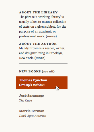
I love me some padded link targets and today’s provider is a Working Library.
The site is about books and their connections. Each post references one or more books and the referenced books are aggregated in the right-hand sidebar. When you hover over a book title, the crisp tiny type is immediately enveloped in a big cozy hover block.

I particularly like how the hover reinforces the column dimensions. It’s a sudden punch of structure to the otherwise airy layout.
(Found via JSM’s oddities)

osmif
on 23 Jun 08Nice UI. Nice clean, almost RESTful URLs too, courtesy of an Expression Engine backend.
Anonymous Coward
on 23 Jun 08I like padded link targets too. It took some effort to do, but I think it was worth it: http://mizzouwire.missouri.edu/
Josh N.
on 23 Jun 08Oops, I forgotto link to Mizzouwire and include my name. :-)
leethal
on 23 Jun 08Wow, Josh N., that was actually really awesome =D
Brandon Durham
on 23 Jun 08I always try to pad any kind of navigational links, for sure. I love the way it feels (and, in this case, looks). Such a small thing that makes a big difference.
Greg B
on 23 Jun 08Where’s the impression of “it’s a link”?
And I’m not implying that it should have been blue underlined text but that is one of those ‘hover around and explore this site kind of thing’.
Bad design in my book.
Joshua Go
on 23 Jun 08Greg B makes a good point that there’s no impression of “it’s a link” anywhere.
I’m a programmer and I mostly write back-end code and deal with the database, but being part of a small shop, it’s inevitable that I eventually touch some aspects of design. My designs have been called “boxy” in the past and so I’ve taken to removing explicitly visible borders.
Doing so will give the design an airy feel, but what you just wrote about the padded link reinforcing the column dimensions is worth making a mental note over. That way, a design can avoid being too boxy while still having some semblance of structure present.
Mandy
on 23 Jun 08Links on the site are identified in boldface, which I think is clear if you look at the entire site (and not just this corner of it).
This is actually one of my favorite parts of the design; I wanted something intentionally restrained (and book-like) but this was one place where it seemed to need a little more oompfh.
Anonymous Coward
on 23 Jun 08Looking at this design, I see a memory I never realized How happy it makes me. Go Mandy.
Well it’s clean and it gives without taking, but I’d send it away.
bucci
on 24 Jun 08Although I agree how padded links are nice, to me, the hovered links were not padded as you have shown on the image. They were padded only when I hovered over the actual words.
I am not a pro about web UI, but could it be because I use IE6?
Although I like the stylish and minimal design of the link, I agree to Greg B about the low impression of “it`s a link”. You find out only when you hover over them.
Tory
on 24 Jun 08Wow, that website is gorgeous.
Michael
on 24 Jun 08It’s all about appropriate context.
This discussion is closed.