You’re reading Signal v. Noise, a publication about the web by Basecamp since 1999. Happy !

Ryan

About Ryan

Ryan's been getting to the bottom of things at Basecamp since 2003.

Video: Ryan teaches product management at Mind the Product in San Francisco

Ryan
Ryan wrote this on 5 comments

“Finally—a chance to talk about product management to the right audience!”

That’s how I felt when Martin invited me to speak at Mind the Product in San Francisco. It was the right time and place, so I took the opportunity to distill years of blog posts and project experience into a condensed 30 minute talk. Now the video is online so those of you who weren’t at the conference can see it.

There are so many resources for programmers and designers to learn their craft, while those of us who guide products from conception to completion usually invent our own wheels. These are the tools I came up with to help teams focus on what matters and track the progress of a product over time. I hope watching the video gives you new ways to think about product management. Maybe it validates some of the things you were already doing and gives you new insights too.

Topics include:

  • How to break the product into “orthogonal capabilities”—separate sections of work that you can track independently
  • How to focus on what the product does instead of getting lost in the details of design and programming
  • How to map out the capabilities and track progress over time
  • How to bring meetings back to earth when people get lost in the clouds

and most importantly…

  • How to sleep well at night because you have a clear view of where you are, what’s done and what’s left to do.

I recommend watching full screen in HD so you can see what I’m writing on the screen. You can see the slides at full size here: http://feltpresence.com/mtp.

The Category Moat

Ryan
Ryan wrote this on 15 comments

A few of us at Basecamp became fans of the “job to be done” framework taught by Clay Christensen, Bob Moesta and Chris Spiek. The core idea is that what you are selling and what people are buying are two different things. Understanding what people are trying to do with your product helps you know whether you’re getting hotter or colder as you consider changes to your product.

For example, we think we’re selling a project management product. But some people really use our tool and pay us every month to manage their clients. The projects were always fine—it’s the clients that are a challenge! That’s just one example.

Clay has suggested (eg. here) that when you identify what people truly use your product to accomplish, you protect yourself from competition. He’s a smart man, so when he says something odd like that I try to dig in. I’m starting to see what he means.

It’s natural to identify with a product category. You think “we make product management software” or “we make candy bars” because you have to explain yourself over and over. It’s always easier to use available categories than to invent new ones. It’s just like language. We speak the lexicon instead of inventing words.

But for people who want to innovate, this is a problem. Identifying with a product category is outsourcing your strategy to the past. Is the world really carved up into allowable product categories? No. We are all figuring this stuff out every day. Experience shows that amazing breakouts and surprise successes competed on unorthodox dimensions (see Blue Ocean Strategy for examples).

Bob tells the story of a clock maker. They sell an alarm clock for small kids who started sleeping in their own room. It’s not a normal alarm clock. It has an arrow that points to whether the kid is supposed to be in bed or whether he is allowed to get up. That way he doesn’t go running into his parents’ room until after a reasonable hour.

If you think this product is a clock then it’s in the clock category in the clock aisle with a clock price. But parents who bought the clock said they would pay $100 or more for it because it keeps the kid out of their room. It’s a sleep protector.

So how does thinking outside the category protect us from competition? I’ve been conducting interviews with Basecamp customers, and I’m feeling first hand how tricky it is to think outside of a category. You don’t have a shorthand. You don’t have words and feature lists given to you. It’s like you’re floating out in space with nothing to grab onto.

That’s the key. The fact that it’s so hard to think outside of a category is the moat. Staying focused on why you made the features you did, what specific situations call for them, and how that combo creates progress for people requires diligence and confidence and unyielding attention to actual behavior. Sticking to the truth of the matter instead of the walls of a category keeps you on your own path and away from the pitfalls of conventional thinking. That’s hard to compete with.

[On Apple’s integrated organizational structure]

Normally, in well-functioning markets, vertical integration is suboptimal. However, if transaction costs in the vertical chain outweigh the losses due the inefficiencies of being vertically integrated, then vertical integration could be the correct course of action.

Apple thinks the exact same way, but not about monetary cost; instead, the transaction costs they consider are the tax that modularization places on the user experience, and it is a cost they are not willing to bear.

A design has to start with some initial conditions, and then adapt to the boundary conditions – the conditions it encounters as it evolves. This can only happen through recursion, which is how our design achieves adaptive evolution and a much better “fit” with the problem. We might have a very good intuition of what the design has to embody – Steve Jobs, for instance, was famous for his intuition of the final qualities a design needed – but then large teams of people had to refine that initial vision and bring iterations to him to evaluate. He was setting the initial conditions (what he wanted the devices to be able to do for people), as they were adapting to the boundary conditions.


Michael Mehaffy and Nikos Salingaros in Unified Architectural Theory: Form, Language, Complexity. A companion to Christopher Alexander’s Nature of Order, Book 1

The Design Roulette

Ryan
Ryan wrote this on 7 comments

There are sites, books, feeds, magazines, and movies about “design.” Thousands of people call themselves “designers.”
But have you noticed … “design” never means the same thing?
When I click on some “design” link, I feel like I’m spinning a roulette wheel. Will it be about:

  • Grids and Helvetica?
  • Typography?
  • How to balance trade-offs?
  • Applying engineering capability to a non-engineering problem?
  • Gradients?
  • Producing emotions?
  • Solving a business problem?
  • Posters?
  • Products?

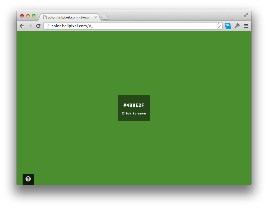
I just saw a cool link on Hacker News. http://color.hailpixel.com/

Screenshot of the color picker

What is it?

  • An interesting implementation because it’s made in HTML5, not Flash.
  • A cool style because it doesn’t look like other pickers.
  • A novel solution to a problem because the large scale gives access to values you can’t reach in a traditional picker.
  • An emotional experience because the immersive colorfield evokes purple twilights and blue-yellow sunrises.
Continued…

Launch: The official Basecamp iPhone app

Ryan
Ryan wrote this on 28 comments

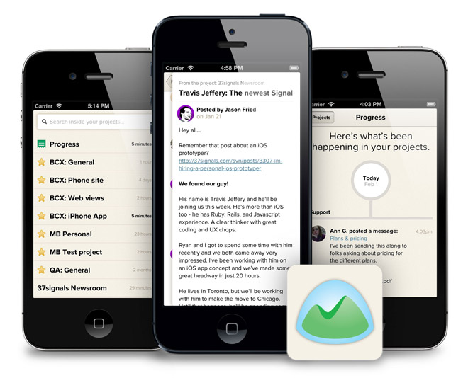
We are proud to announce the first iOS app developed completely in-house at 37signals: the official Basecamp app for iPhone.

Get it now for free on the App Store.

Basecamp on mobile devices

Here’s what you can do with it:

  • Check in on your projects from anywhere. Basecamp for iPhone shows you the latest news on each project.
  • Jump in on a discussion and post your thoughts.
  • View progress as team members complete to-dos and upload files.
  • Look up anything in a project. Refer to a document or make a decision no matter where you are.

We discovered it’s very important on the phone to make sharp priorities early in the design.

Our top priority was fast access to news. You’ll find the app makes it addictive to check in and feel the pulse of your projects throughout the day. You can quickly bounce in and out of projects. Project screens on the phone show the latest news first rather than static project contents.

Our second priority was to offer the full depth of Basecamp. After you dip into a project, you can go deeper and browse its contents. A menu offers all the project sections like Discussions, To-dos, Files, and Documents.

Iterating on iOS is tricky. The medium isn’t as flexible as HTML and CSS. To cut this down we used a hybrid approach. The page stacking behavior and navigation menus are native, while the rest of the screens are web views. Prototyping on Paper came in handy for evaluating native design ideas before committing to code.

We also used some shiny new tech. The app is built in RubyMotion. We barely touched Xcode. Look forward to some posts from Nick for details on that.

We’ve been using the app constantly since we first had a prototype in our hands. I’m thrilled to share it with you today. It’s available now for free in the App Store.

Download on the App Store
  • NOTE: Basecamp for iPhone requires an account on the new Basecamp (released March 2012). Basecamp Classic is not supported.

THAT’S THE THING ABOUT ALL OF THIS. IT’S ABOUT CHOICES. YOU CAN DO ANYTHING YOU WANT WITH A CAMERA, BUT WHEN HULK ASKS THAT ALL IMPORTANT QUESTION OF “WHY?” THERE BETTER BE A REASON FOR IT. AND WHEN YOU GET THAT ANSWER, IT BETTER SPEAK TO THE ACTUAL DESIGN OF WHAT PEOPLE ARE GOING TO FEEL FROM IT. OTHERWISE, YOU ARE NOT IN COMMAND OF YOUR MOVIE. YOU ARE NOT IN COMMAND OF YOUR CRAFT.

Dancing Without A Partner

Ryan
Ryan wrote this on 35 comments

Interface design is a two-person dance. By definition it connects two things—the customer experience and the hidden machinery. As a designer, you need a programmer to accomplish anything significant.

I’ve been thinking a lot about teaching UI lately. How do you teach interface design if you can’t get anything done without a programmer at your side? Pair beginner programmers with beginner designers? Sounds like a mess.

Then I remembered my own experience. When I started making interfaces in sixth grade, I didn’t need a programmer because I had Hypercard. Shortly after that it was Filemaker and Microsoft Access. These tools let me connect with data and display it in different ways without convincing a programmer to work with me. It was plenty to learn the fundamentals.

I haven’t seen a UI course that starts with a tool like Filemaker. And Hypercard doesn’t even exist anymore.

If I was designing an introductory interface design course, I think I would start with this kind of tool. Something that lets you gain the experience of putting affordances on the screen, accepting input and displaying output, moving around and enabling tasks.

That way students could get a feel for interfaces without getting into the complicated dance of communication, programmer languages and shared requirements. That all can come later.