We recently added a support request form to Basecamp (there used to be just a direct email link). The goal of this form: To prioritize support inquiries, reduce uncertainty, and get people the answers they need faster. It also reduces the number of back and forth information-gathering emails, which ultimately makes everyone more satisfied with the support experience.
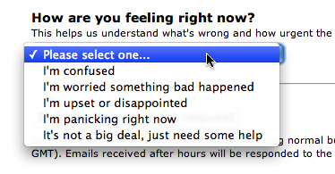
It’s worked really well so far too. But the last question in the original form was missing the mark:

We wanted to know how important the problem was and gauge the emotional state of the person writing to us. But this pulldown just didn’t cut it.
First off, it required too much reading for a pulldown menu. Who wants to process this much info when there’s a problem? Also bad: It’s a pulldown but the options aren’t mutually exclusive. Someone could very well be confused AND worried AND upset. This pulldown just muddies the waters.
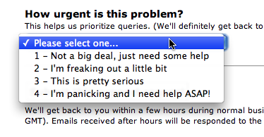
So we decided to change it to an actual scale. 1 = not a big deal, 4 = I need help ASAP.

Much easier to process but it still wasn’t helping us learn whether or not this query was a top priority or not. Why? Because everyone’s problem is urgent.
For example, let’s say someone’s having trouble uploading a file. If they can’t figure out how to upload a file, they’ll say it’s urgent. If file uploading is broken, they’ll still say it’s urgent.
That’s no help to us. Of course, we’ll get back to them either way. But if file uploading is broken, we need to know that immediately so we can fix it. If it’s just confusing someone, that’s a different ballgame. We’ll still quickly resolve the issue, but it’s not a fire that has to be put out instantly.
We thought about adding in a radio button question that asked “Is something broken?” But we didn’t want to make the form any longer. (No one likes feeling interrogated while seeking help.)
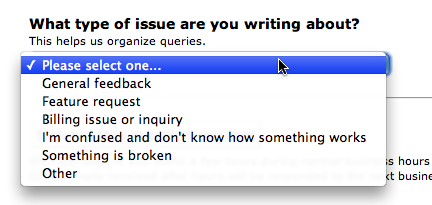
So we went back to the drawing board and came up with this solution:

This gets at what we really want to know here: What kind of problem is this? We lost the subjective nature of the original “give us your emotional state” question and replaced it with a clear question with a clear answer. It’s better to ask for facts than emotions.
Now, if something’s broken, we can spot it and fix it right away. A system failure is much more important to us (and our customers) than a feature request or general feedback. This method lets us prioritize these queries accordingly, instead of treating them like they’re all the same.
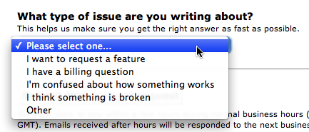
Update: Per feedback on this thread, we’ve adjusted the menu to the following (more consistent language, no more “general feedback” category since “other” is close enough). Thanks for your comments.

Related: Copywriting is Interface Design [Getting Real]

Jim
on 26 Jun 08Think about saying something like “Teach me. I’m not sure how this works…”
Rather than “I’m confused.”
Selecting an option that says “I’m confused”, although it may be correct, just makes me feel dumb.
Perhaps I’m the only one, but that was my gut reaction.
Andrew Green
on 26 Jun 08The Design Decisions series always yields by far the most interesting, thoughtful and useful posts on the whole blog.
allan Branch
on 26 Jun 08Looks like you’ve been watching GetSatisfaction.com’s progress and success. We love their app service and we love 37Signals apps as well. If you can’t use their service this feature is definitely needed.
Gerrit
on 26 Jun 08What about the confusion for the user between: ‘something is broken’ and ‘i can’t do it’? Both FEEL the same to a lot of users.
dusoft
on 26 Jun 08Check Dreamhost support form, they also have very funny dropdown with things like “OMG! Things are broken, people are dying” for really urgent matters etc…
I don’t use that option that much as some things are not that urgent afterall.
Grady Kelly
on 26 Jun 08It seems like you are trying to gauge how the user has come to their issue, or at least know how to approach the response. Maybe something like:
—Tell me how to use this feature.
—I think something is broken.
—Am I doing something wrong?
—This worked yesterday, WTH?
But from your last screen shot, it looks like you are trying to solve more than 1 problem. The user should be able to enter what they are having issue with, i.e., a feature, or billing, etc. I think that the user’s point of failure with the app, or whatever you want to call would be separate, and nice to have. It could help you to know how to best answer their support request. And could help in designing future parts of the app so that similar issues did not happen again.
Ryan Markel
on 26 Jun 08@allan:
I’ve been evaluating GS as an option for the product I work with and I think its four-fold division is also awesome. It will be a much more usable system when their API is mature and they don’t have a bunch of warnings about it instability.
*
I think another great example of a support form is Twitter’s. Four entry blanks: “This is what I DID.” “This is what I EXPECTED to happen.” “This is what ACTUALLY happened.” “This is how I feel in 140 characters or less.”
Having those pieces of information would greatly assist technical people in quickly sorting out whether an error is “pilot error” or “system/machine error,” and more than likely also give them a starting point for investigation if it’s a system thing. The “how I feel” thing helps the support e-mailer approach the problem with tact.
Matrixing a Twitter-like set of questions with this kind of genre-classification would make sorting things out even easier.
Dan Gebhardt
on 26 Jun 08For our time tracking service, we’ve simplified the label on our contact form to read:
“I have a [Question, Suggestion, Comment, Problem, URGENT PROBLEM]”
Justin Reese
on 26 Jun 08Matt, what’s the intentional difference between “General feedback” and “Other”?
ML
on 26 Jun 08What’s the intentional difference between “General feedback” and “Other”?
Other is more like “none of the above.” In theory, this could be different than general feedback.
Denniscs
on 26 Jun 08I love to use the feedback status “OMG! EXTREME CRITICAL EMERGENCY!! EVERYTHING’S BROKEN, PEOPLE ARE DYING” from Dreamhost! It’s awesome.
Ismo
on 26 Jun 08So you came up with same solutions as everybody else.
Anyway, thanks for a post. It’s always nice to get “inside your brain” :)
Peter
on 26 Jun 08Back when I was a consultant.. our issue tracker had 2 columns of note with regards to this post.. Technical Priority, and Business Priority..
Technical = how broken and/or how much functionality does it prevent from working
Business = how much does the user want it.
Examples.. A User’s name spelled wrong, would be very low tech, but could be a showstopper for business..
Broken login would be showstopper for both..
Combined with an estimated LOE column, it became very very easy to prioritize things..
Matt Radel
on 26 Jun 08Great post. I love the idea of the using emotional responses – (over generalization warning) I think folks tend to react to issues emotionally, and I think your options really spoke to that. But I can see how it’d be a nightmare to manage.
Mayhaps you could format your current top 3 options into something a shade friendlier & more emotionally appealing. The tone of the dropdown just seems to cover a pretty wide range right now, as you use language like “something is broken” along with “inquiry”. I’d expect “An Error occurred” or “I have a Question” to gel a bit better.
Anyhoo, just my two cents.
Rob H
on 26 Jun 08How about shortening “I’m Confused…” to “I don’t know how something works.”
Overall, you can tell a lot of thought went into providing a good customer service experience, when reporting a problem. R
john
on 26 Jun 08Another Dreamhoster here. I actually thought about them immediately when I saw this posting. I almost never abuse the system, and they do vary their response time based on what you’ve selected.
Smart people know that their issue is not always URGENT. Stupid people don’t, and you’ll never be able to train them, really, without a penalty box.
Thijs van der Vossen
on 26 Jun 08Why no radio buttons?
The Webloglearner
on 26 Jun 08I am amazed with the system that is mentioned. It is very helpful. These days, although supports exist, it is difficult to fin real support that do it “at heart”. It’s only a display for some to be appearing to have customer/stakeholder support group. What is presented above is very detailed and is purely concerned.
Leslie
on 26 Jun 08@Peter:
I like your set up.
“Business = how much does the user want it.”
I’m curious, how do you decide the view point of the user for the business column?
Richallum
on 26 Jun 08Like the changes. I always felt that the original list was lacking some options. I agree with the Dreamhost comments – liked the list although they spectacularly failed to produce any support for me. I also use Get Satisfaction and having to click on a facial experession and choose an emotion really makes me think – now I don’t automatically click on ‘the world’s ending’ for all issues.
Richallum
on 26 Jun 08One other thing – are you going to roll these out for other products?
JF
on 26 Jun 08One other thing – are you going to roll these out for other products?
Yup, once we get them right with Basecamp we’ll roll them out to the others in time.
john
on 26 Jun 08@Richallum Really? I’ve found DH to be very responsive. They don’t hold hands much, though—pretty bare-bones support.
Shane
on 26 Jun 081. Agree that “I’m Confused” seems negative. But I do try to use all the empathy I can muster when I make these decisions and I think that makes me too cautious sometimes.
2. I also agree that Radio Buttons, generally, are a much better solution that Drop Downs. ESPECIALLY when the drop down is more verbose than, say, a State or Open/Closed/Cancelled state.
Radio’s let me see all options at once without having to click. And drop-downs are HORRIBLE for people without good mousing ability. If the drop-down has a scroll bar, that’s about 1/2 dozen precise mouse-clicks for one selection. Ugh. Double Ugh.
Brian Armstrong
on 26 Jun 08On the surface this appears to be over-thinking a simple problem, but these small changes add up over time. Nice post…
J Lane
on 26 Jun 08Just curious what happens to this form once it’s submitted? Does it just get emailed to support@, or does it dump into some sort of bug/issue tracking setup?
eric shannon
on 26 Jun 08I’d like to see you move support off of e-mail and onto the Web completely. It makes me a little uncomfortable to know that I depend upon a company for internal communications from whom I am unable to receive e-mail. I white listed you in both of my spam systems but still never received an e-mail from support.
I understand the principle that some customers are not worth the expense of time or frustration to keep but it’s a bummer to be on the wrong end of that…
If I had a serious problem, would you be willing to call me or do you strictly run support on e-mail?
Justin
on 27 Jun 08love you 37 signals
Richallum
on 27 Jun 08@john. Yes, I was really upset as I liked the company but basically, my site and hosting account went down for 10 days as there were ‘3rd party server issues’! After the first 3 days I got a reply basically saying, ‘sorry, site tight, should be fixed within a week’. It wasn’t, I left.
anson
on 27 Jun 08Maybe I am being overly sensitive, but changing “something is broken” to “i think something is broken” comes across as a little condescending to the customer.
Yes, we’ve all had so-called bugs reported where the issue is actually just user error or misunderstanding, but i think it’s good customer service to start off by giving them the benefit of the doubt.
Mari Garza
on 27 Jun 08I read this post in the morning and a few hours later found it necessary to write a support request.
Basically, it was a loading bug.
However, there is no drop down for Bug. So I selected “I think something is broken” Still perhaps not the greatest category selection, but nothing else seemed to fit.
Josh
on 27 Jun 08Seems like you’re solving a support workflow problem on your end (sorting and prioritizing requests) by forcing the user to jump through extra hoops. What value does the user derive from completing this drop-down? This is the kind of UI papercut that we should be looking to eliminate from our UIs.
As a user, I just want a response. Every extra field I have to fill in puts a barrier in my way. I would rather you hire extra support people that push this work to me.
But to the smaller point of the post—yes copywriting is an interesting and subtle part of the UI.
musah abubakar
on 28 Jun 08ghana ashiaman 00233 p.o.box as 443 plz i need it fast thanks
markd
on 29 Jun 08Greetings. Thanks for the insights. Curious though, are you using help desk software to manage support or are you still handling it with gmail like you stated a couple years ago in the “tools we use” post ?
Casey
on 02 Jul 08As a Support person, I love-love-love this post, and the comments. I work at a SaaS company, and thinking of ways to get help to our users and users to our help is a huge part of my job.
@Josh: We aren’t trying to make you jump through hoops, we’re trying to make sure we’re fixing the right problem. I have had some seriously non-communicative support tickets, where had they not come with a “login” flag, it would have taken a 2-3 email roundabout to figure out what the problem was. But once I had an idea what the user was having trouble with, I could tell them how to fix it.
Another big help is when a ticket is marked with “System Failure” – we look carefully at those. Is it a crazy bug? If so, I need to tell the engineers NOW, possibly sooner.
Also, of the people experiencing a problem, not many will actually ask for help; they figure it will go away on its own, or someone else will complain. So if we get a ton of people writing in on one particular point, it’s a good bet there’s even more who are just sitting at home or work, grumping at their computers and wishing something would happen. Even I’m guilty of this :P
This discussion is closed.