Most embedded audio players offer a tiny player with the basics: play/pause and a progress bar.

While this design works great for the casual listener, Soundcloud has another audience in mind. Musicians, producers and sound engineers want to do more than listen to a track. They want to provide feedback on specific details. The bass at 2:36 needs more compression. There’s a mic out of phase at 4:01. Can we try another patch for this one chord in the bridge?
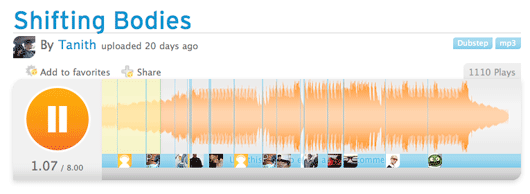
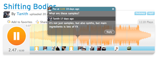
In order to allow this kind of collaboration, Alex and the guys at Soundcloud could have used a standard player and tossed a comment stream below it. Instead they decided to expand the player and allow commenters to add notes directly inside on the waveform itself. The result is pretty cool. People can post tracks and receive a flurry of comments attached directly to the waves.
The player spans the full width of the screen, so it’s easier to set the playhead at the exact spot you want. Commentor’s avatars appear in the bottom of the player, and their comments pop up on hover.
I like how these guys set out to build a collaboration site for music makers, and what did they concentrate on? The music player. It cuts straight to the epicenter (more).
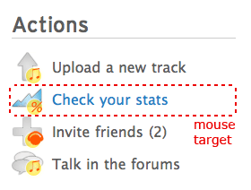
They also scratched my persistant itch for larger link targets in their “Actions” section of the sidebar:

Soundcloud is still in private beta, but Signal vs. Noise readers can check it out with this link: http://soundcloud.com/guestlist/signalvsnoise .


alsomike
on 17 Jul 08This is going to be huge. There are already a bunch of big names like Adam Beyer, Funk D’Void and Fabrice Lig on this site.
Ed Knittel
on 17 Jul 08How does it look with 20, 100, 1000 avatars occupying such limited real estate? Not saying it’s a bad idea but if as alsomike says “This is going to be huge.” then what works for a few might become a visual mess for many.
I just think about the hell Digg went through with their comment system because it became unbearable to understand once the site got bigger than anyone could have imagined.
The bigger the community the more it begins to look like a list (ala Flickr as well – what’s that one image that has been noted to the point of incomprehension?)
I’ll look forward to a followup message when/if they change their mind.
As for larger link targets: everyone’s doing it now. Particularly on left-side navigation.
Eh, on preview I am saying it’s wrong. I’ll stand by my assertion as I do not believe they are laying out data (comments) in the most effective way. The histogram (I know that’s wrong) is visual eye-candy but with no X or Y axis it serves no quantitative purpose.
Thibaut
on 17 Jul 08@Ed : maybe the possible clutter will prevent users to comment with “oh nice one” or “good bass” (ala Flickr) and will educate the community to write more thoughtful comments, more scarcely, more helpful for the track author. A time specific “fave” feature would be a good replacement of the “cool” comment and could prevent clutter too. The histogram is not just eyecandy, it gives you an instant overview of the track phases, and help you locate a particular spot on a re-listen without having to remember a time code. It’s a visual tool.
A similar display of comments for text on blog posts would be neat too : comments linked to a particular word, sentence or paragraph could be a way to lower the misunderstanding bar.
Eric Wahlforss
on 17 Jul 08@ed I’ve been quite happily surprised with how well the timed comments work, not only for discussing details of a track, but also for highlighting interesting music on the site. Whenever I see a track where I recognize a friend’s avatar in the comments I know it’s probably going to be relevant in some way. Also, I should point out that one cannot (yet) overlay timed comments since if you click an avatar it will start a thread from that comment, so the waveform can’t get very cluttered in the end.
Nevertheless, we’re still very much in short-cycle-iteration mode taking in feedback as we go, and I’m sure we’ll introduce better filtering/threading features as we go. The challenge is to provide a precise enough tool musicians and pro:s to have private track conversations (almost 40% of the site’s content is shared privately!), while still making it work for a heavily commented public track…
Eric [Founder, SoundCloud]
alan
on 17 Jul 08so ryan, you going to hook me up with an invite then? :)
Ed Knittel
on 17 Jul 08@Eric Thanks for the explanation. It definitely helps me to better understand who will be using the tool. Private conversations would obviously get rid of the dribble thus making the site exponentially more useful. I look forward to hearing more about this in the weeks to come.
@Thibaut Never underestimate the power of stupid people.
Tom G
on 17 Jul 08very nice
I’ve always been a big fan of annotation of a data visualization. This concept works well for annotating graphs that display the measurement of many kinds of real world data to help correlate cause and effect.
Thanks for the invite!
Don Schenck
on 17 Jul 08Large links? Check. Orange color scheme? Check. Hip language and ‘tude? Check.
Yup, passes the “Web 2.0” formula test.
It’s getting to the point where Web 2.0 is so formulaic that if you “Break the mold” and “kick it old-school”, you’ll be web three point oh.
That’s my opinion.
Don Schenck
on 17 Jul 08Clarification: I LIKE the site, both aesthetically and conceptionally.
Jorn Mineur
on 17 Jul 08This waveform display is very uninformative. Sonic Solutions got that right already back in 1990, so there is no excuse for this crap.
Matt Gorecki
on 17 Jul 08Thanks for the invite, guys. This is very cool. I do like the comments at the specific time markers.
I uploaded a couple of songs. Have a listen.
Bill Tower.
Nathan
on 17 Jul 08Speaking of big link targets, I recently added a bunch to the Blurberati Blog. Previous/Next links, sidebar navigation links, comments links in sidebar and RSS feed link.
Brad
on 17 Jul 08Great usage of macro to micro visualizations.
Do a search, and you get the 10,000 foot view with just a play button available for each song.
The “hot music” lists has that awesome jquery-fied progress slider with time-tracked speech bubbles.
Finally, zoom into a single song and get the comment transcripts in standard blog style for easy scanning.
Love it.
Gary R Boodhoo
on 18 Jul 08@Jorn: its uniformative for an audio editing application, for this purpose the granularity seems quite reasonable to me. All I really need here is some sense of differences and a timeline
cynic
on 21 Jul 08slick site. here’s my url if anyone wants to check out some tunes.
http://soundcloud.com/cynic
cynic
on 21 Jul 08whoops…or a clickable link too
This discussion is closed.