News.com

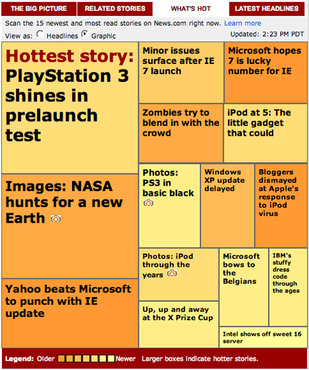
What’s Hot gives a visual snapshot of the 15 newest and most read stories on News.com. The bigger the block, the hotter the story. The brighter the block, the newer the story. Bright yellow means the story was just published.
Archive.org

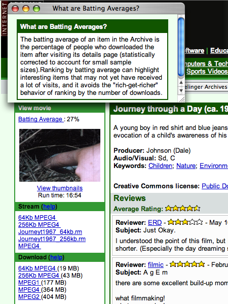
Each item at Archive.org gets a “batting average” (the percentage of people who downloaded the item after visiting its details page).
Walmart

Walmart’s home page has a revolving slide show of products. The 1-2-3-4 bubbles at the bottom slowly fill up so visitors know how long until the next image is displayed. Jay, who submitted this screen, calls it a “nifty way of giving people who are slow readers an idea of how much time they have for your slideshow, and if they need to pause or not.”
Got an interesting screenshot for Signal vs. Noise? Send the image and/or URL to svn [at] 37signals [dot] com.

cjcurtis
on 22 Nov 06don’t really have an opinion about the archive.org or the walmart thing.
but the “what’s hot” on news.com…i don’t get it.
how is that better than listing hottest or newest stories in a nice neat column from top to bottom…and maybe using a little color to differentiate?
(so you can actually read it)
with this, you still have to read headlines, but they are all different sizes and shapes. i’m also thinking this means that the newest stories, since they haven’t had a lot of hits yet, are very small in comparison to the other stories. wouldn’t this be considered counterproductive in the news business??
i see that it does have a “headlines” option, but i don’t see the point of the graphic.
Daniel
on 22 Nov 06That News.com idea is either a rip off or a purchase of an idea that’s been around for quite some time called the Newsmap.
Phil
on 22 Nov 06Which was even already mentioned here: http://www.37signals.com/svn/archives2/screens_around_town_google_news_and_newsmap.php
I don’t quite “get it” any more now then I did then.
Darren
on 22 Nov 06regarding the news.com “what’s hot”
The technique used there is called a treemap – I read about them first in Information Dashboard Design ( Stephen Few, published by O’Reilly, Jan 2006)
According to what I read, the treemap idea was devleoped by Ben Shneiderman at the University of Maryland. ( bio here, google results here )
Seems he’s quite a thinker…something along the lines of Tufte.
Rick
on 22 Nov 06I am receiving an error message when trying to post a message
Thomas
on 22 Nov 06News.com cough copied coughanother site. http://www.marumushi.com/apps/newsmap/newsmap.cfm
ugh
on 22 Nov 06archive.org—batting average = terrible copy writing … but then again archive.org is stuck in about 2001 in terms of experience design.
Oren
on 22 Nov 06What Walmart is using is called a called a heatmap. They are a standard chart type and have been around for a very long time. I wouldn’t call it copying any more than you can say someone copied the idea of a pie chart from someone else. We use these a lot in the financial industry to convey multiple points of data related to a single value. It’s really most useful when you can view changes in the data. It makes it easy to visually spot how the data is altered over time. It’s not all that useful for something like news where you generally don’t care about a stories change in popularity.
You can see an example of its use here: http://www.windowsfs.com/TheMag/tabid/54/articleType/ArticleView/articleId/1414/JPMorgan-Reuters-Map-Out-Data-Views.aspx
Darrel
on 22 Nov 06I came across the CNET orange thing a few weeks ago. It comes across as a giant hairy wart on someone’s face. You just can’t avoid looking at it even though it just kind of grosses you out.
Tamimat
on 22 Nov 06@ Thomas: Everybody is copying Apples Design. Marumshi was not the first person to come up with this design. It is always the understanding of data and transforming into the best visual form. When the “Marumshi” System is good do it, if not search for something else. Even if you Invent it you will find somebody who did it in a small project or in a book or even hounderds of years ago. Even the Yello Highlighting was not a 37signal invention. But if it helps to solve your problem use it.
jeevs sinclair
on 23 Nov 06have you seen http://tenbyten.org (by number27) it’s a very interesting display of the world NOW as per the news and photos, a very clever ideal and great implementation I think.
Tory
on 23 Nov 06People need to stop trying to reinvent the wheel. The News.com treemap is just awful. Readers shouldn’t have to try to decipher some gimmicky-looking chart. Why can’t they just list stories in order of popularity?
john
on 23 Nov 06Why is everyone so bent on whats popular? This article has been read 500 times. This means nothing to me, except that the title was catchy enough to have 500 people click on it.
If the layout works, and doesn’t get in the way, thats all that matters in a design mind. For a real world person, its about content that is easy to figure out.
td
on 23 Nov 06web 2.0 gone a muck. Seems like a lot of people are choosing to focus on just the first of the three screens posted. The Wal-Mart slide show (with hour-glass style timer) is a very useful and enjoyable addition. No comments of archive or news stuff.
I do agree that not everything needs to be dictated and aggregated via popularity.
Nick
on 23 Nov 06I’ve got to agree with the others here that the News.com graphic display is a mess. The fact that they have to explicitly label the hottest story signals the failure of the visual cues.
I don’t know about anybody else, but in my mental model ‘hotness’ is something that is signified using colour. Those oranges and yellows can’t help but conjure images of burning fires. But then I find from the key that colour dictates newness. Now it’s just confusing because I can’t escape from that colour-fire-hot thinking that my experience has taught me. And that means I’m having to really think about decoding the image. And the payoff for that extra processing? That older stories tend to be hotter.
As previous posters have said, display a list and be done with the chartjunk.
Peter Hentges
on 28 Nov 06An alternative to the “most popular” listing of stories on a news site is used by the BBC (http://new.bbc.co.uk). They have a “Most Read” listing but also a “Most E-mailed” listing. It gives you a look at stories people thought interesting enough to email to someone. I think it shows that people tend to email stories that are funny or shocking but at least it’s a different way of sorting the stories.
This discussion is closed.