Darden Studio
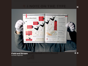
Even though it works like typical lightboxes, the lightbox at Darden Studio (example) feels different due to design choices the firm makes.
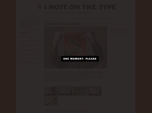
The loading screen has custom typography centered on a black bezel:
And then check how using a non-browser typeface, including the x on the upper right, and the arrows in the lower right spice up the design of the lightbox itself.
ShoeGuru
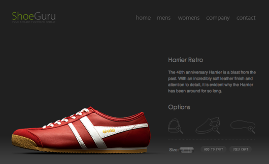
ShoeGuru makes shoe shopping elegant.
Cymbolism
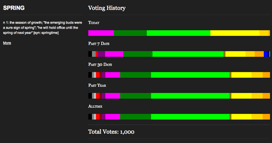
Cymbolism is a new website that attempts to quantify the association between colors and words. You can search for a word and see what colors people associate with it. The goal is to “make it simple for designers to choose the best colors for the desired emotional effect.” Here are the results for the word spring.


GeeIWonder
on 21 Aug 08So cool.
2008 Beijing Olympics Closing Ceremony
on 21 Aug 08this shoe has a perfect design. I like to wear it
Christopher J
on 21 Aug 08The Shoe site is absolutely amazing. I’ve done a lot of ecommerce work and I’ve never seen anything quite like it. That’s why it pains me to not end, that when you add something to your shopping cart BAM PayPal. Why on Earth spend so much effort making a beautiful site to market your brand and then direct them to PayPal?
john h
on 21 Aug 08cymbalism falls prey to chicken and egg logic because it doesn’t weed out bias at all. having a SPONTANEOUS RESPONSE to a color and being asked to match a WORD with a color are two very different things. I mean, how many of us are able to accurately codify our feelings and emotions? Very few.
Nicole
on 21 Aug 08The Shoe Guru design is certainly a step up from the average ecommerce shoe website, but I can’t stand when price isn’t displayed with the item. It’s on the browse page, but then not on the individual item page. As a shoe “power shopper,” this is annoying.
Morley
on 22 Aug 08ShoeGuru looks great, but that damn horizontal scroll…
Mubashar Iqbal
on 22 Aug 08Thanks for the link to Cymbolism, much appreciated. The more people voting on the site the better.
@johnh: I think the point is the initial gut reaction, put too much thought into it and you’ll out think yourself.
scott
on 22 Aug 08Most lightbox libraries, including lightbox 2 and slimbox, have those features.
Personally, I think the default configuration of those two libraries in is nicer than thickbox (the library used by Darden).
Kedoa
on 24 Aug 08ShoeGuru is a really nice site. But i dont know if they deliver to the uk.
Tor Løvskogen Bollingmo
on 24 Aug 08Again the lightbox fails, why do I have to wait for the content to load? People need to see Galleria; http://devkick.com/lab/galleria/
Web Designer Mike
on 25 Aug 08ShoeGuru is amazing but I agree, having the pricing on a separate page is a bit annoying. The usability is lacking there.
simplicity and black
on 25 Aug 08The Lightbox, I have to agree with others here, nothing really special here. The only difference is the quickness of the image that appears, but I don’t see anything so visually appealing that really kicks me out of my seat?
Wanna see something pop, go to http://highslide.com/ Click on the top three images in the gallery. Notice that these are not modal? You can continue to open more windows and move elements around the desktop. That is pretty cool.
As for the shoe site. The value of simplicity is very well played out here. It is a personal value of mine, for ecommerce sites, to minimize design and allow the imagery sell the product. cluttering up a site fuzzy dice is unnecessary.
And to drive the point home, PayPal? WTF? Talk about a cop-out. Even if they were to still use PayPal as the back end processor, there are much more elegant front end services to be used.
frozendevil
on 25 Aug 08(Generalization for the purpose of emphasis)
Lightbox is evil. Period. Any sort of modal/obscuring interface element sucks, especially when the information you’re consuming/manipulating is already INSIDE another window (to make no mention of the fact that lightbox deliberately goes out of its way to obscure every inch of the website it’s on; which might be a good idea if I were adjusting color levels in preparation of publishing my picture but sucks when I’m, you know, just browsing the web). On normal websites when I come across an image link, I open it in a new a new tab so I can view it when I’m ready and not disturb my current activity. On lightbox sites I often find myself inadvertently closing out of the whole tab just because this thing popped up in my face and it’s my gut reaction to get rid of it. And waiting for javascript to twiddle its shit while you sit is just absurd. People keep complaining about load times and how foobox is quicker than blah and this one has a progress bar so it’s better. Really? Seriously? That problem was solved 10 years ago when people still wanted the buttons on their websites to explode when you rolled over them; if you didn’t insist on this god-forsaken image trick implementing a quick, good-looking photo galley would be peanuts.
When I saw the first section in this post was about lightbox I expected it to be some clever implementation that didn’t ruin my whole day—but custom fonts are cool, too.
Nicole
on 25 Aug 08After seeing people mention the PayPal use on ShoeGuru, I just tried it out, and my window was resized when I added to and viewed my cart. Grrr. Is this new or did this happen to other people?
This discussion is closed.